Three Indicators that Call Bear Market Bottoms Were AWOL at the October Lows
To many, October represents the low for the 2022 bear market and what we are seeing today is the first leg of a new bull trend. After all, interest rates have probably peaked, inflation is dying, supply chain problems are over and so is the pandemic.
Looking Closely at the 10-Year - One-Year Spread
One of the problems with that scenario is that it ignores a historical relationship between the stock market and the yield curve, which has only recently begun to invert. Note that the 10-year/one-year spread was used in chart 1 due to its longer history than the more popular 10-2 relationship.
The vertical lines approximate the initial inversion point when the one-year starts to trade at a higher yield than its 10-year counterpart. That means a tight monetary policy as the Fed ratchets up interest rates. The normal state of affairs is for investors to demand a higher yield on long-dated maturities because of the uncertainties involved with the longer time period. The red-dashed arrows suggest that inflation-adjusted stocks usually end up much lower than when the curve initially inverted. In 1989 and 2006, stock prices temporarily rose immediately following the inversion, but both situations eventually saw lower prices. The curve is currently at its most inverted since 1980 as it reflects the seriousness of the 2022 tightening process.

CHART 1: THE 10-YEAR - ONE-YEAR SPREAD. The curve is at its most inverted since 1980 which may be reflective of the Fed's 2022 tightening policy.
Chart source: StockCharts.com. For illustrative purposes only.
The inversion is one reason to be skeptical concerning the October low. Others come from missing pieces of the bear market puzzle that are usually present at such turning points. It doesn't mean October won't turn out to be the low, but merely that the probabilities would be greater had these indicators performed in an expected way.
Chart 2 compares the monthly Cboe Volatility Index ($VIX) to the S&P 500 Index ($SPX). The vertical lines flag the major lows since 1998. Each one, except the late 2019 bottom, saw a $VIX reading at or above the green horizontal "line of fear." The reading at the 2022 low was elevated, but nowhere near where the level you would expect given the magnitude of the 2022 sell-off. Few signs of capitulation here.
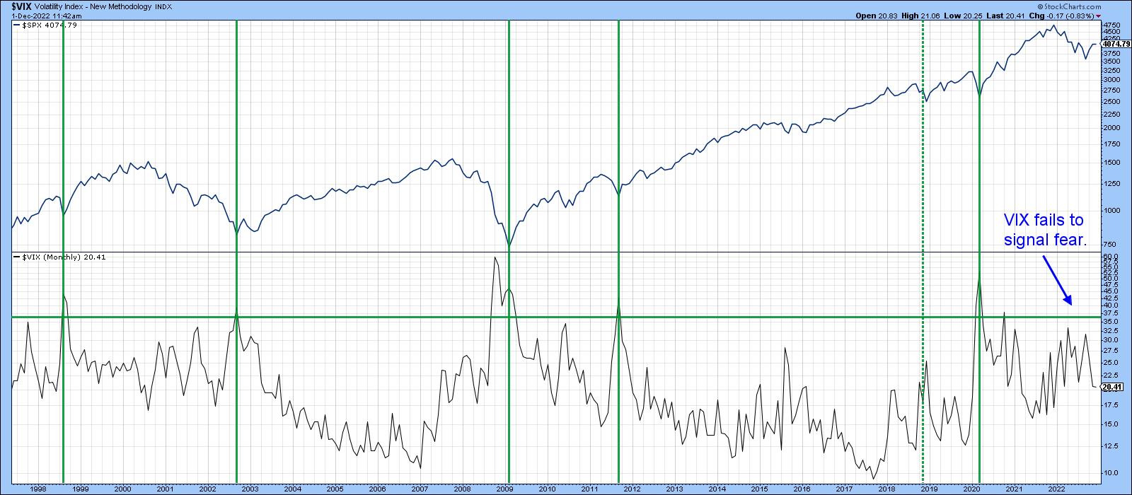
CHART 2: $VIX VS. $SPX. In 2022 $VIX failed to signal fear.
Chart source: StockCharts.com. For illustrative purposes only.
Our second indicator monitors confidence in the bond market, which is also related to expectations for the economy. Credit spreads can take many different forms, but a spread-type arrangement with a relatively long history that can also be plotted on the StockCharts platform is a ratio between the Fidelity Capital and Income and Vanguard Long-term Treasury mutual fund (FAGIX/VUSTX). The former is heavily weighted in favor of high-yield bonds. The latter is exposed to risk-free treasuries. A rising ratio reflects growing confidence among bond market participants, as they bid up the higher-yielding and riskier corporate paper in favor of the more conservative treasuries. Conversely, a falling ratio suggests bond investors are betting on a weakening economy and a greater potential for defaults.
Most of the time the ratio moves in the same direction as the $SPX. The red dashed arrows in chart 3 point out that this is not always the case. There's also an unprecedented divergence in 2022, as stocks fall but the confidence relationship rises. That means that if the October bottom is the final low for the 2022 decline, it would be the first time that a major decline had taken place as confidence was improving. The long-term KST for the ratio is still rising but is at an overbought level, suggesting a downside reversal may not be that far off and, with it, a loss of confidence, which would imply a softer stock market.
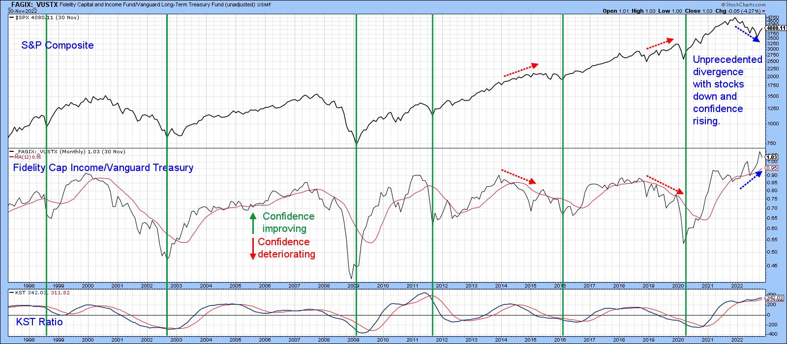
CHART 3: DIVERGENCE BETWEEN STOCKS AND CONFIDENCE IN BOND MARKETS. If the October market low is the final low of the 2022 decline, it would be the first time confidence was rising when stocks were declining.
Chart source: StockCharts.com. For illustrative purposes only.
Finally, chart 4 compares the $SPX to a ratio between it and the CME CBOT 30-year U.S. Treasury Bond Price ($USB). It usually sells off during a bear market, mostly because, generally, the more volatile stocks are busy discounting a forthcoming economic slowdown or recession. The arrows show that the ratio bottoms consistently with the equity market. In 2022, though, stocks sold off, but the stock/bond relationship showed no sign of its normal weakness. Both fell, but bonds fell faster. That now leaves this relationship overstretched on the upside, as evidenced by the long-term KST in the bottom window. It also makes me wonder if bonds are now about to outperform stocks.
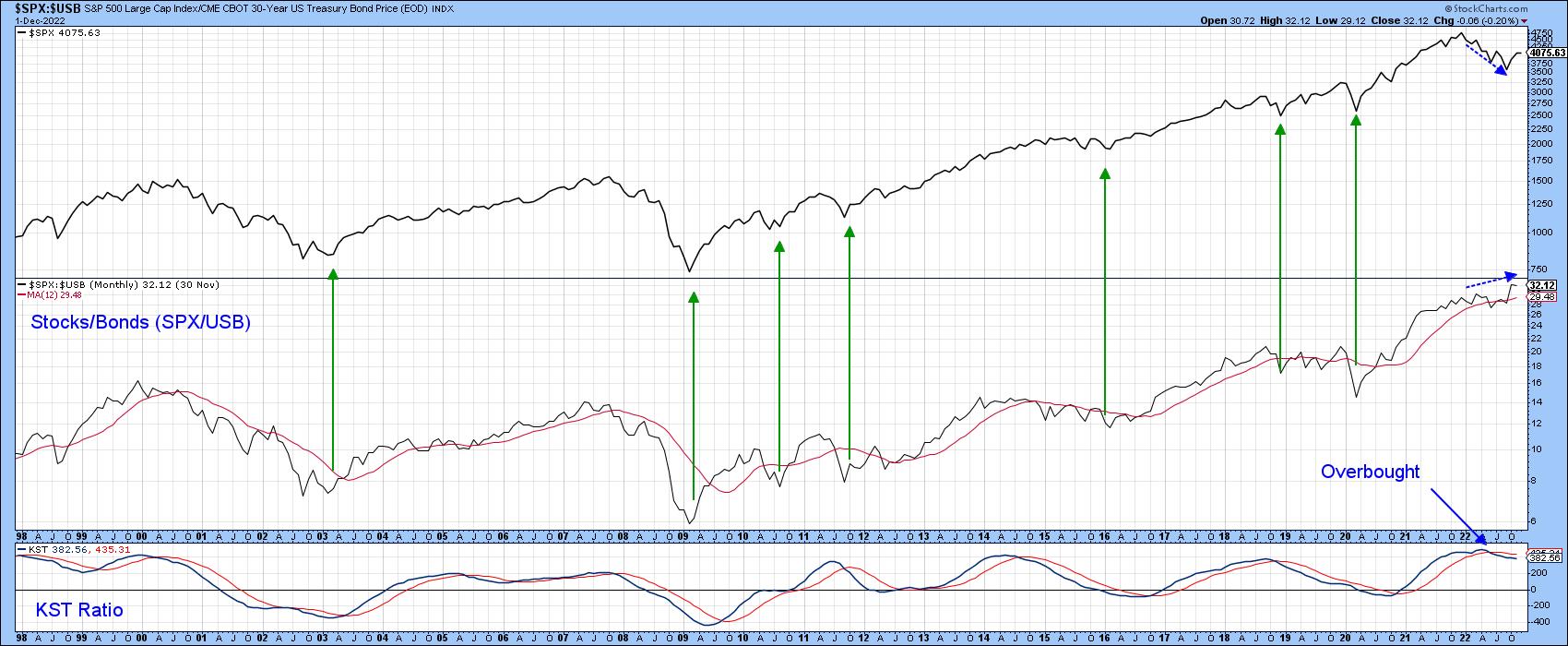
CHART 4: $SPX VS. 30-YEAR U.S. TREASURY BOND. In 2022 the stock/bond relationship showed no sign of its normal weakness. Bonds fell faster than stocks. Does that mean bonds could outperform stocks?
Chart source: StockCharts.com. For illustrative purposes only.
Good luck and good charting,
Martin J. Pring
The views expressed in this article are those of the author and do not necessarily reflect the position or opinion of Pring Turner Capital Groupof Walnut Creek or its affiliates.


