A Tale of Two Indexes

Most of the time, the major indexes move in tandem. Occasionally, they'll throw up positive and negative divergences that technical analysts can use to better identify important trend reversals. Today, we will look at two market averages whose 2022 price action has resulted in completely different potential chart patterns—one bullish and one bearish.
The two indexes are:
- The NYSE Composite ($NYA), which looks as if it is in the process of forming an inverse head-and-shoulders pattern.
- The Nasdaq Composite ($COMPQ), which may be in the terminal phase of completing a head-and-shoulders top.
Both indexes are plotted in chart 1. $NYA is marginally above its 52-week moving average (MA), and $COMPQ is some way below its MA. Either breakout could provide the signal for the next major move, which could be up or down.
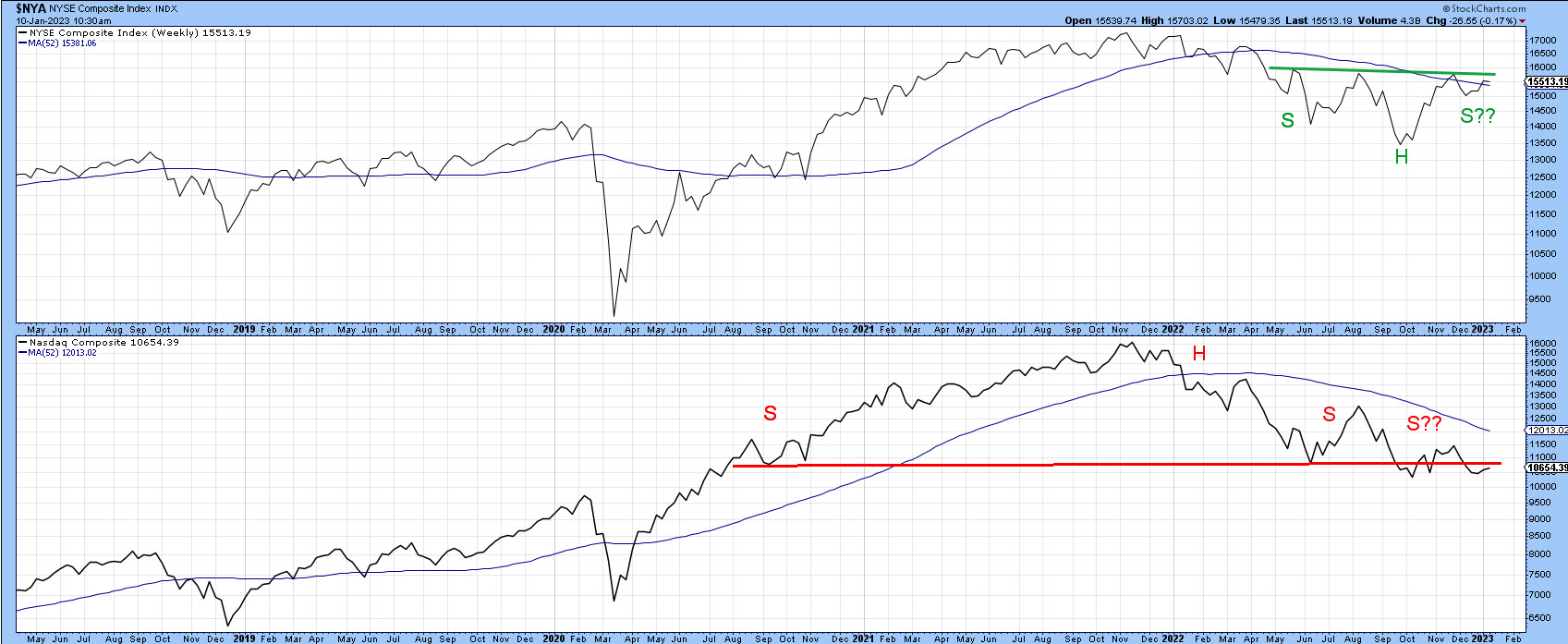
CHART 1: NYSE COMPOSITE AND NASDAQ COMPOSITE. The NYSE looks as if it's completing an inverse head-and-shoulders pattern whereas the Nasdaq Composite appears to be completing a head-and-shoulders pattern.
Chart source: StockCharts. For illustrative purposes only.
In chart 2 you can see that the $NYA is experiencing a series of declining short-/intermediate-term peaks and troughs. To reverse this progression, it would be necessary for the price to rally and hold above the late November high at 15,800. In doing so, a decisive close above that number would also complete the potential inverse head-and-shoulders formation. For now, though, the peak-trough progression remains intact and the reverse head-and-shoulders pattern continues to bear the label "potential".
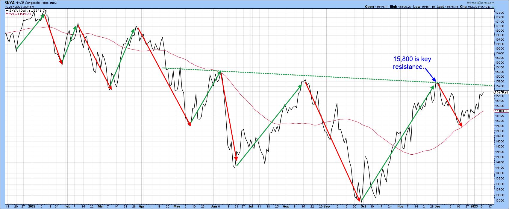
CHART 2: DECLINING PEAKS AND TROUGHS IN THE NYSE COMPOSITE. The 15,800 is an important resistance level. Keep an eye on this index to see if it closes above it and follows through.
Chart source: StockCharts. For illustrative purposes only.
The bull and bear balance presented by $NYA is reflected in chart 3. Here, it is evident the 2021–2022 top, indicated by the red head-and-shoulders neckline, is equally matched by the green neckline of that potential 2022–2023 inverse head-and-shoulders at around the 15,800 level.
The bears are narrowly in charge at the moment because the index is below that resistance trendline. But it could easily reverse. The Special K remains in a downtrend but is close to the signal line and two green trendlines. Together, these three technical indicators represent very important resistance and, if surpassed, would enhance the importance of any decisive move that can hold above 15,800.
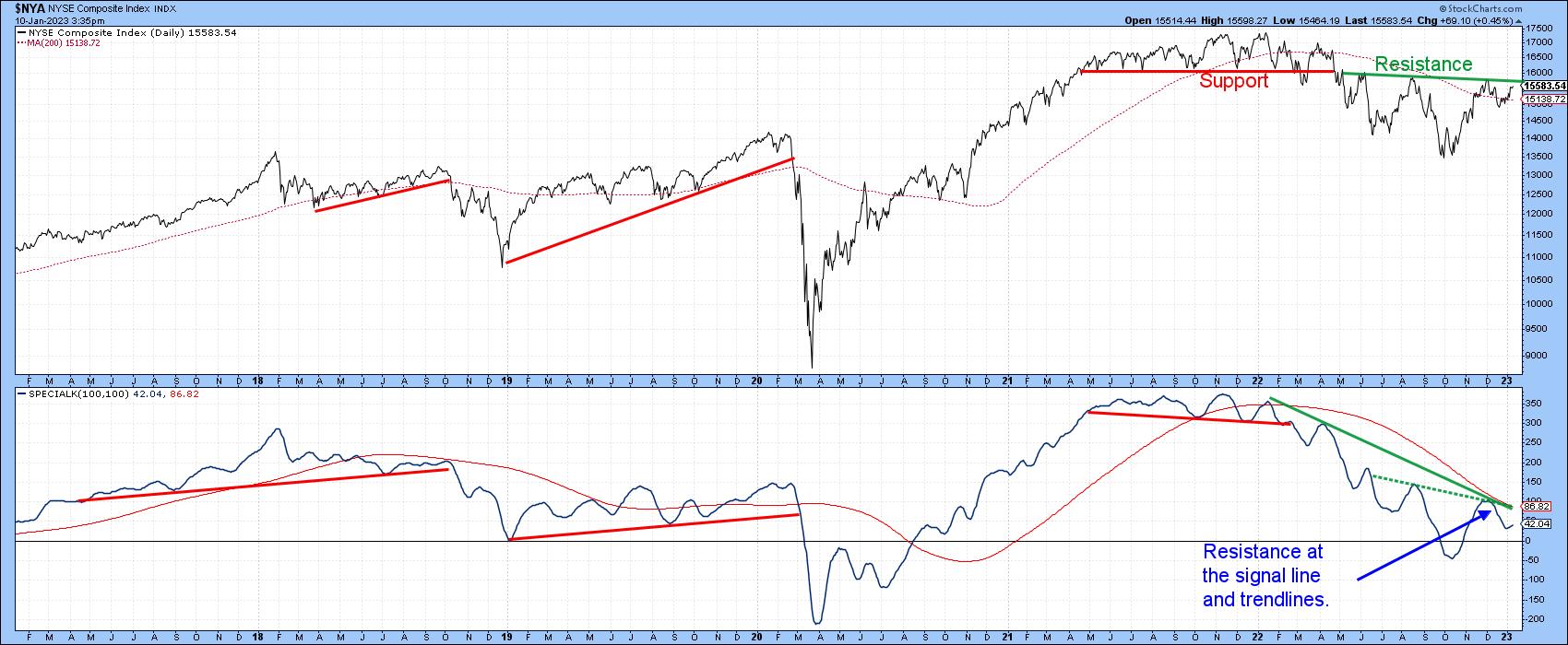
CHART 3: BULL AND BEAR BALANCE. The necklines of a head-and-shoulders top and head-and-shoulders bottom are equally matched. The bears have a slight advantage but that could reverse. Keep an eye on the Special K indicator.
Chart source: StockCharts. For illustrative purposes only.
Chart 4 shows that $COMPQ is also experiencing a declining peak/trough progression and has just touched a marginal new closing low. It is therefore as close to re-affirming its downtrend as the $NYA is of signaling an upside reversal.
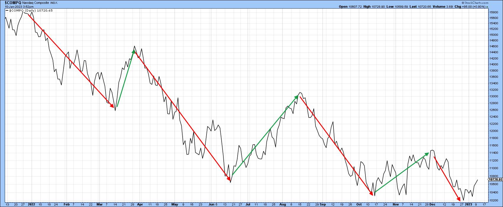
CHART 4: WILL THE NASDAQ'S DOWNTREND CONTINUE? The Nasdaq Composite has just touched a new marginal closing low. How much lower can it go?
Chart source: StockCharts. For illustrative purposes only.
Chart 5 takes a closer look at the two indexes on a daily basis, along with the S&P 500 index ($SPX). It shows that, since November, the three series have, in one way or another, traced out small potential head-and-shoulder tops. I want to stress the word "potential" again, because, until any of these patterns are completed with a decisive close below the respective potential necklines, they're not a technical reality. The lines are currently around 15,000 for $COMPQ, 3,800 for $SPX, and 10,200 for $COMPQ. If these potential formations aren't completed, they would be classified as not "working", a technical event that, like a whipsaw, is usually followed by an above-average move, in this case to the upside.
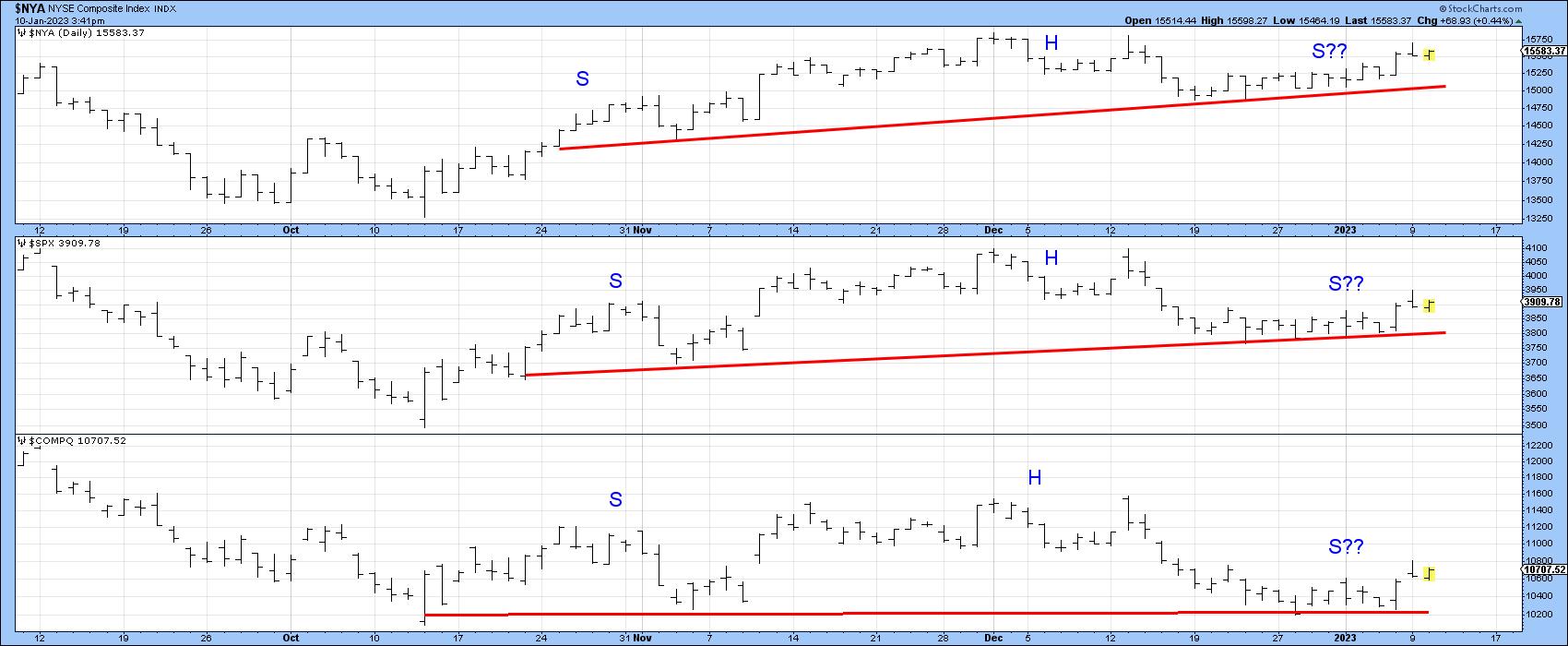
CHART 5: A HEAD-AND-SHOULDERS TRIFECTA. Watch for these three indexes to close below their necklines. If these technical formations aren't completed, there could be an above-average move to the upside.
Chart source: StockCharts. For illustrative purposes only.
Regardless of the ultimate direction of any of these breakouts, chart 6 suggests that $NYA will continue to outperform because it has broken out from a base and is being supported by all three momentum series. The overstretched short-term Know Sure Thing (KST) indicator hints that a correction temporarily favoring $COMPQ could get underway. However, the bullish, but not overextended, long-term series argues that $NYA will be the victor in the longer run.
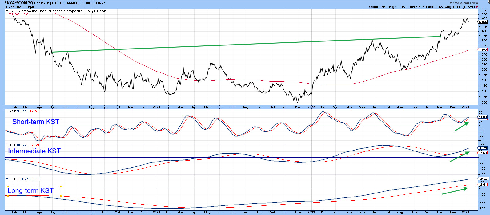
CHART 6. NYSE COMPOSITE COULD BE THE VICTOR IN THE LONG RUN. The short-, intermediate-, and long-term KST indicators suggest a temporary correction in the Nasdaq but an upside move in the NYSE Composite.
Chart source: StockCharts. For illustrative purposes only.
Stocks vs. Commodities
One indicator that could support a breakout in $NYA is the change in the relationship between stocks and commodities. At a normal bear market low, stocks, a forward-looking indicator of economic activity, tend to bottom ahead of commodities, which are more of a coincident indicator. That means the ratio between these two asset classes usually bottoms around the same time as stocks.
This ratio is exemplified in chart 7 by the long-term KST. In this instance, stocks are represented by the $SPX and commodities by $CRB. The green arrows approximate periods when the KST bottoms from a sub-zero position and crosses above its nine-month MA. Since 1960, there have been 17 signals, and only one was not followed by a worthwhile stock market rally. In the last month or two, the KST has started to hook up from a very oversold position, but it has yet to reach its MA. It's still bearish but could be close to a positive signal.
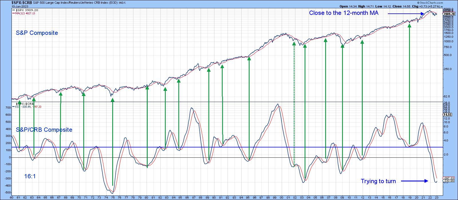
CHART 7: RELATIONSHIP BETWEEN STOCKS AND COMMODITIES. The KST is looking like it's trying to hook upward from a very oversold area. A cross above its moving average would be a strong indication.
Chart source: StockCharts. For illustrative purposes only.
When you substitute $SPX with $NYA, as in chart 8, the KST is literally at the same level as its MA. That's because $NYA has been a superior performer. There's nothing that says a bull market is guaranteed to follow a positive crossover, but, if $NYA breaks above the 18,500 level at the end of the month, it would greatly enhance the probability of one developing. Until then, a cautious approach is appropriate.
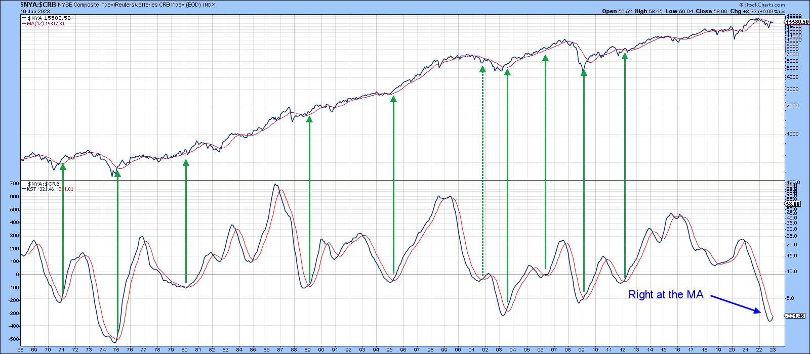
CHART 8: POSSIBLE BULL MARKET IN NYSE COMPOSITE? Maybe, but it all depends on if $NYA breaks above 18,500 by the end of January and if KST crosses above its MA.
Chart source: StockCharts. For illustrative purposes only.
Good luck and good charting,
Martin J. Pring
The views expressed in this article are those of the author and do not necessarily reflect the position or opinion of Pring Turner Capital Groupof Walnut Creek or its affiliates.


