Fourteen-Year Trend Favoring Relative Action of U.S. Equities May Be Over
From the financial crisis in 2008 until October of last year, the U.S. stock market handsomely outperformed the Dow Jones Global Index ($DJW). However, recent price action suggests that this relationship may be about to change.
Stated more accurately, U.S. relative performance may have peaked last October, just as the S&P 500 index ($SPX) was recording its October low. Since that time, the ratio between the $SPX and $DJW has been falling like a stone. However, it has now reached mega-support in the area of its secular up trendline, as shown in Chart 1.
The chart also demonstrates how the ratio has historically lent itself to trendline construction. Each violation was followed by a worthwhile and long-term trend reversal. Note that the long-term KST is threatening to cross below its 9-month MA. If that 2008-2023 up trendline is ruptured, a KST sell signal would be an odds-on possibility, thereby further supporting the idea of a huge trend change in this relationship.

CHART 1: HAS THE RELATIVE PERFORMANCE OF U.S. STOCKS PEAKED? When you look at the ratio between the S&P 500 index and the Dow Jones World Index, it has reached the support level of a secular uptrend.
Chart source: StockCharts.com. For illustrative purposes only.
Chart 2 compares the $SPX to the rest of the world, which is represented by the MSCI EAFE ETF (EFA). The direction of the trend is similar but more pronounced than the comparison of the U.S. to a world index constructed with healthy U.S. weighting. In this instance, it's possible to draw a slightly different trendline, but it too is once again positioned right at the line. It is also evident that the 48-month moving average (MA), another dynamic level of support, is intersecting with the ratio and up trendline. So far, during this secular advance, the MA hasn't been decisively penetrated. If it was, it would represent a major technical event.
The pink shadings reflect periods when the percentage price oscillator (PPO), using the six and 15 parameters, was below zero. That has only happened twice since 2010, so this month's bearish crossover represents a third.
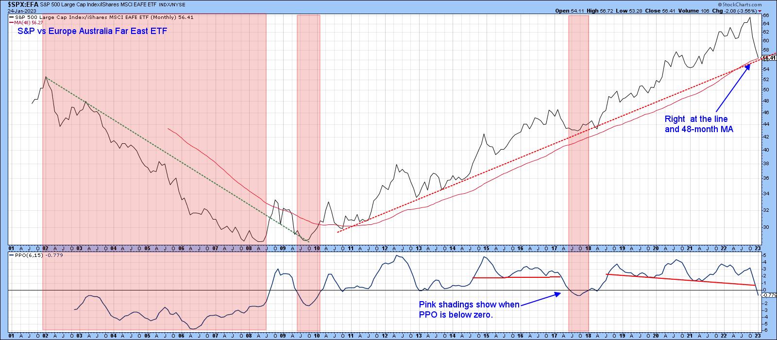
CHART 2: S&P 500 INDEX VS. MSCI EUROPE AUSTRALIA FAR EAST (EAFE). Relative performance is right at an uptrend and the 48-month moving average. The PPO is also below zero.
Chart source: StockCharts.com. For illustrative purposes only.
Finally, Chart 3 indicates that the 13-week rate of change (ROC) is at a post-2017 record low. This reading actually outstrips anything seen during the 2003–2008 part of the previous secular bear market. That's a big deal because it signals a characteristic change from a bull to a bear market. Alternatively, it could indicate a shift from a bull market to a multi-year trading range. Either way, it represents a piece of valuable evidence that the primary trend favoring the U.S. is over for a while.
An extreme oversold, on the one hand, can be interpreted as a bearish long-term factor. However, an oversold condition is still an oversold condition. That means things are currently overstretched on the downside. Since this ratio and $SPX vs. $DJW are both at key trendlines, and the former is intersecting with its 48-month MA, this is as good a place as any for anticipating some form of relief rally. Chart 3 also hints at the possibility that the $SPX/EFA weekly ratio may be in the process of forming a head-and-shoulders top. That's not a prediction, but a statement of a possible scenario.
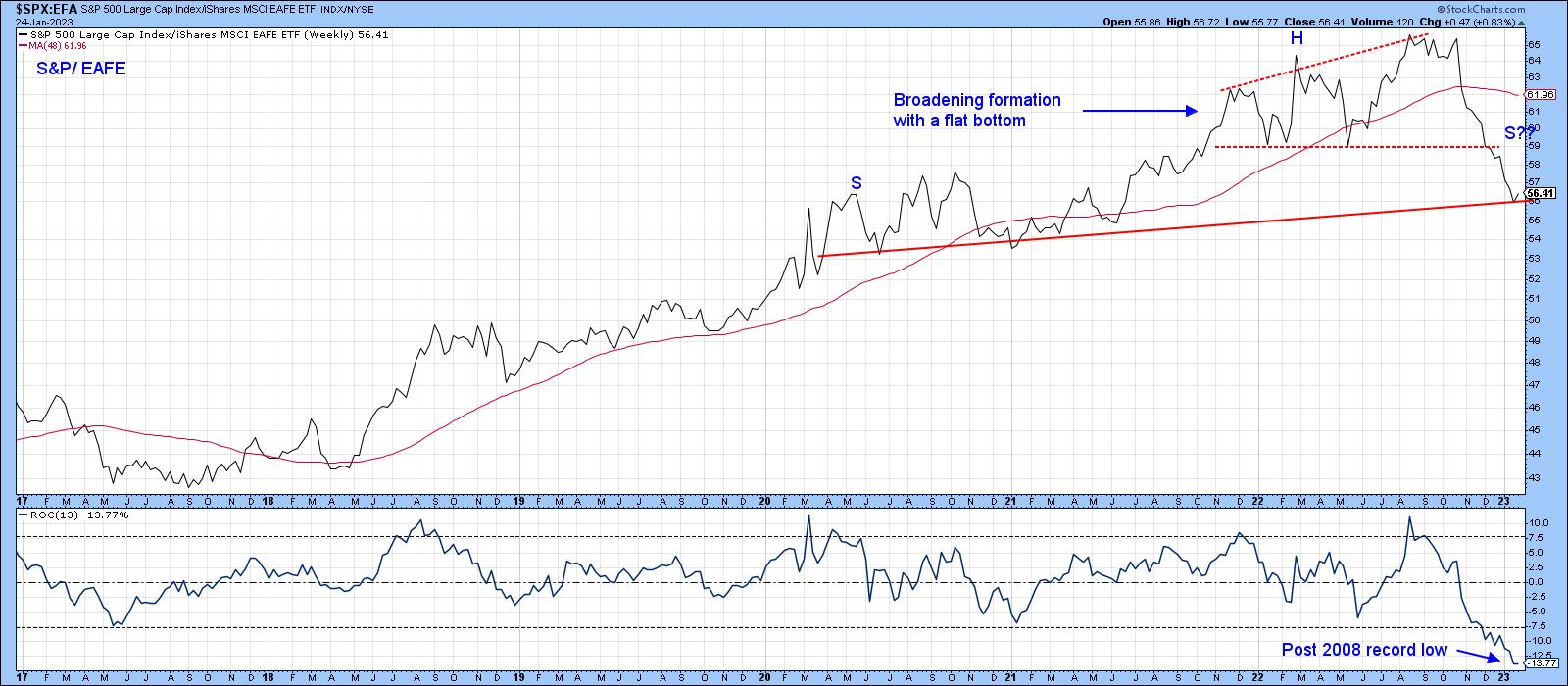
CHART 3: IS THE MARKET BECOMING MORE BEARISH? A broadening formation plus a possible head and shoulders top formation suggests that there may not be enough strength to carry the market higher.
Chart source: StockCharts.com. For illustrative purposes only.
The chart also shows that, between late 2021 and 2022, the ratio traced out a broadening formation with a flat bottom, otherwise known as a bearish right-angled broadening formation. These patterns normally pack a huge punch relative to their size, as they reflect a situation that's gradually becoming progressively more volatile and, therefore, unstable. As the pattern broadens by registering consecutively higher highs, bearish traders reach the give-up phase. With individual securities, it forces them to cover short positions.
Consequently, at the final peak, sentiment is very bullish, with bearish bets few and far between. In other words, we have a very weak technical structure. Prices then fall as a consequence. However, instead of finding support at the horizontal trendline, they immediately drop through it. These patterns are really head-and-shoulder tops, but the situation is so weak that prices don't have the strength to form the right shoulder. Bearing that in mind, any rally that takes place from current levels will find it tough sledding to surpass the trendline forming the lower part of the broadening formation.
Europe Comeback
Chart 4 features one broad area that should be a beneficiary of any move away from the U.S., namely the iShares Europe 350 ETF (IEV). It uses the Nirvana ChartStyle. It's evident that IEV has violated a multi-year trendline for relative strength, a move that's also supported by the relative long-term KST. Relative strength, in this case, is measured against the iShares MSCI World ETF (ACWI). The price itself has broken out from its 2022 base and crossed above its 65-week exponential MA. It's seen a sharp run-up since the October low. So, a digestion of recent gains that allows the absolute KST in the second window to catch up, is a possibility.
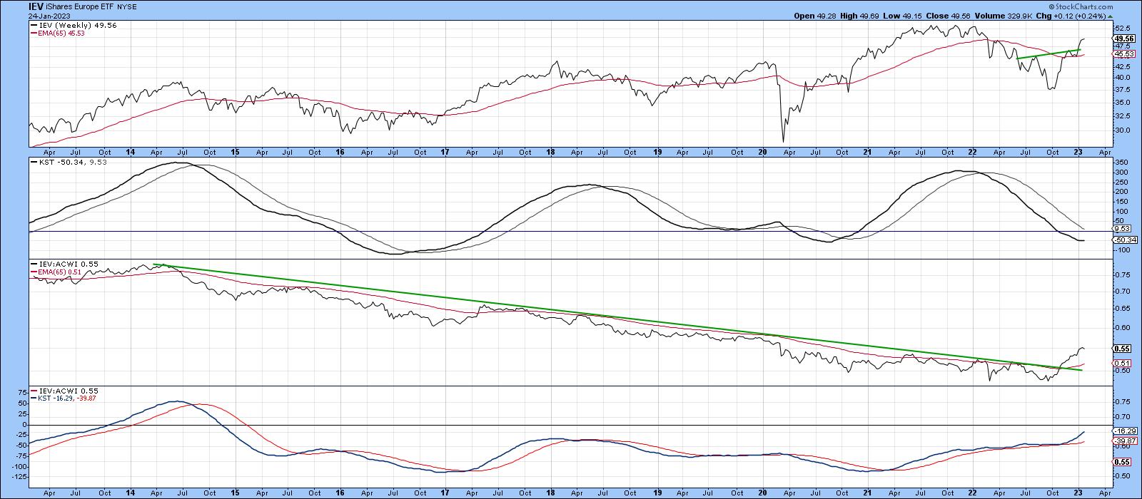
CHART 4: EUROPEAN STOCKS COULD BE SHOWING SOME STRENGTH. If you have been focused on U.S. stocks in the last decade, it may be time to look at global stocks. European stocks may be showing bullish characteristics.
Chart source: StockCharts.com. For illustrative purposes only.
Good luck and good charting,
Martin J. Pring
The views expressed in this article are those of the author and do not necessarily reflect the position or opinion of Pring Turner Capital Groupof Walnut Creek or its affiliates