Selecting Sectors Using the Nirvana ChartStyle
In the last couple of weeks, I've had a couple of conversations with clients asking how I go about selecting promising sectors, even when not much excites me at the moment.
To start with, I'm a believer in the principle that the character of short-term moves—which I classify as moves lasting between three to six weeks on average—is determined by the direction of the primary trend (nine months to two years). Those short-term moves, taking place in the same direction as the primary trend, possess greater magnitude and tend to last longer than counter-trend movements. If you're going to get a whipsaw or other deceptive event, it's more than likely to develop during short-term trends that develop contrary to the direction of the main trend.
The bottom line is that it really helps to have the primary trend on your side, whether you're a short-term trader or an investor. There's no perfect way to identify the direction of the main trend, but a good first step is to use monthly data to calculate a long-term Know Sure Thing (KST) indicator or the moving average convergence/divergence (MACD) oscillator.
Step One: Plotting the Sectors
Figure 1, which is reproduced from my Intermarket Review, plots the approximate point on the long-term KST bell curve where each sector and industry group labeled in the diagram resided at the end of December. For the sake of convenience, I split the cycle into four parts: winter, spring, summer, and fall. A late winter/spring or even early summer position represents a great time for acquisition. Not guaranteed of course, but certainly offers better odds of success than at the beginning of the fall quadrant.
Right now, most sectors and industry groups featured in the diagram are in the corrective fall position. It is also evident that quite a few are close to joining the six groups already resting in the winter phase. It's when the number of sectors in winter peaks that a bull market generally gets underway. If the current rally extends, it will likely push a lot of groups directly into summer via the transition point (as labeled in the figure). If not, more sectors can be expected to drop into winter.

Step Two: Identify Low-Risk Prospects
Step two is to take a closer look at some of these low-risk prospects currently positioned in the winter or spring quadrants from a relative strength aspect. For this, I use what I call my "Nirvana" template or ChartStyle. It is so named because it offers a substantial amount of information on the long-term technical position of a specific sector in one simple arrangement. Chart 1 for instance, shows the nirvana ChartStyle for the iShares Nasdaq Biotech ETF (IBB). This template features the price, together with its 65-week exponential moving average (EMA) in the top window. The long-term KST, constructed from weekly data and its 26-week EMA is featured in the second window.
The two lower clips feature the same EMAs and momentum. This time, however, you're looking at relative action against the S&P Composite. In doing so, you see a complete long-term picture of the absolute and relative action. In an ideal situation, you want to see both KSTs reversing to the upside from below zero at a time when the two price series are above their 65-week EMA. Alternatively, they could be breaking above a down trendline or completing a price pattern.
Incidentally, if this approach appeals to you. just click on the chart and save it as a ChartStyle for yourself.
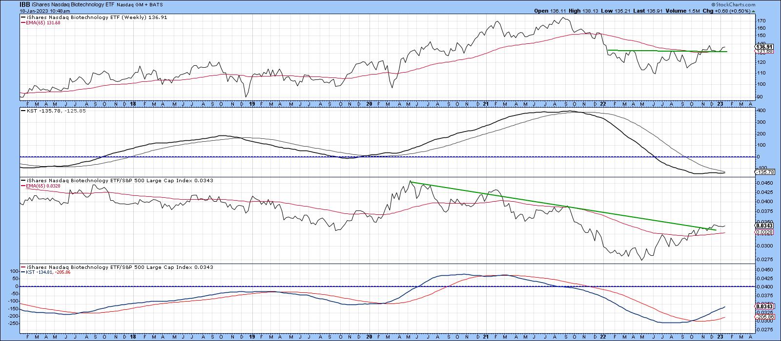
CHART 1. LONG-TERM PICTURE OF ABSOLUTE AND RELATIVE ACTION. Both KSTs should reverse and move to the upside when the two price series are above their 65-week EMA.
Chart source: StockCharts.com. For illustrative purposes only.
In the case of the IBB, the absolute KST is below zero but rising gently. That puts it in the spring quadrant. The price itself is above its 65-week EMA and has completed its 2020 base, which is another positive. Relative momentum, in the bottom window, is even more firmly placed in the spring quadrant than its absolute counterpart. It's also worth noting that the RS line is above its EMA and the 2020–2022 down trendline.
The Industrial Select Sector SPDR Fund (XLI) is close to winter and its RS line has already broken out from a large base (see chart 2). This move is also being supported by a rising and firmly bullish KST. The price itself is above its EMA but needs to break more decisively above its 2021–22 resistance trendline. One problem is a declining absolute KST from an above-zero position. That could easily move from its current fall position into summer in the event that the XLI breaks decisively above its recent trading range. However, similar action that developed in 2020 shows that an immediate transition from fall to summer doesn't come without risk. One saving grace is that during this previous period, the RS line was deteriorating. Currently, it's improving, so an absolute price breakout, should it materialize, is more likely to be valid.
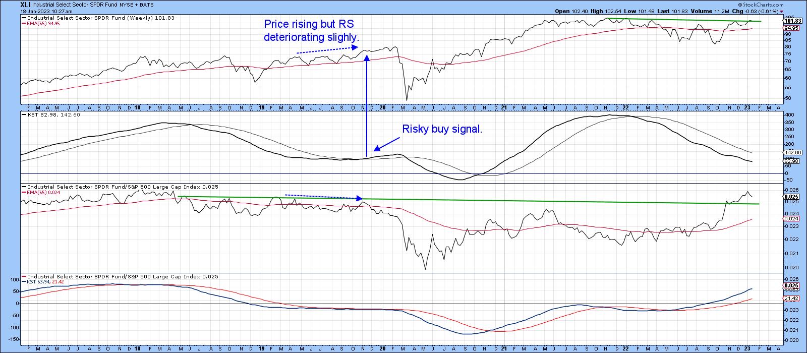
CHART 2. INDUSTRIAL SECTOR IS LIKELY TO BREAKOUT. The RS line has broken out from a base, the KST is bullish, and price is above its EMA.
Chart source: StockCharts.com. For illustrative purposes only.
Possible Bull Market?
During the bull market between late 2020 and early 2022, most sectors and groups were in a summer (markup) phase, as shown in Figure 2.
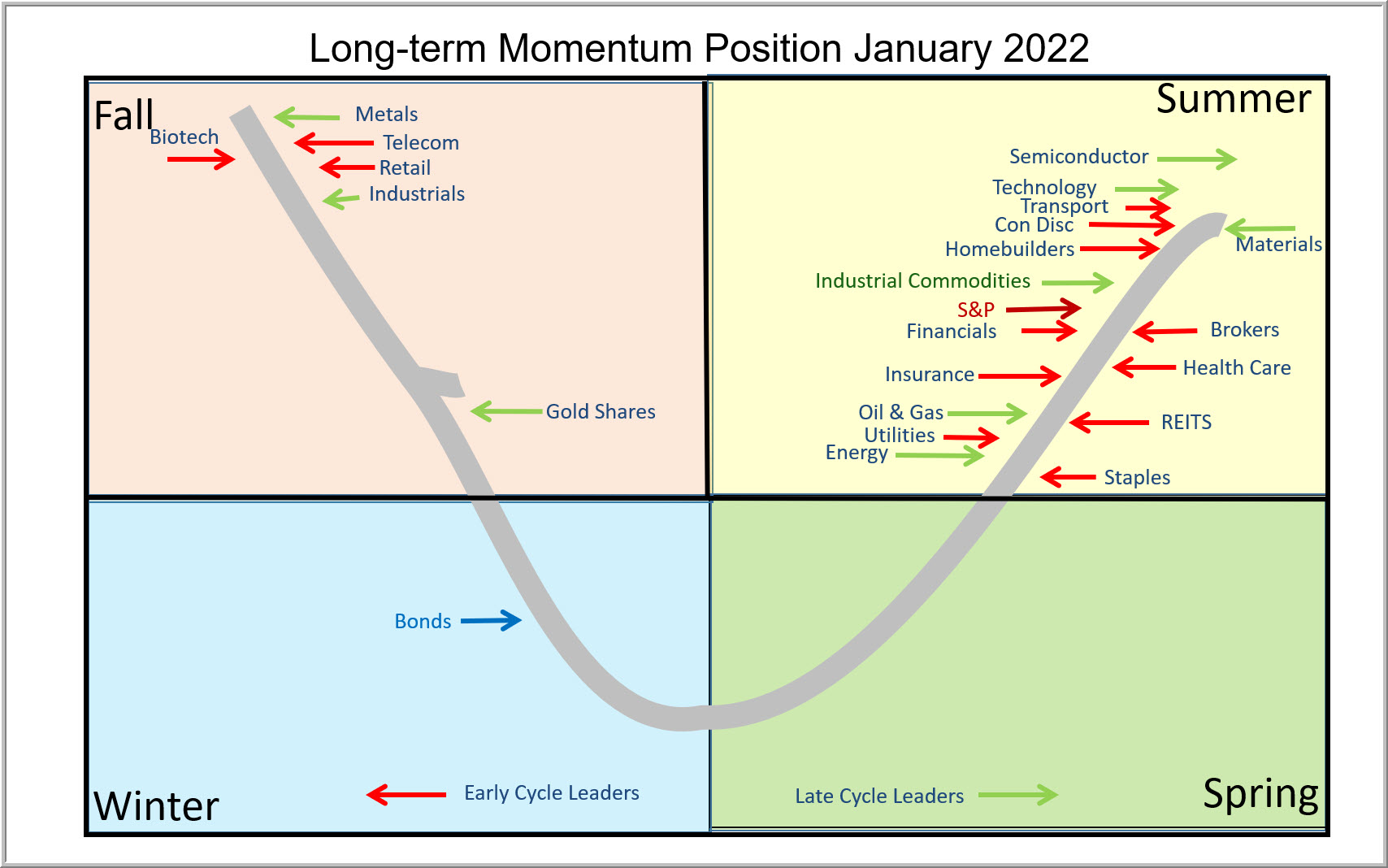
If the current rally extends, there's a good possibility that many of them will transition directly from fall to summer, thereby indicating a bull market. However, the danger of those same groups slipping into winter cannot be discounted, so a generally cautious stance seems more appropriate until more sectors can move into a bullish position.
Good luck and good charting,
Martin J. Pring
The views expressed in this article are those of the author and do not necessarily reflect the position or opinion of Pring Turner Capital Groupof Walnut Creek or its affiliates.


