Momentum for This Interasset Relationship Just Reversed. What Are the Implications?
Every business cycle has an inflationary and deflationary part to it. And if you know the prevailing phase, it can be enormously helpful. For example, when inflation is dominating, it's usually a favorable environment for commodities and commodity defensive sectors, such as mining and energy. At such times, it's also a good idea to lower exposure to long-dated bonds.
Conversely, during the deflationary stage, it generally pays to downplay inflation-sensitive sectors and emphasize those performing relatively well during periods of economic weakness. This would include Utilities, Health Care, and Consumer Staples. Note the word "general" has been emphasized, because individual sectors don't always react in an expected manner during the course of every cycle. You can read more about the relationship between the various asset categories and the business cycle in a series of articles starting here.
The Inflationary/Deflationary Cycle
To take advantage of the trends in different sectors, it's important to identify changes in the inflation/deflation relationship. Fortunately, business activity is cyclical in nature, as each cycle rotates from an inflationary to a deflationary part. That enables us to follow this chronological sequence by way of long-term smoothed momentum. My preference is to use the Know Sure Thing (KST). However,moving average convergence/divergence(MACD), based on monthly data, is also helpful. The series used here is the ultimate inflation/deflation relationship, that between (inflation-sensitive) commodities and (deflation-sensitive) bonds.
Chart 1 plots the long-term KST for the relationship between the 30-year U.S. Treasury Bond ($USB) and the CRB Index ($CRB), rather than the commodity/bond ratio. This is done to correspond with fluctuations in bond prices, which are plotted in the upper window. In this way, rising momentum reflects deflationary conditions. Note how it fell between mid-2020 and late last year, as commodities rallied and bonds, thanks to Fed action, fell. Now the KST has bottomed and crossed above its nine-month moving average (MA). The arrows, marking previous positive KST MA crossovers, show that this kind of action is usually followed by rising bond prices in their own right, not just against commodities.
There are two caveats. First, all previous signals took place during a secular uptrend, when bear markets were brief and bull markets stronger. That made it easier for buy signals to be profitable. Now, the price is below that blue 96-month MA, which suggests the secular trend has reversed to the downside. If true, it means buy signals will face a secular headwind. Second, the ratio itself remains below its red 12-month MA, so the price still needs to confirm the improving momentum.
And

CHART 1: BOND/COMMODITY RATIO KST. The indicator shows that the secular trend may have reversed.
Chart source: StockCharts.com. For illustrative purposes only.
One area to monitor going forward is the ratio itself. It's featured in Chart 2, on a weekly basis, together with two indecisive KSTs. It seems likely that this vacillation would be resolved with a decisive Friday close that holds above the horizontal trendline at, say, 0.51. In doing so, this would argue for a substantially higher ratio and, by implication, firmer bond prices and a positive 12-month MA crossover by the $USB.
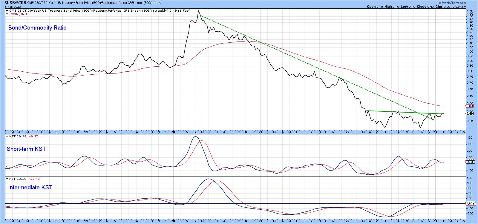
CHART 2: BOND/COMMODITY RATIO. The short-term and intermediate-term KST indicates indecisiveness. Keep an eye out for the indicators to move above the horizontal trendline.
Chart source: StockCharts.com. For illustrative purposes only.
Chart 3 compares the CRB Composite with a KST calculated from the Commodity/Bond relationship. It, of course, is mirroring bond/commodity momentum. The red arrows tell us that it's normal for these KST sell signals to be followed by a declining CRB. The three dashed ones indicate that this isn't always the case. Since one of my key secular indicators has been pointing to a secular commodity bull for some time, it's not out of the question that a primary trend commodity bear market could take the form of a trading range, rather than an actual decline.
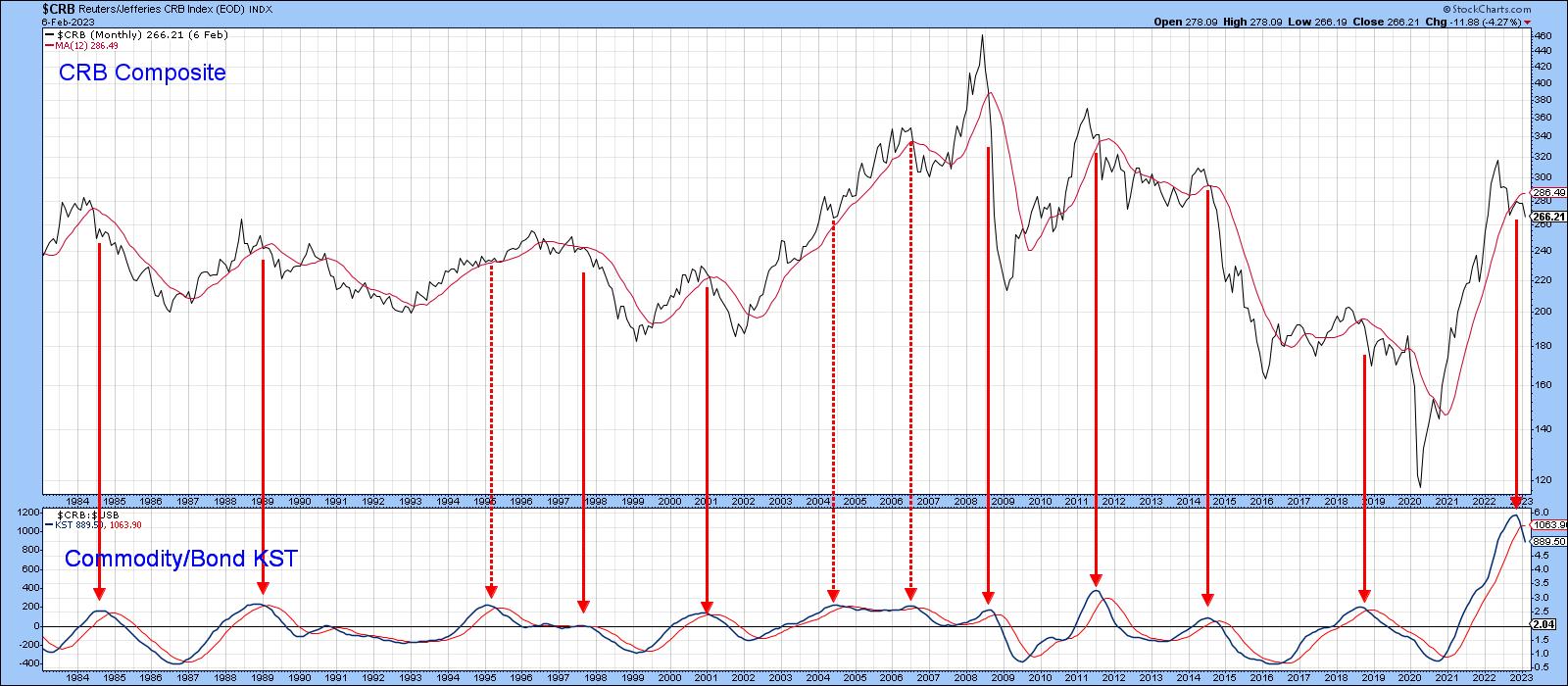
CHART 3: CRB VS. COMMODITY/BOND KST. While there's a chance that commodities may decline, don't rule out the possibility of commodities moving within a trading range.
Chart source: StockCharts.com. For illustrative purposes only.
What Does the Change in the Commodity/Bond Ratio Mean for Equities?
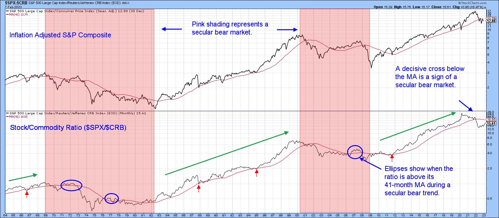
The question arises as to what a commodity/bond downside reversal means for stocks themselves. History tells us that equities thrive in an environment where commodity prices are relatively stable in either direction. That's because sharply moving commodity prices reflect instability and instability implies uncertainty. The stock market abhors uncertainty. Chart 4 tends to confirm that conclusion, since the green arrows, marking the KST peaks, are almost all followed by an extended period of rising prices.
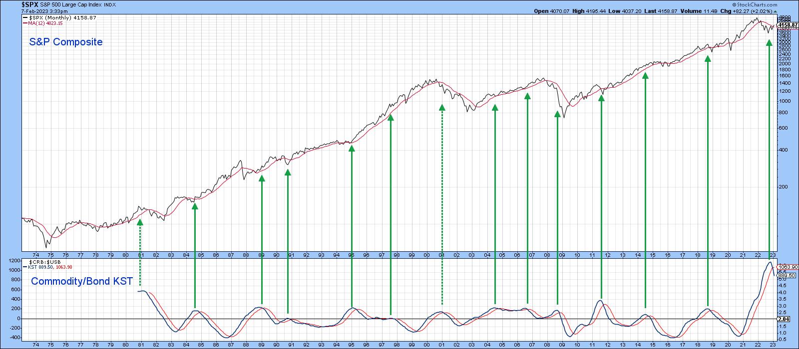
CHART 4: WILL EQUITIES THRIVE? The commodity/bond KST with the S&P 500 index suggests that equities may move higher.
Chart source: StockCharts.com. For illustrative purposes only.
A Quick Note on the Secular Trend for Equities
Using the benefit of hindsight, the pink-shaded areas in Chart 5 reflect secular bear markets for the inflation-adjusted S&P 500 index. Note that the stock/commodity ratio (middle window) crossed decisively below its 41-month MA at the beginning of 2022. This is important because it hasn't decisively penetrated this average during any of the secular bull markets that have taken place since 1964. This suggested that a secular bear market began in January 2022. Of course, the crossover represents only one piece of evidence of a secular reversal. If valid, though, it suggests the potential bull move signaled by Chart 4 and rationalized by my article published last week, could be relatively contained. In that respect, a rebound by the stock/commodity ratio to its 41-month MA would be a good starting point.
Good luck and good charting,
Martin J. Pring
The views expressed in this article are those of the author and do not necessarily reflect the position or opinion of Pring Turner Capital Groupof Walnut Creek or its affiliates.


