The Good News About SVB Bank They Are Not Telling You
There is a well-known saying going around Wall Street that, when the Fed hits the brakes, someone inevitably crashes through the windscreen. That obviously applies to shareholders and directors of Silicon Valley Bank (SIVB), though depositors, following a nail-biting weekend, are apparently off the hook. It also warns the central bank that it may have taken the inflation-fighting too far.
After all, when you've been feeding the banking system with zero interest rates for a long time and subsequently raising them by a record amount over a 12-month time span, there are bound to be negative consequences. While the Fed, I believe, will continue to say it's focused on the inflation fight, the potential for further SIVB fallout is where its head will be. This should provide an opening for bonds, which is the area I'd like to focus on.
To start with, let's establish our time frames.
The Secular Trend
Chart 1 features the very long-term picture for the 10-year US Treasury yield. It was in a secular downtrend starting in 1981 but reversed to a secular uptrend in 2020. That view is based on a number of observations. First, the yield violated its secular down trendline. Second, the 96-month moving average reversed its downward direction for the first time since 1981. Finally, the long-term Know Sure Thing (KST), along with numerous primary trend Rate of Change (ROC) time spans, recently reached record levels. When I say "record," I mean record, as my data goes back to the Civil War. This strong momentum, coming off a long-term decline, is the price equivalent of a breadth thrust in the stock market, representing the first sign of a new vibrant bull market.

CHART 1: THE LONG-TERM PICTURE OF 10-YEAR US TREASURY YIELD INDEX.
Chart source: StockCharts.com. For illustrative purposes only.
Primary Trend
That said, primary up trends, even under the context of a secular bull, don't last forever, and the SIVB collapse is a sign that the system may not be able to take much more, which argues in favor of lower yields. In that respect, the red arrows indicate that KST peaks have consistently been followed by lower yields.
The ratio between inflation-protected bonds and nominal ones (TIP/TLT) tracks the 10-year Treasury yield; it is shown in Chart 2. The trend of this relationship is currently bullish for yields. However, both series are close to their respective 12-month moving averages. Most telling is the recent long-term KST sell signal for the ratio, an event that has been consistently followed by lower yields as bond investors have shunned the inflationary protection provided by the TIPS.
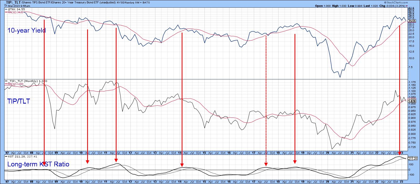
CHART 2: RATIO BETWEEN INFLATION PROTECTED BONDS AND NOMINAL ONES (TIP/TLT).
Chart source: StockCharts.com. For illustrative purposes only.
Chart 3 displays the ratio in a daily format. It appears to be in the late stages of forming a head-and-shoulders top. Its completion seems likely because the Special K (SPK)has already broken down from a distribution formation of its own and is trading below its signal line. Finally, the short-term KST, in the bottom window, has just triggered a sell signal.
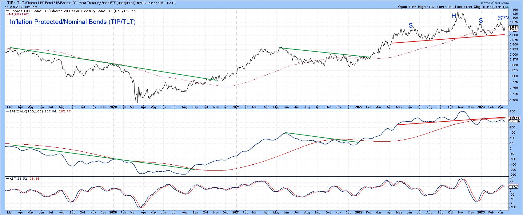
CHART 3: DAILY CHART OF TIP/TLT.
Chart source: StockCharts.com. For illustrative purposes only.
Another approach is to compare bonds to commodity prices, arguably the ultimate deflation/inflation relationship. Chart 4 accomplishes this by comparing the 30-year US Treasury Bond Price ($USB) with the KST of its relationship to the CRB Composite ($CRB). The arrows flag KST bottoms, i.e., when bond momentum starts to outperform that for commodities. These signals consistently provide major buying opportunities for bonds. This indicator recently triggered another buy signal.
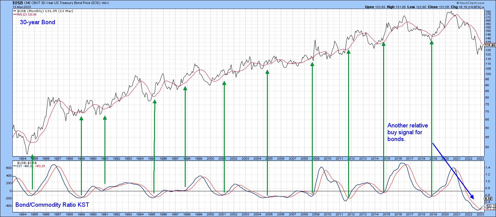
CHART 4: LONG-TERM VIEW OF BONDS VS. COMMODITIES.
Chart source: StockCharts.com. For illustrative purposes only.
Chart 5 plots the ratio itself on a daily basis. It's already violated its bear (inflationary) down trendline and now appears to be forming a base. The Special K has moved decisively above its signal line, which means that the odds of bonds not only outperforming commodities but rallying in their own right, are high.
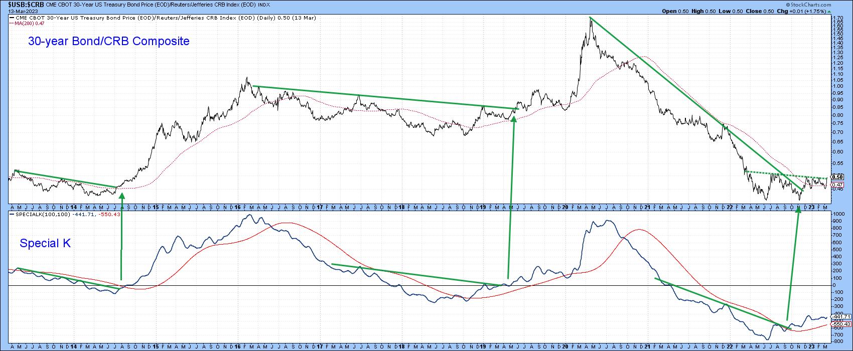
CHART 5: DAILY CHART OF BONDS VS. COMMODITIES.
Chart source: StockCharts.com. For illustrative purposes only.
The ratio between the Fidelity Capital and Income to the Vanguard Treasury funds (Chart 6), a proxy credit spread reflecting swings in confidence, has fallen to its 200-day secondary bull market up trendline. The 10-year Treasury yield has done the same thing. Pulling back to a line and dropping below it are two entirely different things. That said, it's becoming obvious bonds have reached a critical point, a view which is supported by the relationships described earlier.
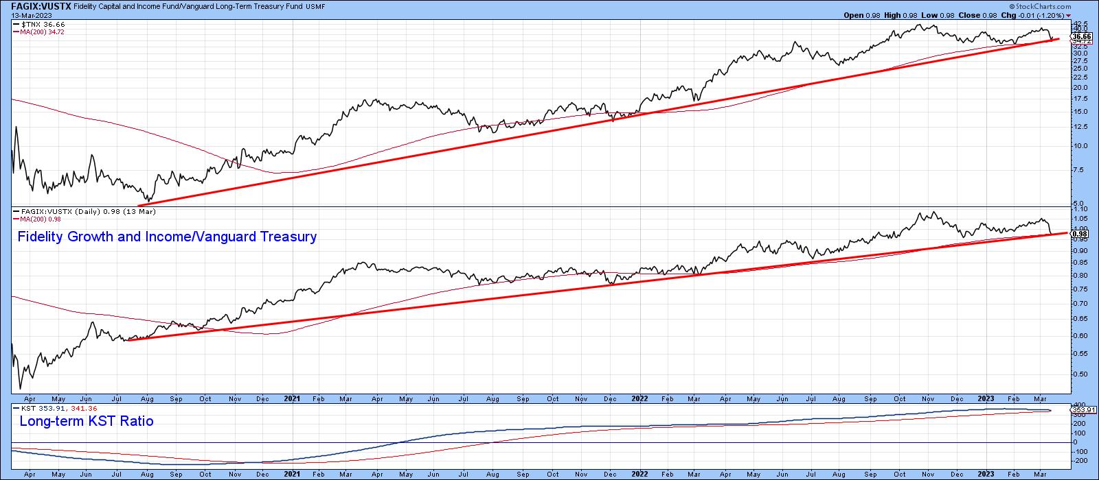
CHART 6: FIDELITY GROWTH AND INCOME VS. VANGUARD TREASURY.
Chart source: StockCharts.com. For illustrative purposes only.
That's also the impression we get from the final chart featuring the iShares 7-10-year Trust (IEF). Having just crossed its 200-day MA, it now finds itself right at the neckline of a potential downward-sloping head-and-shoulders pattern. The SPK is in a similar position. The newly minted buy signal from the short-term KST, in the bottom window, suggests the odds of a valid breakout are high, though the recent sharp rally suggests a few days of consolidation is likely first.
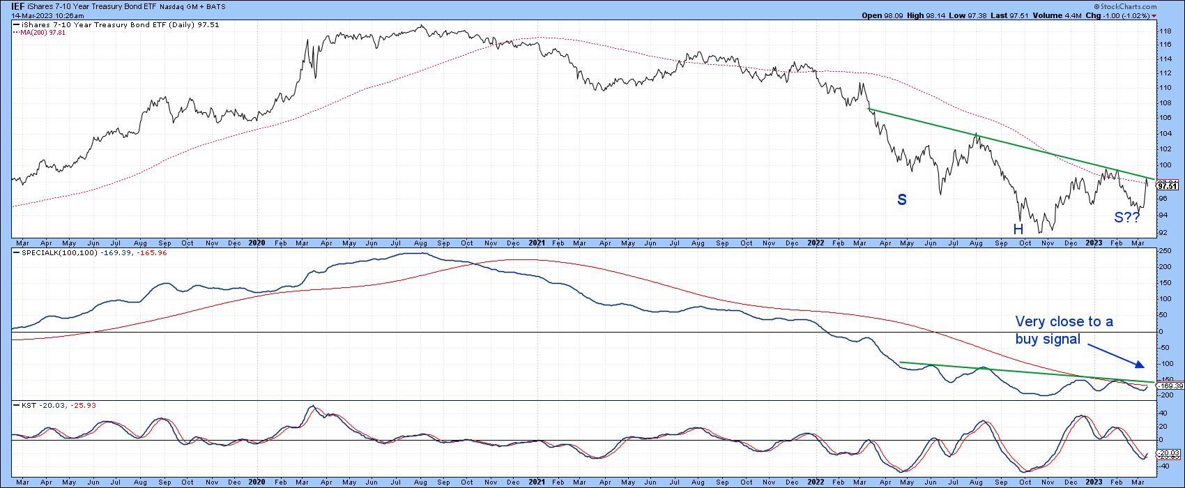
CHART 7: ISHARES 7-10 YEAR TREASURY BOND ETF.
Chart source: StockCharts.com. For illustrative purposes only.
Good luck and good charting,
Martin J. Pring
The views expressed in this article are those of the author and do not necessarily reflect the position or opinion of Pring Turner Capital Groupof Walnut Creek or its affiliates.