Market Faces Key Test
Global equities have risen for the last three weeks and now are at or just below key chart points. Chart 1, for instance, shows that the S&P 500 index ($SPX) is close to breaking above resistance in the form of its 2022–23 down trendline. In reality, that benchmark is the neckline of a potential inverse head-and-shoulders pattern. Since this accumulation has been one year in the making, an upside breakout that can hold would be no small matter. All three advance/decline indicators in the chart are above their 200-day moving averages (MAs), so there is a pretty good chance a successful upside break will take place. Note that the S&P 500 has already cleared its dashed bear market trendline.
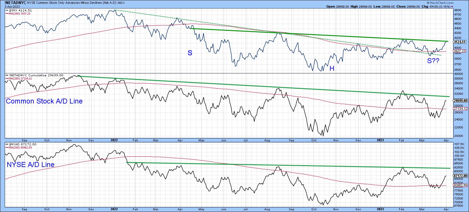
CHART 1: S&P 500 INDEX CLOSE TO BREAKING RESISTANCE. A break above the 2022 to 2023 downward trendline with follow-through could mean an upside breakout.
Chart source: StockCharts.com. For illustrative purposes only.
Chart 2 offers a similar arrangement, but this time for the whole world. Note that the iShares MSCI ACWI ETF (ACWI), in the upper window of the chart, is also poised to complete a large reverse head-and-shoulders, along with my Global A/D Line, which has actually begun to edge through its resistance line. Furthermore, an examination of the A/D Line since mid-2021 indicates that there have been two environments: first, a bearish distributional one, as flagged by the red trendline, and second, its potential canceling out by the accumulation formation, indicated by the green trendline. A joint upside breakout in both charts would clearly be positive.
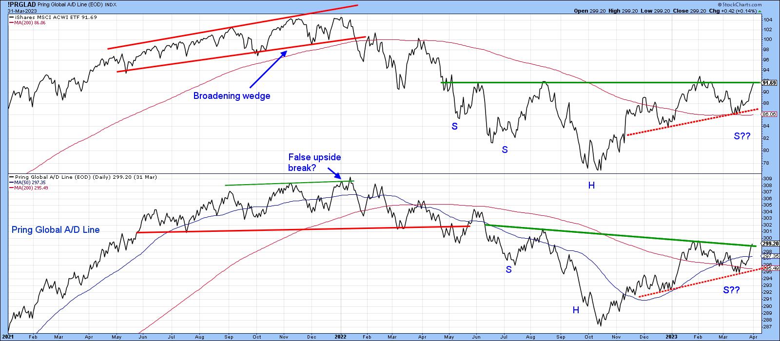
CHART 2: WORLD STOCKS SHOWING SIMILAR POTENTIAL AS S&P 500 INDEX. An accumulation formation seems to be playing out in ACWI. An upside breakout could be a positive sign.
Chart source: StockCharts.com. For illustrative purposes only.
I have also drawn in a couple of red-dashed trendlines, the violation of which would likely invalidate any upside breaks or non-breaks. The line for the price is particularly crucial since it joins the two most recent lows and is not far from the 200-day MA. That said, the current short-term technical situation is still oversold and is unlikely to result in a downside resolution. Nevertheless, that should not preclude us from anticipating weakness in case things do not work out as expected.
More on the Global Picture
Chart 3 features my global diffusion indicator. This one monitors a universe of individual country ETFs above their 50-day MAs. The vertical lines approximate instances when it drops below the oversold zone and reverses. Since the oscillator has now tentatively cleared its MA, I'm treating it as another buy signal. In the past, such action was usually followed by a worthwhile rally of sufficient power to enable an upside breakout in the current situation. The three dashed vertical lines remind us that this is not a perfect indicator, but these signals were all triggered under the context of what was a primary bear market.
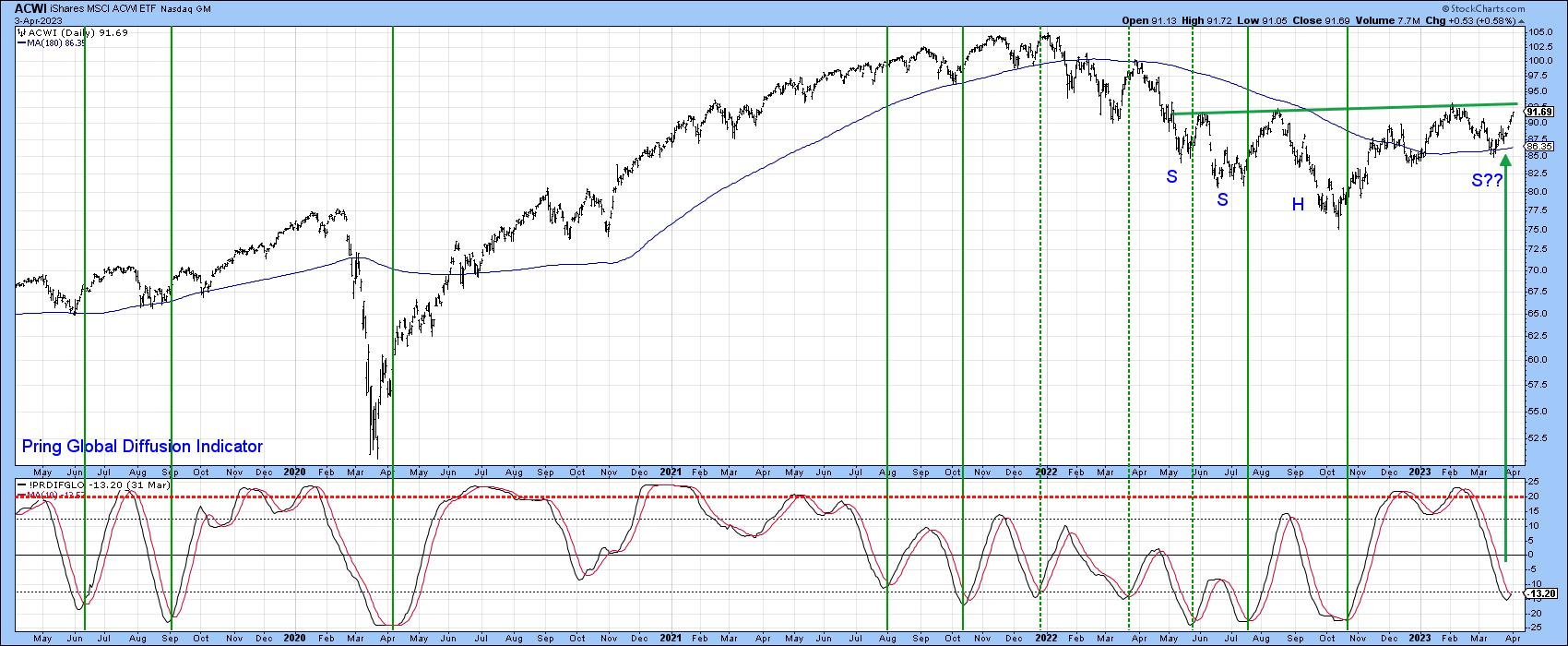
CHART 3: PRING'S GLOBAL DIFFUSION INDICATOR AT WORK. The indicator is ready to reverse from an oversold area, which could a sufficient rally may be likely.
Chart source: StockCharts.com. For illustrative purposes only.
Near-Term US Indicators
One reason for being optimistic comes from individual investors, as polled by AAII. Chart 4 shows they are leaning to the bullish side. Normally, it pays to go contrary to these investors. This point is highlighted by the blue shading, which approximates periods when bearish sentiment has clustered around or above the 45% zone. Such readings have not precluded declines, but usually, they've been limited in scope. Put another way, the chances for an upside breakout are greater, with a +45% reading than one in the 20s.
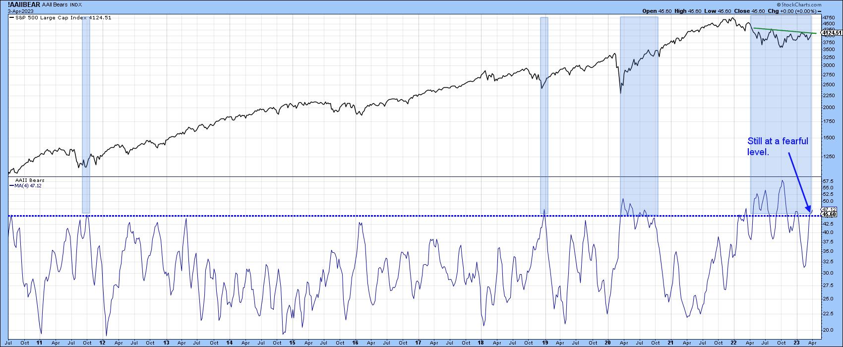
CHART 4: INDIVIDUAL INVESTOR SENTIMENT. The AAII shows that individuals are leaning toward the bullish side. Chances for an upside breakout are higher.
Chart source: StockCharts.com. For illustrative purposes only.
Chart 5 features the percentage of NYSE stocks above their 200-day MAs. The raw data are fairly jagged, so the chart plots this data as a 10-day EMA. On two recent occasions, it has been possible to construct a couple of red up trendlines, the violation of which was also followed by a nasty decline. Earlier this year, we saw a bullish breakout; it remains to be seen whether a rally follows. However, one encouraging sign comes from the recent upside reversal, which came at a higher level than its December bottom. This action, as indicated by the two dashed-green arrows, sets up a potential positive divergence with the index.
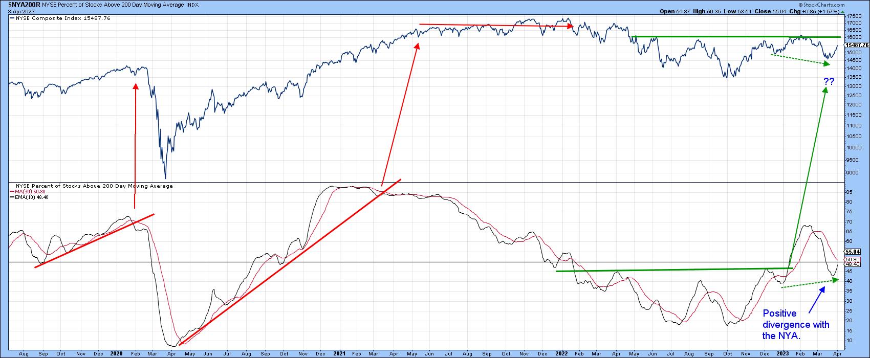
CHART 5: PERCENTAGE OF STOCKS ABOVE THEIR 200-DAY MOVING AVERAGE. Looks like a positive divergence between the NYSE Composite and the percentage of stocks above their 200-day moving average. Keep an eye on this one.
Chart source: StockCharts.com. For illustrative purposes only.
My Dow Diffusion Indicator has just triggered another buy signal by dropping below its green oversold zone and rallying back above its MA. The solid green arrows show that a worthwhile rally generally follows such signals. However, the dashed ones indicate weaker ones. Since it's still close to an oversold reading, it seems likely that the Dow Jones Industrial Average will succeed in breaking above that resistance trendline at 34,000.
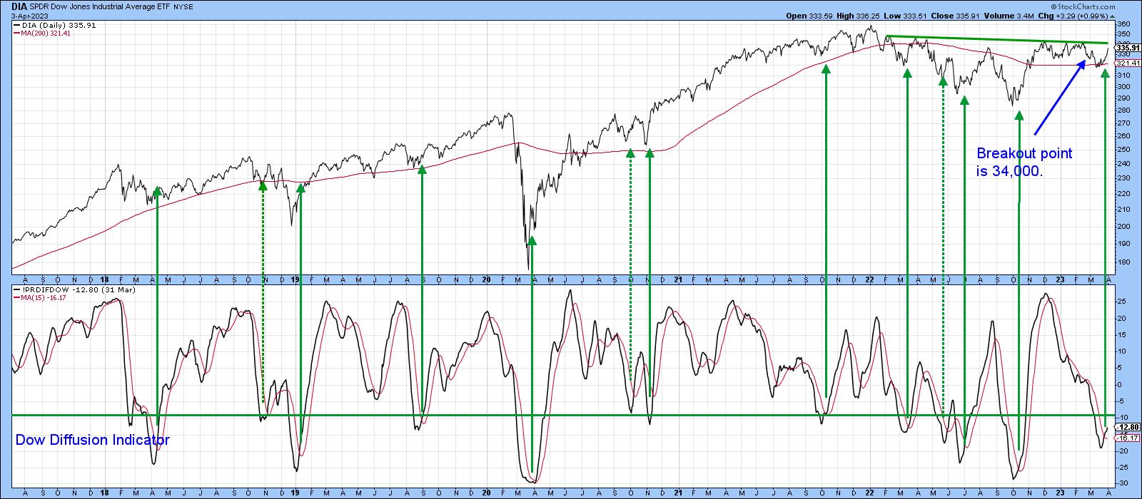
CHART 6: WILL THE DOW BREAK ABOVE ITS RESISTANCE LEVEL AND TREND HIGHER? The Dow Diffusion Indicator suggests a strong chance the Dow will break resistance.
Chart source: StockCharts.com. For illustrative purposes only.
We should always proceed cautiously, but right now, the line of least resistance, provided that overhead resistance is overcome, looks like it's up.
Good luck and good charting,
Martin J. Pring
The views expressed in this article are those of the author and do not necessarily reflect the position or opinion of Pring Turner Capital Groupof Walnut Creek or its affiliates.


