Could We See a Buy Signal for Stocks and Bonds Similar to 1982?
The other day, I was looking at the charts of stocks, bonds, and gold and remembered that the lows of 1982 were preceded by a similar setup to what we see today. History rarely repeats exactly, and there are many differences between now and then. Still, I think it's worth revisiting 1982 while paying attention to what might transpire between these three markets in the current situation.
The 1982 signal kicked off a nice bull market, so I'll start by examining a couple of reliable long-term indicators that have already turned bullish just to confirm that the current long-term technical position is consistent with a primary bull market of some kind.
Bullish Primary Trend Indicators
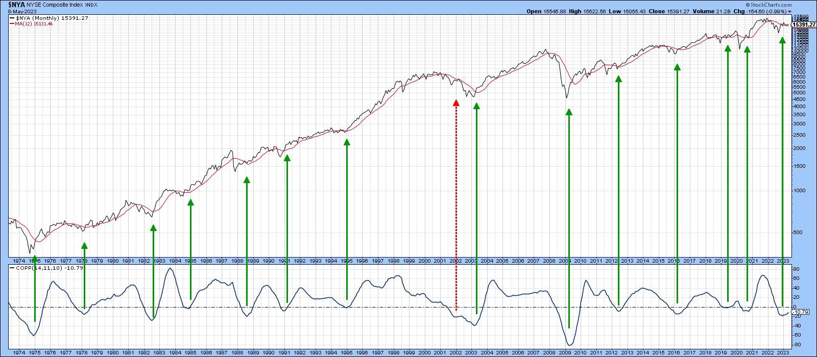
Chart 1 compares the NYSE Composite Index ($NYA) to its Coppock Curve. The Coppock is constructed by adding an 11- and 14-month Rate of Change (ROC) and smoothing the result with a 10-month weighted moving average. According to its inventor, Mr. Coppock, its only purpose in life is to generate a long-term buy signal by dropping below zero and then reversing to the upside. It's not perfect, because there is no holly grail, but it has been consistent, as indicated by the vertical lines. In 2001, when the indicator went prematurely bullish, the curve barely reversed. While there are no guarantees, the latest signal is much more likely to succeed because of its decisive nature.
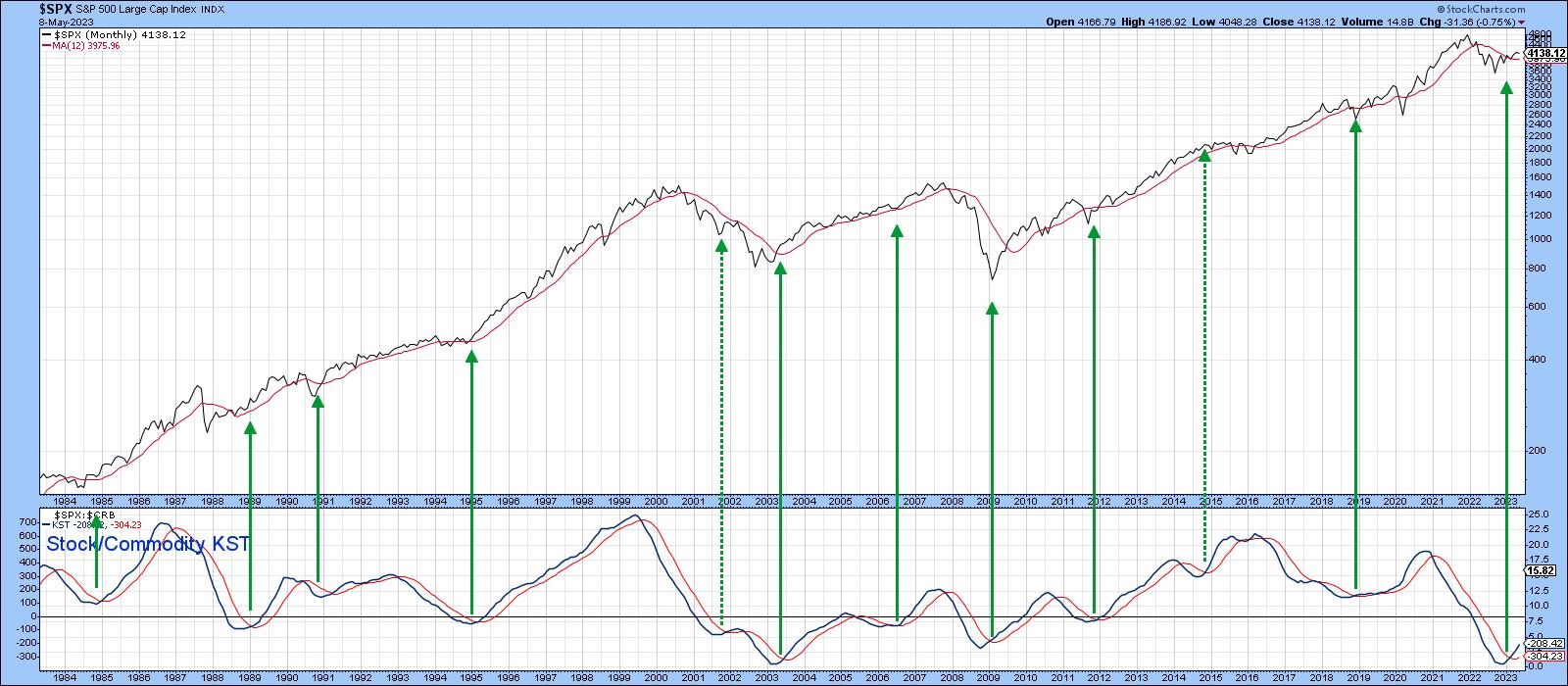
That's also true for the Know Sure Thing (KST) of the ratio between stocks and commodities, featured in Chart 2. This relationship works because stocks are a leading indicator of the economy and commodities, more of a coincident one. When its momentum bottoms, this too offers a reliable signal that the economy has turned the corner from a recession or growth slowdown to recovery, which is a recipe for higher equity prices.
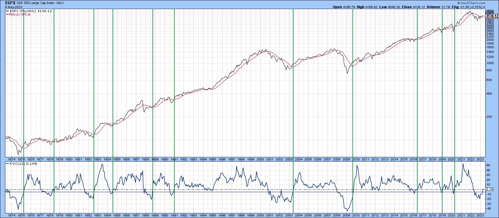
Finally, Chart 3 features the S&P 500 index ($SPX) and its 12-month ROC. Buy signals are generated when this momentum indicator drops below the -5% level and subsequently crosses above zero again. Previous examples have been flagged by the vertical lines. Jim Kopas, one of my partners at Pring Turner, took some time out to crunch the numbers since 1900 and found there were 38 buy signals that averaged gains of 14.6% over a 12-month holding period. That compares to a 7.2% average of all 12-month holding periods since 1900. Risk following these signals was slightly less, with a standard deviation of 17.1% compared to 19.1%. Moreover, the maximum forward drawdowns during the 38 buy signals were substantially better, with the worst 12-month forward return being -21%. That compared to -65% during all time frames. The indicator generated its 39th buy signal in April. I am not saying all the indicators are positive, but there does seem to be enough to have confidence that, absent a black swan event, this market is headed higher. Like 1982 stocks and bonds, though, it could still use a bit of a push if something more exciting is going to happen.
Let's take a close look at what happened in 1982.
1982 and Now
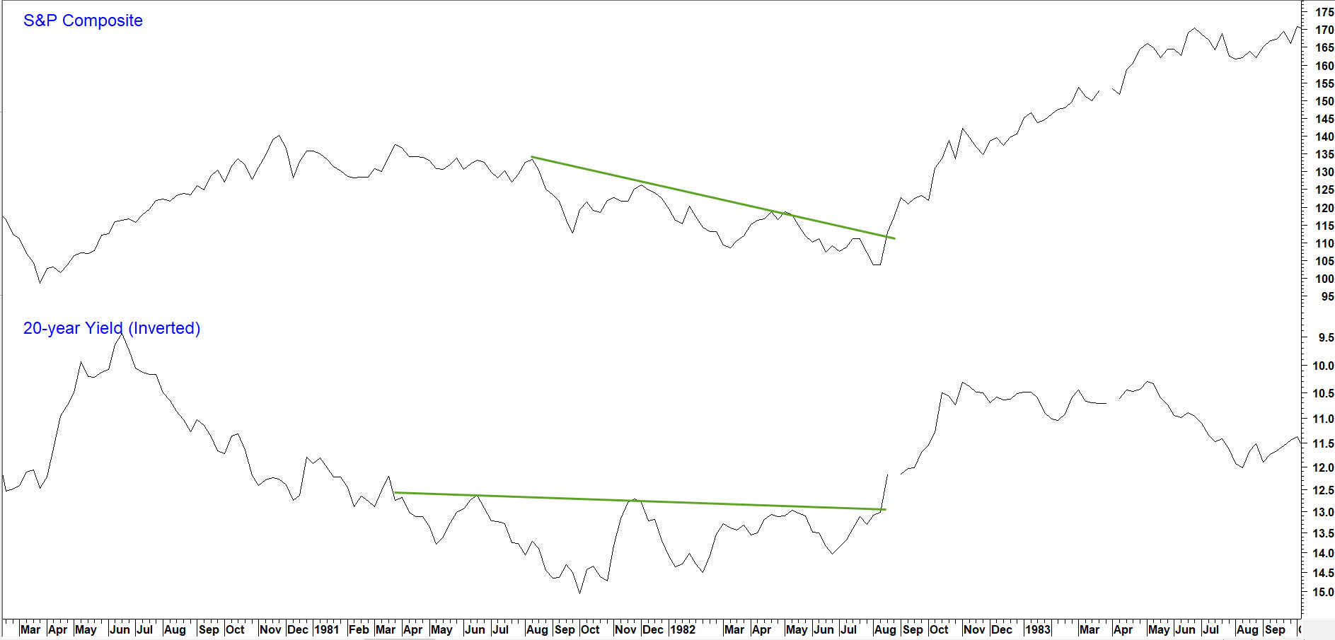
Chart 4 shows the path of stocks and gold in 1982. Note how the price of the yellow metal broke first, and that was above a very nice 18-month down trendline. Since gold generally leads commodities, this was a sign that a new recovery was not far off, which later paved the way for stocks to break out.
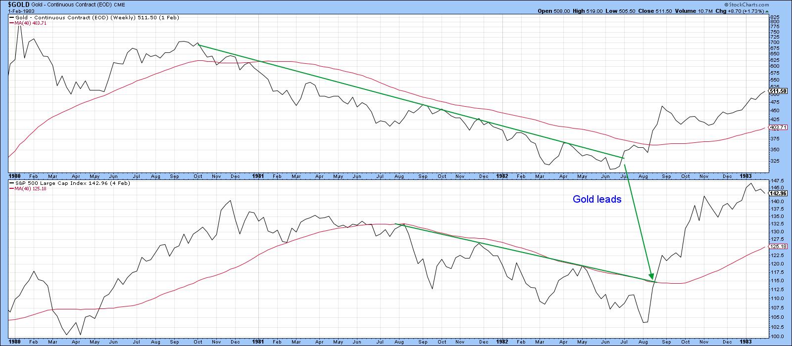
Chart 5 shows the technical state of the stock and bond markets in 1982. Note how both simultaneously broke above key resistance trendlines coming off the August equity lows. The move in bonds was particularly important because it was the market's way of saying that lower interest rates were likely. Equities generally, but not always, do better with declining rates, since lower rates eventually stimulate the economy.
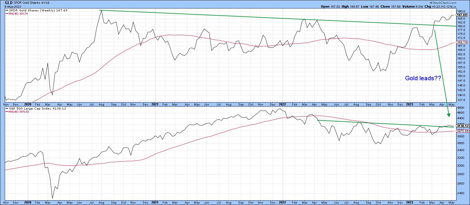
Now, if we turn to 2023, Chart 6 indicates that SPDR Gold Shares ETF (GLD) has already set the scene, as it did in 1982, by breaking above a two-and-a-half-year resistance trendline. The S&P 500 has also moved above resistance on this weekly chart but not yet in a very convincing way. A more decisive breakout is needed before we can conclude that the break will be valid.
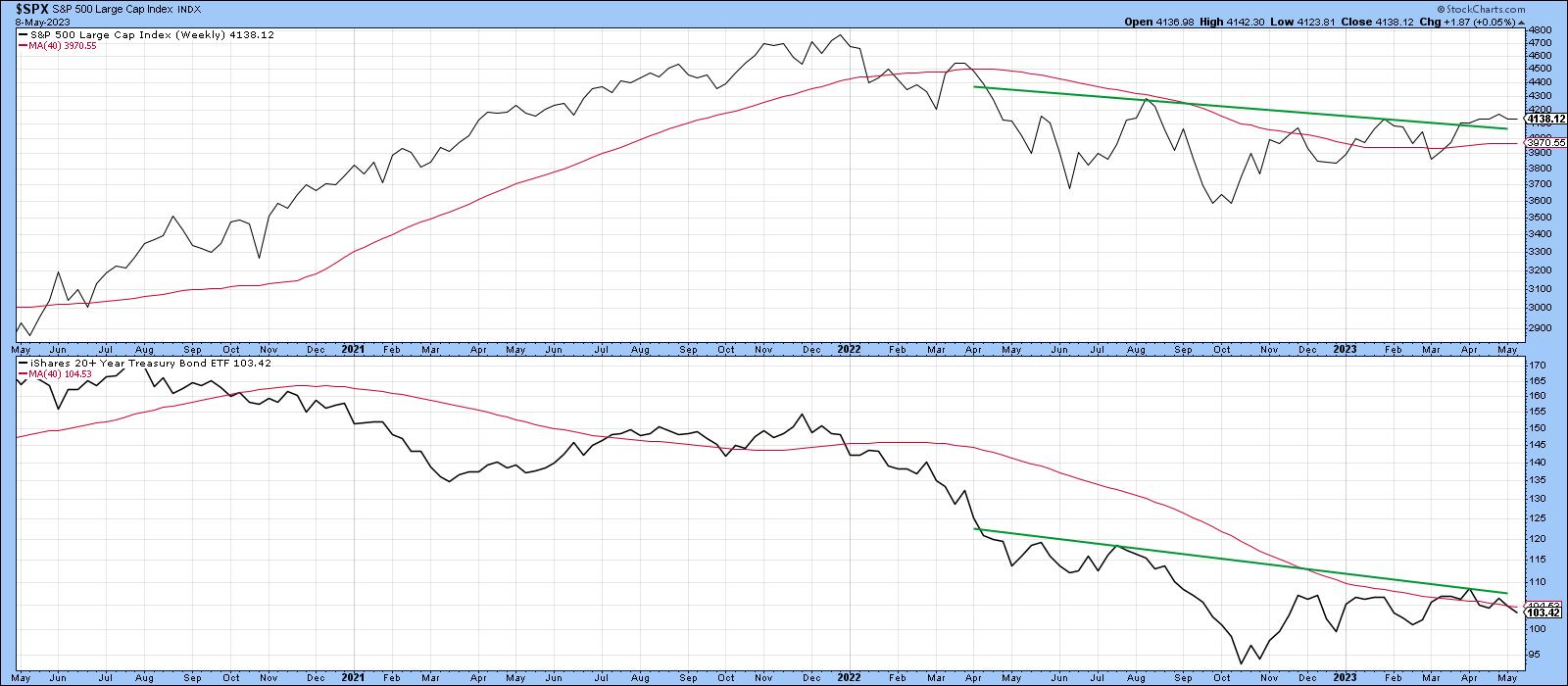
Finally, Chart 7 compares stocks to bonds for the last few years. You can see the similarities between now and 1982, as both series have found resistance around key trendlines. To be comfortable with any break, I would like to see a Friday close in the S&P above 4,200 and $110 for the iShares 20-year plus Treasury ETF (TLT); then, we could be in business.
Good luck and good charting,
Martin J. Pring
The views expressed in this article are those of the author and do not necessarily reflect the position or opinion of Pring Turner Capital Groupof Walnut Creek or its affiliates.


