Perhaps It's Time for the Laggards to Catch Up?
The recent strong performance by a few tech stocks has gained widespread attention, as has the disappointing market breadth. The result has been a soaring NASDAQ and a lagging NYSE Composite and Dow. Small cap stocks have also left a lot to be desired. The question is whether this divergence, like most others, will end in tears or whether these laggard market averages can play catch up. I lean to the latter camp because most of the primary trend indicators I follow are in an early bull market phase, and some short-term market indicators are oversold.
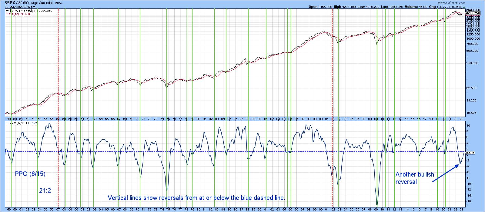
Chart 1, for instance, shows that the PPO, using the 6 and 15-month parameters, has just begun to turn up. Counting the two double signals as one, there have been 23 upside reversals since 1949, only two of which were false positives. A twenty-fourth signal was triggered recently, and the magnitude of its reversal has already been far stronger than the two failed ones. If this indicator was reversing from an overbought condition, I would be much more concerned about the breadth divergences, but, to me, this looks more like the start of a primary bull market instead.
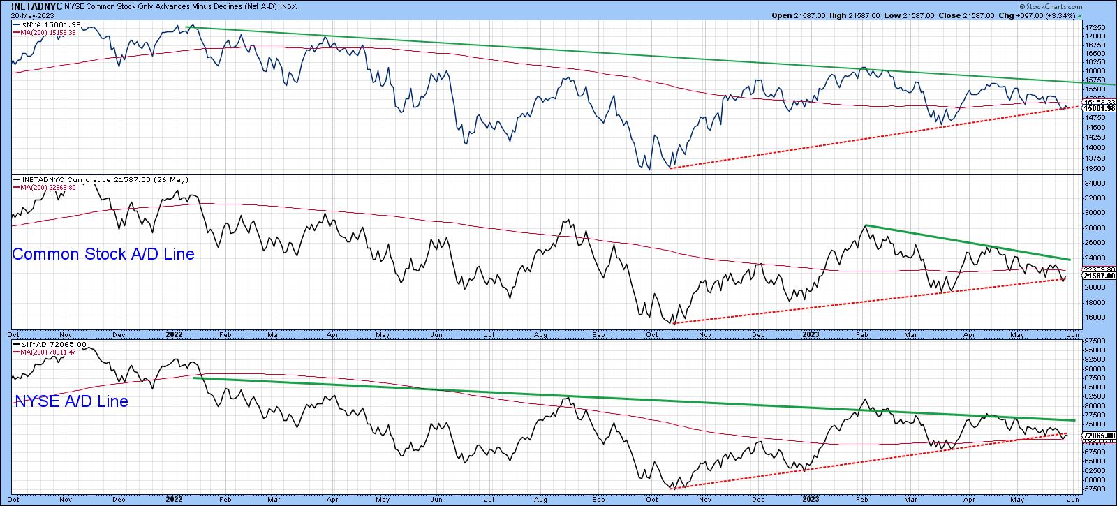
If so, that should mean the series in Chart 2 find support around current levels and begin to rally above those green down trendlines.
Sentiment is Bearish
Chart 3 plots a 10-week average of AAII bulls. Right now, there are not that many of them, which, from a contrary perspective, is very positive. Usually, when this MA turns up, prices advance, so the recent reversal is certainly welcome. At worst, low readings in the last few months are likely to continue to act as a cushion against substantially lower prices, as has been the case for the last year.
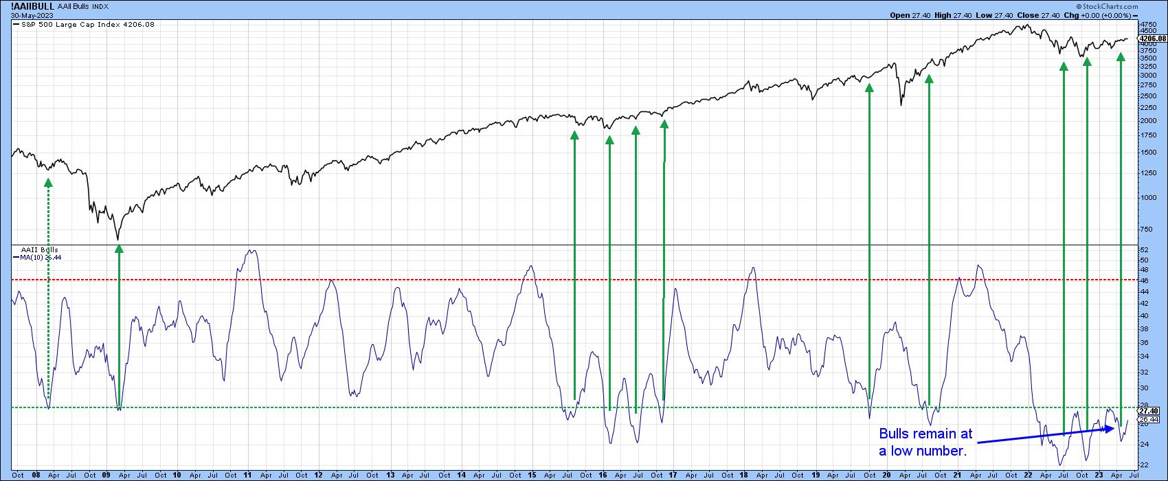
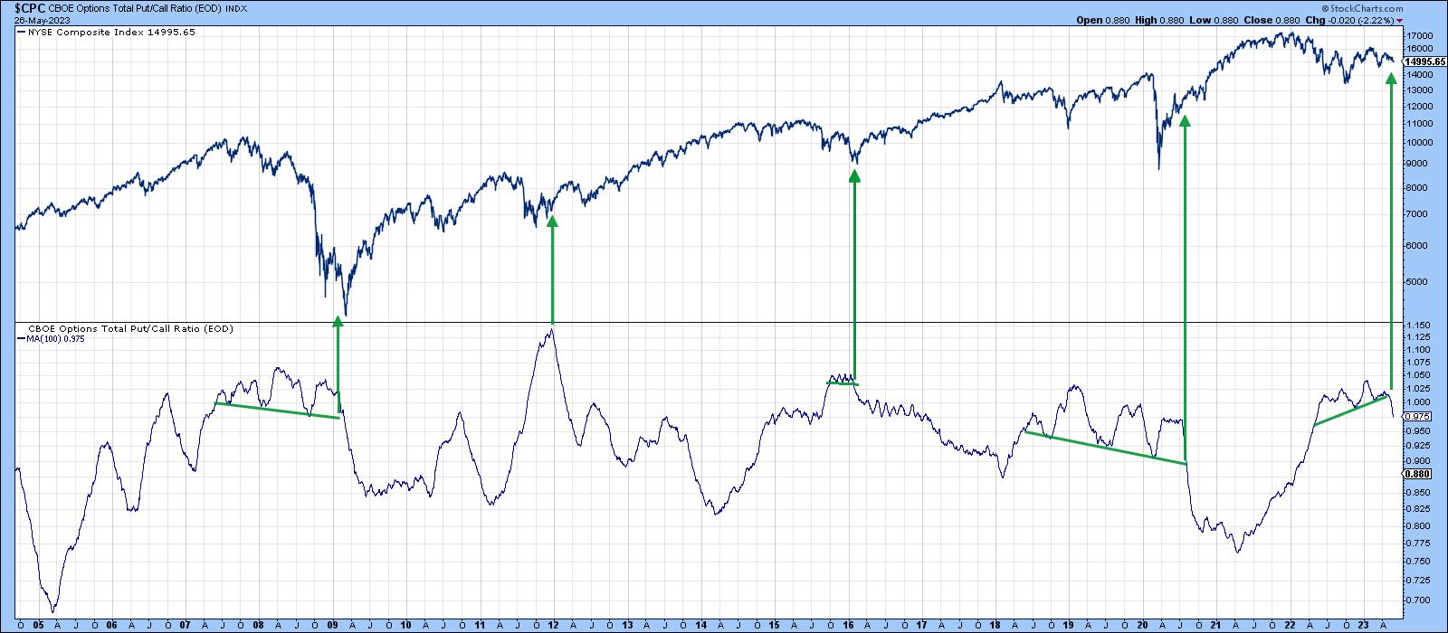
Chart 4 plots sentiment using the CBOE Total Put Call ratio. The raw data are jagged, so the series in the chart has been plotted as a 100-day MA. A rising average indicates growing pessimism because more puts are being purchased over calls. The arrows mostly show periods when it has been possible to construct trendlines on the smoothed ratio and observe their violation. Each example was followed by a declining ratio and a very meaningful rally. The indicator has just broken down from an upward-sloping head-and-shoulders top. This indicates a more optimistic trend in sentiment, as traders purchase increasing amounts of bullish bets on calls. That should be positive for equities.
Positively Positioned Short-Term Indicators
Chart 5 features my Bottom Fisher indicator, which you can read about here. The arrows show when it falls towards its oversold zone and reverses with a subsequent MA crossover; a rally lasting 3 weeks or more typically follows. If last week's reversal follows suit and generates a short-term advance, it would likely have sufficient power to push the NYA above its 2023 down trendline, subsequently challenging its February high.
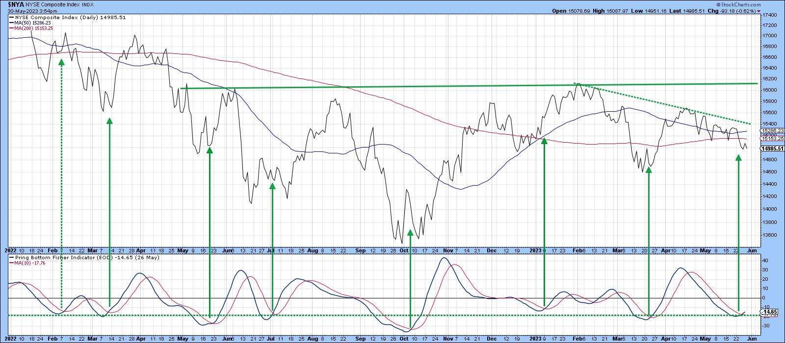
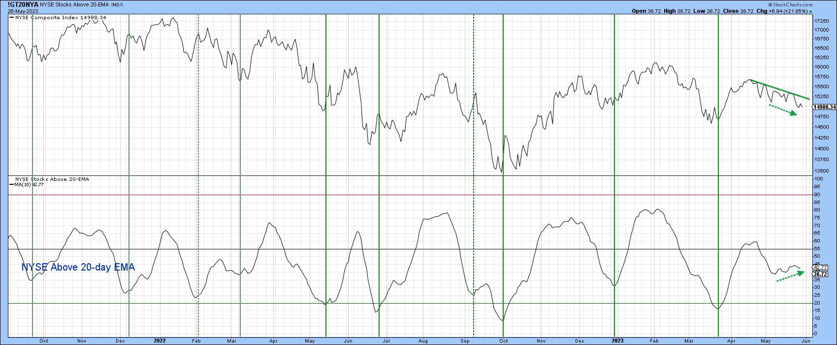
Chart 6 compares the NYA to a 10-day MA of NYSE stocks trading above their 20-day EMAs. Note that the NYA itself has been gradually working its way lower in the last few weeks, but the number of stocks above their 20-day EMA has actually been edging up. This suggests that things may be getting stronger internally to the extent that a successful challenge of the April/May down trendline is possible.
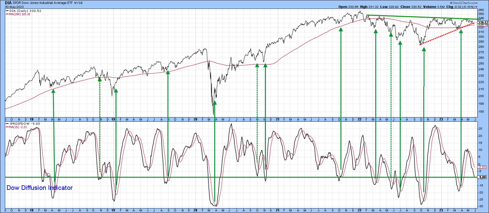
The Dow has been another laggard. This is reflected in an oversold reading by my Dow Diffusion indicator, which monitors the number of Dow stocks in a positive trend. It's still declining, of course, so we cannot register it in the bullish camp yet. However, at these low levels, it would not take much to release some powerful bullish momentum. The arrows show that reversals in the indicator from a position at or below the green horizontal line usually result in a worthwhile short-term advance.
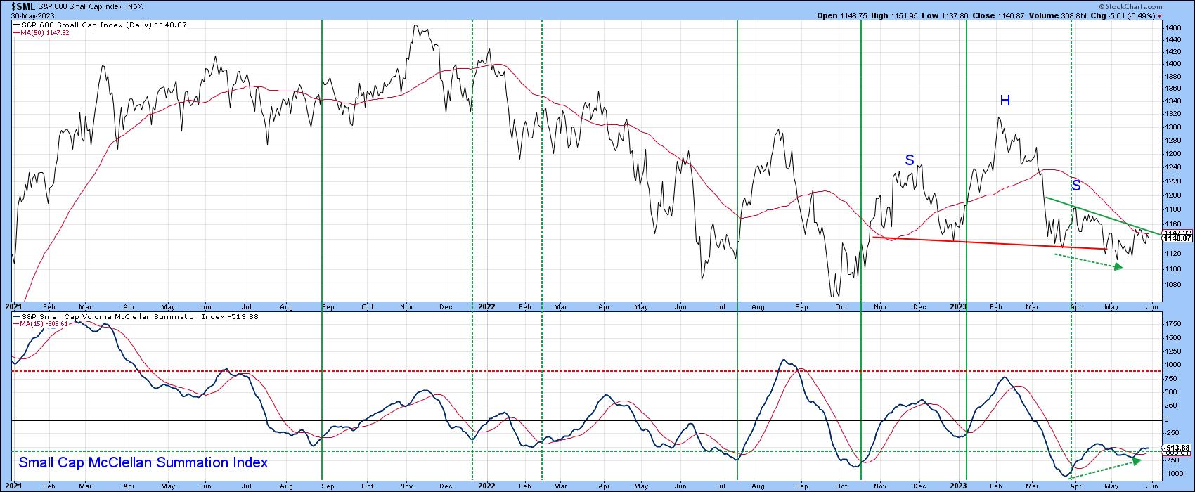
Finally, the frustration of many market observers with small-cap performance has been palpable. Chart 8 hints that better times may lie ahead. For the first time since the bear trend began early last year, the Small Cap Summation Index has experienced a positive divergence with the price. It is also back above its 15-day MA. Equally as important is the fact that the price broke down from a head-and-shoulders top and has since recovered. If it can now close above the dashed green down trendline, it would confirm the break as false. Since whipsaws are usually followed by above-average moves in the opposite direction to the break, a daily close that can hold above 1,160 would tip the balance and give the $SML a sporting chance of playing catchup.
Good luck and good charting,
Martin J. Pring
The views expressed in this article are those of the author and do not necessarily reflect the position or opinion of Pring Turner Capital Groupof Walnut Creek or its affiliates.