The Long-term Trend of the US Dollar May Not Be as Bearish as You Think
There has been a lot of talk recently about diversifying away from the dollar and it potentially losing its reserve status. The primary trend of the Dollar Index may be bearish, but the longer-term charts do not agree; they suggest that the dollar's death is greatly exaggerated. Let's take a look.
The Primary Trend
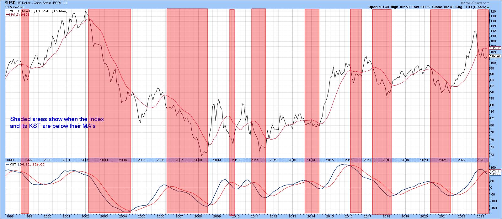
My interpretation of the Dollar Index's technical position is that it is in a primary bear market or multi-year trading range. That view is largely based on price action in Chart 1, which shows that the Index is below its 12-month MA and has a negative long-term KST. Since that momentum indicator is still very overextended, it is also reasonable to conclude that the bear may be in a relatively early stage. It's not a perfect approach by any means. However, the pink shadings tell us that monitoring these two moving averages has captured most of the downside over the last 20 years or so.
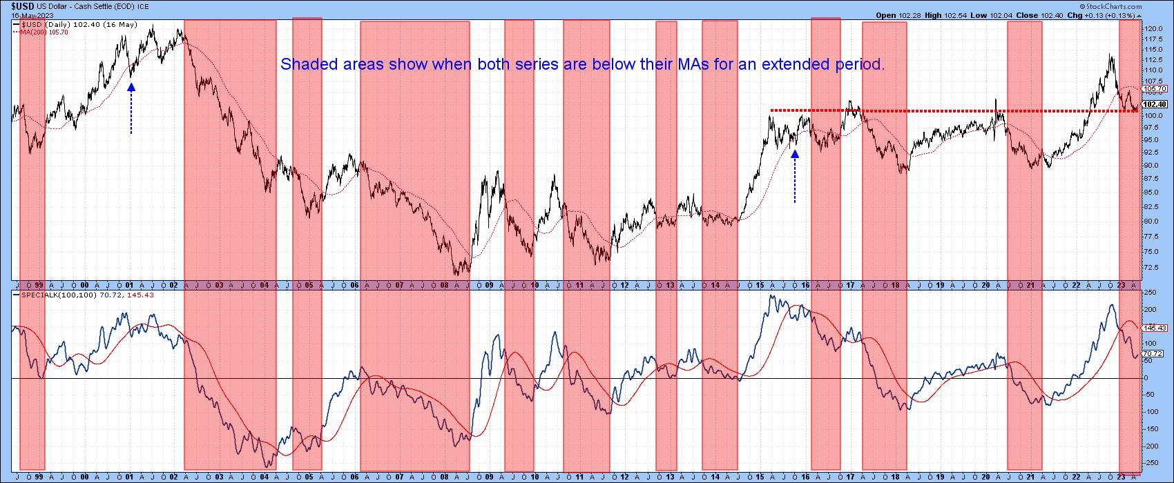
A similar situation presents itself in Chart 2, where the shadings indicate when the Special K is below its signal line and the Index is trading south of its 200-day MA. The two dashed arrows flag the two whipsaw moves in that regard. At this point, the Special K is showing no signs of a reversal, thereby supporting the bearish case.
The Secular Trend
The secular trend contains several primary moves and generally determines their character. When it is declining, it results in larger-than-average primary bear markets and weak and brief bull trends, whereas a secular bull has the effect of lifting all boats. That means stronger primary bull markets and more contained bearish moves.
Chart 3 sets the secular scene by identifying them with the red and green arrows.
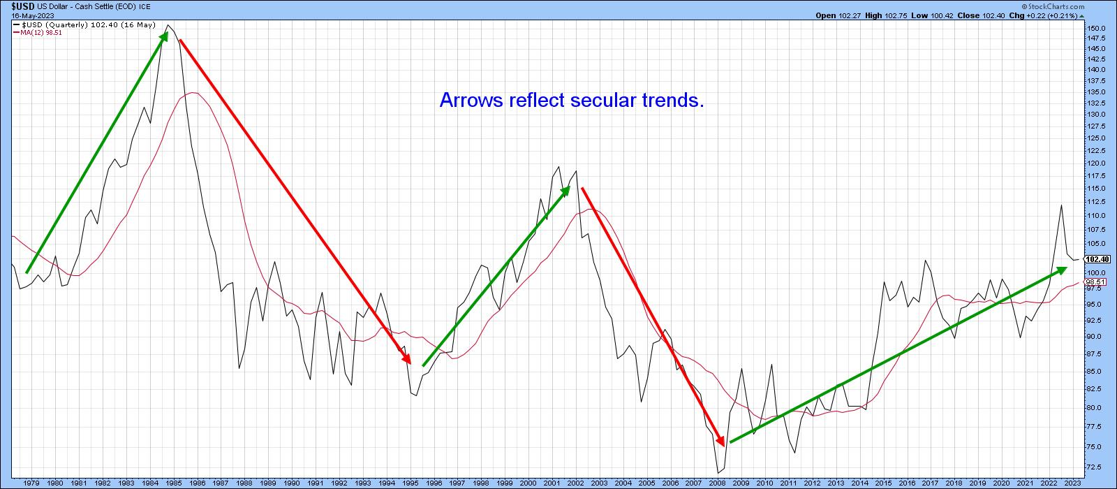
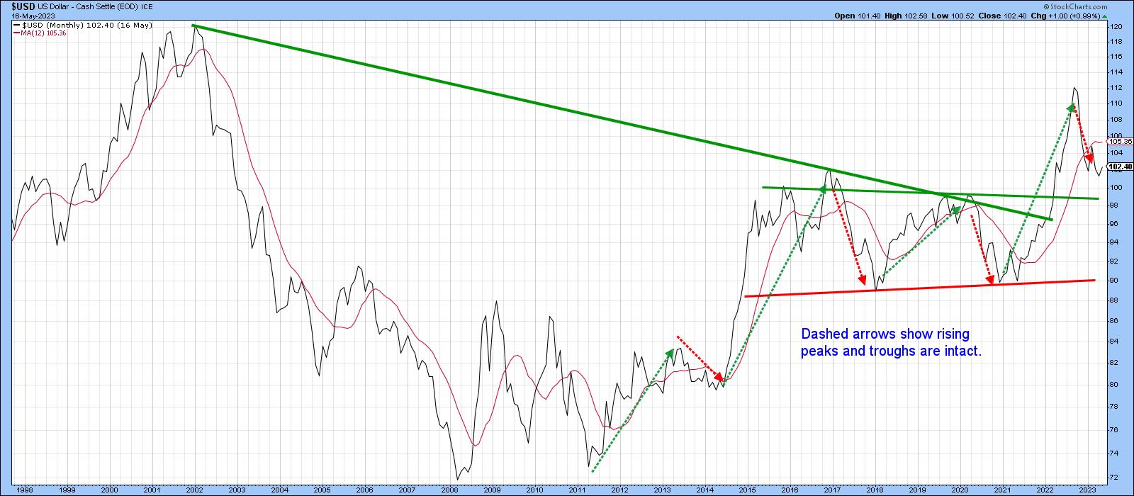
Chart 4, on the other hand, tells us that, since the current uptrend began in 2008, the Index has experienced a series of rising primary trend peaks and troughs. That progression is still in force, implying that the big post-2008 bull market is still intact. We can also see that the Index broke above a multi-year trading range, which suggests the potential for higher ultimate prices. Under that context, the current "bear" market looks very much like a normal retracement move.
Studying the way momentum behaves in a bull and bear market is also helpful for getting a fix on the direction of the secular trend. During bull markets, oscillators are very sensitive to oversold conditions and generally bounce quickly after reaching them. By the same token, they easily move to an overbought condition, i.e. in the blue area, and are often reluctant to give up ground when overextended. In effect, sell signals tend not to work so well. During a bear market, oscillator behavior tends to be the exact opposite.
Chart 5 illustrates this interaction between a nine-month RSI and the secular trend. Note that during the 2002 –2008 secular bear, the RSI had no problems sinking to the red oversold zone. However, since then, it has been extremely sensitive to oversold conditions. Furthermore, it has managed to achieve a couple of prolonged overbought conditions, both characteristics of a secular bull. Finally, the Index remains above its 24-month MA, which the small red and green arrows show to have been a consistently good pivotal point.
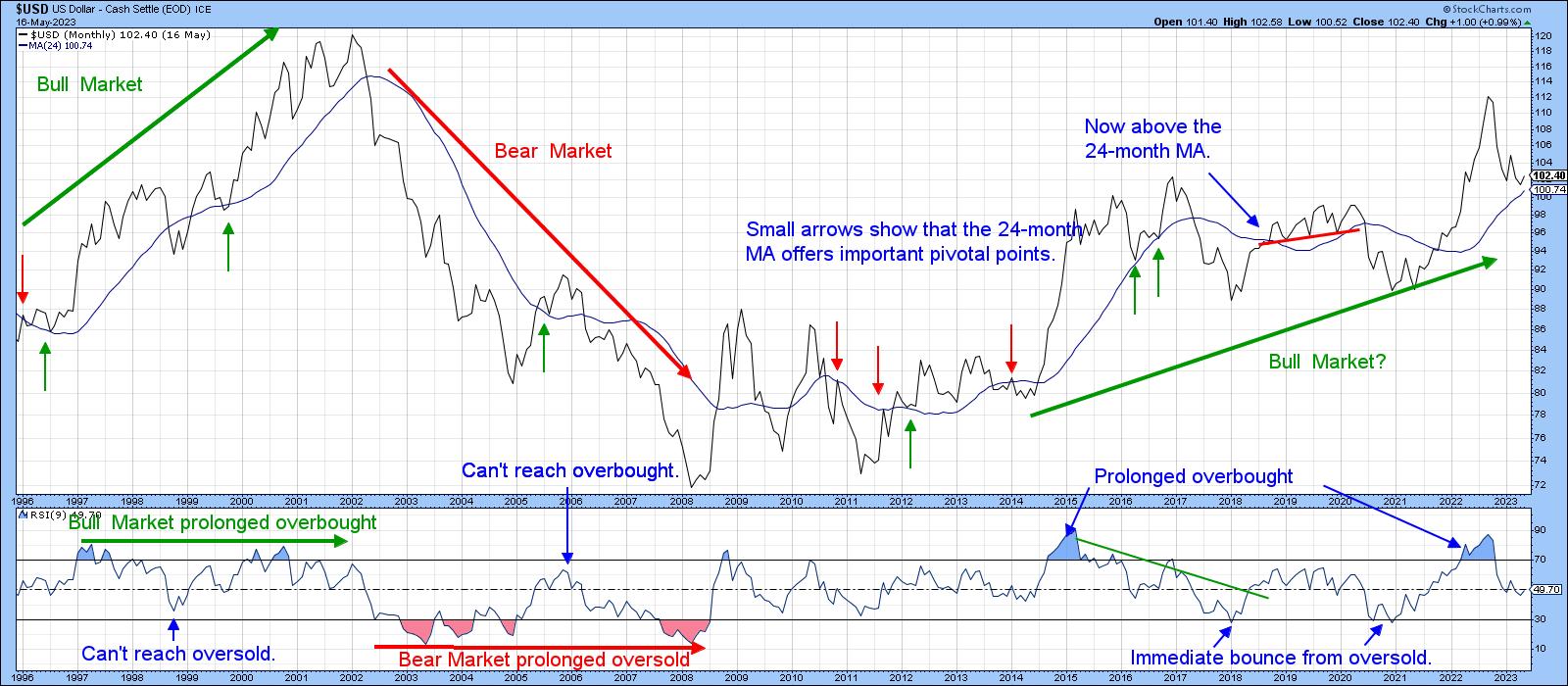
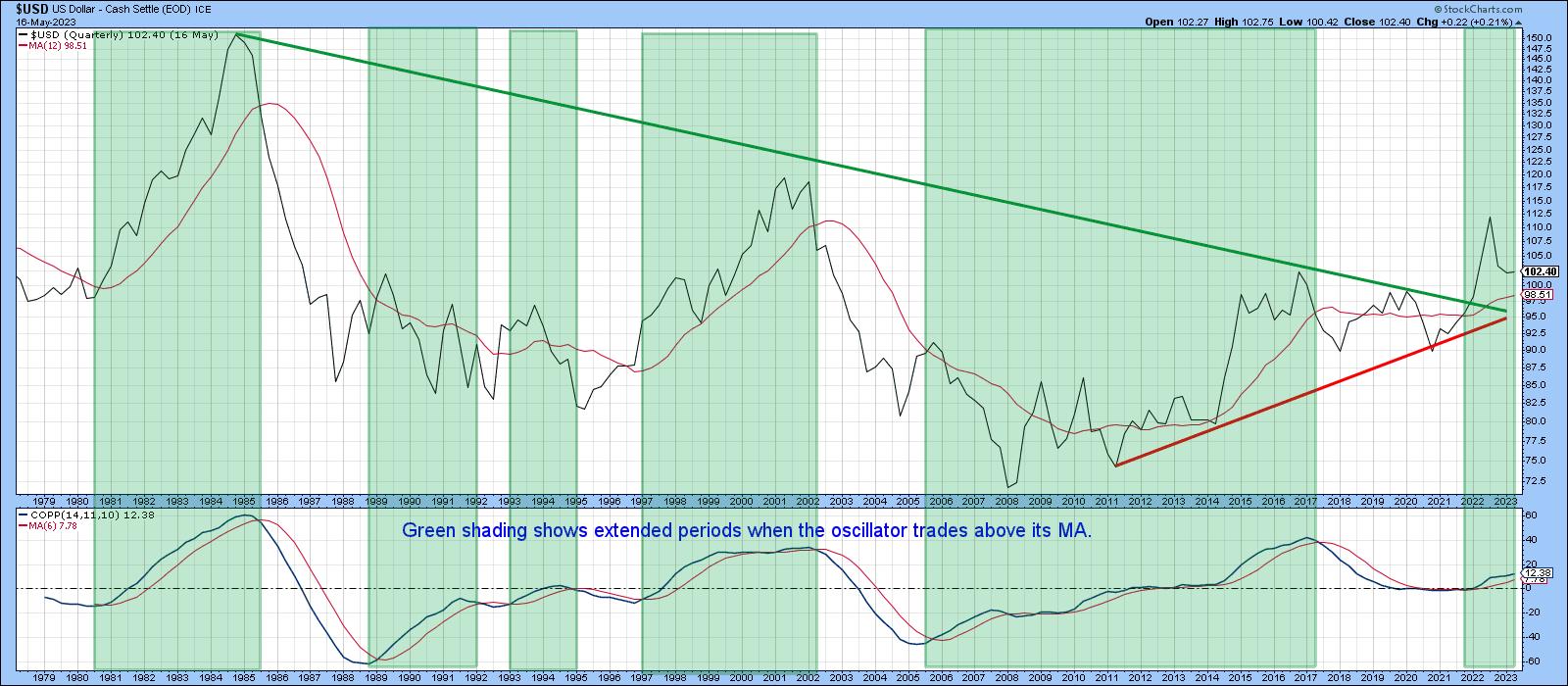
Chart 6 also supports the secular bull thesis. It compares the Index to a Coppock Curve, based on a quarterly timespan. The first thing to note is that the Index recently violated its 1985-2022 down trendline, which is a significant long-term development. It's also above its twelve-quarter MA, though, with so many whipsaws having developed in the last 45-years, I wouldn't place too much emphasis on that. What is significant is the fact that the Coppock is back into a decisively bullish mode.
The Immediate Outlook
Bearing in mind that most of the evidence points to a secular bull market and that counter secular primary trends tend to be limited in downside potential, it is worth referring back to Chart 2, where it is evident the Index recently found support at the thick dashed line.
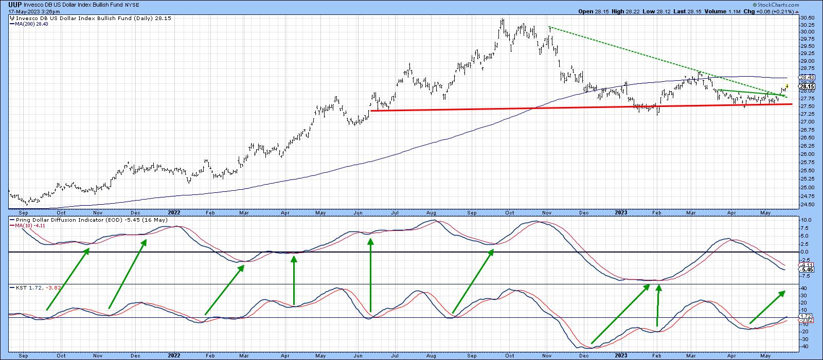
Chart 7 also shows a bounce off support, a breakout above a small base, and a bear market down trendline for the Invesco DB US Dollar Bullish Fund (UUP). It looks like it is headed higher, since the daily KST has already turned up and may well succeed in reversing the downward trajectory of my Dollar Diffusion Indicator in the middle window.
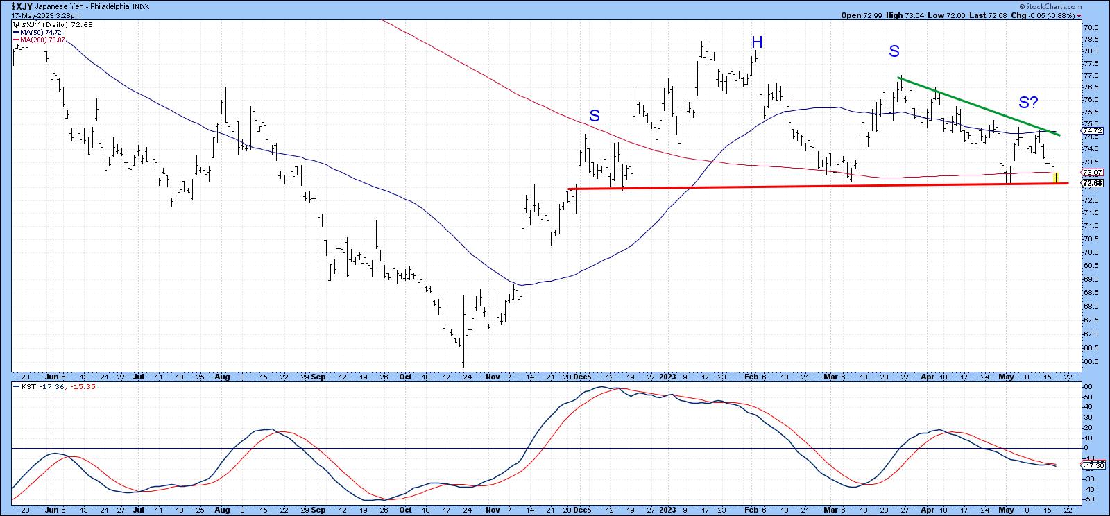
The Yen
Chart 8 features a quarterly chart for the yen. It broke down from a massive top some time ago and its Coppock curve is in a bearish mode.
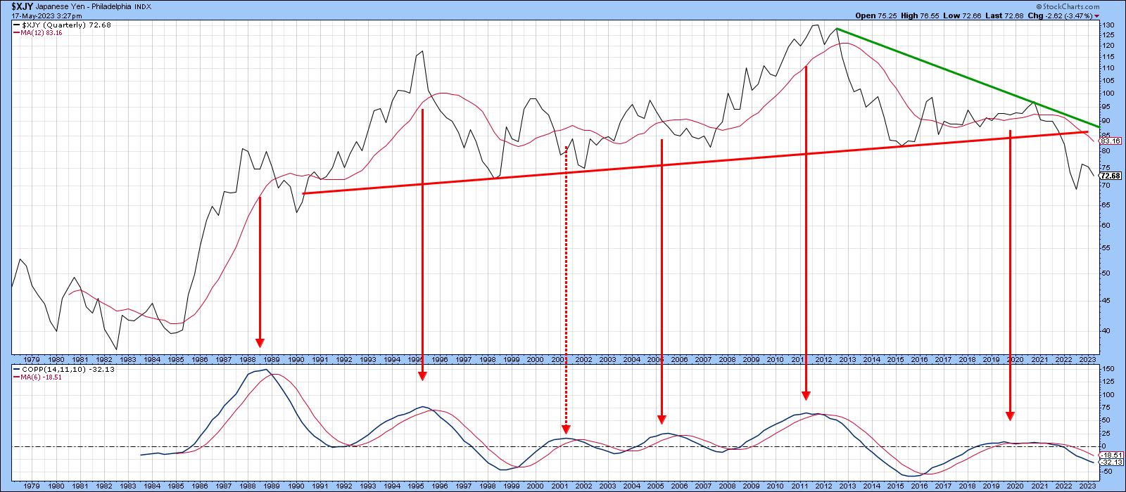
That suggests the yen, as represented, in Chart 9, is likely to break down and at least test its October low.
Conclusion
While it seems likely the Dollar will rise from current levels, it's important to bear in mind that the long-term KST is still overextended and most probably needs to work off this condition. Consequently, any rally is likely to develop in more of a trading range environment than an immediate resumption of the secular bull market.
Good luck and good charting,
Martin J. Pring
The views expressed in this article are those of the author and do not necessarily reflect the position or opinion of Pring Turner Capital Groupof Walnut Creek or its affiliates.