Is the Tech Rally Overdone?
When the direction of the primary trend changes, it's usually because the business cycle is transitioning from a slowdown or recession to a recovery. That process usually results in a change in sector rotation, as defensive ones, such as utilities and consumer staples, come to the fore and more speculative issues are downplayed. The market peaked in early 2022 and declined into October, following which we have seen a nice, but very much unloved, rally. Right on cue, the economy has slowed down. Some sectors, such as manufacturing and housing, are in a clear-cut recession, but others, such as the labor market and the services sector, are relatively unscathed. The thing that strikes me about all this is that sector leadership on the upside has not been characterized by the usual suspects, rather an extension of the previous ones.
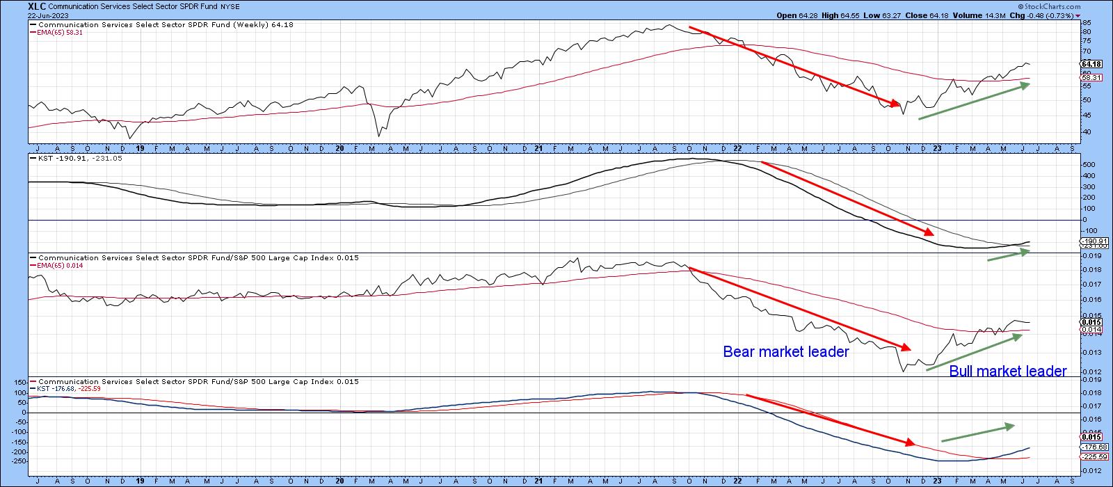
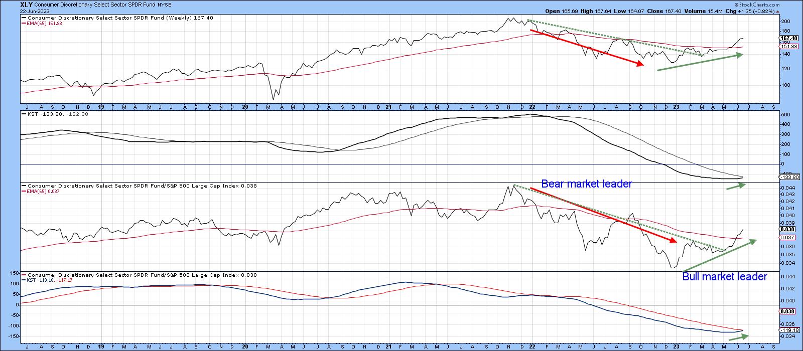
To explain this, I refer to my Nirvana Template. I call it that because it contains most of the elements I need for a quick assessment of the long-term technical picture. Chart 1, featuring utilities, shows an example. It consists of four windows, the upper two of which contain the absolute price information in the form of the Friday close, its 65-week EMA and the long-term KST. The price and its position relative to the EMA sets the scene for the direction of the primary trend. The KST gives us a fix on how far that trend may or may not be in its development. Meanwhile, the lower two panels contain the same information, but this time for relative action against the S&P or whatever market average you choose.
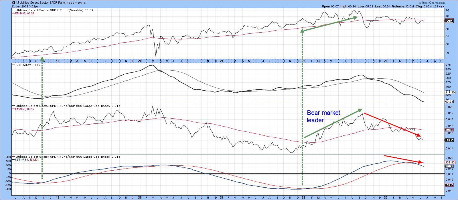
Ideally, we want to acquire the item concerned when the two KSTs are trading below zero, but above their respective 26-week EMAs. It's also good to see the price and relative line above their 65-week EMAs, or breaking through a meaningful trendline of some kind. Two examples for the utilities have been flagged with the dashed-green arrows. It is self-evident that this layout is helpful for long-term investors. If we assume that a rising tide lifts all boats, it also means this arrangement and its focus on the primary trend can also be of aid to short-term traders, since it helps to isolate pro-trend short-term signals, which tend to be a lot more profitable than contra-trend ones. Should you discover that you too find this arrangement helpful, simply click on any of the charts in this article and then save it as a ChartStyle or in a ChartList.
Defensive Sectors
Currently, we are seeing defensive sectors underperforming. For example, the RS line for the Utilities, in Chart 1, is below its EMA, and the KST for relative action has been in a negative mode for most of 2023.
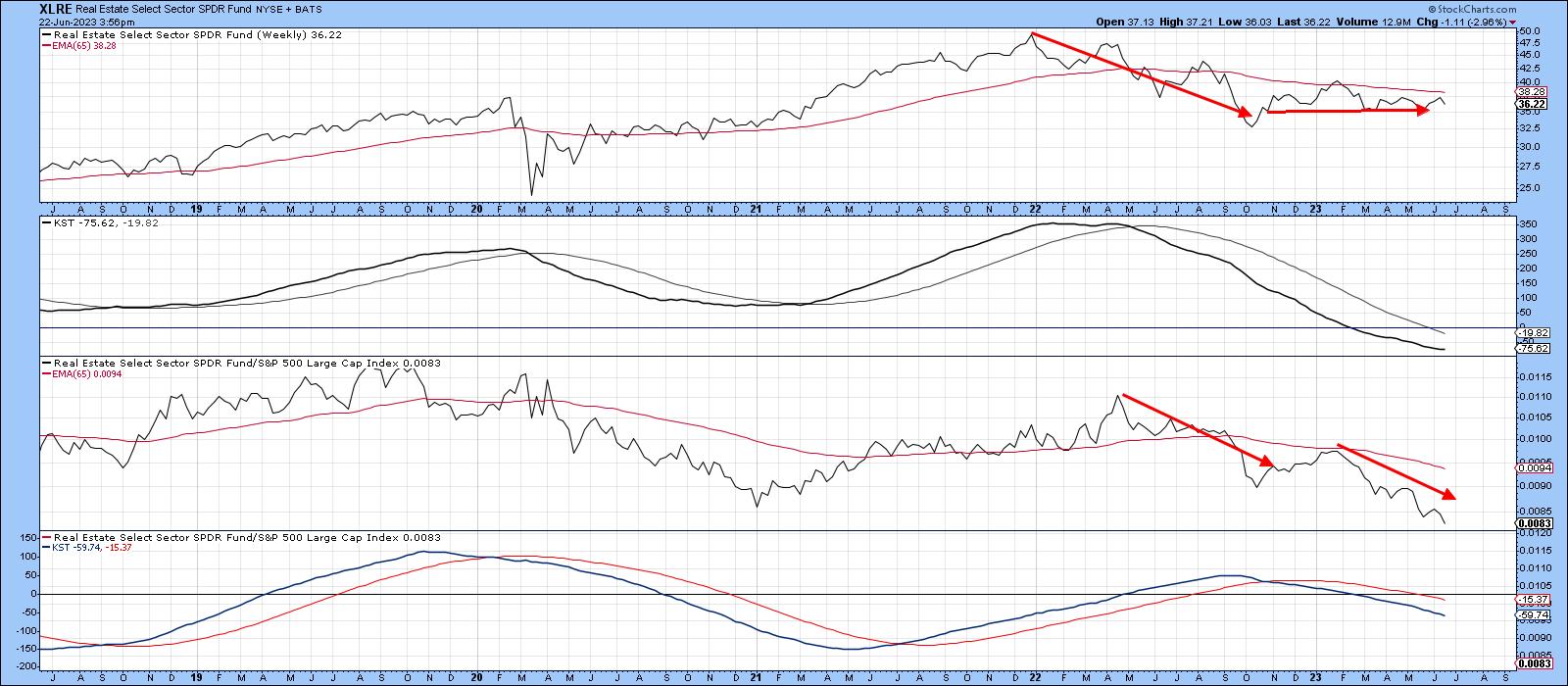
RS action for Real Estate, in Chart 2, spent the 2022 bear market in a negative trend, which, following a post October rally, has now resumed. One of the things I have learned from this arrangement is that sectors (or stocks) trading below all four EMAs are usually best avoided, and those where all are above usually do okay. Real estate is currently negative on all four grounds.
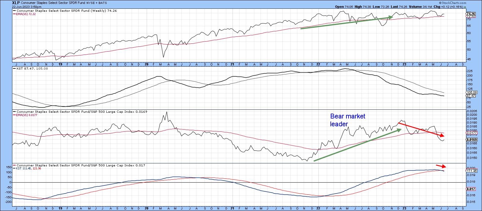
Finally, on the defensive sectors, we see that consumer staples relative action peaked at the turn of the year, just slightly after the October low in the overall market. That weakness has been sufficient to result in the relative KST crossing below its 26-week EMA. Now, three of the four indicators in the chart are below their EMAs.
Market Leaders
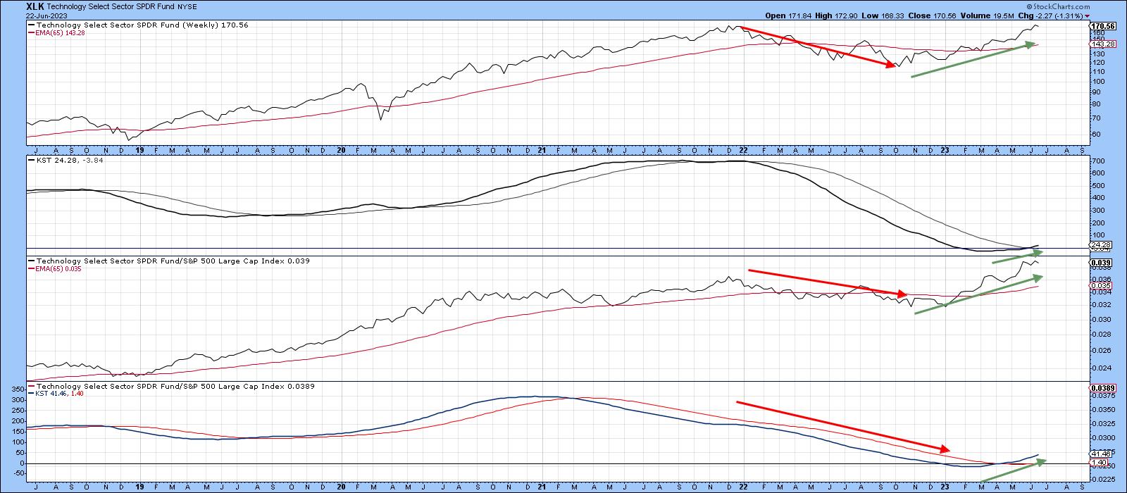
Chart 4 features the undisputed leader, technology. The red arrows indicate it was a downside leader the during the 2022 bear market. Now, it is leading on the upside, with all four indicators being above their respective EMAs. Note that even though the RS line is at a new all-time high, neither KST is at an overstretched level. This leaves room for substantially higher prices.
A similar downside/upside leadership pattern is also apparent for the communications services sector. Once again, all four series are now trading above their EMA's. If you look carefully, you will see that both KSTs, despite a four-month rally, remain well below their equilibrium point. That also suggests plenty of unrealized upside potential.
Finally, consumer cyclicals, unlike the market, did not bottom in October, as they troughed out on both an absolute and relative basis in December. Since then, this sector has been on a tear. As a result, the two KSTs look set to join the price and RS line above their respective EMAs.
Conclusion
Some may say that technology, communications and consumer cyclicals have come too far, and that may well be the case from a short-term aspect. However, as long as their RS lines and long-term relative momentum continue to rise, it will represent one piece of evidence, to me, that the post-October rally is alive and well.
Good luck and good charting,
Martin J. Pring
The views expressed in this article are those of the author and do not necessarily reflect the position or opinion of Pring Turner Capital Groupof Walnut Creek or its affiliates.