These Charts Explain Why Stocks Have Been Rallying Since October
The ellipses in Chart 1 reflect economic events that have adversely affected the stock market since the 1950s. The pink ones reflect recessions, and those colored in blue indicate setbacks that anticipated economic slowdowns. Slowdowns develop when some economic sectors slip into recession, but that weakness is insufficient to push the aggregate economy into an economic contraction. The whole point of the chart is to demonstrate it is normal for stocks to move ahead of the economy. Hence, stocks decline ahead of both recessions and slowdowns, but since the latter are "soft landings", the magnitude and duration of the decline is far more contained than under recessionary conditions.
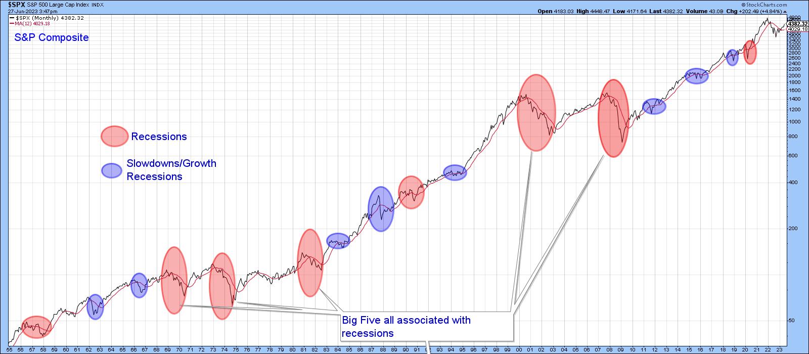
The word normal has been italicized because economic fluctuations account for the vast majority of bear markets, but exceptions occasionally arise. For example, the market correctly anticipated a recession in 2001, but, instead of immediately discounting the recovery, as is typically the case, the S&P proceeded to decline in the ensuing couple of quarters following the ending of the business cycle contraction. My rationale for this aberration is that the market was too busy unwinding the tech bubble to be concerned with any economic progress that might have been taking place at the time. To find a similar disconnect between the market and the economy, we have to go back to the late 1920's, where an unflinching equity market looked straight through a recession on its way the final peak in 1929.
It's worth noting that the S&P never dropped below its 12-month MA in the bullish late 1920s. Neither did it move above it in the late 2001-2002 bearish period, all of which brings us to the current situation and where we stand between the economy and the market.
First, it's important to understand that there is no such thing as "the economy" in the sense that everything moves up and down simultaneously. That's because the economy is really a set series of chronological events that are continually repeating, as in Figure 1 featuring long-term momentum for the Conference Board's Leading, Coincident and Lagging economic indicators.
The Chronological Sequence Between Economic Indicators
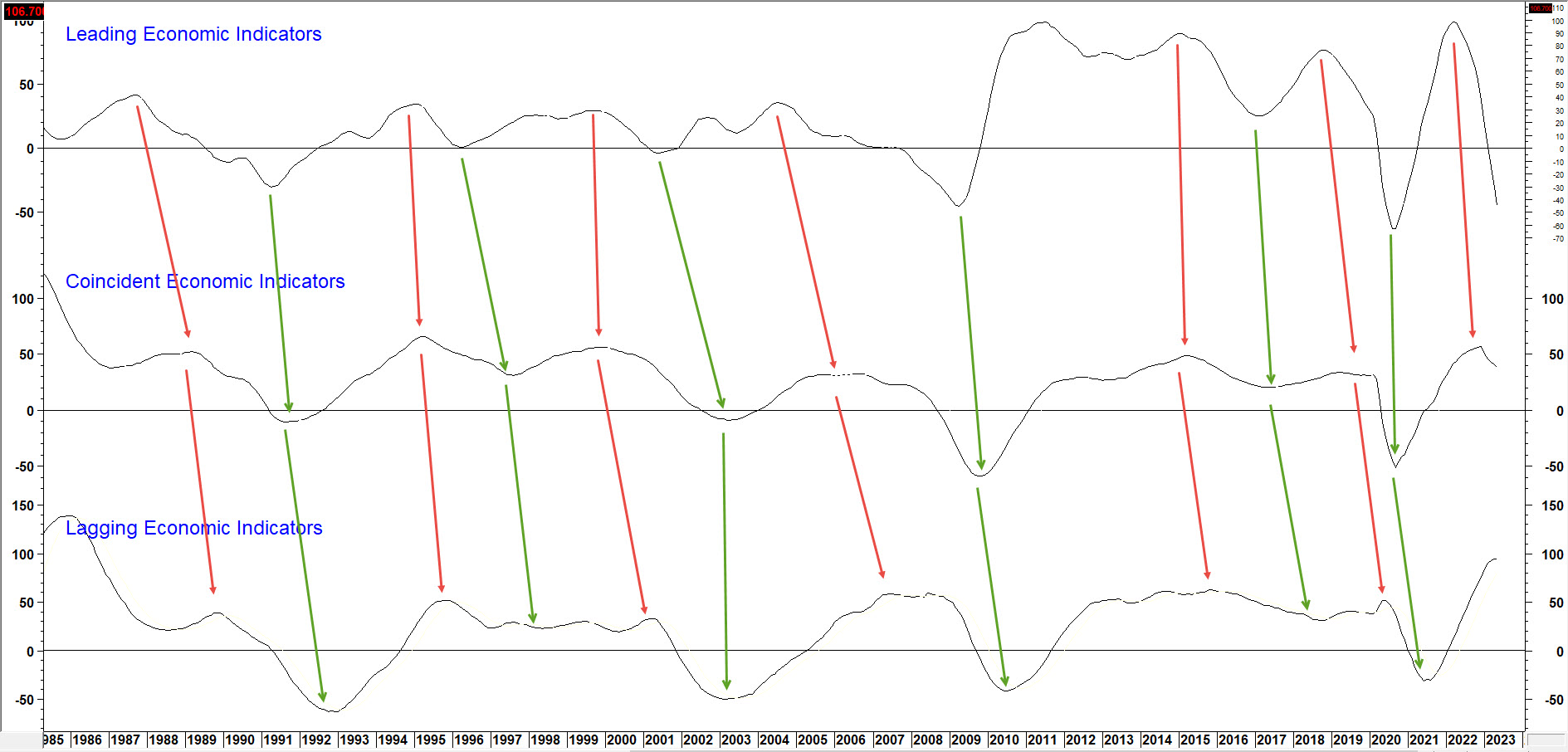
Just like a train begins with an engine and ends with a caboose, each recovery starts with the highly interest-sensitive housing market and works its way through to capital spending. It's our guiding light for managing portfolios atPring Turner Capitaland allocating capital in my monthlyIntermarket Review.
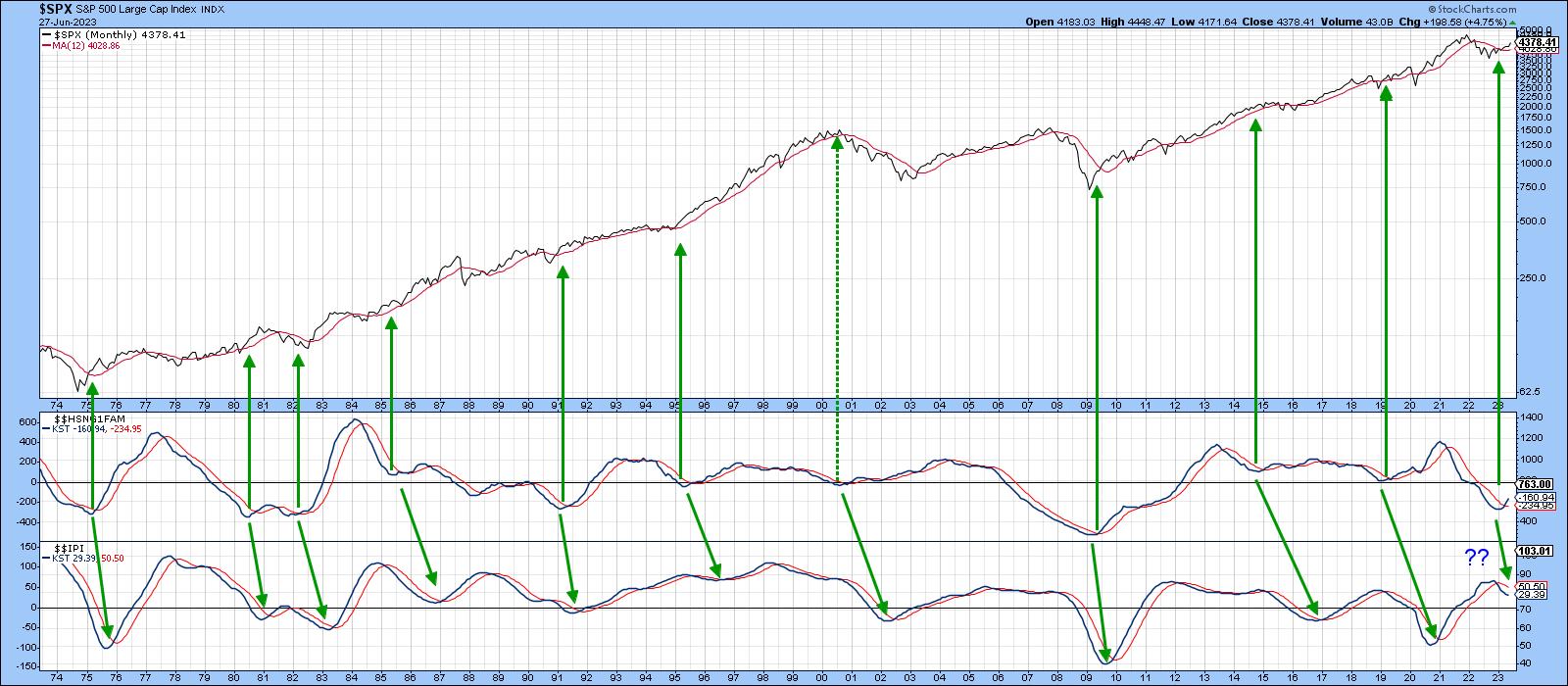
"The economy", if there is one, refers to the middle carriages on a train, in this case things like GDP and industrial production. StockCharts has a small universe of economic indicators on its database prefaced with the $$ symbol. For example, Chart 2 compares the momentum of new homes sold ($$HSNG1FAM) to that for industrial production ($$IPI). The arrows slant to the right because the purchase of new homes moves ahead of industrial production in the business cycle chronological sequence. The leads and lags vary, of course, but there can be no mistaking that home sales precede reversals in the manufacturing sector.
The arrows pointing to the S&P also tell us lows in the home sales momentum represent good buying opportunities for stocks. The 2001 period was a notable exception. New home sales momentum bottomed around the turn of the year. The chart does not reflect the May increase of 763,000 over April's 680,000, which was reported earlier today, but it certainly helps explain why stocks have been rising.
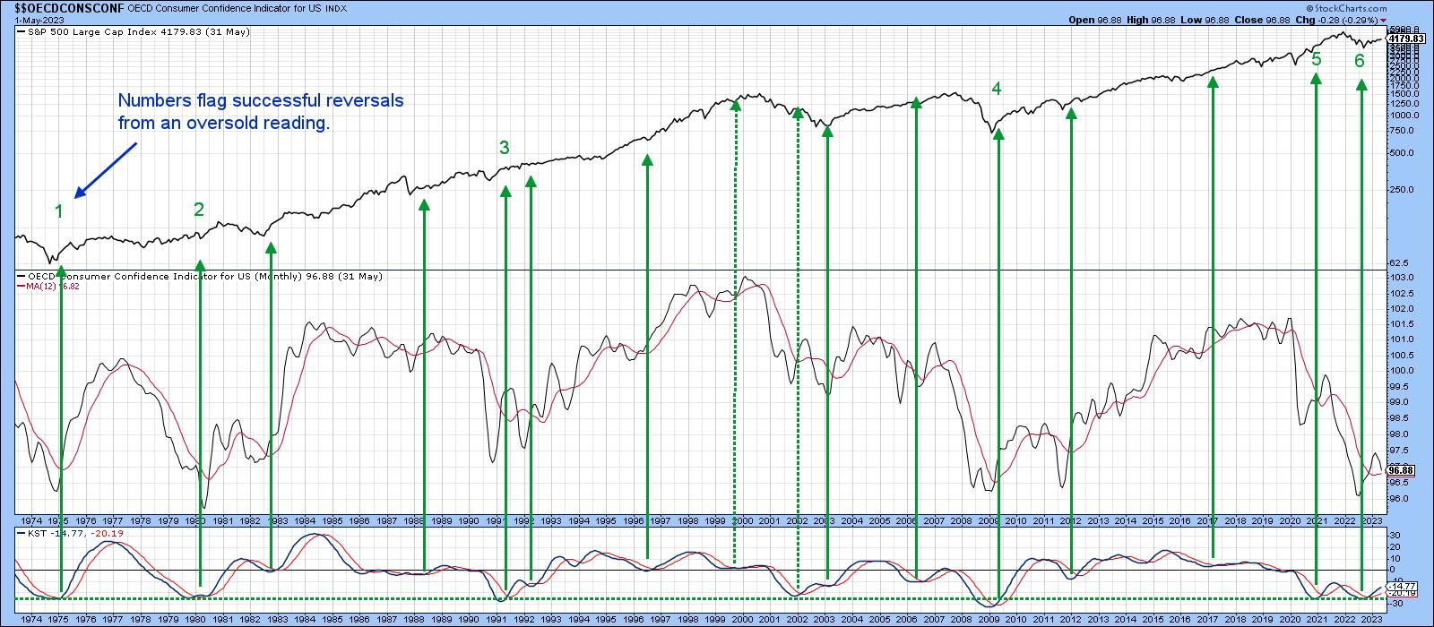
So does Chart 3, which features sentiment as monitored by the University of Michigan ($$UMCSENT), another economic series available on the StockCharts database. I find the raw data to be far too jagged to run a moving average through and come away with timely signals for the stock market. However, calculating a long-term KST and using sub-zero momentum reversals does provide an early-bird buying opportunity. Previous instances have been flagged with upward-pointing green arrows. Note that this series bottomed several months ago, thereby triggering a stock market buying opportunity.
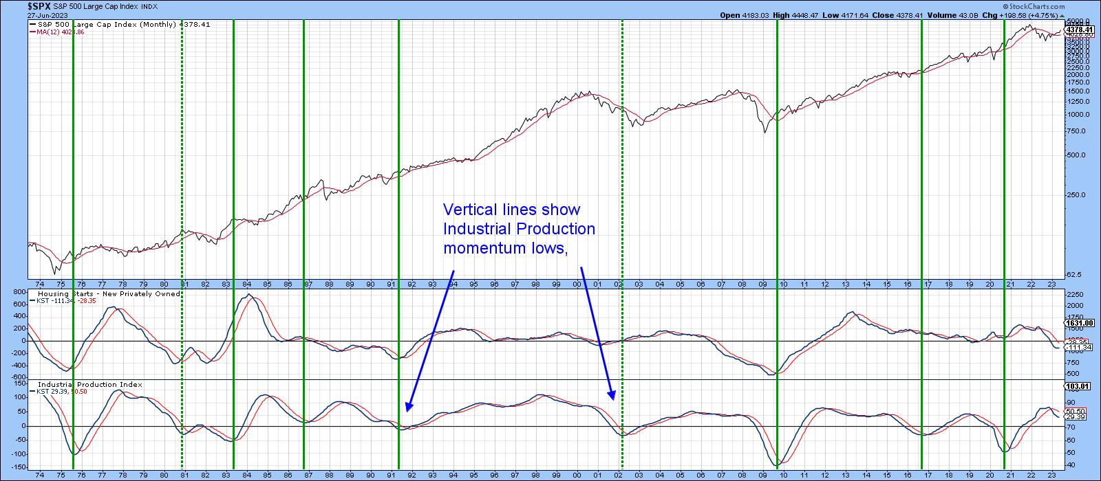
Momentum for both the homes sold and sentiment indicators are currently registering subdued readings. That suggests further ultimate gains are likely. By way of reassurance, Chart 4 returns to our business cycle sequence concept. I have already noted that the housing industry leads manufacturing at cyclic lows. However, the chart demonstrates that the same leading relationship applies to Housing Starts ($$HSNGSTARTS) at cyclical peaks. Equally important, as demonstrated by the vertical lines, is the fact that when industrial production momentum bottoms, the bull market in equities usually has much further to run. At this point, industrial production momentum is showing no signs of an upside reversal. That does not guarantee an extension of the trend of higher stock prices, but it certainly puts the odds strongly in its favor. Put another way, until industrial production momentum troughs out, it's still pretty early in the cycle.
Good luck and good charting,
Martin J. Pring
The views expressed in this article are those of the author and do not necessarily reflect the position or opinion of Pring Turner Capital Groupof Walnut Creek or its affiliates.


