Commodities are in a Bear Market, But These Indicators Say That Could Soon Change
I have been bearish on the primary trend of commodities for some time whilst still maintaining a bullish stance on their secular or very long-term trend. In other words, negative over a 9-month-to-2-year outlook, but constructive on a 10-to-20-year one. The secular aspect is important, because history shows primary bear markets are relatively subdued in both magnitude and duration under the context of a secular bull. On that basis, it could be time to anticipate a reversal from the downtrend that began 19 months ago, back in January 2022.
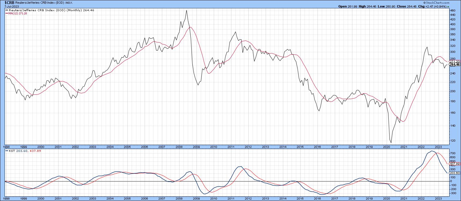
Chart 1, featuring the CRB Composite, shows that the Index is below its 12-month MA and also sporting a bearish long-term KST. Not much doubt about a downtrend using this approach.
Nevertheless, it is often the case for primary bears developing in a contra secular way to quickly and unexpectedly rotate to the bullish side, resulting in unwelcome lags for the longer-term indicators, such as those featured in the chart. In other words, if the bear market is over, we would not expect to have this confirmed until some time after the fact. That said, there are other markets and relationships that move in sympathy with or anticipate commodity trend reversals, which we should consider.
Commodities vs. the Stock Market
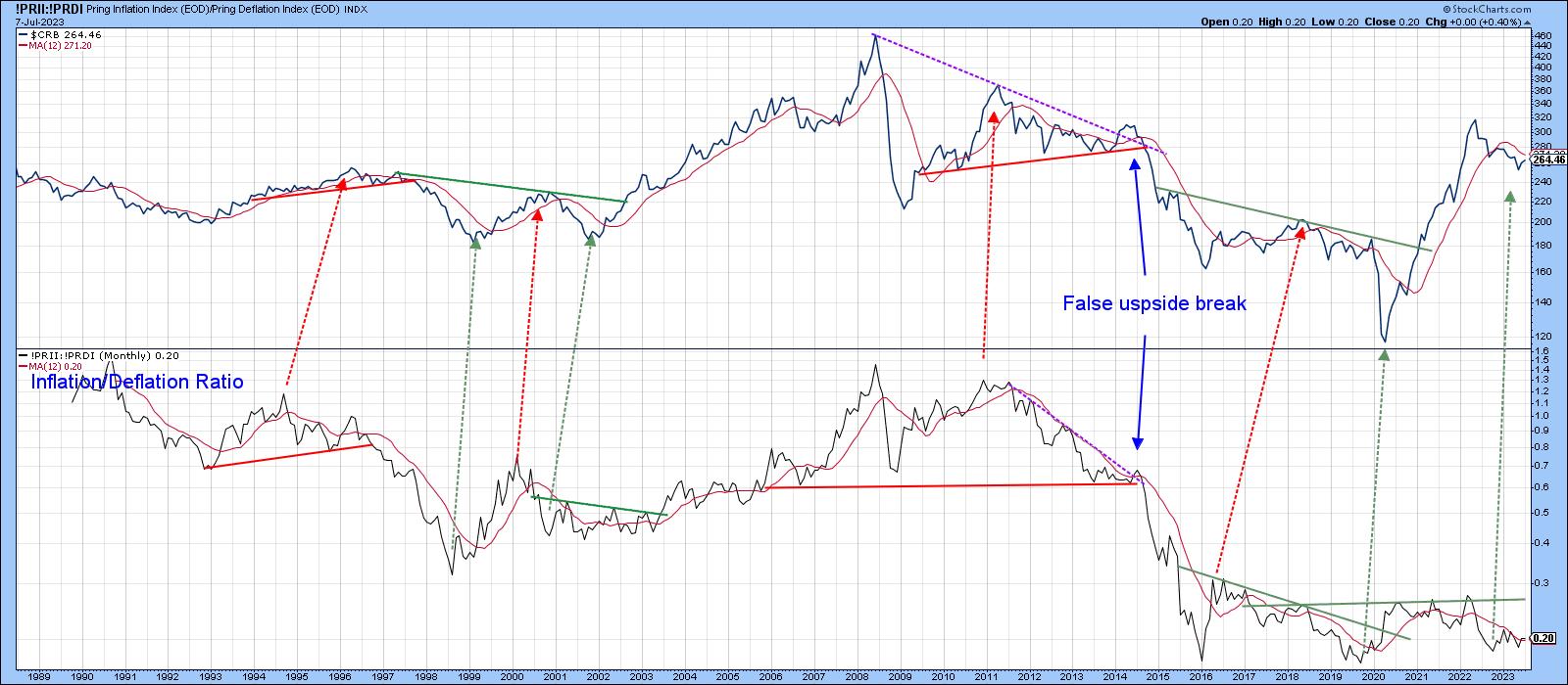
One of these relationships is derived from the internal battle in the stock market between inflation and deflation sensitive stocks, in the form of my Inflation/Deflation Ratio, discussed here. The ratio is constructed from two indexes (!PRII and !PRDI) specifically designed to replicate stocks that are sensitive to inflationary and deflationary conditions.
Chart 2 compares it to the CRB Composite. The arrows connect many of the reversal points and slant to the right because the stock market, in the form of the ratio, has a strong tendency to lead commodities. This relationship bottomed last October and has failed to confirm lower lows being set by the CRB, which is positive. Unfortunately, the leads and lags vary and occasionally are not present, so it cannot be used as a precise timing device.
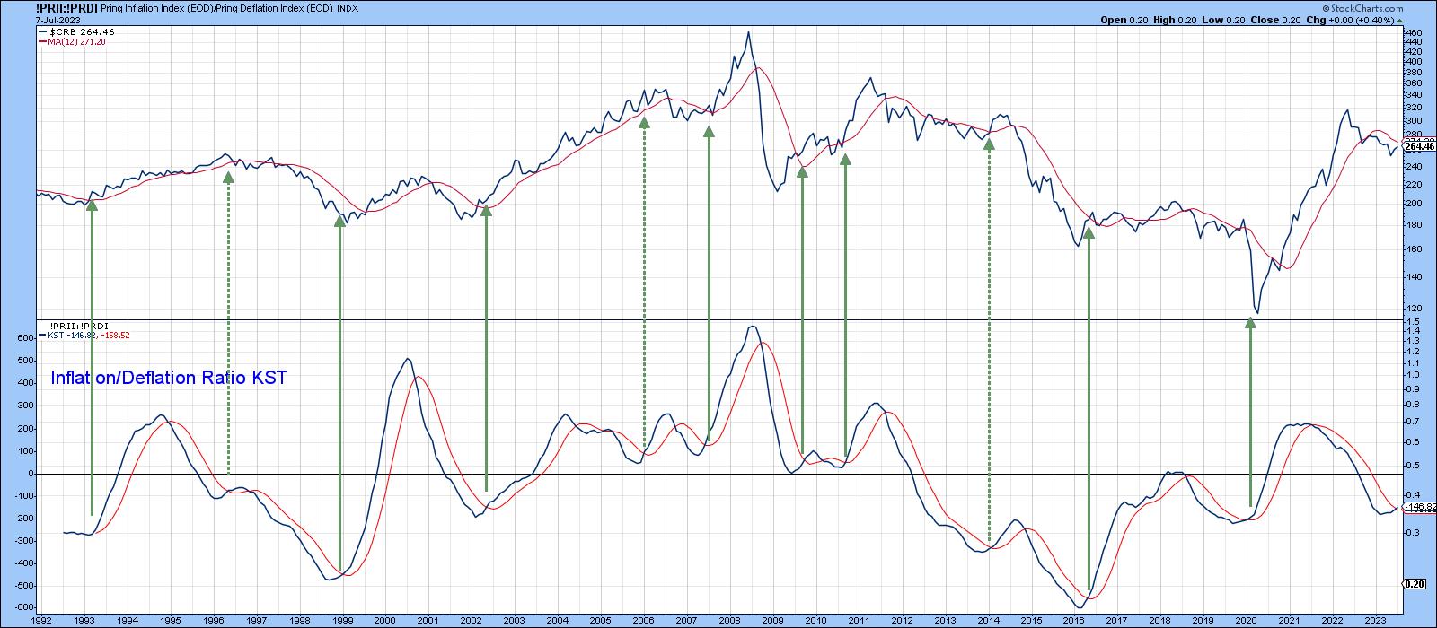
That said, Chart 3 compares a long-term KST of the ratio to the CRB. The solid green arrows tell us that KST buy signals have consistently identified important buying opportunities for commodities. The dashed ones remind us that this is not a perfect approach. Early data for July indicate another buy signal has just been given. However, this is a monthly chart, and the final plot only counts when we have a July, month-end close. Since this is a very smooth and deliberate indicator, chances are that, unless there is a sharp decline between now and then, this indicator will remain in the bullish camp.
Commodity-Sensitive Currencies
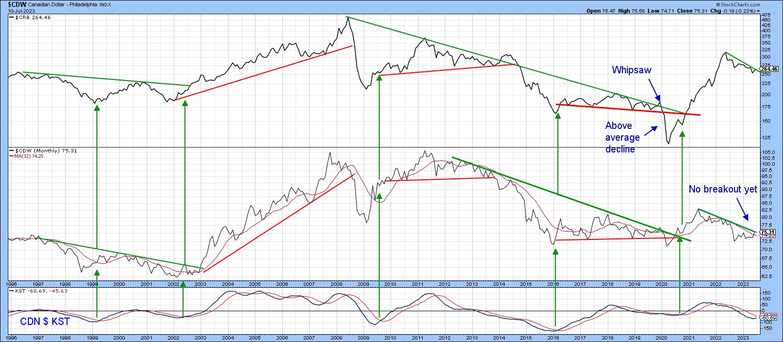
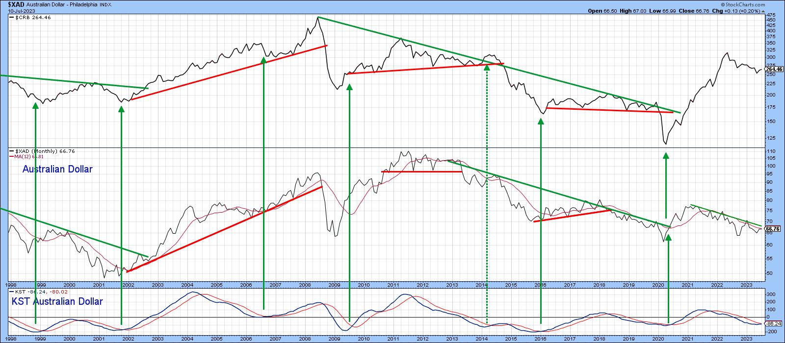
The resource sector for the Canadian and Australian currencies has always been important; so much so that Charts 4 and 5 can be used to reliably identify a primary trend reversal in the CRB Composite. Buy signals are triggered by the long-term KST turning up from a sub-zero position. Additional evidence is often provided with joint trendline breaks from both the currency and the commodity index. Tentative July data suggests an imminent KST signal and a too-close-to-call Canadian dollar trendline break. No cigars yet, but certainly warranting a close look going forward.
A similar picture is being painted by the Aussie currency.
Changes in the Level of Bond Traders' Confidence
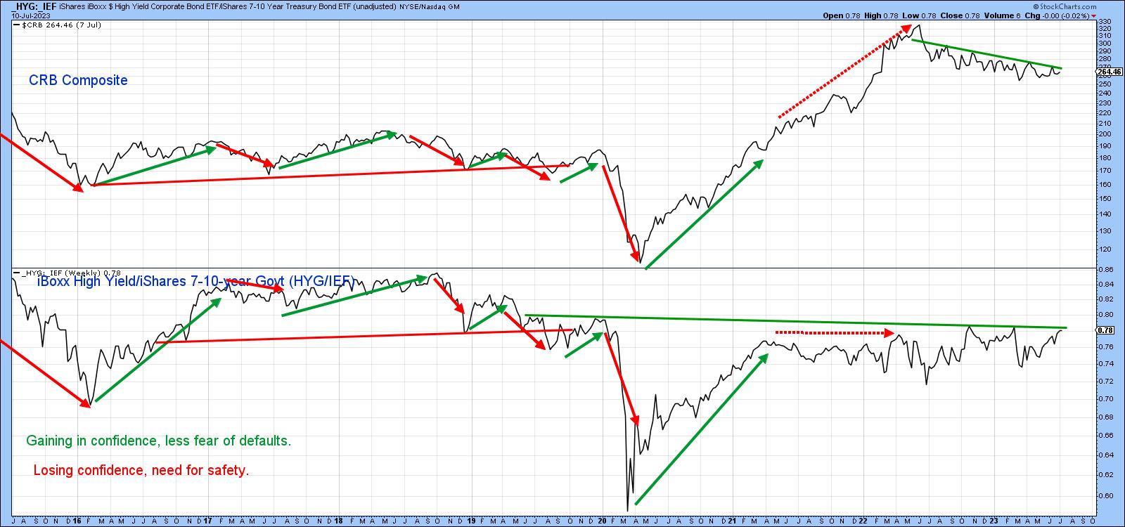
The red and green arrows in Chart 6 show that, most of the time, changes in the ratio between high yield and good quality bonds (HYG/IEF) move in similar swings as commodity prices. When investors favor riskier high yield paper over the safety of governments, it reflects confidence which spills into the commodity pits, and vice versa. Recently, both series have been constrained by trendlines, a downward one for the CRB and a horizontal one for the ratio. The down trendline can be constructed in different ways, but it seems likely that Friday close that can hold above the 273-5 area would represent a reliable signal that the trend had changed to bullish.
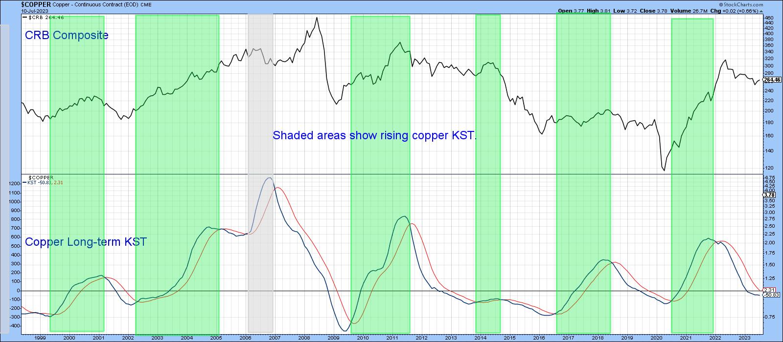
Dr. Copper Could be Paying a House Call
Finally, copper is widely used in many industries and is often used as a bellweather for the economy. Although it has a small weight in the Index (base metals in total only represent 13%), the copper price trends seems to track it quite well.
In this respect, the green-shaded areas in Chart 7 demonstrate that the trend for the CRB is usually positive when the copper KST is trading above its 9-month MA, while the unshaded white areas indicate that prices are at their most vulnerable when it is below its MA. That's a condition that has been in force for the last year. However, this momentum indicator has begun to stabilize, suggesting that a turn may not be that far away.
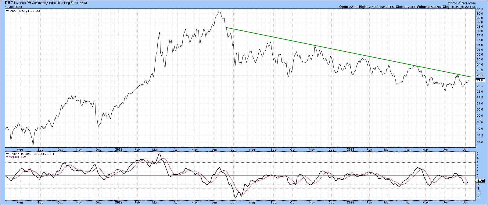
Finally, Chart 8 compares the DB Commodity Fund (DBC) to my diffusion indicator, which monitors a basket of commodities above their 50-day moving average. It looks to be in the process of triggering a short-term buy signal, which, in turn, suggests a challenge of that down trendline. A decisive close that can hold above the previous short-term high at $23.60 would probably be sufficient to reinforce the tentative buy signals being transmitted by the other charts. Until then, a watch-and-see policy is appropriate.
Good luck and good charting,
Martin J. Pring
The views expressed in this article are those of the author and do not necessarily reflect the position or opinion of Pring Turner Capital Groupof Walnut Creek or its affiliates.


