Is this a Normal Correction? Or Could It Be the Start of Something Much Bigger?
The recent rise in interest rates and energy prices is certainly a cause for concern should these trends extend in any meaningful way over the next few months. After all, we are just about to enter September, which is seasonally the worst month of the year for stocks. Following that, there is the crisis-prone month of October. It is also true that many indicators remain in overbought territory and AAII numbers are heavily skewed to the bulls, so it's not difficult from a contrarian aspect to adopt a bearish stance.
This correction probably has further to go, but, until proven otherwise, this is still a bull market. The late great Richard Russell used to remind us that surprises come in the direction of the main trend, which, if our bull market scenario pans out, means the correction could well be over when we least expect it.
The Main Trend
Chart 1 sets the scene with the Coppock Curve. With one exception in 2022, this indicator has signaled all the bull markets since 1980 and remains at a relatively subdued reading. More to the point, it is showing no signs of a downside reversal. The S&P is also well above its 12-month MA, so no sign of trouble there either.
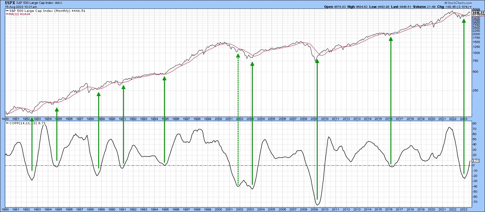
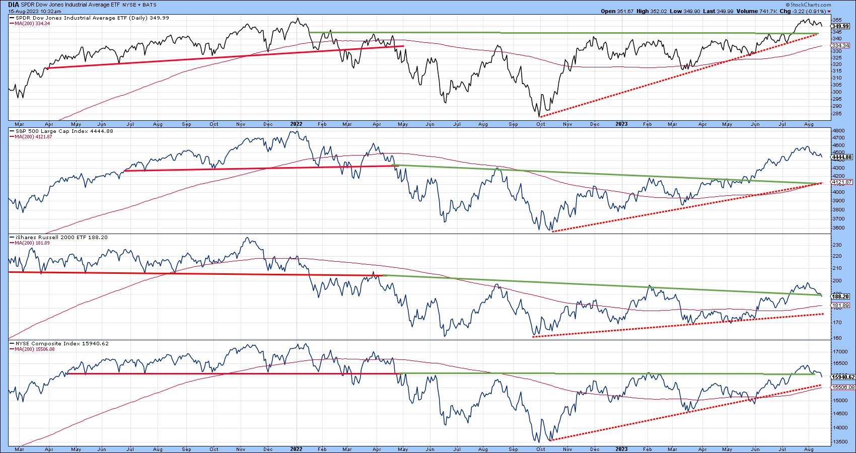
Chart 2 features the Dow, Russell 2000, and the S&P and NYSE Composites. All are experiencing a series of rising peaks and troughs and are comfortably above their 200-day moving averages. One thing to watch out for is the fact that the Russell and NYSE Composite are very close to their extended breakout trendlines. If those are violated, that could well trigger a test of their moving averages and dashed red bull market trendlines.
This Time It's Different
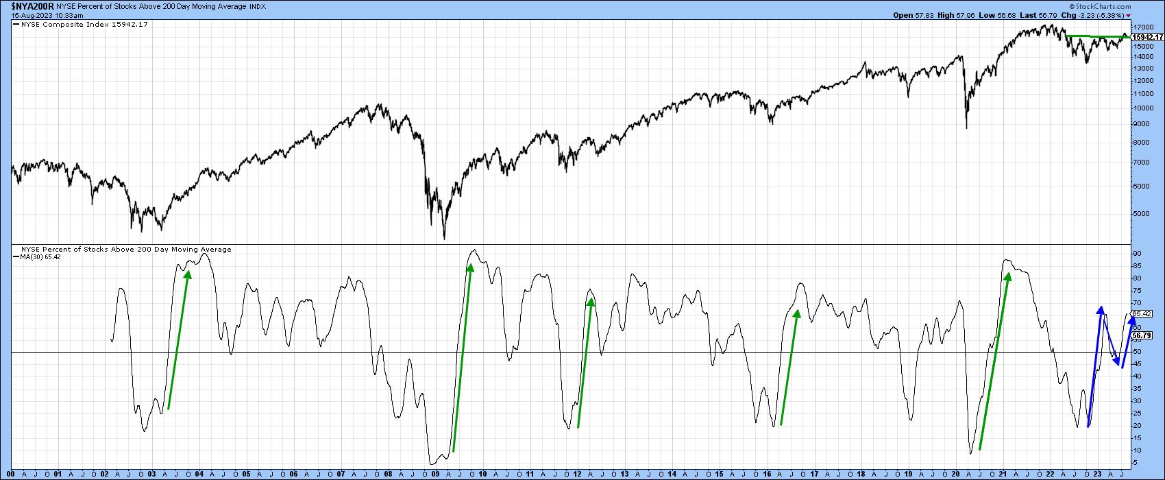
That said, there is no doubt that this bull market is acting in a different way than most others preceding it. We can see this in Chart 3, featuring the percentage of NYSE stocks trading above their 200-day moving averages. The green arrows flag the rally off the previous five bear and mini-bear markets. Note how they were literally straight-line affairs, initially peaking at an extended level. Now consider the rally off last October's low. Rather than being a straight line, this advance took the form of an upward zig-zag. This was a positive move, but had nowhere near the power of its predecessors.
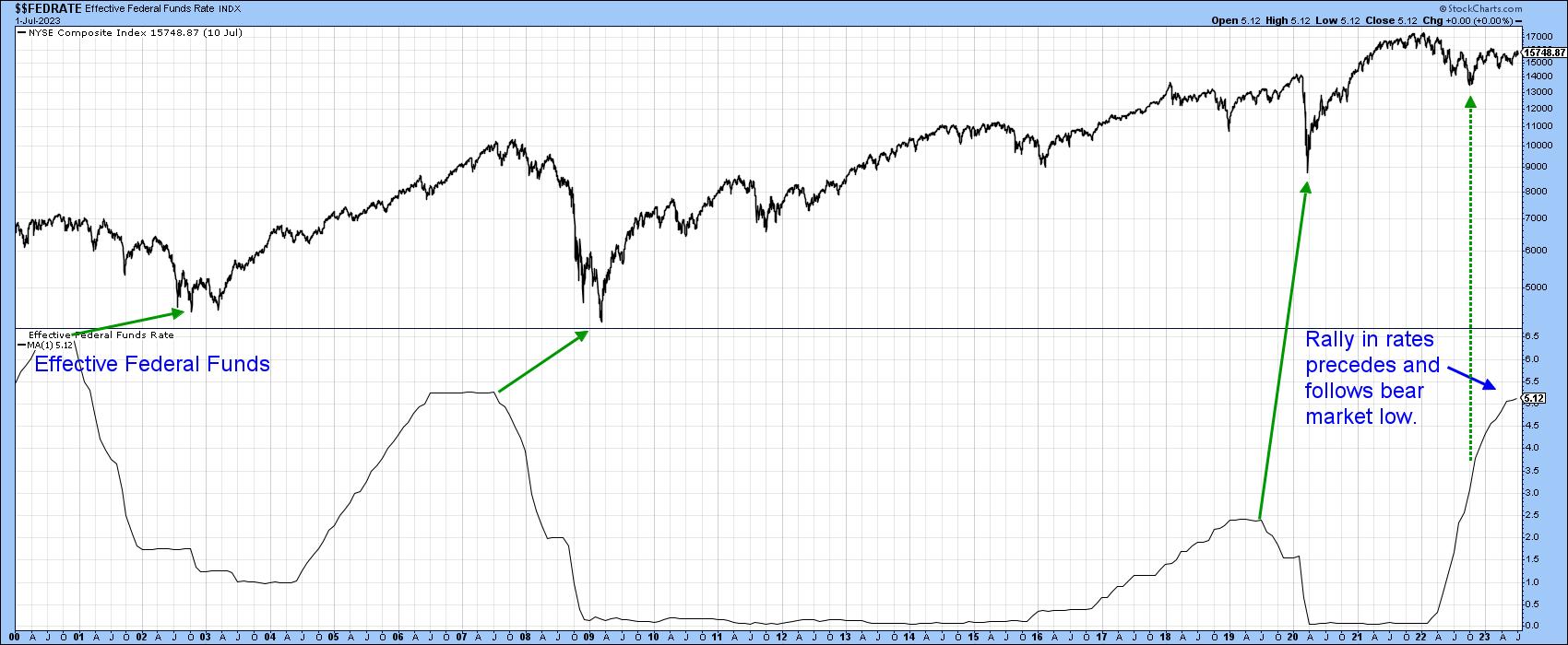
The reason probably lies in the fact that the three bear markets that were associated with recessions -- 2000-2002, 2007-2009, and 2020 -- were all preceded by a sharp and protracted decline in interest rates. In that respect, Chart 4 tells us what we already know, that last October's bottom was not only preceded by higher rates, but is being followed by them as well. For more on this potential headwind, you might want to read thisarticle. The point I am trying to make is the current trend is bullish for equities, but we should expect less in terms of duration, magnitude, or both for the 2022-?? cycle than previous ones. It's important to remember that the lower rates reflect a weak economy, where corporate breakevens are significantly lowered. Consequently, when the economy begins to recover, increased revenues go directly to the bottom line, and an explosive stock market follows. In the current situation, the unrelenting rise in short-term rates is likely to constrain the primary bull market.
The Correction
The indicators I rely on are still flashing corrective vibes. Remember, this can take the form of a trading range as well as a decline, so it's possible that the support for the Russell and NYSE Composite in Chart 2 could still hold as part of an ongoing sideways retracement move.
One short-term indicator that has reliably signaled the termination of a correction in a bull market is the silver cross. Chart 5, for instance, features an indicator calculated from the percentage of DJIA components with a positive silver cross (20-day above 50-day MA). It has started to roll over from an overbought level. Previous sell signals have been flagged with red arrows. Most were followed by a short-term correction of some type, especially those that were triggered under the context of a bear market. It is obviously closer to a sell than buy signal.
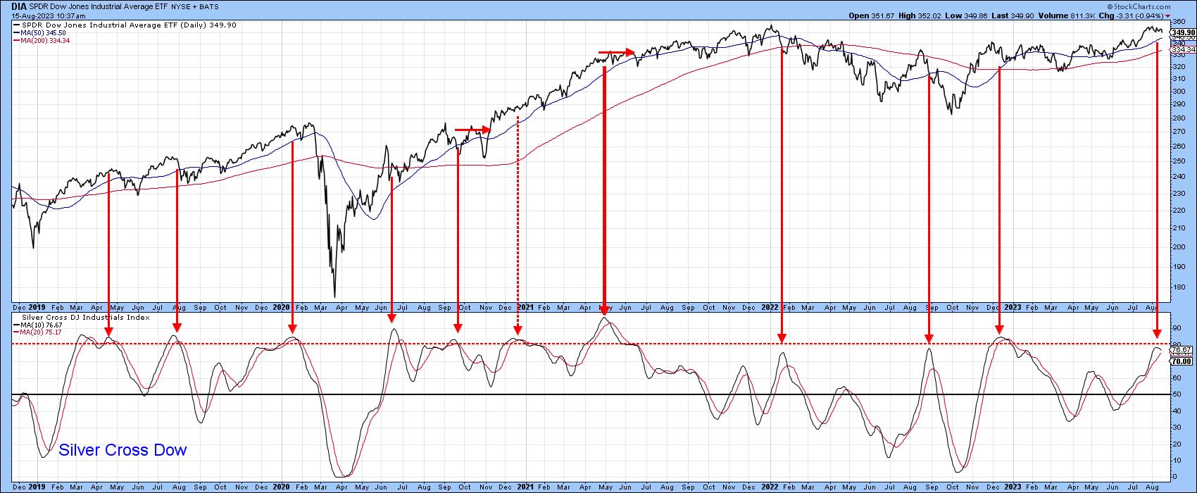
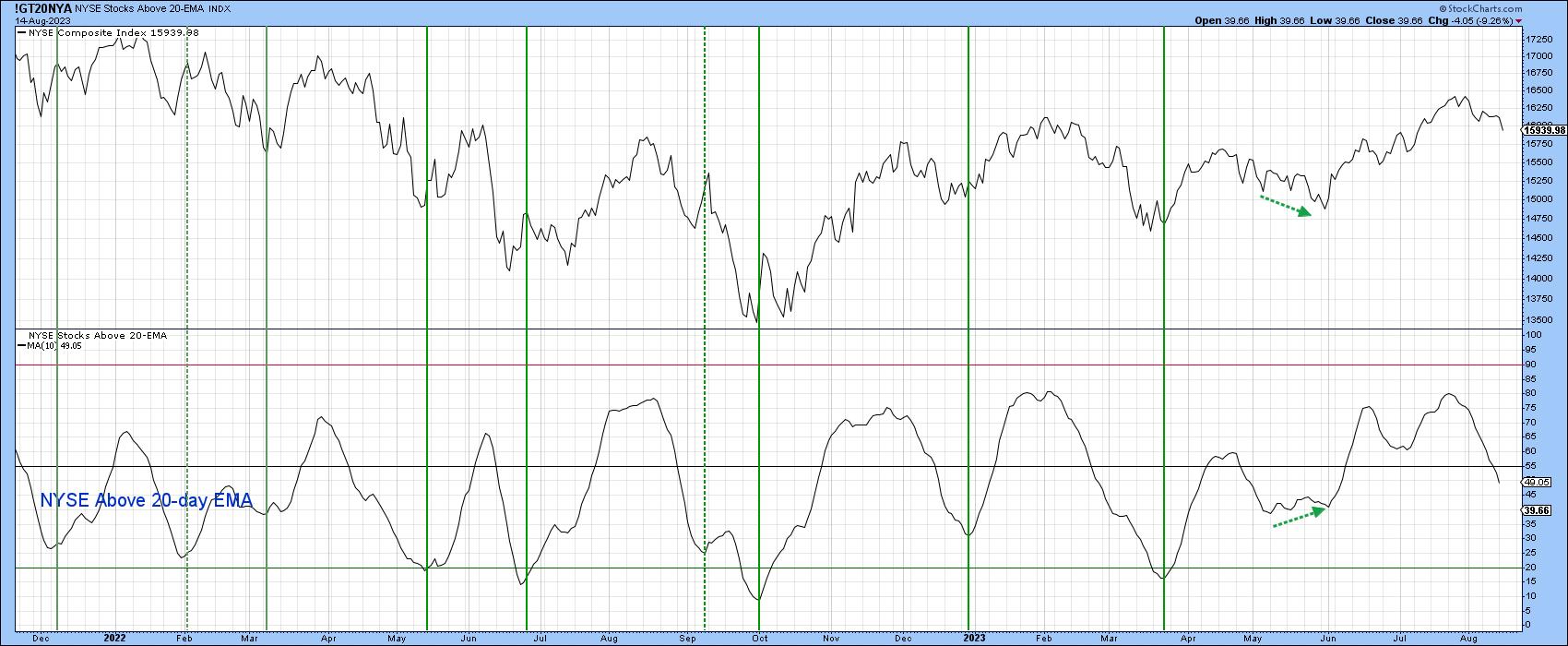
Chart 6 features the percentage of NYSE stocks above their 20-day EMA. This indicator has been bearish for some time and is now at a neutral level; no sign of a buy signal here.
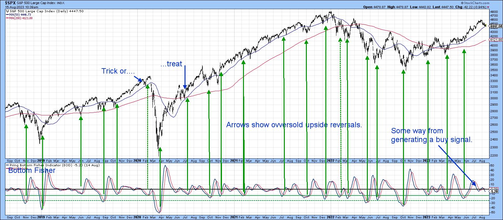
The indicator that I am following most closely, though, is my Bottom Fisher (!PRBFISH), which you can read about here. This series is valued for its ability to "fish" for bottoms more than anything else. It triggers buy signals and earns a green arrow when it drops to one of the green horizontal oversold lines, and then reverses to the upside. Generally speaking, the lower the level at which the reversal takes place, the stronger the signal. Clearly the "fisher" is some way from generating a signal, which suggests the August correction has further to run.
Remember, you can update any of these charts by clicking on them. You can even save them in a ChartList or as a ChartStyle.
Good luck and good charting,
Martin J. Pring
The views expressed in this article are those of the author and do not necessarily reflect the position or opinion of Pring Turner Capital Groupof Walnut Creek or its affiliates.


