Positive Confidence Ratios Argue for Higher Stocks
KEY TAKEAWAYS
- Comparing risky asskets with more conservative ones can reflect investor confidence
- Negative divergences offer subtle indications of a deterioration of a stock market rally
- An upward trend indicates that investor confidence is positive
Traders and investors pay a lot of attention to surveys to assess swings in sentiment, but watching what people do with their money can often be just as informative, if not more so. The idea is to compare the performance of a risky asset with a more conservative one. When the risk-on part of the equation outperforms its risk-off counterpart, it reflects confidence in the economy and vice versa. Higher equity prices usually follow.
These relationships are also subject to negative and positive divergences. For example, if a new high is achieved by the S&P 500 index ($SPX) and it remains unconfirmed by the ratio, a subtle indication is given that the quality of the rally is deteriorating. Positive divergences, while less common, have a similar but opposite effect.
Examples of Divergences
A couple of examples of negative divergences in action are shown in Chart 1, comparing the S&P 500 to a ratio between the riskier Fidelity Capital and Income fund (FAGIX) to the more defensive Vanguard Long-Term Treasury fund (USMF). The first example developed in 2020, when the ratio peaked ahead of the S&P 500. The second developed throughout 2021 and took longer to evolve. It was eventually confirmed by a break in the 2020–2022 up trendline early in 2023. It's currently taking on a bullish flavor, having already reached a post-2020 high ahead of the index. That action doesn't guarantee that stocks will also achieve a new high, but it's more positive than the emergence of a third negative divergence.
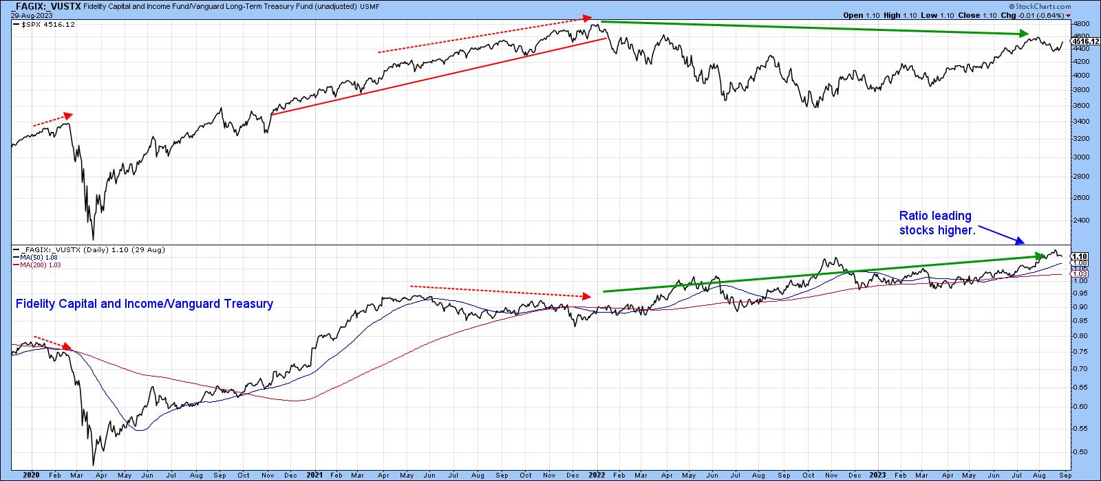
CHART 1: S&P 500 COMPARED TO A RATIO OF FAGIX TO USMF. It's taking a bullish flavor with the ratio leading stocks higher.
Chart source: StockCharts.com. For educational purposes.
The green shadings in Chart 2 use the benefit of hindsight to establish uptrends for the ratio. Looking at the S&P 500's performance during these periods, it's evident that a rising ratio is bullish for stocks. The chart also shows it broke out from a huge base in 2022 and has been zig-zagging its way higher ever since. The blue arrows underpin the fact that the 200-week moving average (MA) has been a formidable support and resistance point. That characteristic enhances the significance of actual crossovers. The index is comfortably above the average at present.
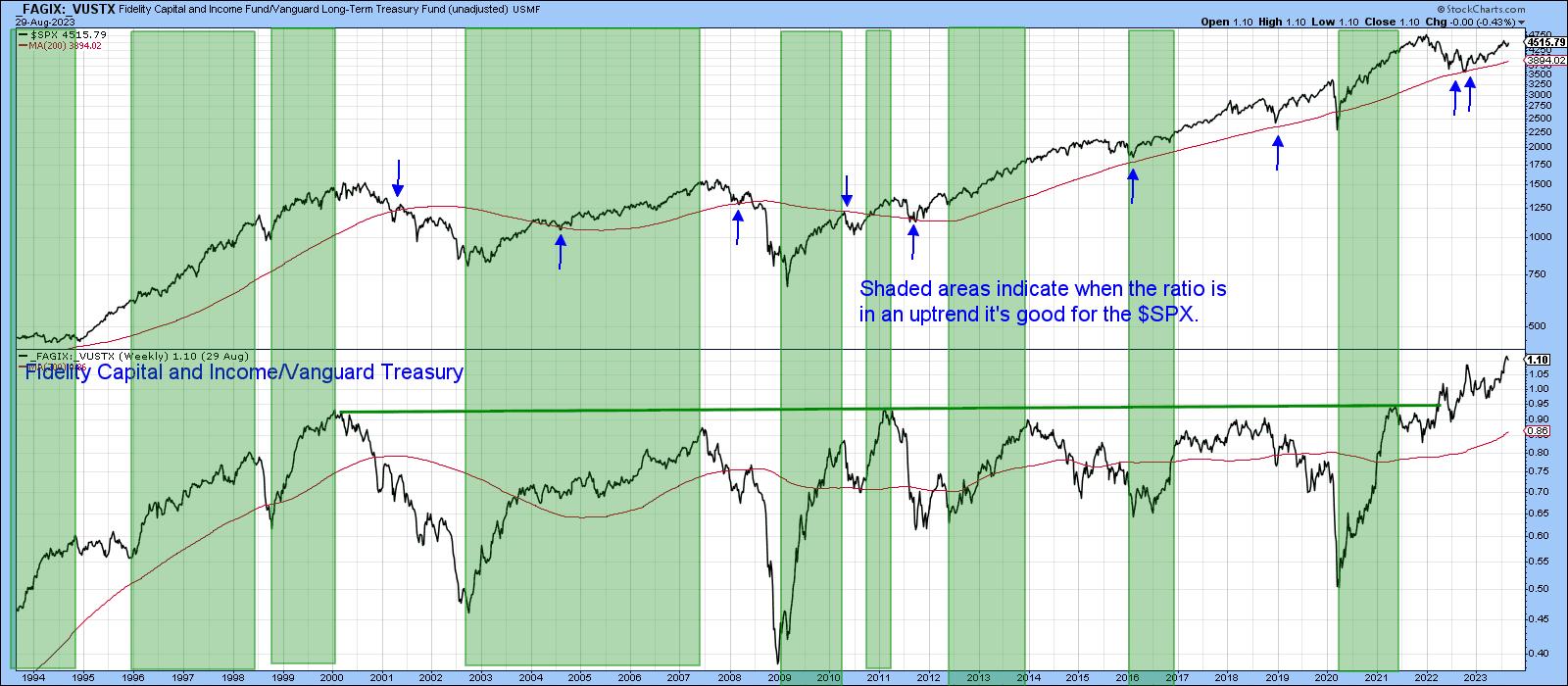
CHART 2: S&P 500 BROKE OUT OF A BASE IN 2022 AND HAS BEEN ZIGZAGGING SINCE THEN. The index has been trending higher, bouncing off its 200-week moving average.
Chart source: StockCharts.com. For educational purposes.
The iShares iBoxx High Yield Corporate Bond ETF (HYG) to the iShares 7-10-year Treasury ETF (IEF) also gives us a feeling for sentiment among bond traders. A huge negative divergence built up between 2019 and 2020, which was eventually confirmed by a trendline break in the index. The process was then repeated with a 2022 up-trendline confirmation, similar to that between the Fidelity and Vanguard funds in Chart 1. At the beginning of the current bull market, the HYG/IEF relationship experienced a positive divergence, whereby the ratio failed to confirm the new S&P 500 low. Now, the message is bullish because the ratio has broken to the upside and reached a post-2020 high.
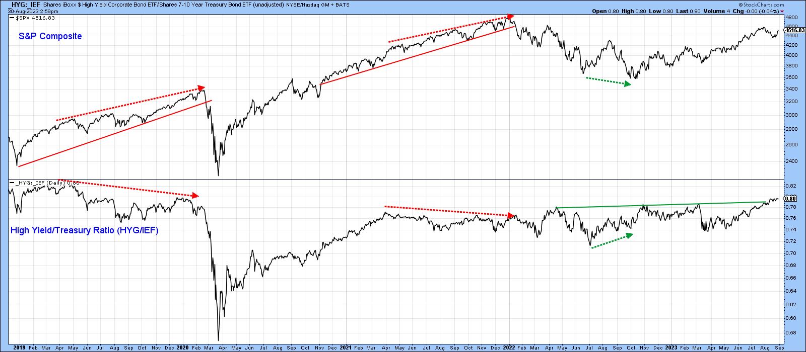
Chart 3: S&P 500 COMPARED TO THE HYG TO IEF RATIO. The ratio has broken to the upside as the S&P 500 moves higher.
Chart source: StockCharts.com. For educational purposes.
This breakout is shown in greater detail in Chart 4, confirmed by a bullish intermediate Know Sure Thing (KST). The long-term series has started to edge up but remains slightly below its exponential MA. Nevertheless, if the breakout turns out to be valid, it will likely have sufficient power to tip the finely balanced KST into a bullish mode as well.
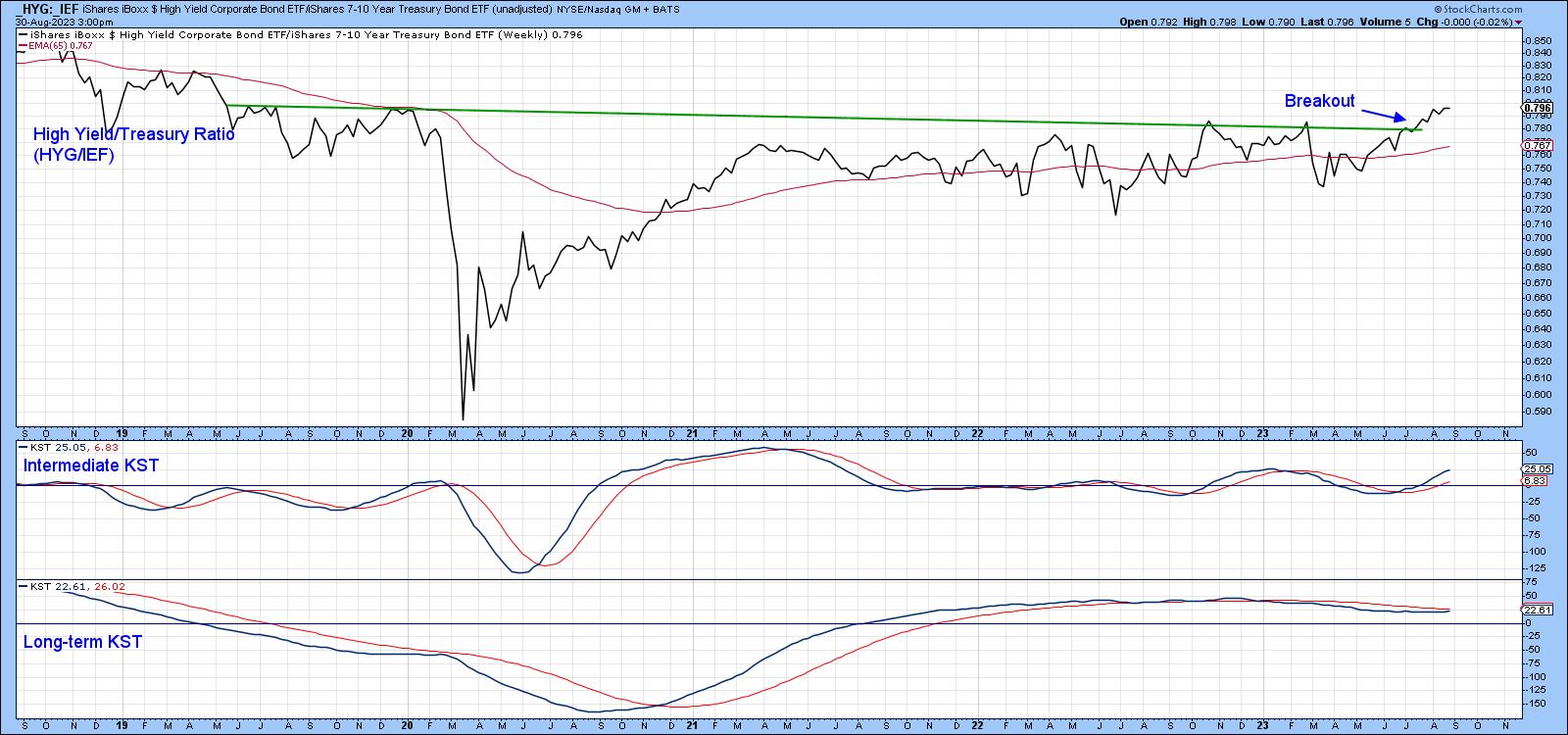
CHART 4: ADDING THE KST INDICATOR. The intermediate KST shows a bullish signal, and the long-term KST is starting to edge higher.
Chart source: StockCharts.com. For educational purposes.
Another method that helps us to gauge swings in confidence is to compare a defensive stock market sector to the price of an even more defensive bond ETF, a.k.a. the Consumer Staples Select Sector SPDR (XLP) to the iShares 20-year+ Treasury Fund (TLT). Using the benefit of hindsight, the green-shaded areas on Chart 5 show periods where the ratio has been in a rising trend. For the most part, such an environment has been positive for stock prices.
That said, there was one instance when Consumer Staples outperformed bonds, but equities sank. That period is represented by the gray shading. The chart shows that, in almost all cases, positive green shading was accompanied by the S&P 500 trading above its 12-month MA. During most of the gray-shaded period, it wasn't. Since the ratio is already ahead of equities at a post-2002 high and the S&P 500 index itself is above its 12-month MA, this relationship is in a positive mode, which suggests further equity gains lie ahead.
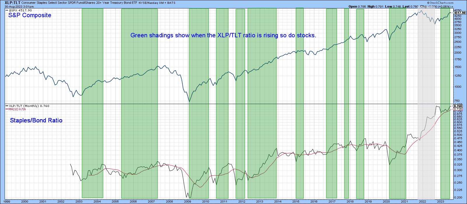
CHART 5: COMPARING S&P 500 TO XLP: TLT. This relationship is also in a positive mode, which suggests there could be more equity gains.
Chart source: StockCharts.com. For educational purposes.
Our final relationship takes us abroad. Chart 6 compares the Dow Jones Global Index ($DJW) to the iShares International High Yield Bond ETF (HYXU) to Barclays International Treasury Bond ETF (BWX) ratio. It's the international equivalent of the HYG/TLT ratio. The pink shadings tell us that when the ratio's long-term KST is below its nine-month MA, it's generally bearish for equities. By the same token, the unshaded areas reflect a rising KST and, for the most part, rising stocks. This relationship is also in a positive mode. You can see how it broke out from a multi-year basing pattern at the beginning of the year and is leading the $DJW higher. The chart also shows three negative divergences, each followed by a trendline break and a subsequent decline. No such discrepancy exists today.
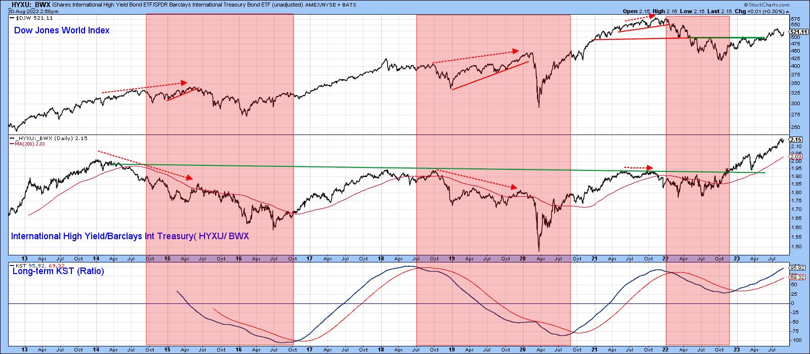
CHART 6: RELATIONSHIP BETWEEN DOW JONES WORLD INDEX AND XYXU:BWX. There were three negative divergences but as of now, the relationship is in a positive mode.
Chart source: StockCharts.com. For educational purposes.
Final Thoughts
These relationships show that traders in stock and bond markets are in a confident mode and are not currently smelling sustained economic weakness. That doesn't guarantee higher equity prices, but it's much more encouraging than if these relationships were deteriorating.
Good luck and good charting,
Martin J. Pring
The views expressed in this article are those of the author and do not necessarily reflect the position or opinion of Pring Turner Capital Groupof Walnut Creek or its affiliates.


