This Sector Looks Really Sick Long-Term
The overall market has been rallying since registering its low last October. However, there is one sector which, in August, fell below its October low on a monthly closing basis. More serious is the fact that it recently violated a 23-year secular up trendline. Can you guess which sector I am referring to?
Secular Trend
The answer is utilities, or, more specifically, the Dow Jones Utility Average. Chart 1 features this index on a quarterly basis back to the 1940s. By way of emphasizing the long-term significance of such trendline penetrations, the 1966 trendline break was followed by a massive selloff and multi-decade consolidation. It was not until 1985, 20 years later, that the 1965 peak was surpassed in any meaningful way. One thing to note is the violation of the line is not quite official yet, as there are still a couple of weeks trading until the end of September, which marks the quarterly close. Even so, there are other reasons as to why a confirmed penetration is likely to materialize.
First, the quarterly Coppock Curve in the bottom window went bearish in July. The vertical red lines approximate previous such sell signals. Most, as represented by the solid ones, have been followed by weakness in the utility average.
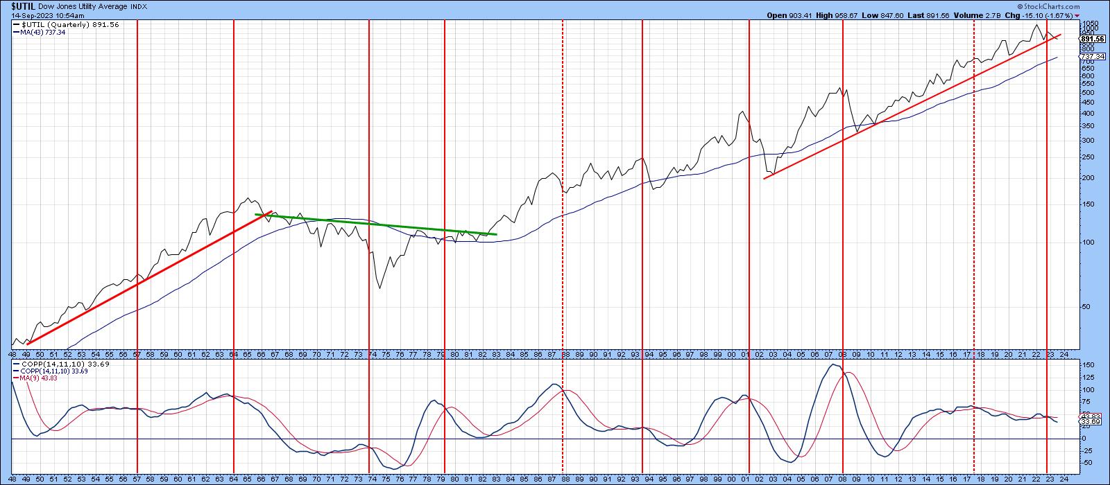
Chart 2 displays the same indicators, but this time on a monthly basis. The green arrows show when the Coppock Curve turns up from a below zero position. The indicator is currently below equilibrium, but is still constrained in its downward trajectory. It therefore remains in a bearish mode. The chart also tells us the secular up trendline has already been decisively violated. There are several ways in which the line could have been constructed, but I chose one of the more conservative possibilities. In any event, recent action has seen a violation of that red 48-month MA.
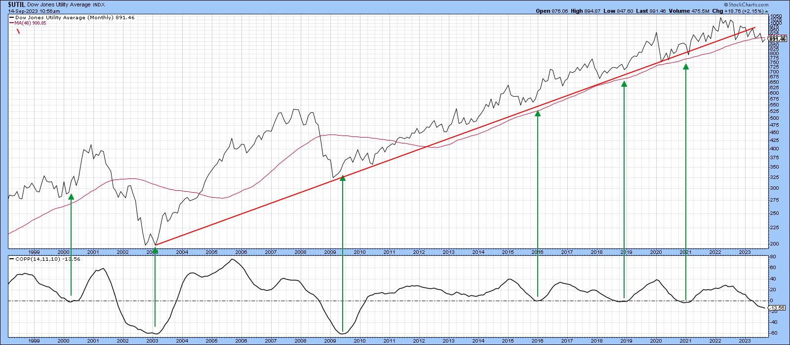
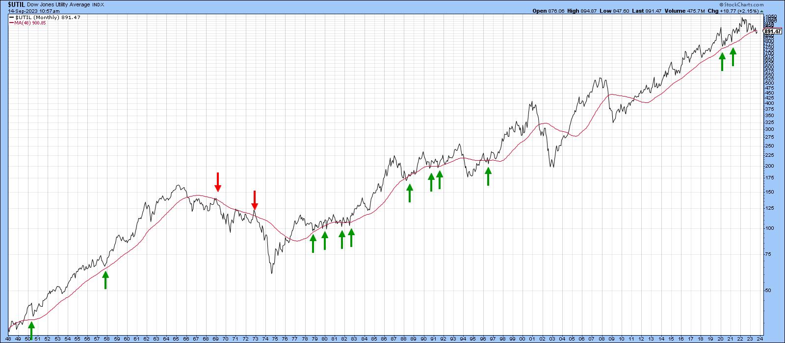
Chart 3 takes this moving average back to the 1940s, where the red and green arrows point up situations where it successfully turned back challenges from both the upside and downside. Allowing for slight whipsaws, this average has acted as a very important dynamic level of support or resistance in the 80 years covered by the chart. Bottom line: when a decisive penetration does take place, it usually signals a reliable change in the major trend.
Primary Trend
Chart 4 shows a PPO using the 6- and 15-month parameters, which I find to be quite helpful for many markets. In this respect, the pink shading highlights periods when the oscillator is below zero. It was uncharacteristically late in signaling the two post 2,000 bear markets. However, to its credit, it has until recently remained in a positive mode for the last 12 years. The latest September data indicates a very marginal negative crossover, but a more decisive one is required to come to a bearish conclusion concerning this piece of technical evidence. It seems likely that this will happen, since the Index itself has just completed a massive top. This price pattern could be interpreted as a symmetrical triangle or a complex head and shoulders. It really does not matter what you call it; this formation reflects a battle between buyers and sellers, and the sellers clearly won. Also worthy of note is the fact that the series of declining peaks and troughs is still in force. There was one hopeful example of a rising trough in February, but the declining peaks remained intact throughout the whole period.
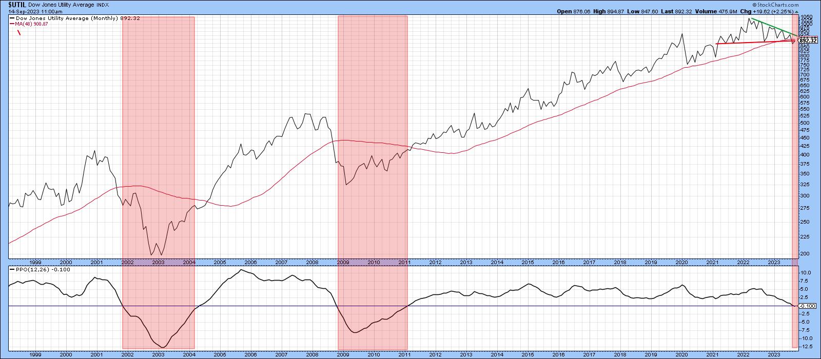
Chart 5 features this price action on a weekly basis for the SPDR Utility Fund (XLU). In the last few trading sessions, the XLU has rallied back to the extended breakdown trendline, throwing up the possibility that the top may not work. If that is the case, we would need to see a decisive Friday close that can hold above the $68 level. That's where the green trendline joining the three right shoulder peaks is residing.
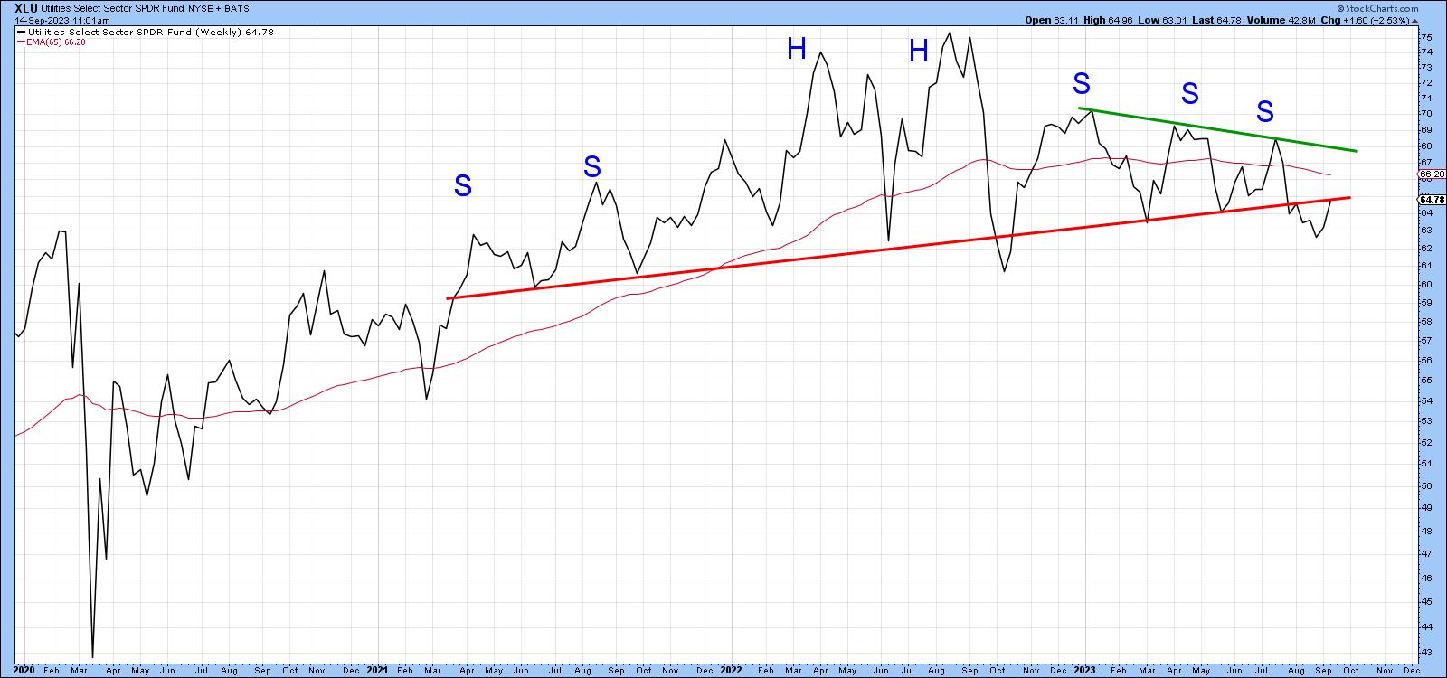
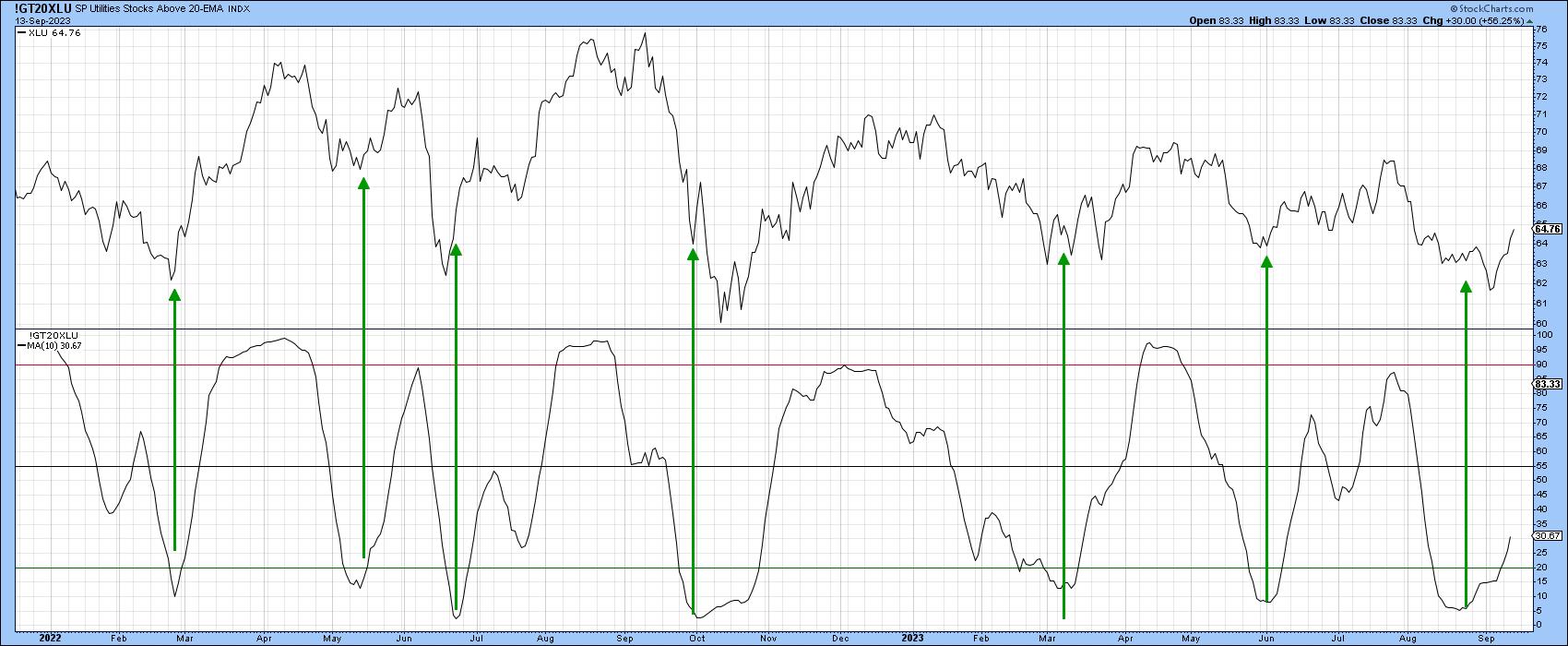
Chart 6 suggests this is a definite possibility because the percentage of XLU components above their 20-day EMA is in a positive mode. The arrows show that upward reversals in this indicator have been fairly consistent in calling a rally.
Conclusion
Whilst the short-term technical picture leaves room for hope, it seems more likely that the negative vibes being transmitted from the longer-term indicators are more likely to prevail in the end.
Good luck and good charting,
Martin J. Pring
The views expressed in this article are those of the author and do not necessarily reflect the position or opinion of Pring Turner Capital Groupof Walnut Creek or its affiliates.


