This Stock Market Looks Horrible... But...
Chart 1 shows that the S&P Composite, like both A/D Lines, has completed and decisively broken down from a head-and-shoulders top. The two breadth indicators have also violated their bull market up trendlines. On the surface, things look pretty grim, with three seasonally weak September days left to trade and the crisis-prone month of October still to be experienced. What's not to like?
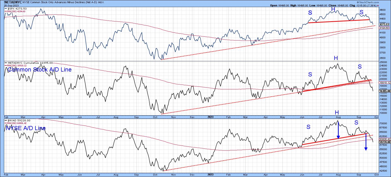
CHART 1. IT'S LOOKING BEARISH. When the S&P 500 ($SPX) and two Advance-Decline Lines have broken their bull market trendlines, should you start getting nervous or look for buying opportunities?
Chart source: StockCharts.com. For educational purposes.
It's Still a Bull Market
Chart 2 offers some long-term perspective, as it plots the long-term KST for the dividend yield on the S&P Composite. The arrows flag peaks in this momentum indicator.
There are two points worth noting. First, this approach has consistently called primary bull markets since the 1950s. The only questionable signal was generated in 2019, just prior to the pandemic. Remember, this chart covers a lot of data, so even the early 2007 signal was followed by nine months or so of a rising market. That brings me to the second point, which is that the latest buy signal has only just been given. There is nothing to stop it from reversing in the immediate future, but it seems unlikely when its 70-year history is considered.
In other words, it's still a bull market.
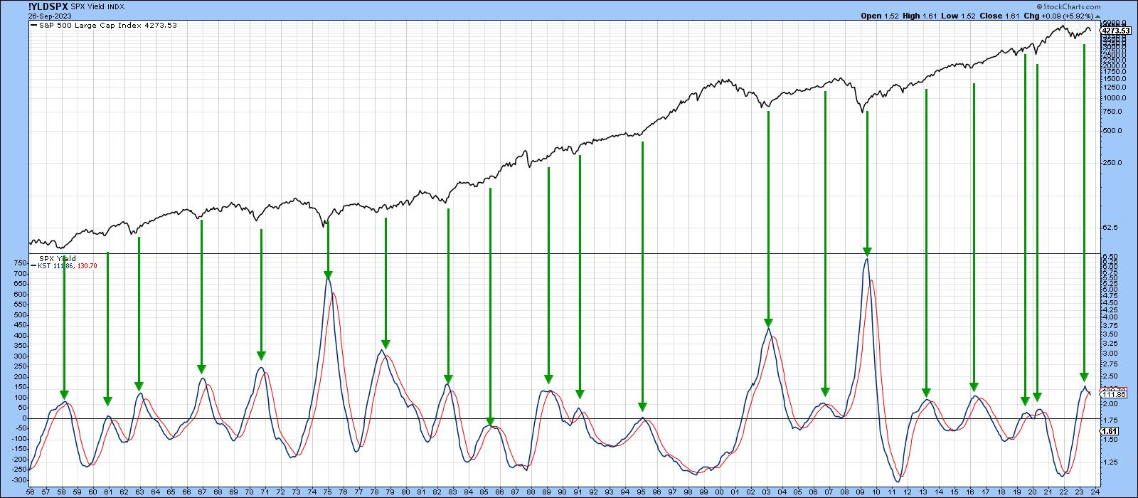
CHART 2. THE LONG-TERM KST INDICATOR SHOWS THAT THE MOST RECENT BUY SIGNAL IS STILL IN PLAY.
Chart source: StockCharts.com. For educational purposes.
Chart 3 also paints a bullish picture. In this instance, it is a long-term KST of the ratio between the NYA and the CRB Composite (stocks vs. commodities). Sub-zero upside reversals in this interasset relationship have consistently generated profitable buy signals. Commodities have been rising lately, but the positive KST says that stocks can deal with it. I substituted the NYA for the S&P because it is very close to its 12-month moving average (MA), thereby reminding us that, although most of the primary trend indicators are bullish, we should certainly not be complacent about the possibility of a reversal.
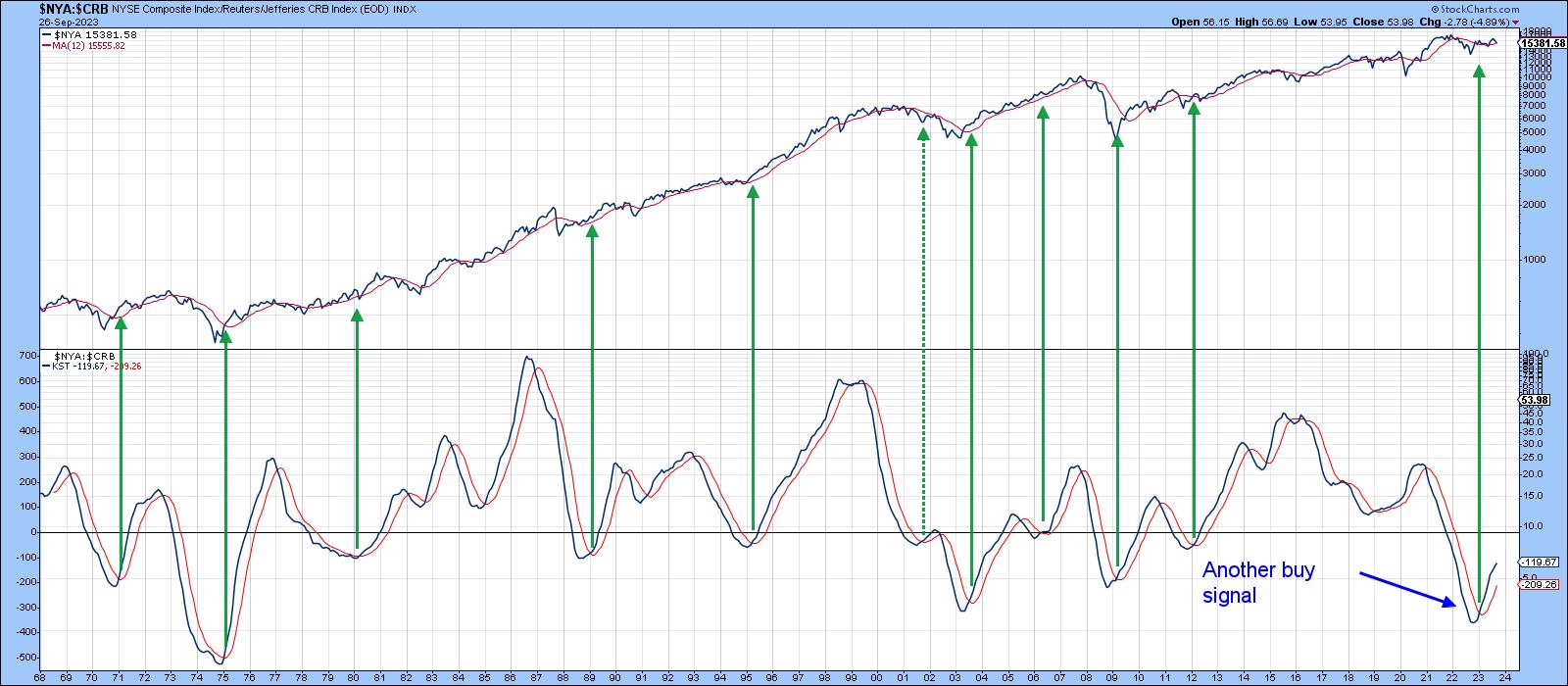
CHART 3: $NYA:$CRB AND KST. This is another bullish picture for this interasset relationship.
Chart source: StockCharts.com. For educational purposes.
Short and Intermediate Indicators Behave Differently in Bull and Bear Markets
Since most of the long-term indicators are positive, it is wise to assume that the uptrend since last October is intact. Generally speaking, when a market is in a primary uptrend, the short-term and intermediate indicators are relatively constrained on the downside and are more prone to false downside breakouts than when the overall trend is negative. In other words, these indicators behave differently in bull and bear markets.
Chart 4 tries to make the point with NYSE high/low data calculated by Dow Jones. Using the benefit of hindsight, the pink shading identifies bear markets, leaving the unshaded areas to represent primary bull trends. There are very few instances when the 15-day high/low MA drops below the green horizontal line during a bull market. During last year's bear market, it dropped below the green line several times. Since then, the indicator has fallen to the line, but has failed to sink below it. That's always a possibility, but at this point, the indicator's behavior is consistent with what we would expect it to be doing in a primary bull market.
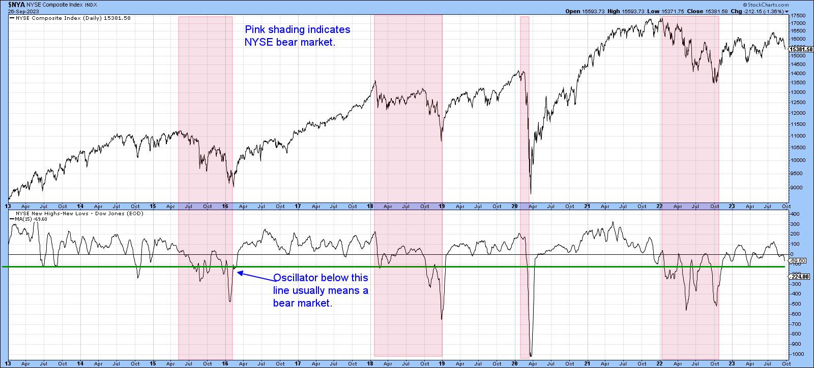
CHART 4. NYSE COMPOSITE AND NYSE NEW HIGHS-NEW LOWS. The unshaded areas represent bear markets, and we're not seeing that right now.
Chart source: StockCharts.com. For educational purposes.
Three Indicators to Watch
Finally, there are three indicators I think are worth watching for a possible reversal, because they have a consistent record of calling rallies in bull markets, and they may be close to an upside reversal.
The CBOE Options Total Put/Call ratio, or its 30-day MA, has just entered a zone of pessimism. This is flagged by the horizontal green line in Chart 5. The arrows show buy signals are generated when sentiment becomes less pessimistic, i.e. when the indicator reverses to the downside. It's still rising, so we cannot call a turn yet, but if this is still a bull market, a reversal is probably not that far away.
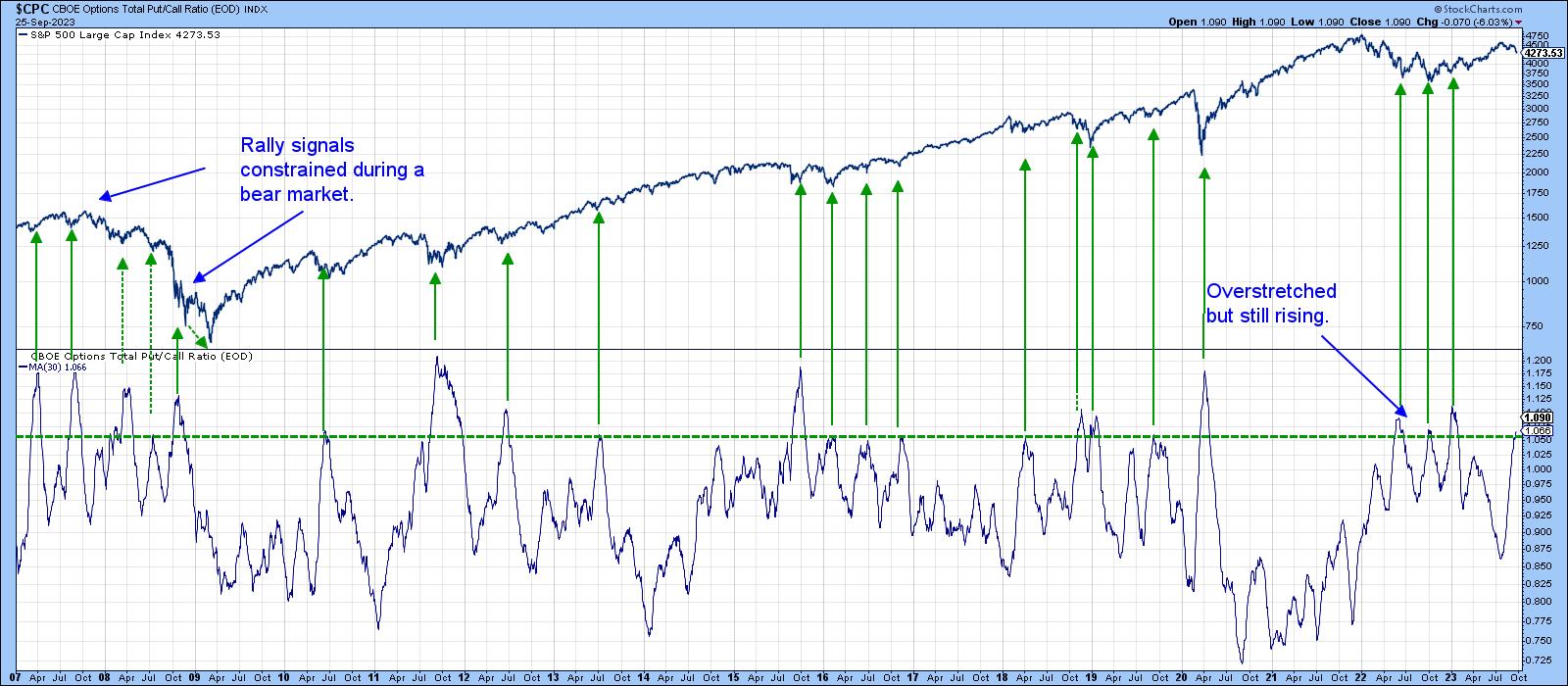
CHART 5. CBOE OPTIONS TOTAL PUT/CALL RATIO. If this is a bull market, expect to see a downside move in this sentiment indicator.
Chart source: StockCharts.com. For educational purposes.
The same comments apply to the 10-day MA of the number of NYSE stocks trading above their 50-day (10-week) MAs. Again, the arrows tell us when this indicator goes bullish by falling to or below the green horizontal line and crossing back above it. This oscillator is still declining and hasn't quite reached the line, but it's not far from a signal provided, as I believe this is still a bull market.
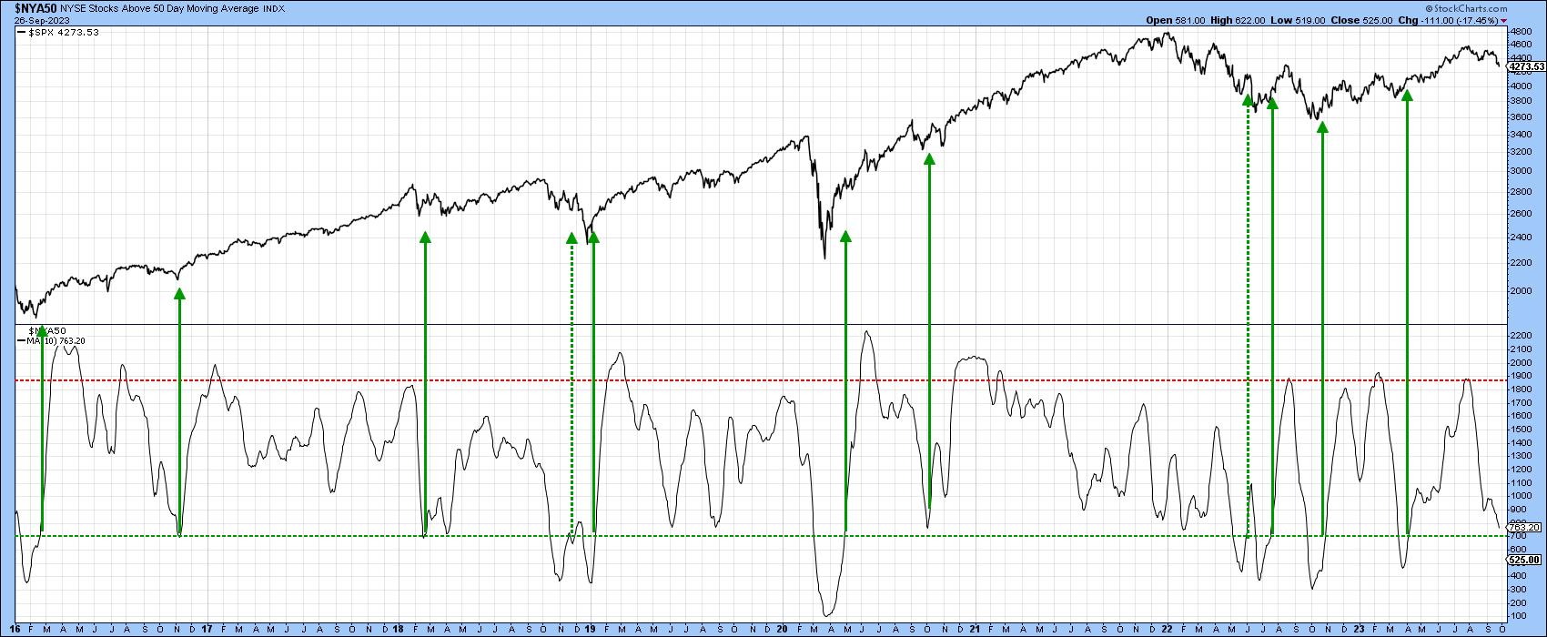
CHART 6. NUMBER OF NYSE STOCKS TRADING ABOVE THEIR 50-DAY MOVING AVERAGE. The indicator might fall to or below the green horizontal line and cross back above it. That would be a bullish indication.
Chart source: StockCharts.com. For educational purposes.
Chart 7 features my Dow Diffusion Indicator, which has just reached its oversold zone. Once again, we need a reversal to generate another bullish green arrow. That hasn't happened yet, but you can see the DJIA itself has now fallen right back to support its extended breakout trendline and the 200-day MA.
Could this be it??
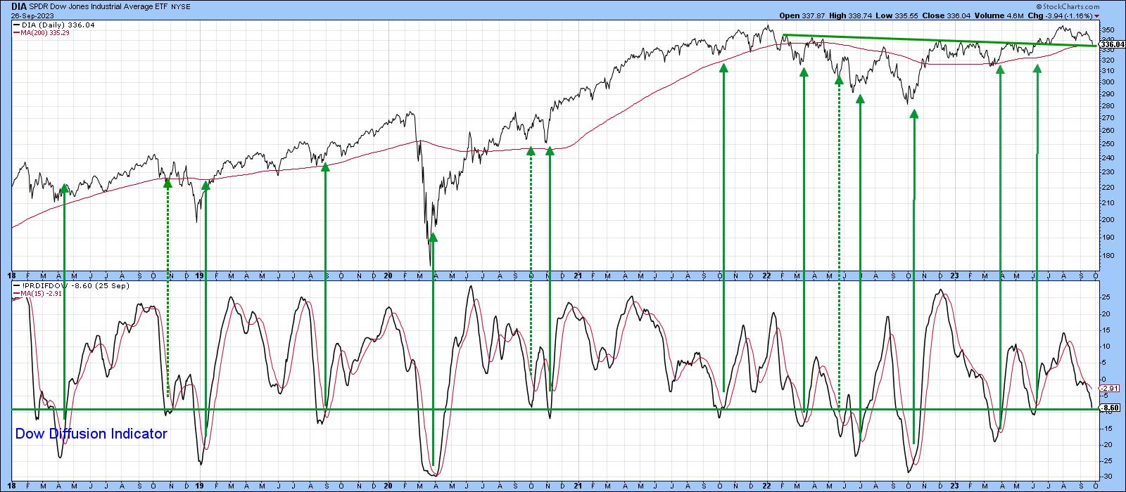
CHART 7. DOW DIFFUSION INDICATOR. An upward reversal from its oversold zone would be a bullish indication.
Chart source: StockCharts.com. For educational purposes.
Good luck and good charting,
Martin J. Pring
The views expressed in this article are those of the author and do not necessarily reflect the position or opinion of Pring Turner Capital Groupof Walnut Creek or its affiliates.


