Some Gold Indicators Approach Critical Chart Points
When Anwar Sadat, President of Egypt was assassinated in 1981, gold rallied sharply over the near-term, but the advance soon petered out. The reason was that gold was in a primary bear market, so the advance merely represented a counter-cyclical move. Gold has rallied sharply since the Middle East crisis broke out, so will this advance also end in tears for the bulls?
Gold Itself is at Important Resistance
The answer is much more important now, because gold is trading slightly below some mega-resistance in the form of the 2011-2023 overhead trendline, as is shown in Chart 1. It is also just above the 2001-2023 secular bull market trendline, which means that something big could be about to happen in either direction.
The green shadings point up periods when the PPO is above zero, thereby reflecting a bull market. Nothing is perfect, so the three small arrows flag the few whipsaws that have developed over the last 40 years or so. This PPO is currently in a positive mode, and the price itself has moved back above its 12-month MA. That does not guarantee an upside breakout, but it certainly increases the odds.
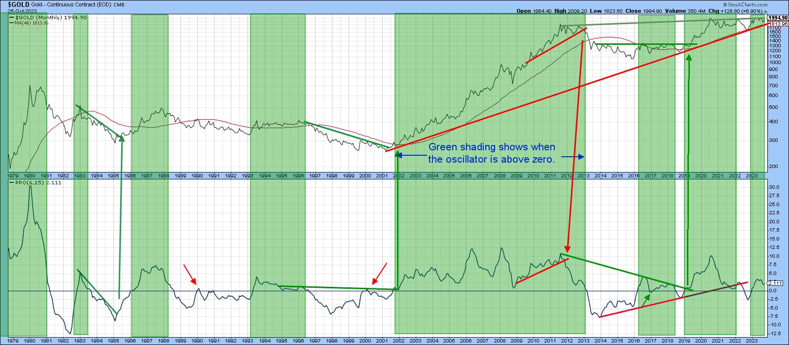
Chart 2 shows an even greater area of resistance when gold is adjusted for inflation. That resistance takes the form of a trendline joining all the peaks since 1980. Note that the chart has not been updated to reflect the recent rally.
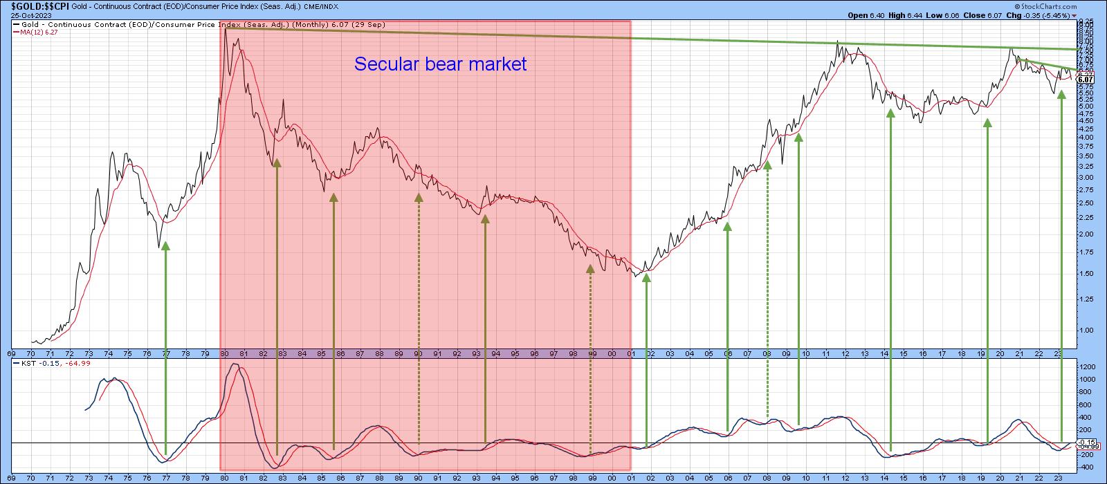
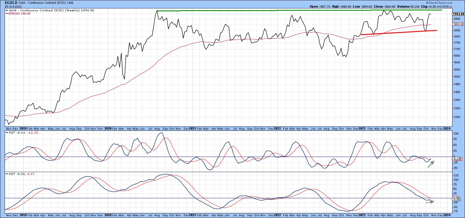
Chart 3 focuses on weekly data, where the overhead resistance in the $2,000 area is obvious. The short- and intermediate-term KSTs have started to turn, but are not what we might call decisively bullish. On the one hand, we could say they are in a subdued mode and therefore able to support a nice rally before becoming overextended. On the other, it's possible that a "Sadat" bear market scenario materializes. In that case, the tentative reversal in these indicators would be brief, as the resistance proved overwhelming, with the price subsequently sinking below the red support line.
The Dollar Headwind
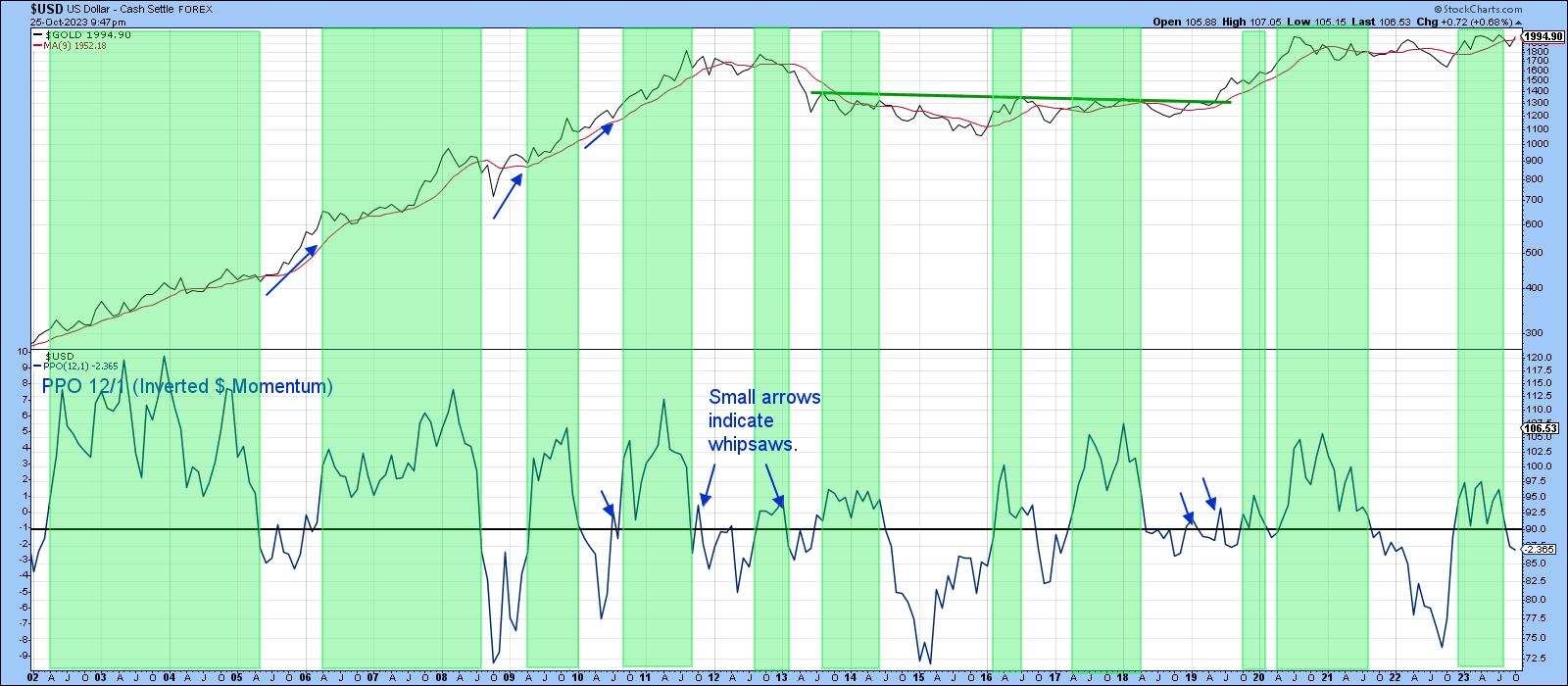
The strong US Dollar Index is supporting the case for a downside breakout. In that respect, Chart 4 compares the gold price with a PPO for the dollar. Since the two tend to move inversely, the PPO has been plotted inversely, so the two series swing in a similar direction. The blue arrows, plotted against the gold price, flag periods when it has rallied in spite of a rising dollar (declining PPO). There are not many instances, as this is the exception rather than the rule. A rising dollar would therefore act as a headwind for additional gains.
On the flip side of that are two factors. The first is that the dollar is short-term overbought and could consolidate for a while, or decline and thereby provide a window of opportunity for gold to break to the upside.
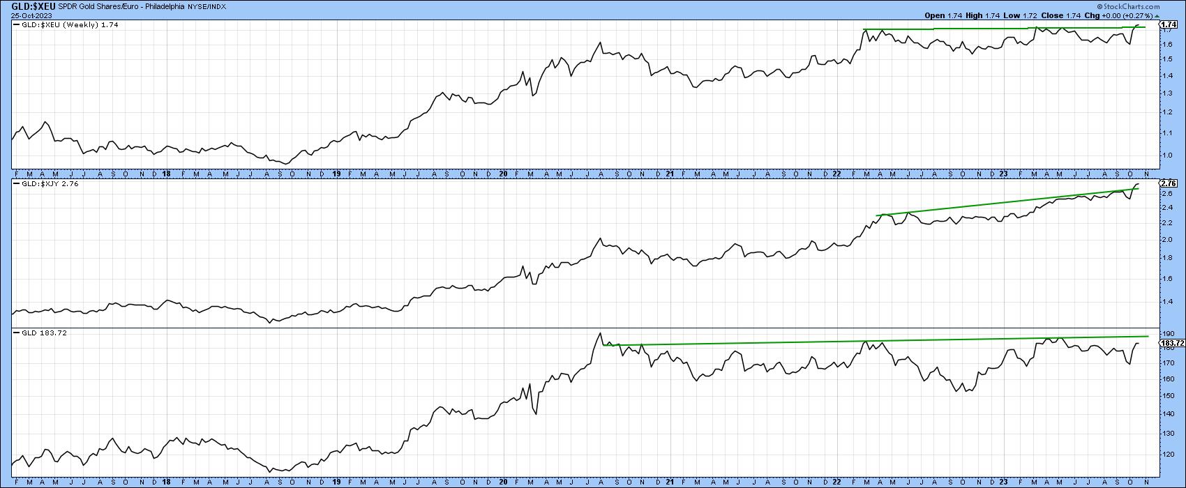
The second is that gold has broken out in both yen and euro terms and is positive in its own right. In that way, currency swings have been acting as the icing on the bullish case.
As we can see, the dollar price of the yellow metal has reached a crucial technical juncture. That's not all, as several gold-related relationships have reached a similar technical spot.
Key Relationships Could be Close to a Breakout Point
The Gold Bugs Index ($HUI) consists of companies that downplay the hedging future production. That means it is a more leveraged way of playing swings in the gold price than the VanEck Gold Miners ETF (GDX). Its relative strength against the gold price is featured in the middle window of Chart 6. The shading represents periods when the Special K of the ratio is above its red signal line. These tend to be strong periods for the GLD, which is featured in the upper window. When trendlines can be drawn for all three series and are jointly violated on the upside, a strong gold rally typically follows. The ratio is currently trading just below its 200-day MA and the Special K is right at its downtrend line and signal line. We have already discussed the fact that gold itself is just below resistance, so this combination could be very close to an upside resolution that will filter down tor the price itself.
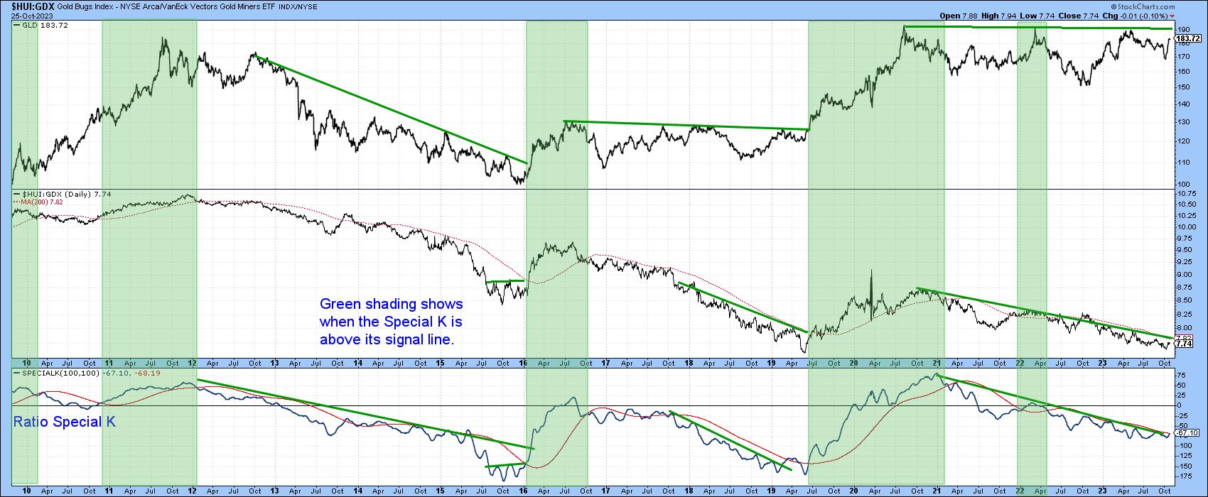
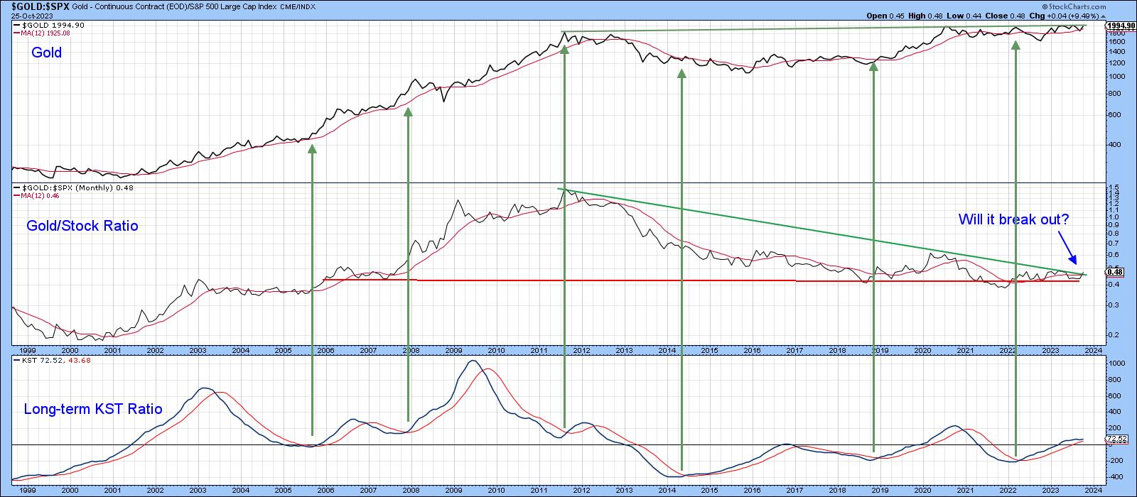
Chart 7 features the Stock/Gold ratio. This series has also been caught between two converging long-term trendlines and has started to break to the upside in favor of gold. In this respect, it is being supported by a bullish long-term KST. A breakout would be significant because a rising ratio is usually, though certainly not always, bullish for gold in its own right and bearish for stocks in theirs.
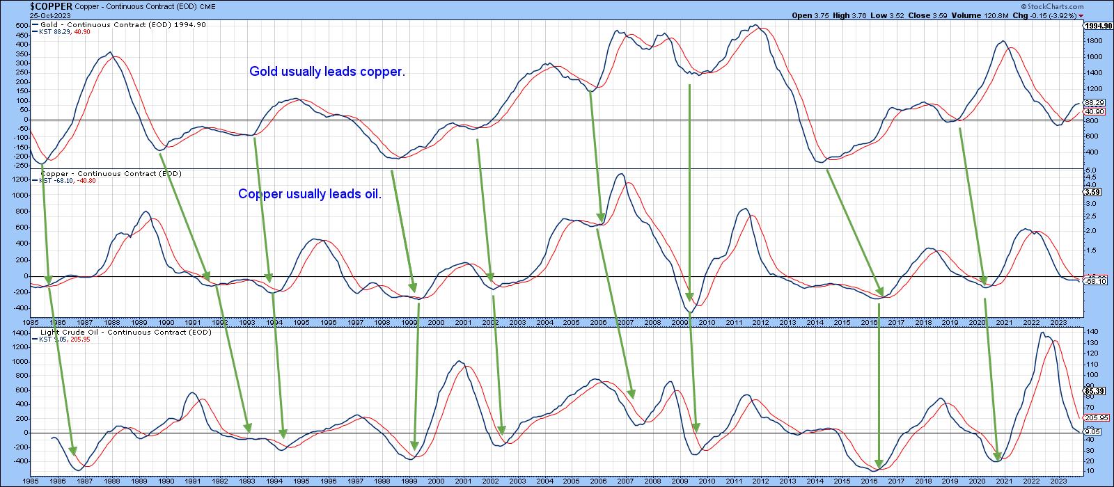
Finally, Chart 8 features the long-term KST for gold, copper, and oil. The arrows tell us that lows in the gold KST typically lead those for the two commodities. Unfortunately, those leads vary. However, should gold break above the resistance trendline in Chart 7, it is very likely that it will be followed by commodity inflation in the usual manner.
Good luck and good charting,
Martin J. Pring
The views expressed in this article are those of the author and do not necessarily reflect the position or opinion of Pring Turner Capital Groupof Walnut Creek or its affiliates.


