Benchmarks that Will Tell Us this Market Has Legs
A couple of weeks ago, I wrote an upbeat article on the market, pointing out the fact that many short- and intermediate-term indicators were in a potentially bullish position at a time when stocks seemed impervious to bad news. I concluded "That does not mean the market will go straight up..... What it does imply, though, is that US equities are in an important buy zone going into a bullish end-of-year seasonal."
I also pointed out that a major problem would arise in the event the S&P dropped below its 12-month MA, at around 4,200, because that would confirm some weak action by the long-term KST. The 12-month span is not perfect, but it does test consistently better than most other primary trend moving averages. I stated that I did not expect such a scenario, given the position of the indicators at the time and the market's apparent resiliency to bad news. I was wrong, because October's selloff resulted in a marginal negative crossover. Since it requires a month-end close for a monthly plot, the Index is still technically below the average, though with a 4,365 Monday close it is back above it.
Obviously, we do not know where the S&P will close until the end of November. However, the position of the indicators is such that a positive re-cross seems very likely. Let's first review some of them, and then see what benchmarks need to be achieved to give us confidence the MA will be regained at the end of November.
Oversold and Bullish Indicators
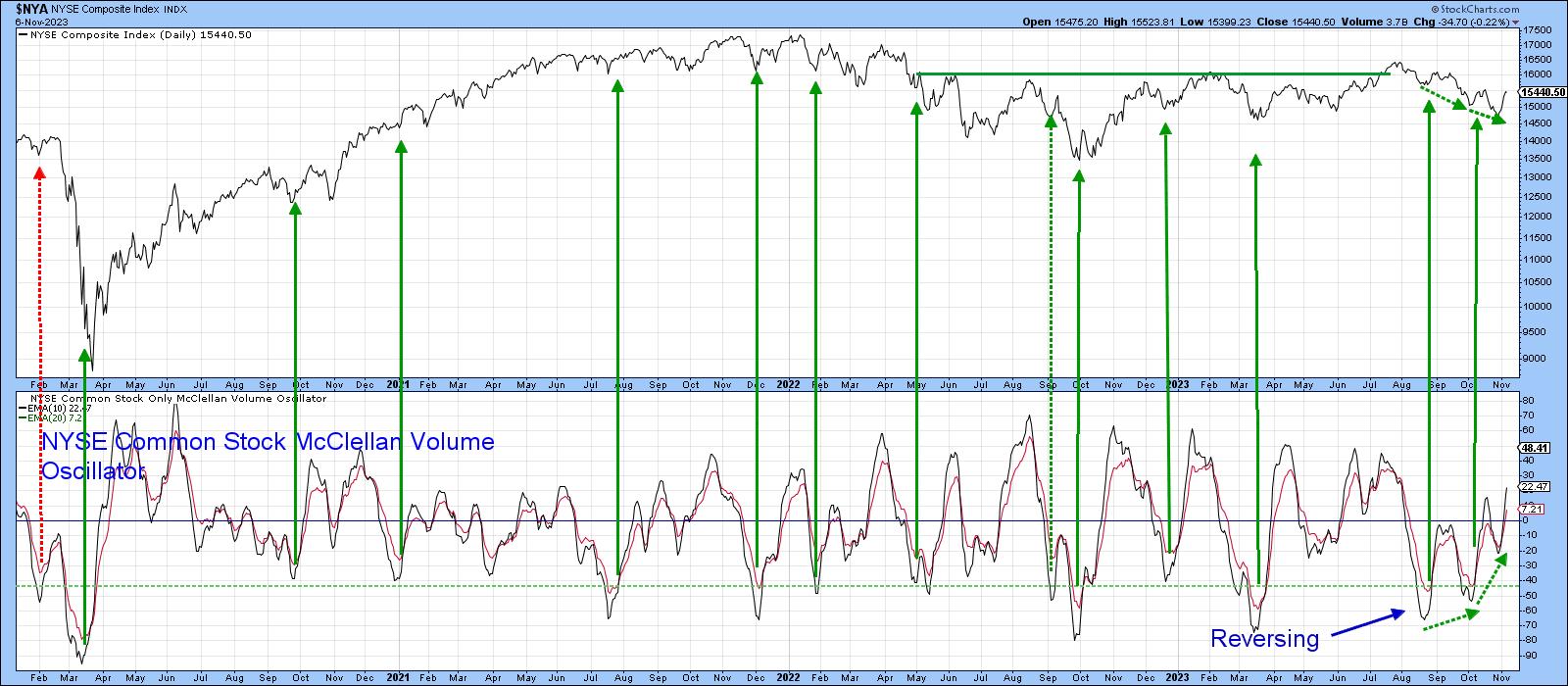
Chart 1 features a 10-day MA of the NYSE Common Stock McClellan Volume Oscillator. The arrows tell us when the indicator reverses to the upside from a position below the horizontal dashed-green oversold line. In the vast majority of situations, a rally lasting more than 4 weeks typically materializes.
The indicator triggered a buy signal in early October, which was followed by a small rally and a marginal new low for the NYSE Composite (NYA) at the end of the month. However, this action enabled the oscillator to set up a second positive divergence with the Index. We need the Index to respond with a trend break of its own, but I will get to that later, except to say that positive divergences are rare for this series, so two potential divergences are far more scarce.
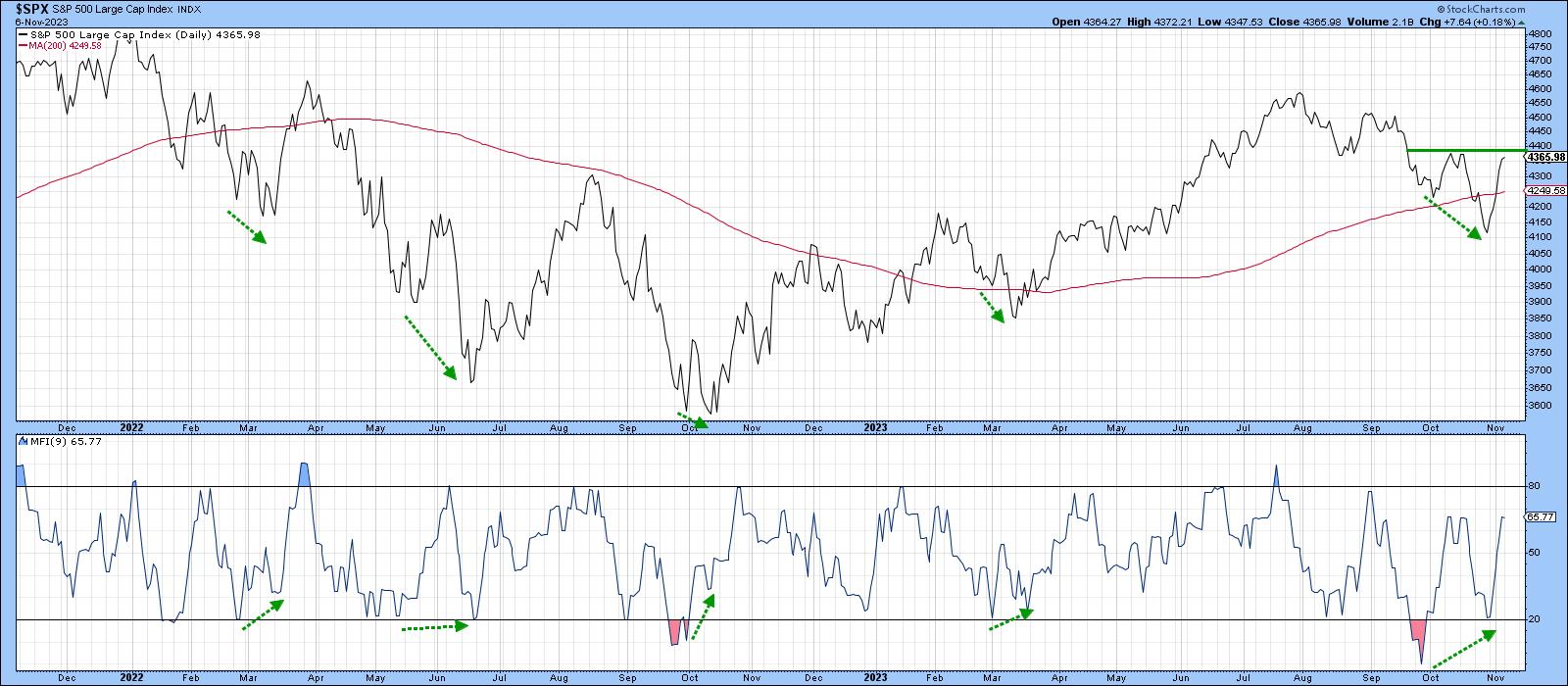
The 9-day Money Flow Indicator (MFI) has also diverged positively with the Index, having bounced sharply in the last few days. Previous examples have been flagged with green dashed arrows. All were followed by a short-term rally, greater in size than we have seen so far from the one, which in itself suggests more upside potential.
Another indicator I find useful is a daily KST applied to the $VIX. It is featured in Chart 3, where the arrows flag downside reversals that take place at or above the green "worry" line. Green ones indicate valid signals, red false positives. Another buy signal has been triggered, which again suggests higher prices will follow.
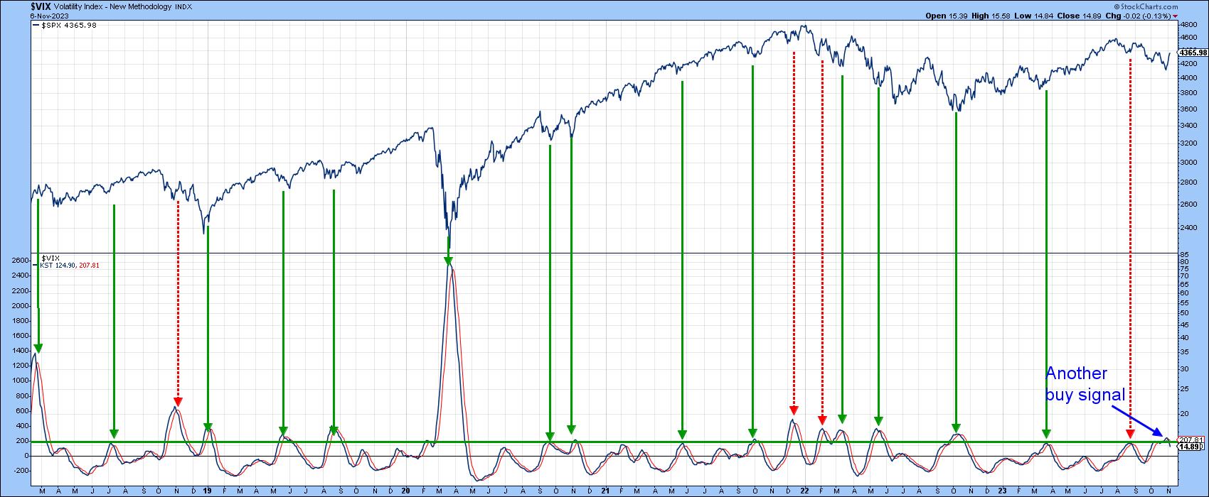
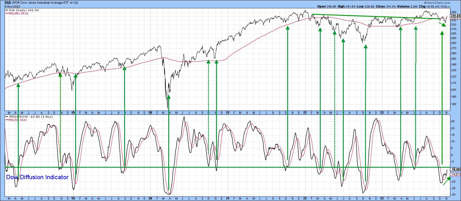
Chart 4 features a diffusion indicator that monitors the percentage of the DJIA components in a positive trend. It goes bullish when it reverses from the oversold zone. There have seen fifteen signals since 2018. The dashed arrows highlight the three disappointing buy signals, but the vast majority were successful. That places high odds that the market will move higher in the coming weeks, especially as the most recent low in the Dow was not confirmed by the oscillator.
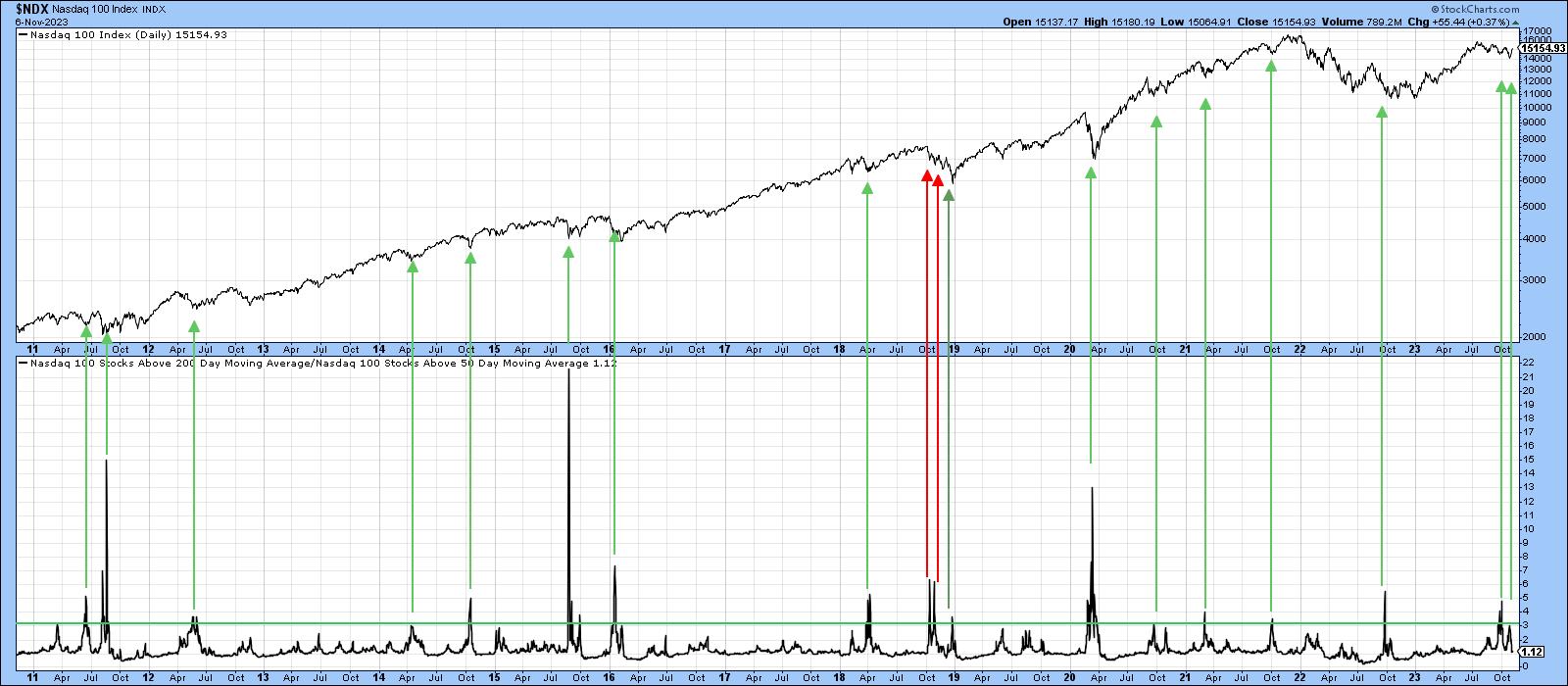
Finally, Chart 5 compares the NASDAQ Composite to an indicator that divides the number of NASDAQ stocks above their 200-day MA by that for the 50-day MA. It triggers buy signals when the market is sufficiently oversold, in order to permit the number of stocks north of the 50-day to be three or more times the slower turning 200-day MA series. When this number peaks, a buy signal is triggered. Once again, the green arrows indicate positive buy signals, and the two red ones false positives. October saw the indicator go positive for equities once again.
The Trend
We can see from the charts above that the short technical picture is very constructive and able to support a nice year-end rally. However, we need some evidence that suggests recent strength is more than a reflexive rally, which a crossover of the 12-month MA would confirm. That's why it's a good idea to examine the short-term trend aspect in order to have more confidence the S&P will still be above its 12-month MA at the end of the month.
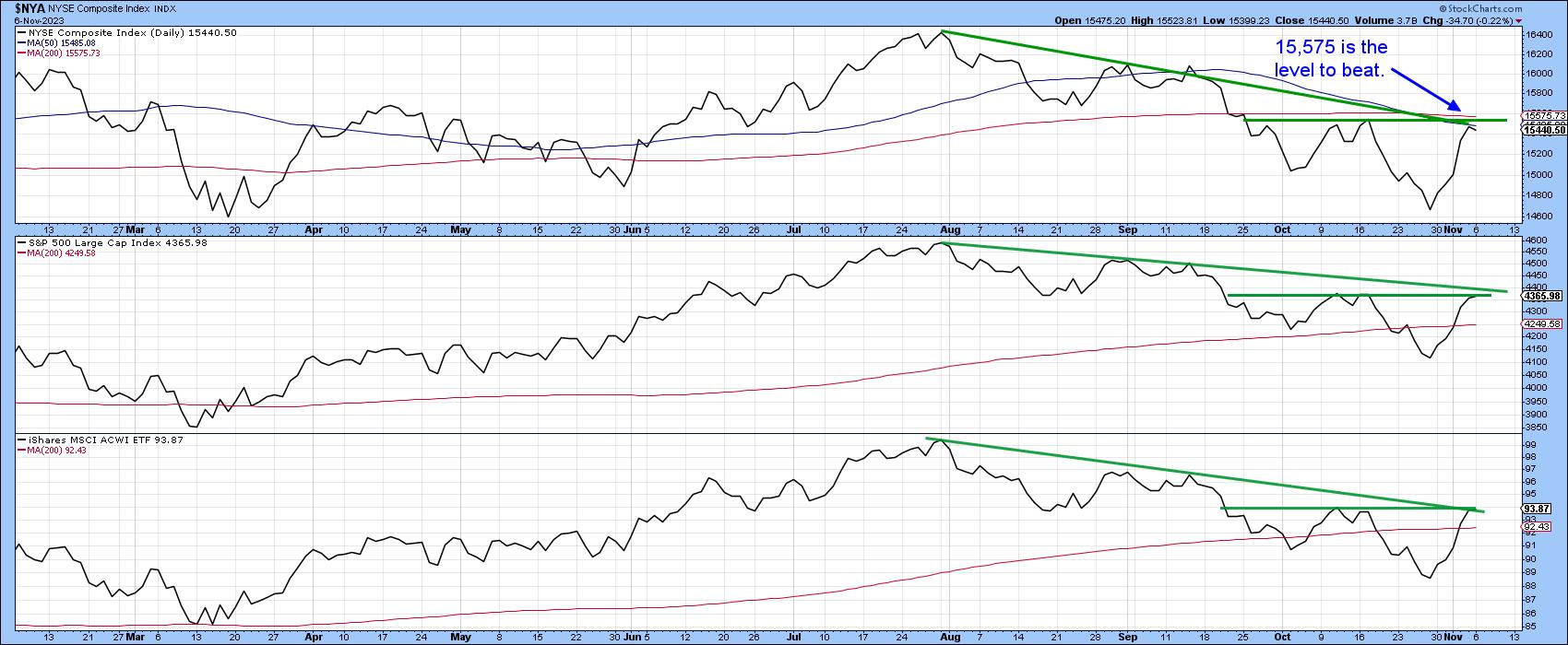
Chart 6 sets the scene for the NYSE and S&P Composites, as well as the MSCI World ETF. The latter two have already regained their 200-day MAs, but all three face resistance in the form of their mid-October highs and August-November downtrend lines. The NYA has the biggest challenge, since that same resistance is also in the area of the 50- and 200-day averages, the highest of which is the 200-day span at 15,575. It seems to me that, if the NYA can break and hold above that level, this would be sufficient upside momentum from which to project a month-end crossover of the S& P 12-month MA, and therefore clearance to a test of the bull market high.
Good luck and good charting,
Martin J. Pring
The views expressed in this article are those of the author and do not necessarily reflect the position or opinion of Pring Turner Capital Groupof Walnut Creek or its affiliates.


