Is It Time for Interest Rates to Fall?
I last wrote about bonds and interest rates in August, as they were in the process of challenging their October 2022 highs. My conclusion at the time was that they were likely to go through, but that upside potential would be limited due to what seemed at the time to be an overwhelming consensus voting in favor of higher bond yields. It is premature to conclude that rates are now headed south, asdecisivetrend breaks in yields themselves have yet to be experienced. However, several momentum setups and other factors do suggest that prices could rise, and that yields drop, going into the year-end period.
To start, let's take a closer look at the near-term picture.
Short-Term Trend
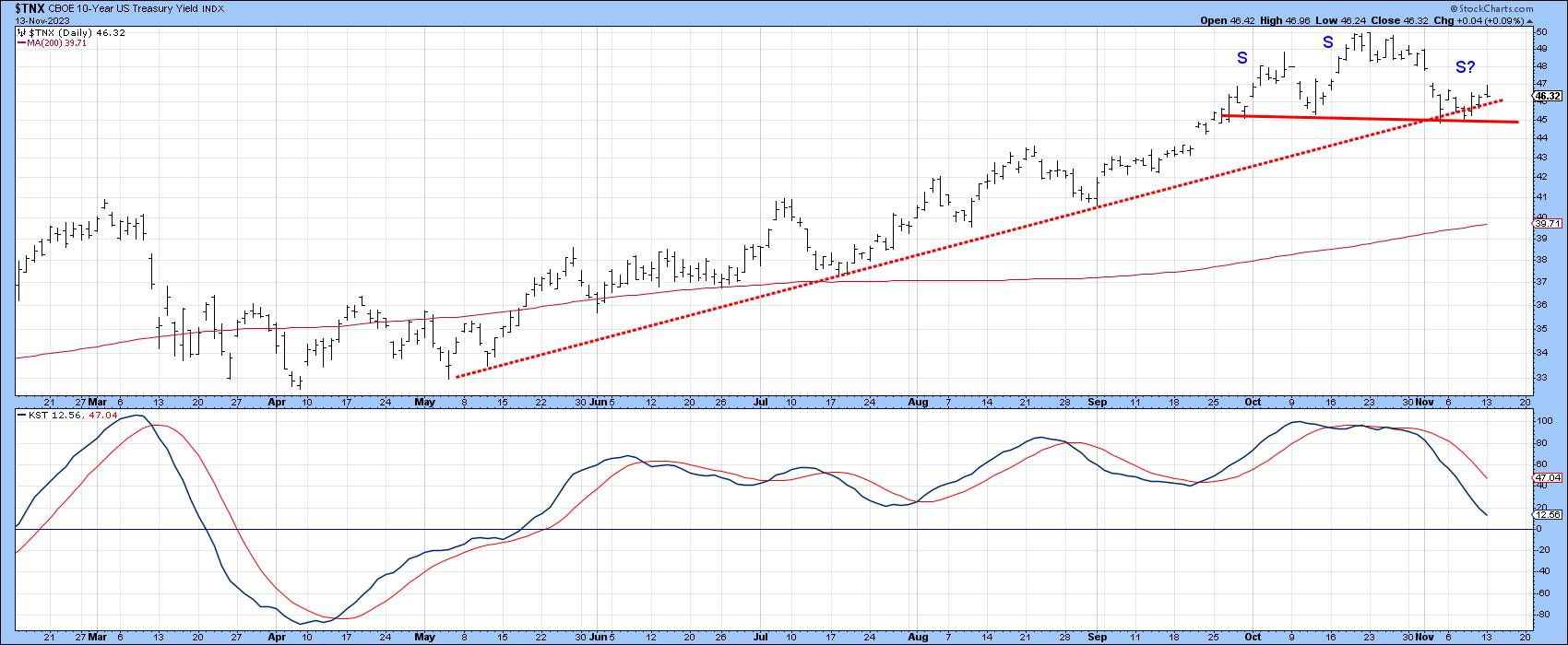
Chart 1 shows that the ten-year yield ($TNX) is well away from its 200-day MA, the violation of which would be a sign of a primary trend reversal. However, we do see the yield struggling to maintain itself above its 2023 up trendline. It is also holding out the possibility of completing a small head-and-shoulders top should it manage to drop below the 4.4% level. The declining daily KST in the bottom window offers more evidence in this direction.
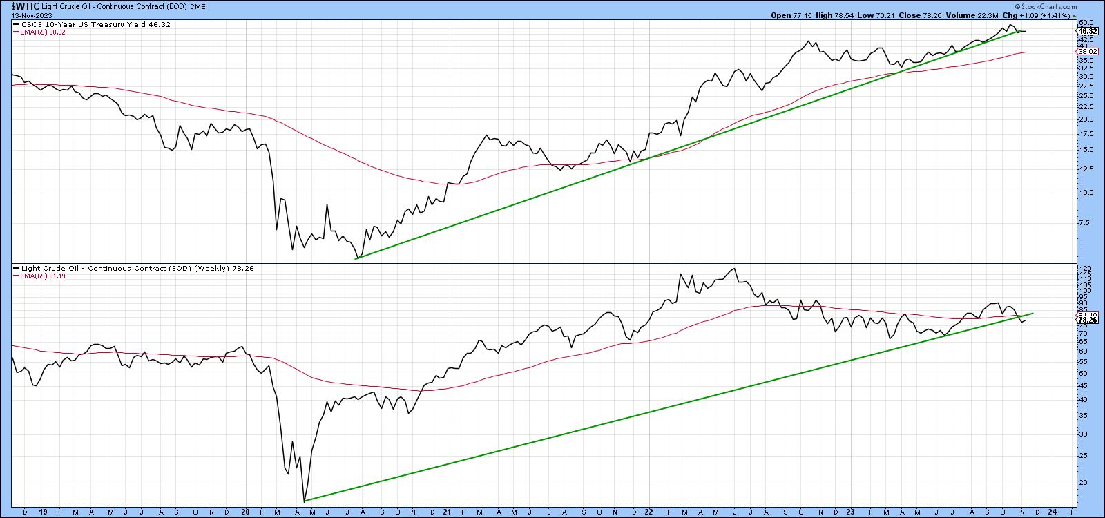
Oil and bond yields do not always move in sync, but, since the 2020 low, they have, to the extent that it is possible to construct a similar up trendline for both. For the $TNX, that is a particularly impressive support zone, since it has been touched or approached on numerous occasions without giving way. Right now, the yield is slightly below the line, but not sufficiently for a decisive break. Oil has completed a small head-and-shoulders top and dropped slightly below its up trendline. Equally important is the fact that the line and the 65-week EMA have converged in the same area. This reinforces their role as a major support level, thereby increasing the significance of the recent downward break. Unless the correlation between yields and energy prices has changed or the break turns out to be a whipsaw, this action argues strongly in favor of lower rates.
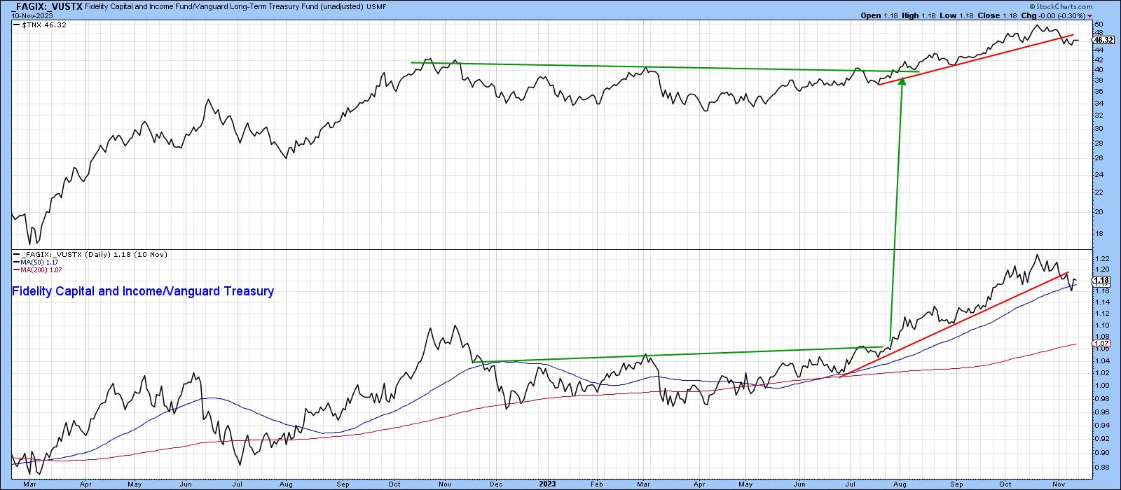
This Confidence Relationship Has Broken its Uptrend
When investor confidence in the economy is improving, yields tend to move higher and vice versa. One useful confidence relationship is calculated from the ratio between Fidelity Capital and Income Fund and the Vanguard Treasury. The Fidelity fund invests in more speculative higher yielding corporates. That compares to the safety of government paper contained in the Vanguard portfolio. When the ratio is rising, it reflects growing confidence.
Chart 3 shows that yields have a strong tendency to rise in such an environment. Indeed, this relationship led last summer's breakout in the yield itself. Fast forward to the current situation and you can see that, on a weekly close basis, both series have violated their post-summer up trend lines.
The Longer-Term Picture
The Effective Fed Funds Rate has been plotted in the lower window of Chart 4. A yield curve calculated by dividing the 2-year yield by its 30-year counterpart is displayed in the upper window. I have reversed the calculation from the normal yield curve presentation in order to mimic swings in the Fed Funds. The vertical lines intersect with peaks in the curve, whereas the dashed blue arrows indicate that market forces, as represented by the curve, lead the Fed at cyclical peaks in rates. The curve has begun to decline (known as steepening) and now crossed below its 12-month MA. This repeats similar action seen at previous cyclical highs. We obviously do not know the market's lead time in the current cycle, but, unless recent weakness turns out to be a whipsaw, the peak in rates may not be far away.
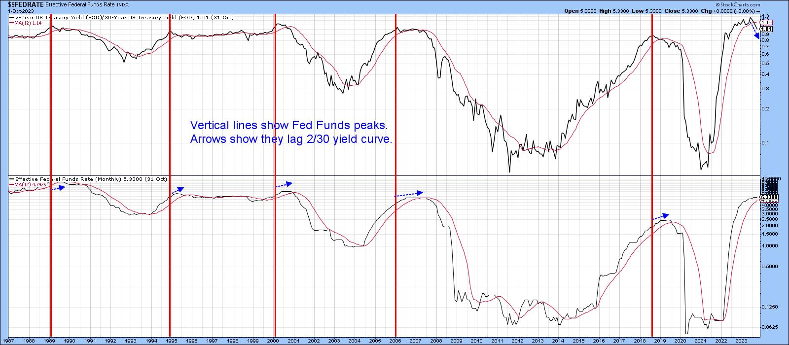
Chart 5 compares the 30-year yield to the long-term KST for the ratio between bonds ($USB) and commodities ($CRB). The arrows approximate KST buy signals since 1994. The latest signal has not worked so far, probably because the secular trend has most likely reversed to the upside. However, this momentum indicator is at a subdued level and is still providing a positive backdrop for prices.
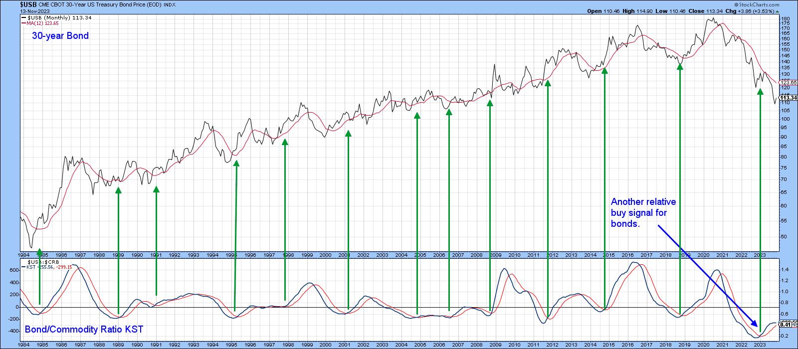
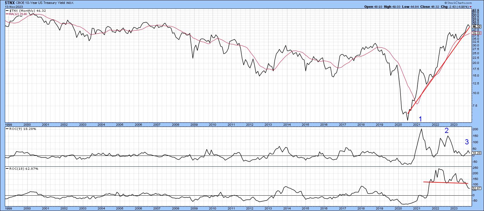
Chart 6 underscores the critical nature of the current technical picture. On the one hand, the record reading in both the 9- and 18-month ROCs is another sign that a reversal in the post 1981 secular downtrend took place in 2020. If so, much higher yields should materialize for most of this decade. On the other hand, peak number 3 for the 9-month ROC has been unable to push this momentum indicator much above zero. That's a very negative sign if confirmed by a price trend reversal. The same can be said for the top in the 18-month series. In this instance, confirmation for both would come with a decisive break below that post 2020 up trendline, better still the 12-month MA at 3.9%.
If a drop takes place, there is no proven way of forecasting how long and how deep such a counter-secular move would be. However, with many positioned in a different direction, such an unexpected move would likely catch most investors unprepared.
Good luck and good charting,
Martin J. Pring
The views expressed in this article are those of the author and do not necessarily reflect the position or opinion of Pring Turner Capital Groupof Walnut Creek or its affiliates.


