These Three Intermarket Relationships are at Key Juncture Points
We spend a lot of time analyzing sector rotation, but there are also other relationships that can offer useful insights to internal market dynamics. One aspect of this is the relationship between market averages.
NASDAQ vs. the DJIA
As an example, Chart 1 plots the relationship between the NASDAQ Composite and the Dow Jones Industrial Average. It is currently resting below what could turn out to be the neckline of an inverse head-and-shoulders pattern.
There are a couple of grounds for suspecting that it will be completed. First, both KSTs are in a positive mode. Second, the ratio is trading above its 200-day moving average, indicating that the primary trend of this relationship is an upward one. It also appears to have experienced a false downside breakout in late October. When confirmed by supplementary evidence, whipsaws such as this are often followed by above-average price moves, as traders scramble to get back to the right side of the market. In this case, the confirmation would come from a violation of the 2022-2023 green downtrend line. If a breakout does materialize, the false break would likely add some power to it.
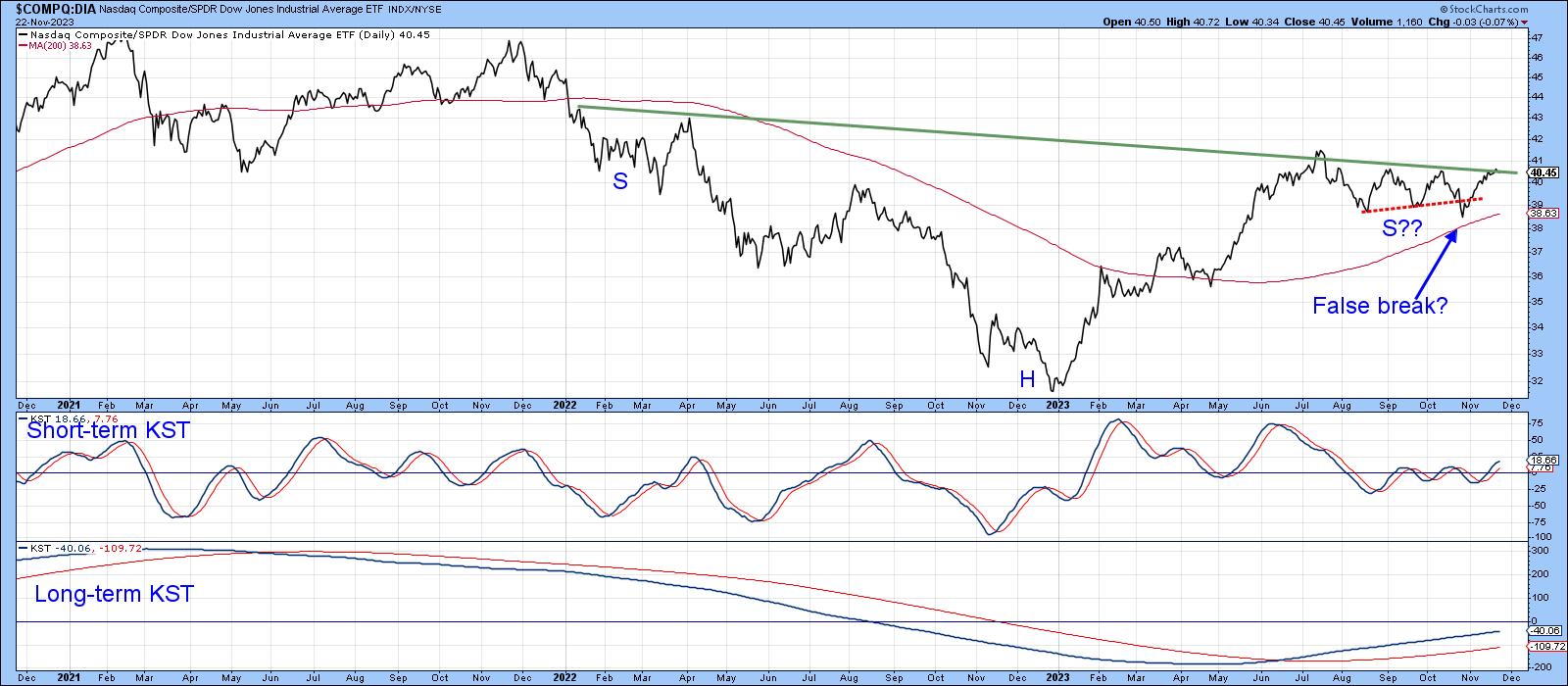
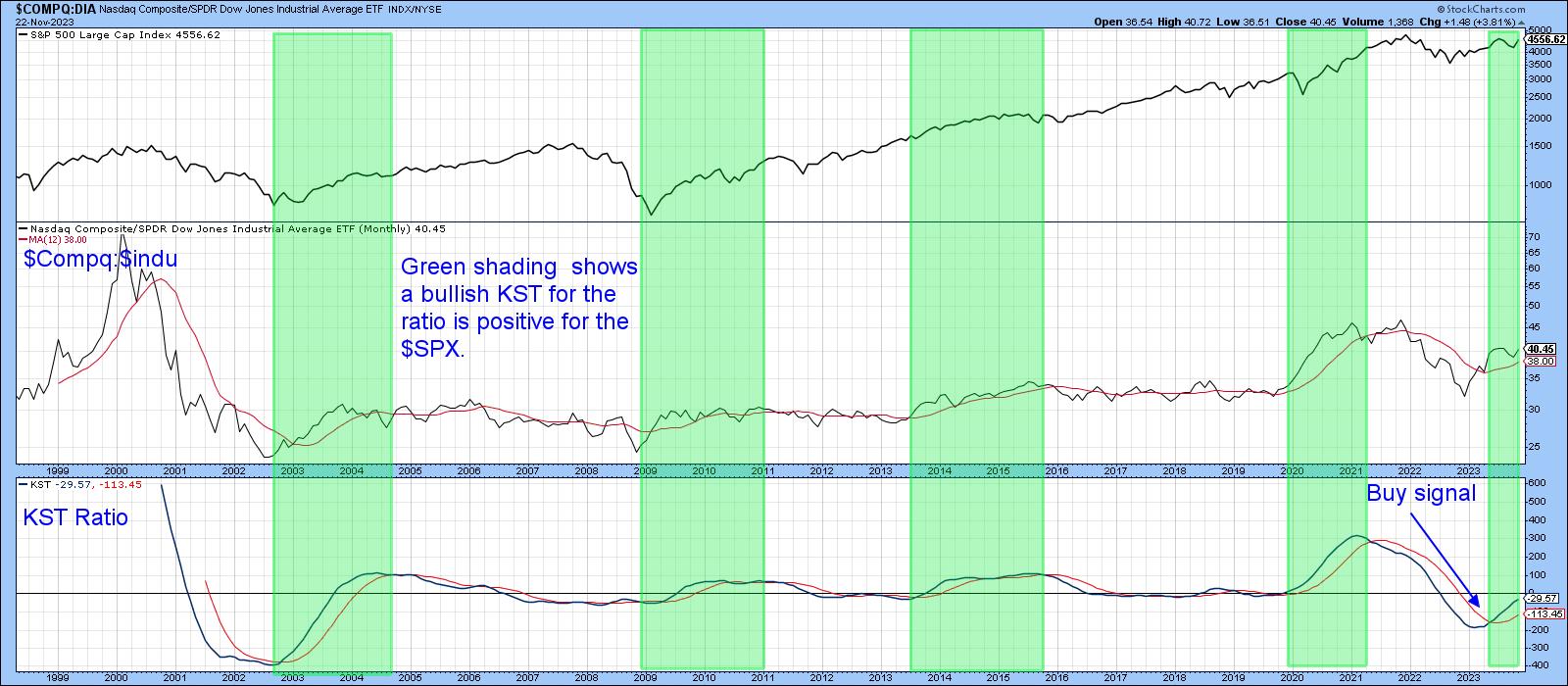
Chart 2 shows that a rising ratio between the NASDAQ and DJIA is usually a positive factor for the market as a whole. In that respect, the green-shaded areas show us when the KST for the ratio is above its moving average. If you examine the top window containing the S&P Composite, it is evident that such an environment has a bullish bias. This model is already on a buy signal, which would be enhanced in the event that the ratio breaks above the trading range shown in Chart 1.
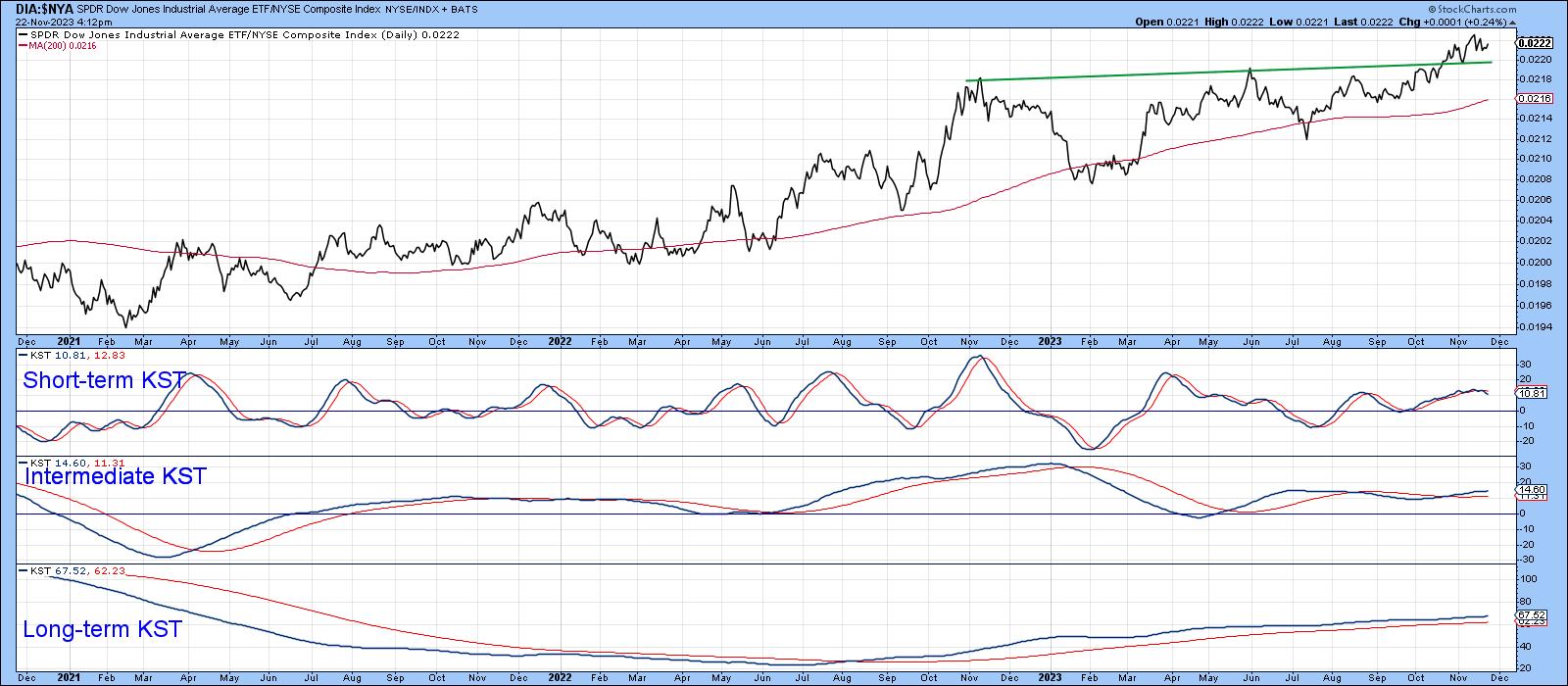
The DJIA is not a complete lost cause, because the ratio between it and the NYSE Composite has broken to the upside. This is featured in Chart 3.
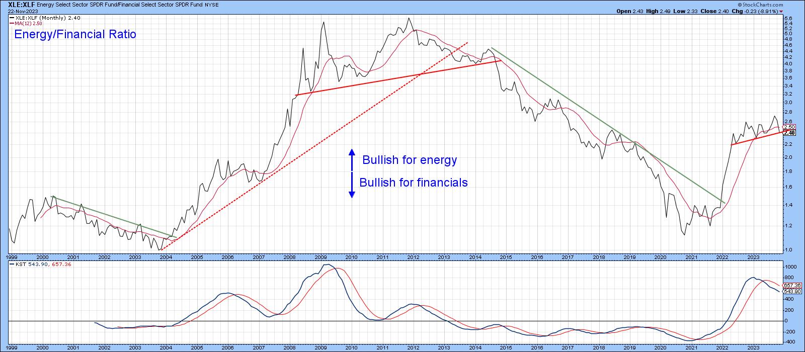
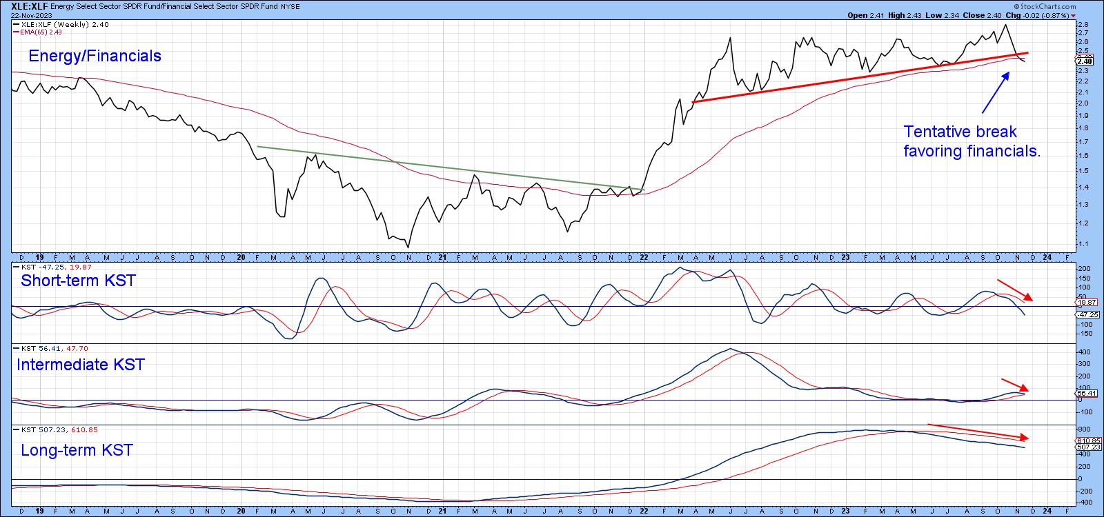
Energy/Financial
The long-term relationship between the energy and financial sectors is laid out in Chart 4. It turned up in favor of energy in 2020, but has recently been stalled in a 2-year trading range. Since the ratio is now below its 12-month moving average and the long-term KST has triggered a sell signal, it seems likely that financials have begun a period of superior performance against energy.
This can also be seen from Chart 5, which shows the data on a weekly closed basis. This relationship has already experienced a marginal break, because it is below its 65-week EMA and the trendline marking the lower part of the trading range. The break is likely to be valid because all three KSTs are in a negative mode for energy (positive for financials). If that proves to be correct, it would suggest a less inflationary environment going forward.
Commodities vs. Bonds
That's the message we also get from Chart 6, featuring the ratio between commodities in the form of the CRB composite and 30-year bonds. This is arguably the most important inflation-deflation relationship offered by the financial markets. As is evident from the chart, since early 2020, the ratio has been in a strong uptrend favoring commodities. For now, it is managing to hold above the bull market trend line and 200-day moving average. We always assume that the prevailing trend is intact until proven otherwise. In this instance, that would involve a decisive downside penetration of the trend line and MA.
The chart also contains a Special K indicator, which you can read about here.Briefly, it combines the momentum from the short-, intermediate-, and long-term trends into one series. That means, in most situations, it reverses more or less simultaneously with the price series it is monitoring.
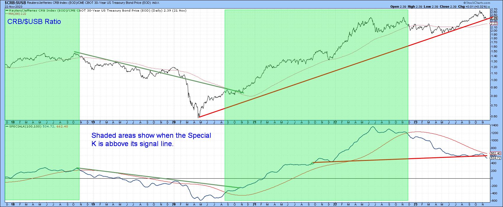
The green-shaded areas draw our attention to periods when the Special K is above its red signal line. It dropped below it late last year and has been in a downtrend ever since. It's also worth noting the Special K itself has recently violated a support trend line and dropped to a new bear market low. This happened more or less simultaneously as the price registered a new high. I have an expression that says,"where the Special K goes, the price usually follows". In this instance, that would involve a violation of the bull market trend line, thereby signaling a more disinflationary environment for financial markets.
Good luck and good charting,
Martin J. Pring
The views expressed in this article are those of the author and do not necessarily reflect the position or opinion of Pring Turner Capital Groupof Walnut Creek or its affiliates.


