Three Intermarket Relationships to Watch in Early 2024
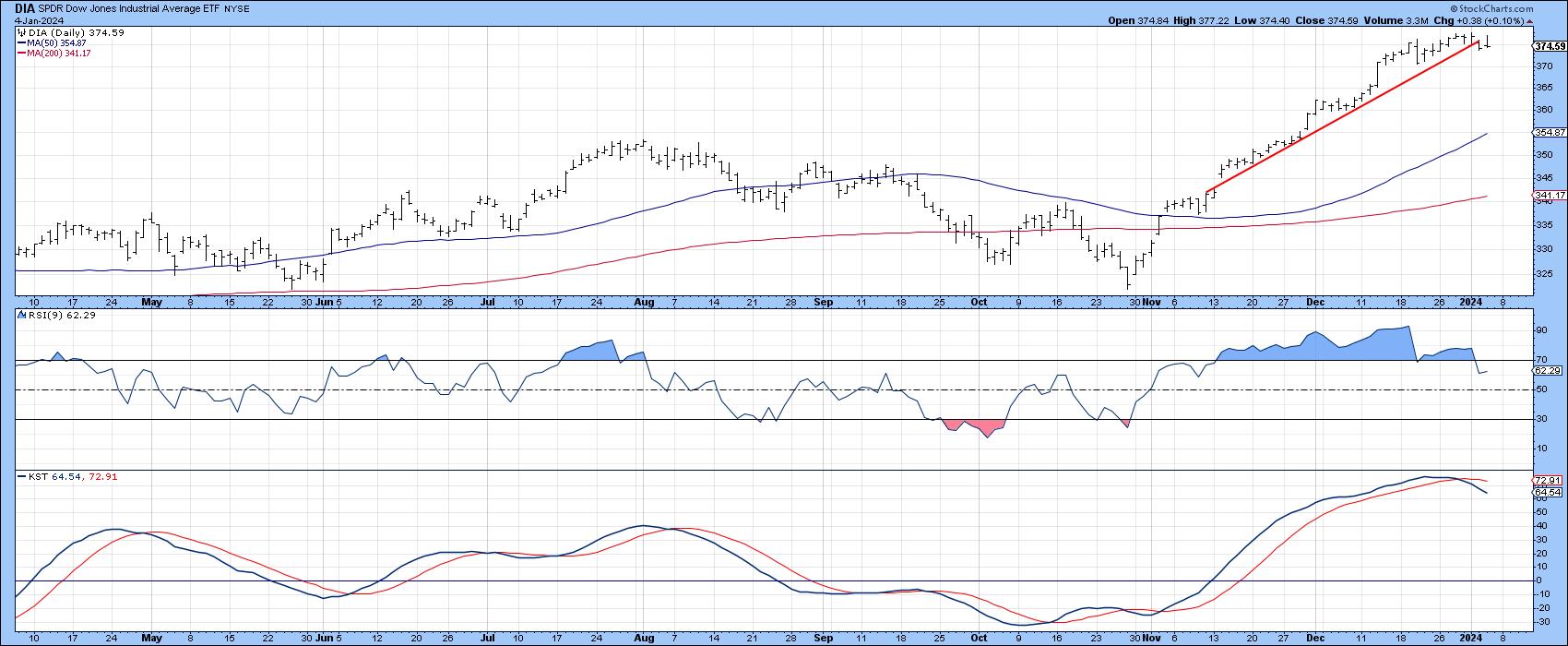
It has been a great rally, but this week has seen the DJIA violate its post November up trendline. In addition, the 9-day RSI has retreated below its 70 overbought zone for the first time since early November, and the daily KST has triggered a sell signal. Is it time to sell? If you are a short-term trader, it may make sense, but for those with a longer-term outlook, there are a lot of indicators suggesting this market has much more to run on the upside.
Taking a step backwards, all a steep trendline break tells us is that the uptrend has lost all or some of its momentum and is likely to be followed by an actual reversal or a trading range, following which the uptrend resumes but at a less hectic pace. Since counter-cyclical corrections, which I believe this one to be, are notoriously difficult to play, they are best ignored by all but the nimblest of traders.
The market hit its low watermark in October of 2022, but the rally following the October 2023 features several of the characteristics normally associated with the first rally in a new bull market. Two examples are a broadening of the list and declining interest rates. Moreover, many of these primary trend indicators have only recently reversed.
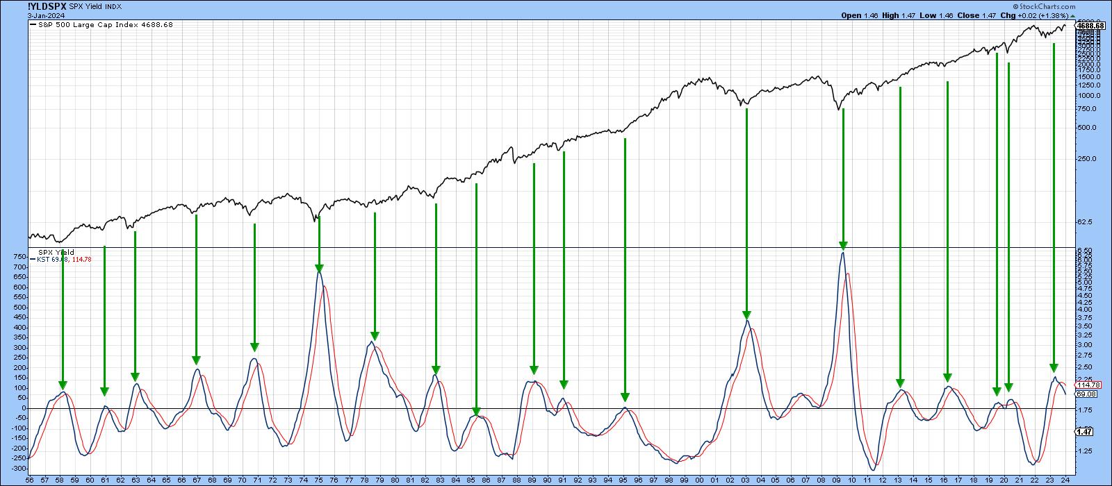
Chart 2, featuring the long-term KST for the S&P dividend yield represents one example. When the market sells off, dividend yield momentum moves progressively higher until equities hit bottom, at which point the KST starts to reverse. The arrows flag the peaks and are invariably followed by higher stock prices. Jim Kopas at Pring Turner calculates that, since 1874, real stock prices have risen on a monthly annualized basis of 5.8%. However, when the KST drops below its 9-month MA, as was recently the case, that return jumps to 10.2%. It's one of the most consistent and reliable indicators for assessing the direction of the primary trend that I have ever come across.
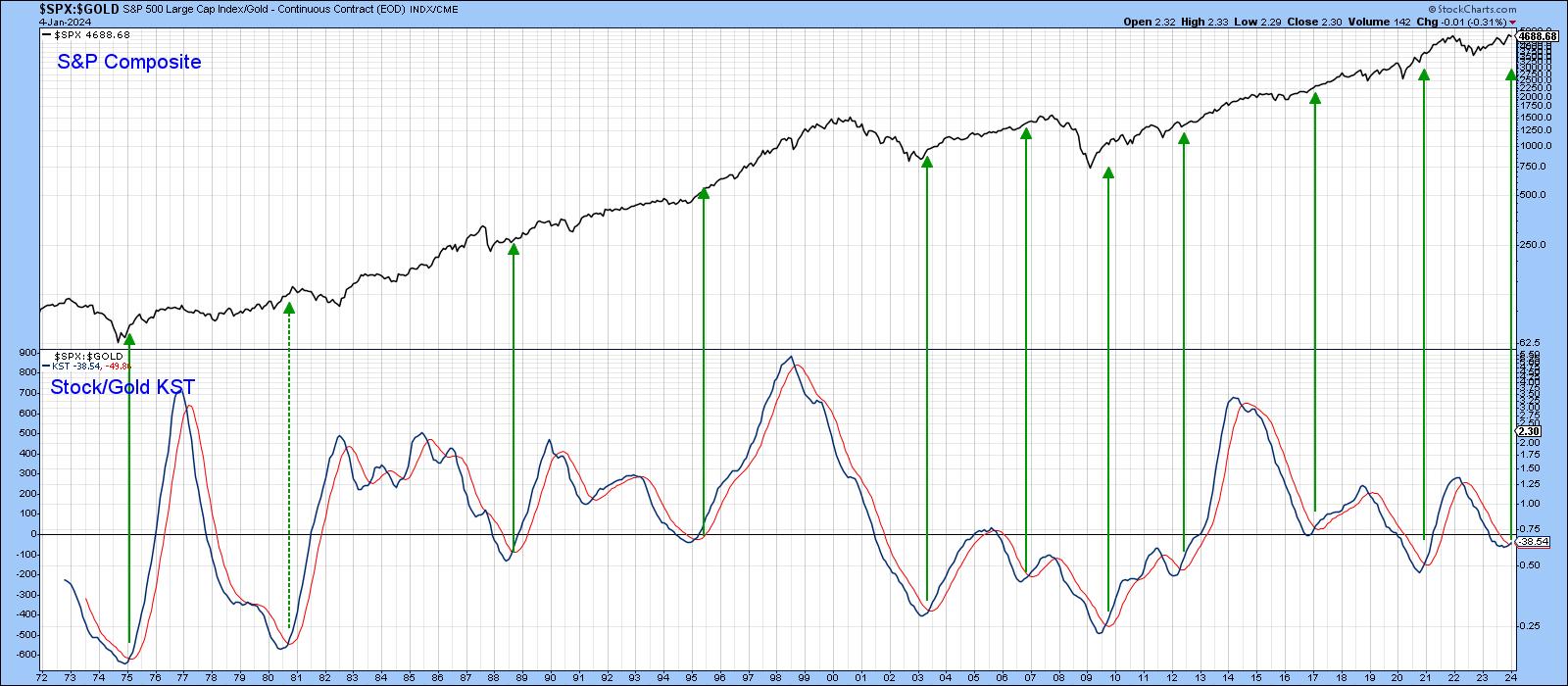
Now Chart 2 may not be a true intermarket relationship as cited in the title, but Chart 3, comparing stocks (growth and stability) to gold (uncertainty and instability), certainly is. The actual ratio is not shown, but its more actionable long-term KST is. The green arrows draw our attention to the sub-zero moving average crossovers since 1972. There are ten examples, only one of which (1981) could be regarded as a false positive. An eleventh signal has just been triggered and is another reminder that October 2023 possesses some of the characteristics of a bear market low that were not apparent in the post-October 2022 advance. It's important to note that the bullish stock/gold KST says nothing about the absolute performance of either. They could both rise with stocks rising faster, or both drop with gold the weaker, for instance. A rising ratio merely tells us that stocks are likely to outperform gold, and that's usually bullish for stocks in their own right.
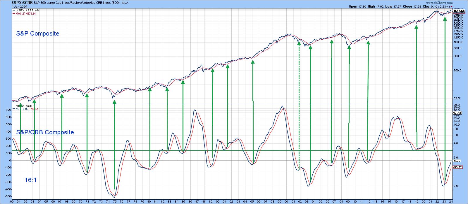
Stocks vs. Commodities
At the start of a bull market in stocks, commodities are usually declining, as they have a strong tendency to lag. This means an early bird warning of a stock market low comes from a bottoming in the ratio between them. Since this data can be unduly ragged and misleading, calculating the ratio's long-term KST offers a smoother and more orderly transition. Chart 4 represents this relationship.
The green arrows highlight momentum buy signals, which have been generated from at or below the green horizontal line. This technique went bullish early last year. However, it is still only at the equilibrium point, which leaves plenty of upside potential before becoming overstretched on the upside.
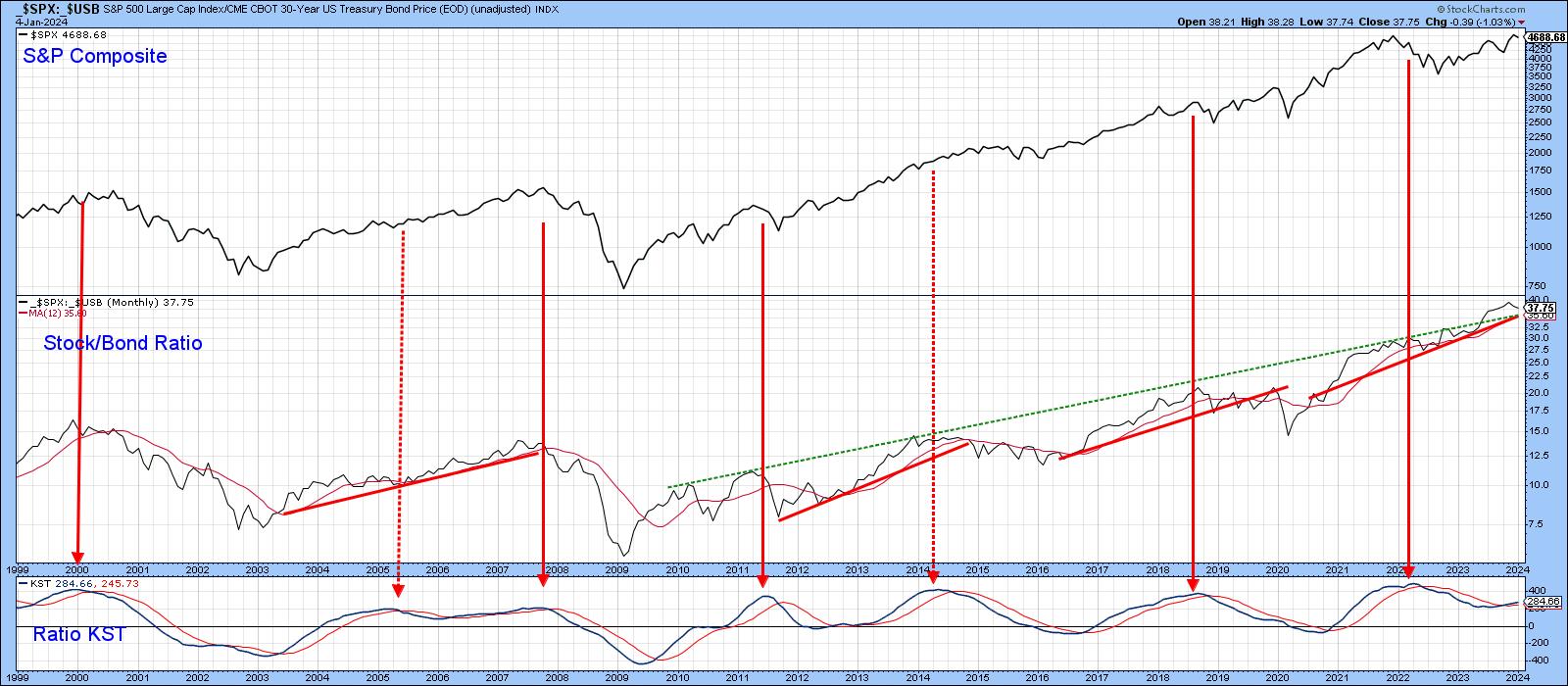
Stock/Bond Ratio
Markets can and do change their minds, and one relationship that may help in that regard is one between stocks and bonds, excluding interest and dividends. Chart 5 shows it is still in an uptrend and, therefore, bullish for stocks. In this instance, KST sell signals, as flagged by the solid red arrows, have correctly warned of trouble five of seven times since the turn of the century. It seems to me that a lot of commentators are expecting an improving economy in 2024, some of which has already been built into stock prices. That's also a view shared by the intermarket relationships covered here. However, should last year's elusive and widely forecasted recession materialize, it might show up first in the stock/bond ratio. That's because it is unlikely stocks could outperform a strengthening bond market should the economy weaken. Alternatively, if it overheats, bonds would fall, but stocks would likely fall faster.
Specifically, I would be looking at the 35.6 area of the _$SPX:_$USB ratio, as that is where the 12-month MA, red up trendline and extended dashed green resistance trendline are currently residing. As it stands right now though, the ratio is above the two trendlines lines and its momentum trend is positive, so let's enjoy the ride.
Good luck and good charting,
Martin J. Pring
The views expressed in this article are those of the author and do not necessarily reflect the position or opinion of Pring Turner Capital Groupof Walnut Creek or its affiliates.


