Only a Fool Would Try to Call a Correction in a Bull Market, So Here Goes!
The vast majority of the primary trend indicators are pointing to a bull market and have been doing so for the better part of a year. Chart 1, for instance, shows that NYSE Margin Debt, or rather its long-term KST, has only recently gone bullish. The vertical lines point out the vast majority of signals since 1959 were followed by higher prices. Many of these signals developed in a relatively early phase of a primary trend advance. If that's the case, you may ask, "Why worry about a correction?" The answer is you probably shouldn't, unless you are a talented nimble short-term trader, or an investor looking for potential weakness as an opportunity to augment longer-term positions.

More on Corrections
Corrections are short-term moves that run counter to the main trend. They are notably difficult to play, many times terminating at the point where most participants have only just begun to realize one is underway. In a primary bull market, short-term oscillators are very sensitive to oversold conditions and tend to shrug off overbought ones, often leading the unwary to sell prematurely for a downturn that never materializes, or which is postponed.
Thinking in terms of the stock market, we can break corrections down into two buckets, internal and index. Many start as an internal phenomenon, only later extending to the S&P Composite or whatever other index is being monitored. Ironically, people tend to look at the S&P as their icon in judging whether a downside or sideways correction is underway. That's fine for those solely exposed to the principal index components; however, if an internal correction is underway, it means fewer and fewer stocks are participating on the upside, thereby making the task of stock selection that much more difficult. In short, don't believe everything the indexes are telling you.
The Current Picture
We often look at previous highs as potential resistance points for possible reversals, but that's not doable with the S&P Composite, which recorded an all-time high last week. However, the NYSE Composite, along with its common stock and regular A/D Lines, has not broken into record high ground. In the case of the NYA, the all-time peak is a little higher than the current price, whereas the A/D lines have clearly found resistance at the two green trendlines. When their bases are finally completed, they will serve as a strong foundation for significant long-term gains. For corrective purposes, though, both series effectively peaked at the turn of the year, indicating an internal correction has already begun.
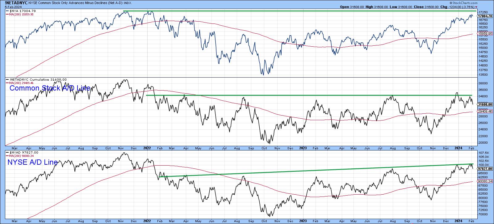
Chart 3 shows that the NASDAQ Composite has recently recorded a post-2022 bull market high. The lower window features the NASDAQ bullish percent. Four reversals from extreme levels have taken place in the last couple of years. Each was followed by a decline in the Index. Recent weakness in this indicator has not adversely affected it yet; however, in the last couple of weeks, the oscillator rallied and peaked once again following an unsuccessful attempt to clear its 20-day MA. Quite often, such secondary reversals from a lower level are followed by a more urgent decline and, therefore, indicate greater vulnerability than that which existed at the initial peak.
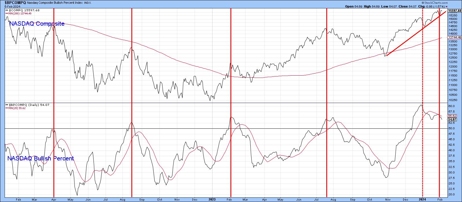
Recent action by the bullish percent indicates a more selective market and that an internal correction has begun. However, the Index has not yet confirmed. A starting point for that confirmation would be a decisive violation of the 2023-24 up trendline.
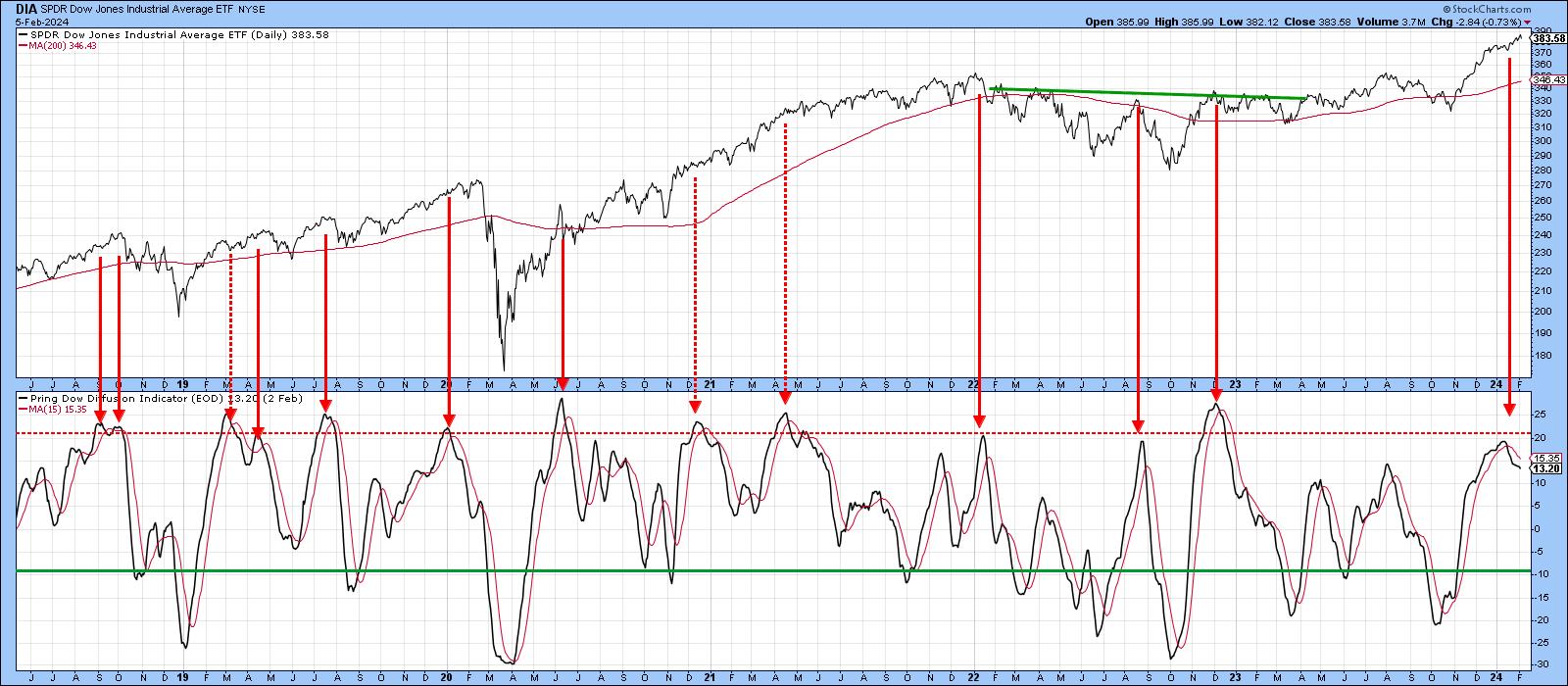
Chart 4 features another breadth oscillator, this time one for the Dow with my Dow Diffusion Indicator. The solid red arrows show that downside reversals taking place from an overbought reading are usually followed by a decline. The dashed ones reflect false negatives. The indicator recently peaked just shy of the overbought line and has been sinking ever since. Based on similar action in the past, the suggestion is that prices are headed lower.
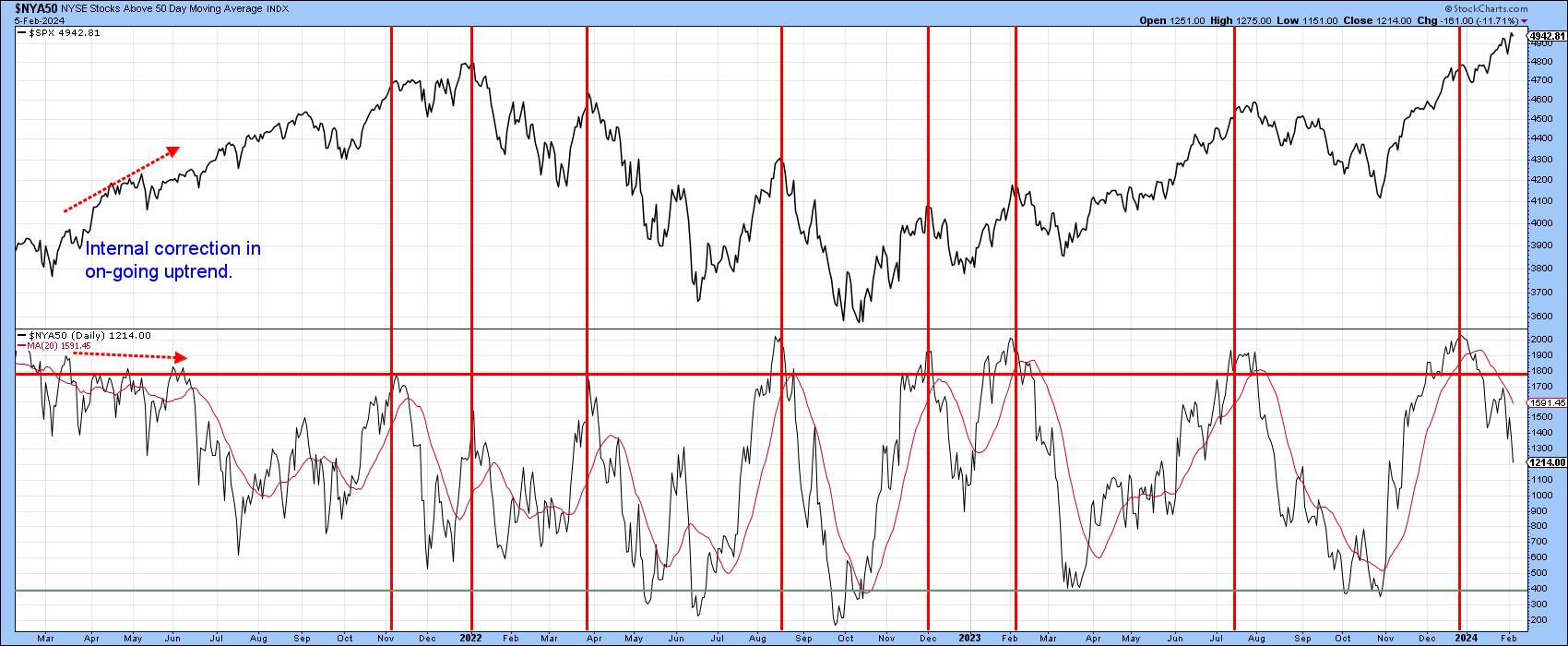
Finally, Chart 5 shows that the percentage of NYSE issues trading above their 50-day MAs has been dropping precipitously since the turn of the year. It hasn't affected the $SPX yet, but it has clearly been more difficult to find winners over the short term than the Index would suggest.
I have seen a lot of commentary on the fact that the first quarter of a presidential election year is usually weak, which, from a contrarian aspect, makes me uncomfortable. However, it does seem as if the market is set up for some disappointment in the immediate future, so let's see how things decide to play out.
Good luck and good charting,
Martin J. Pring
The views expressed in this article are those of the author and do not necessarily reflect the position or opinion of Pring Turner Capital Groupof Walnut Creek or its affiliates.


