Don't Bet on Lower Rates
To paraphrase the late great contrarian Humphrey Neil: When everyone thinks alike, it's usually time to look for a turn in the market.
It seems to me, after reviewing an unscientific survey of the financial media, that everyone and his dog (no disrespect to our canine friends) is looking for three interest rate cuts by the end of the year. If there are any disputes, they center on the timing and number. In my experience, when the question is about how much rather than whether, that's another reason to become suspicious of the lower rate projections. In my book Investment Psychology Explained, I point out that it's not sufficient to be contrary just for the sake of being contrary; instead, it is important to come up with a plausible alternative scenario and then to see whether it starts to unfold.
One way of accomplishing the task at hand is to take a global step backwards to gain some perspective. In that respect, Chart 1 features the 10-year yield for the US, UK, Germany, and Japan. All broke above resistance levels in 2022 by clearing the green horizontal trendlines.

Apart from Japan, these charts subsequently violated key red support trendlines. Valid up trendline violations are either followed by an immediate reversal or a trading range, following which prices reverse to the downside or resume their uptrends by breaking to the upside. The thin blue vertical line shows that global bond yields for the most part entered a trading range environment in September 2022. Our Fed watching friends are looking for a downside resolution, but what are the chances of an upside one?
The answer could well lie in the commodity pits, as yields and commodity prices often move in tandem. Chart 2 compares the 5-year yield with the CRB Composite. The two series certainly do not move tick for tick, but there can be no mistaking that, since 2017, major swings in yields have been replicated by commodities. Since mid-2022, both have been caught in a trading range. If the red line for the yield is violated, the trading range would turn out to be a head-and-shoulders top. On the other hand, it is apparent that the CRB Composite is trying to emerge from its trading range. Given its relationship with government yields, it may well be leading the 5-year series higher.
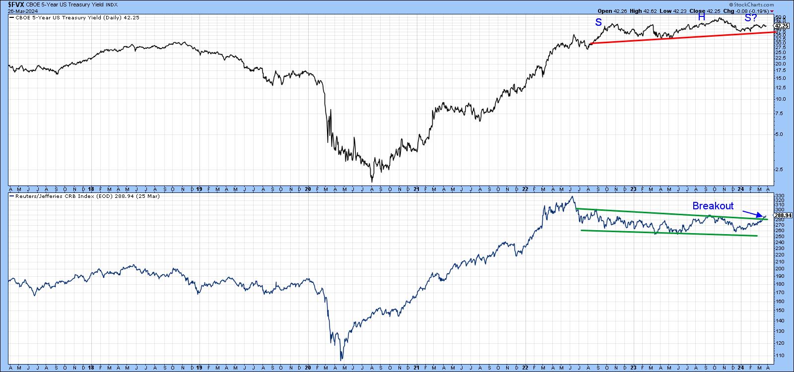
Chart 3 shows that there is also a connection between the CRB Composite and the Producer Price Index, since all the major price swings in one are replicated by the other. The PPI data is only available until February, which means that the CRB does not reflect the tentatively bullish March action we saw in Chart 2. What does suggest higher commodity prices, though, is the upward reversal for the Coppock Curve for the PPI. This technique is particularly impressive, as all previous sub-zero upside reversals since 1999 were followed by PPI primary bull market. If it's a valid reversal, and there are few reasons for believing otherwise, it seems like an odds-on probability that bond yields will experience another up leg to their post-2020 bull market, given their relationship with commodities.
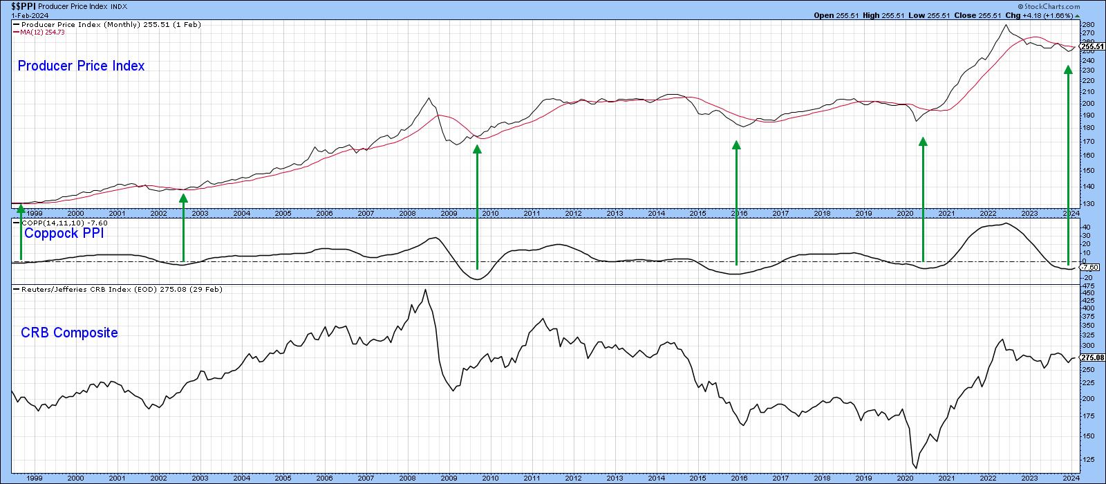
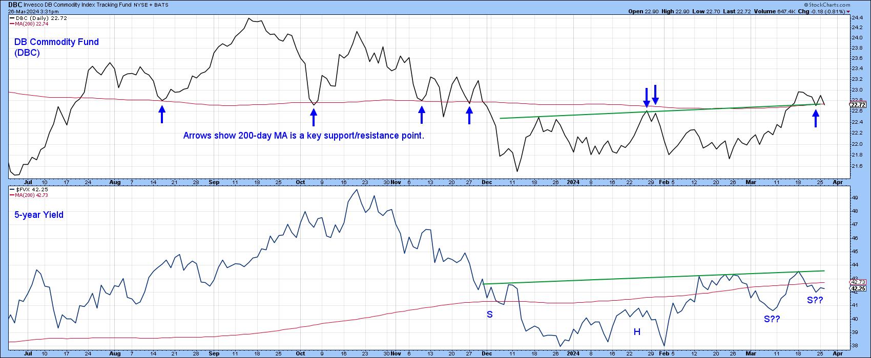
Chart 4 compares the 5-year yield to the DB Commodity Fund (DBC). Like the CRB Composite, it appears to be resolving its recent trading range on the upside. The blue arrows tell us that the 200-day MA has proven to be a major pivot point in the last 9 months, so it will be interesting to see whether the price can continue to hold above it. If so, the yield will likely be dragged up as well.
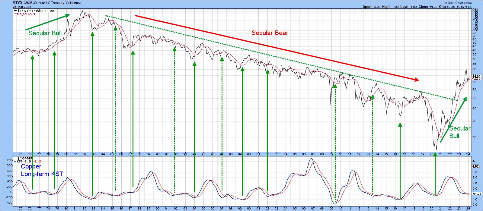
Finally, Chart 5 compares the 30-year yield to a long-term KST for copper. The solid vertical lines show KST buy signals are usually followed by a rising yield, especially when the secular trend for yields is bullish, which I believe to be the case currently. The four dashed arrows tell us when the signal was less timely; they all developed under the context of a secular bear. The KST has recently gone flat, so we cannot yet say that it is signaling higher yields. However, things are clearly at a make-or-break point with many of these relationships and prices. A lot will depend on whether my assumption that we are in the inflationary phase of the business cycleis correct. Bearing in mind that markets rarely accommodate the crowd, perhaps it's time to investigate that alternative scenario a little deeper?
Good luck and good charting,
Martin J. Pring
The views expressed in this article are those of the author and do not necessarily reflect the position or opinion of Pring Turner Capital Groupof Walnut Creek or its affiliates.


