DJT Has Closed Last Week's Gap, But is It Enough?
Sometimes, simple indicators like bar or candlesticks operate just as the textbooks tell us they should. I don't normally follow individual stocks, but the hype surrounding last week's listing of Trump Media piqued my interest to see if the technical position squared with what the many bearish fundamentalists are saying. What I found was a plethora of one- and two-bar price patterns, scattered around its trading history, most of which were effective in calling trend reversals, especially a significant one that formed last week.
The Trump Media and Technology Group (DJT) has been trading for four days, but its predecessor Digital World Acquisition Corp was listed several years ago, which means we have a track record suitable for chart reading on "Trump" investors. Using peak and trough analysis as our guide, DJT fell into a bear market at the beginning of 2022 . It zig-zagged down until April of the following year, then formed a rectangle from which it broke out in July 2023, signaling a new bull market in the process. Those rising peaks and troughs are still intact.

That sets the scene from a longer-term perspective, but it is interesting that most of the important turning points since October 2021, when the shell company was originally listed, have displayed reliable one- and two-bar reversals. These patterns really reflect crowd psychology in action, so I will quickly go through some of these textbook examples, ending up with last week's noteworthy trading.
Incidentally, if you want to delve into this concept of one and two bar price patterns, Chapter 10 of Technical Analysis Explained, available atthe StockCharts book store, explains them all.
Chart 2 shows the first 8 months of trading, where you can see that the price immediately ran up to the intraday high just shy of $180. There was no way of knowing that at the time, but the engulfing pattern certainly offered a clue that prices had entered its expected corrective phase of between 5-10 days. In this case, though, it was a lot longer than that.
The next important event was some dark cloud cover in January of 2022. These patterns develop when the opening price gaps up on the day, but closes more than halfway down the real body of its predecessor. A short-term consolidation followed.
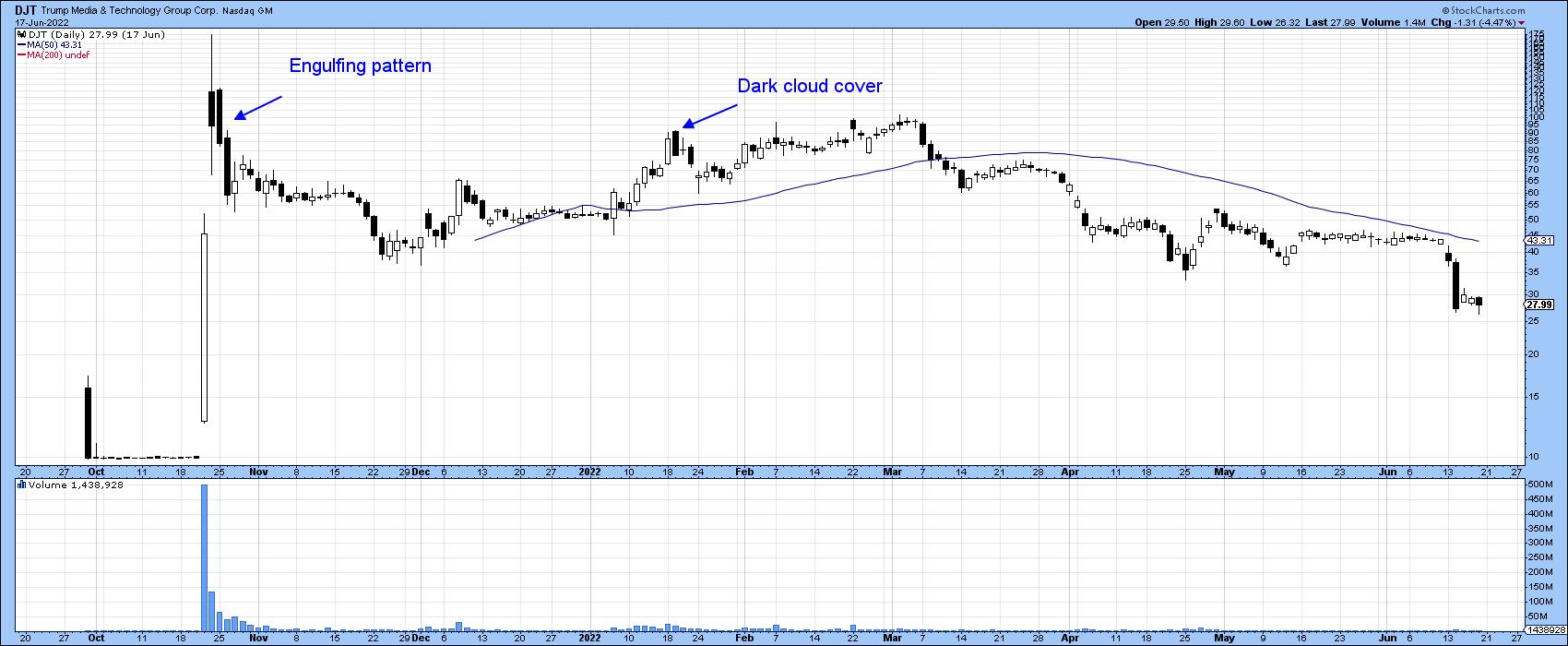
Chart 3 switches to a bar chart and features a false break below a support trendline. This is a one-day pattern, called a Pinocchio bar, that occurs when the intraday price drops below support but the open and close do not. In this instance, support took the form of a trendline. In the case of the character, his nose grows bigger with the size of the lie. With the bar, the strength of the signal is determined by the size of the false break.
The bear market rally following the Pinocchio was terminated by a two-bar reversal. These patterns are characterized by the first wide bar opening near its low and closing near the high. The second represents an abrupt turn, as it opens near its high and closes near the low. Virtually everyone who bought during the pattern's formation goes home with a loss, therefore acting as a weight on the market.
Another small rally was reversed in February of last year by an inside bar. These develop when, following an up or downtrend, a relatively wide bar, where buyers are in control, is followed by one that it totally encompasses. The pattern, therefore, ends with supply and demand equally balanced and the probability the short-term trend has reversed. The greater the contrast between the width of the two bars, the stronger the signal.
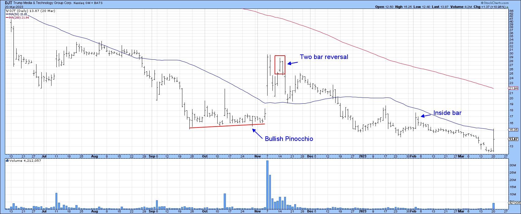
Chart 4, which brings us up-to date, features two bearish inside bars. It also shows a bullish outside bar that formed in August 2023. The end of the early 2024 rally was signaled by a bearish Pinocchio. The resistance in this case was provided by the green trendline, though to be fair we would not have known that it existed at the time. On the other hand, support in the form of the red downward sloping trendline would have been evident when the March bullish Pinocchio formed, and what a rally that triggered.
February also saw the formation of a bearish exhaustion bar. These bars usually develop after a run-up in price and open the session with a substantial gap, so sizeable in fact that it is only partially filled by the end the session. There are several characteristics that determine the significance of an exhaustion bar:
- Its width — the wider the bar, the bigger the battle between buyers and sellers.
- Volume — the greater the activity, the more traders that are trapped with a loss.
- The close — the lower the close relative to the open the more negative the pattern.
- The preceding trend — the more persistent and sharper the preceding trend, the greater the potential for profit-taking.
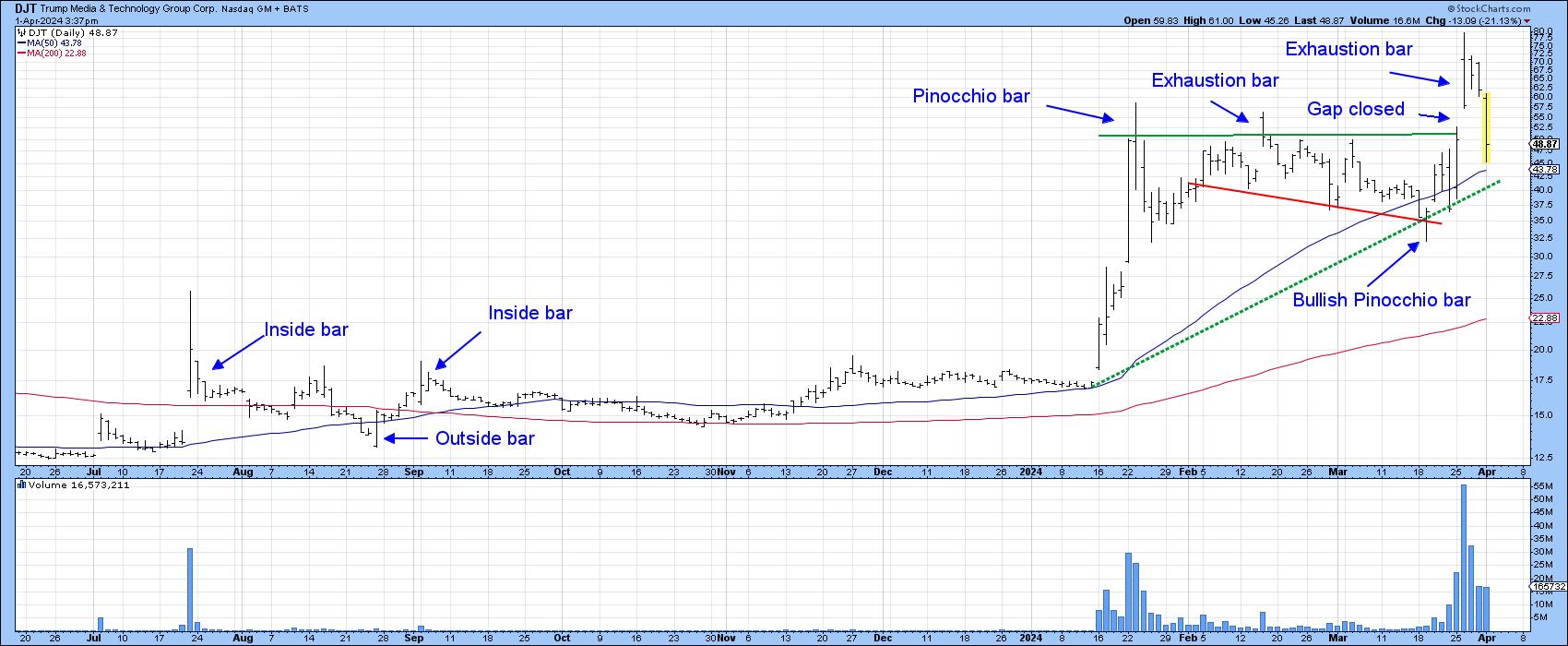
Using these benchmarks, the February exhaustion bar, whilst qualifying as a legitimate pattern, packed a greater punch than its characteristics suggested. On the other hand, the initial trading day for the newly listed DJT scores heavily on the four exhaustion bar characteristics cited above. When we look backwards, it is possible that it could mark the end of the bull run. However, at this point, it does not represent sufficient evidence of a bear market on its own. A reversal in the longer-term indicators is required for that.
What this pattern does suggest is that, at best, the intraday high of March 26 is unlikely to be breached without several weeks or more of corrective activity first taking place. In the meantime, it's worth monitoring the dashed green up trendline, the penetration of which would confirm last week's action as a false upside breakout and a likely game changer.
Good luck and good charting,
Martin J. Pring
The views expressed in this article are those of the author and do not necessarily reflect the position or opinion of Pring Turner Capital Groupof Walnut Creek or its affiliates.


