The Day the Yields Broke Out
Wednesday brought an unexpected firming up of the inflation figures, causing analysts and commentators to trim the number of times they expect interest rates to be cut this year. Whenever it is that the questions turn away from whether to when and by how much, as was the case until about 2 weeks ago, it raises my contrary bones. At that time, virtually every forecast was for lower rates, meaning a substantial number of traders were positioned in that direction. Not surprisingly, markets responded to the unexpected news by causing rates to break to the upside.
Most market participants look to the Fed for every nuance concerning the future direction of interest rates. Chart 1, though, tells us a smarter place to look is the market itself, as the Fed is normally a lagging indicator. This relationship is highlighted in the chart by the arrows, which mostly slant to the right, as they connect the peaks of the 2-year yield with those for the Fed Funds. In other words, the market is the first to sense changes in the economic environment, and the consensus-driven Fed eventually gets the hint. The most notable discrepancy of this nature occurred in the 2021 period, when the 2-year yield was moving sharply higher against a Fed Funds rate, which was being artificially held down. It's little wonder this was followed by a historically large up wave in the annual CPI.

The 2-year yield has recently experienced a sideways trading range, just like the Funds rate. However, the latter is reported on a month-end basis, so Chart 1 does not reflect April's firming in the 2-year yield. Chart 2 does, though, and we can see the yield has broken out from a reverse head-andshoulders pattern and crossed above its 200-day MA. Note the breakout is also being supported by a positive daily KST.
The next level of resistance, which would resolve the rangebound activity of the last couple of years, is at 5.1%. Decisively surpassing that point, say to 5.3% would, in my view, indicate that the trading range formed by the pattern to be a continuation of the previous bull market.
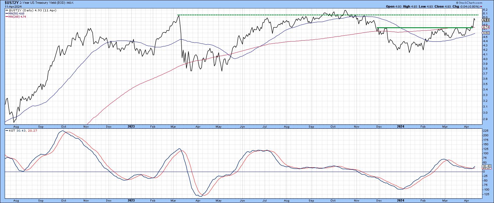
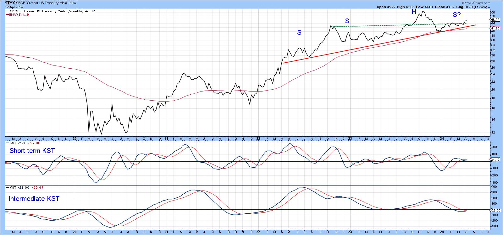
Chart 3 features the 30-year series. Initially, trading action suggested it was in the process of tracing out a large head-and-shoulders top. However, the yield never violated the neckline or its 200-day MA, both of which were in the same vicinity. Wednesday's CPI news has caused the yield to rally above the dashed trendline, joining the peaks of the two shoulders and thereby placing the odds narrowly in favor of the pattern not "working". Patterns that fail to act in the manner expected are usually followed by an above-average price move. In this case, traders expecting lower rates positioned themselves accordingly and could well be forced to take position more in sympathy with a trend of rising rates.
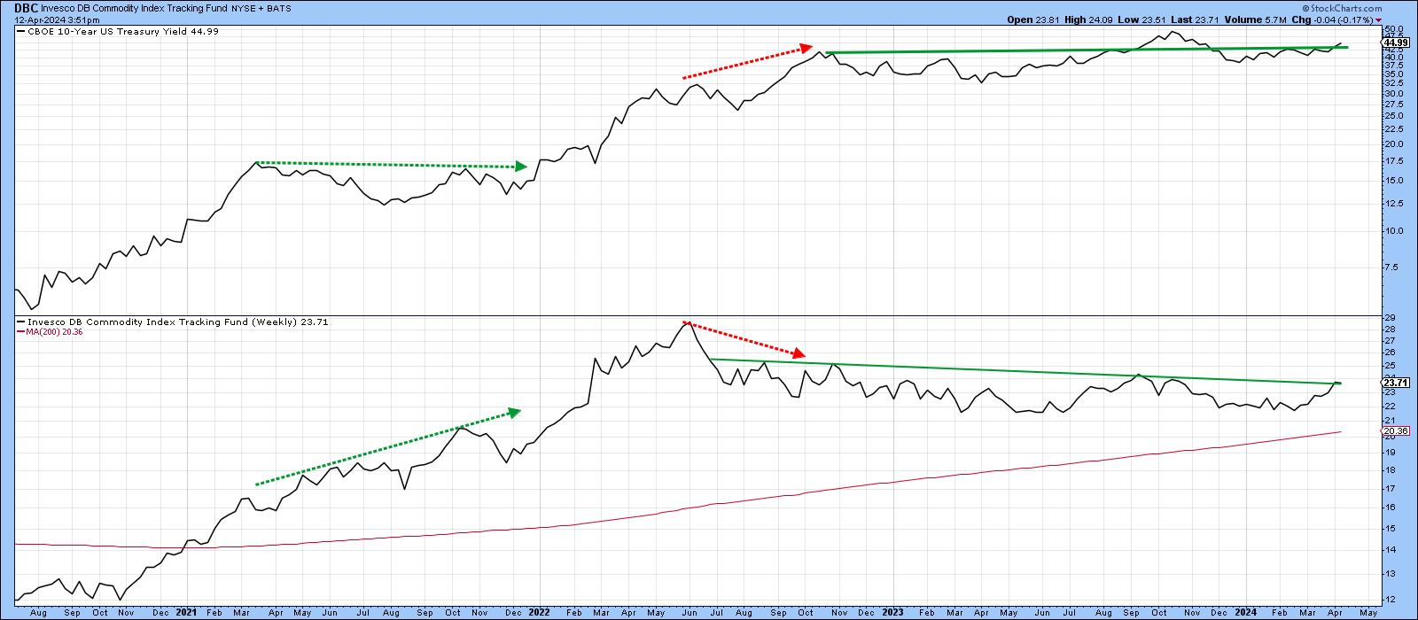
If this failed pattern scenario is going to pan out, it will probably need the help of commodities, as indicated in Chart 4. This one shows that the yield on the 10-year bond often moves in sympathy with the Invesco DB Commodity Fund (DBC). The dashed red and green arrows tell us that commodities often move first, with their upward and downward pressure, eventually feeding back into the yield. Given this relationship, it seems unlikely the tentative breakout in the 20-year will hold unless the DBC breaks out as well. If it does not, we may have to revert to the idea that rates may be peaking. Stay tuned, it could get more interesting, especially if the rising rate scenario catches a lot more people by surprise.
Good luck and good charting,
Martin J. Pring
The views expressed in this article are those of the author and do not necessarily reflect the position or opinion of Pring Turner Capital Group of Walnut Creek or its affiliates.


