What Does Today's Outside Bars in the S&P and NASDAQ Mean Going Forward
A couple of weeks ago, I wrote an upbeat article on the US stock market opining that the correction was over. I still think that's the case, but I do have to note that a bearish outside bar formed on both the S&P and NASDAQ on Thursday. That, plus some other short-term indicators turning down, suggests a test of the recent lows is now in the cards.
Negative outside bars are ones that totally encompass their predecessor and close towards their low. A stronger signal is given if the bar forms after a rally, as that indicates the potential for profit-taking. A bar which encompasses more than just its predecessor also offers a stronger signal. So too does a particularly wide one, as that reflects a more intense battle between buyers and sellers. Thursday's outside bars scored on all these fronts, as Chart 1 demonstrates.

I should add that outside bars generally have a downwards or sideways effect for between 5-10 bars. In this instance, that would be days. However, since some of the short-term indicators have begun to roll over, the effect of Thursday's action has the potential to be more long-lasting.
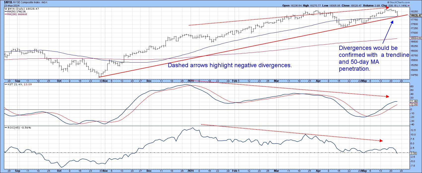
Chart 2 shows that the NYSE Composite, like most other averages, did not experience an outside day. It is currently at support just above its 50-day MA and post-October up trendline. If these benchmarks are violated, it would likely usher in more corrective action, because it would confirm the two sets of negative divergences for the daily KST and 45-day ROC. Note that the ROC was barely able to break above its equilibrium point, as the Index was trading at a new high. When confirmed by a trend reversal signal such as an up trendline violation, such a setup is often followed by a sharp decline decline.
Short-Term Momentum Indicators
Chart 3 features the NYSE Common Stock McClellan Volume Oscillator, or rather its 10-day EMA. The red arrows show that downside reversals from an overbought condition are typically followed by a correction of some kind. (The dashed ones indicate false negatives.) This indicator topped out a couple of days ago and looks headed lower.
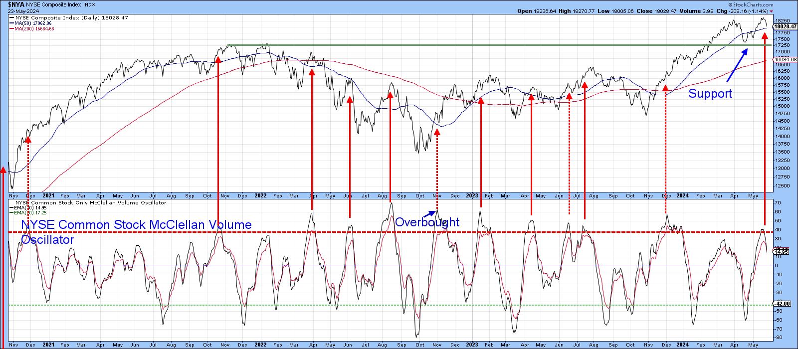
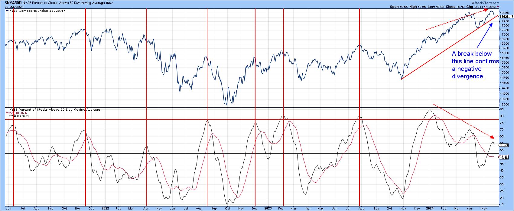
Chart 4 displays the percentage of NYSE stocks above their 50-day (10-week) MA. It definitely underscores the price divergences indicated in Chart 2, but, in its case, the divergence is breadth-inspired, as fewer and fewer stocks were able to cross above their 50-day MA as the market itself traded higher. These discrepancies need to be confirmed, of course, and that would involve a violation of the up trendline.
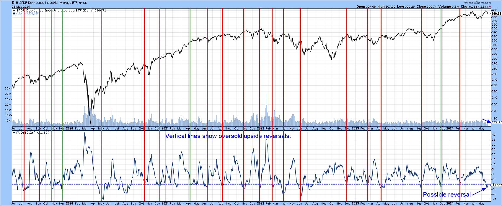
A rising market based on declining volume is usually resolved on the downside when activity picks up. In that respect, the red vertical lines in Chart 5 show that when the PVO for the Dow falls to an oversold level and then reverses, the DJI usually responds with some kind of a sell-off. The indicator looks as though it may have bottomed out earlier in the week. In case you are thinking that the current signal will fail, note that only one of the failed signals identified with green lines, experienced any kind of a correction, unlike the current situation in which prices have already begun to drop.
Conclusion
Whilst some vulnerability probably lies ahead, its important to understand that little has happened to question the validity of the post-October 2023 bull market scenario. A bumpy ride ahead cannot be ruled out, but, barring any black swan events, higher prices are likely once profit-taking has run its course.
Good luck and good charting.
Martin J. Pring
The views expressed in this article are those of the author and do not necessarily reflect the position or opinion of Pring Turner Capital Groupof Walnut Creek or its affiliates.


