Is the Bond Market About To Make a Big Move?

The bond market experienced a secular bear between 1981 and the spring of 2020. Chart 1 offers three reasons why it has since reversed and given way to a secular uptrend or possibly multi-year trading range.
The first piece of evidence comes from violating the multi-decade trendline. Second, the price has experienced a series of rising peaks and troughs since 2020. Finally, and arguably the most important reason of all, is the record-high reading in the 12-month Rate of Change (ROC). When I say record, my data goes back to the Civil War, and I have never seen anything remotely similar to either the initial thrust off the 2020 low or the even higher reading following it at peak number 2. If you want to see a similar example of a once-in-a-generation momentum thrust, check out the 1933 12-month ROC peak coming off the 1932 low. That's the sort of historic reversal we are dealing with here, but in this case for bond yields.
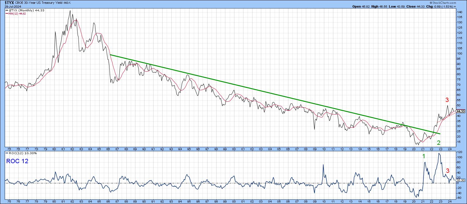
Meanwhile, back at Chart 1, you can see the 2023 high in the yield was accompanied by very little in the way of upside momentum at red 3, thereby setting up a huge negative divergence. Divergences need to be confirmed by price, and in this case, that would involve a violation of a potential upward-sloping head-and-shoulders pattern. So, let's take a look at the price, as opposed to yield action, in greater detail.
Bond Price Action: A Deep Dive
Chart 2 shows that the price of the 30-year bond is right at the breakout point. The fine balance between buyers and sellers can be appreciated because the 50- and 200-day moving averages have gone more or less flat and are very close together. All three momentum indicators—short-term, intermediate-term, and long-term Know Sure Thing (KST)— are bullish but not decisively so. That means they could easily reverse, but at the moment, they are hinting at a probable upside breakout.
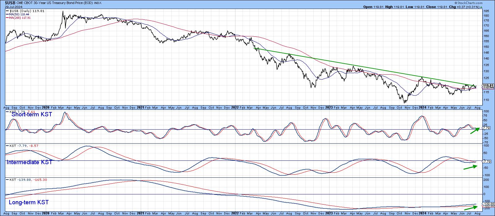
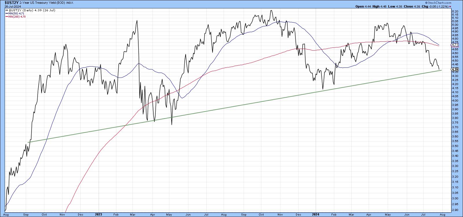
Chart 3 shows that the Fed-sensitive US two-year Treasury Yield is also close to a breakdown, with both moving averages turning down and almost touching each other. Once again, we see a very finely balanced technical picture.
Key Bond Market Relationships Look Toppy
Chart 4 compares the 10-year yield to the ratio between inflation-adjusted and nominal bonds, a kind of bond market inflation/deflation ratio. Swings in this ratio closely match those of the 10-year yield to the extent that a significant move in the yield usually follows joint trendline breaks. Once again, we see a fine balance waiting to be resolved in one direction or the other.
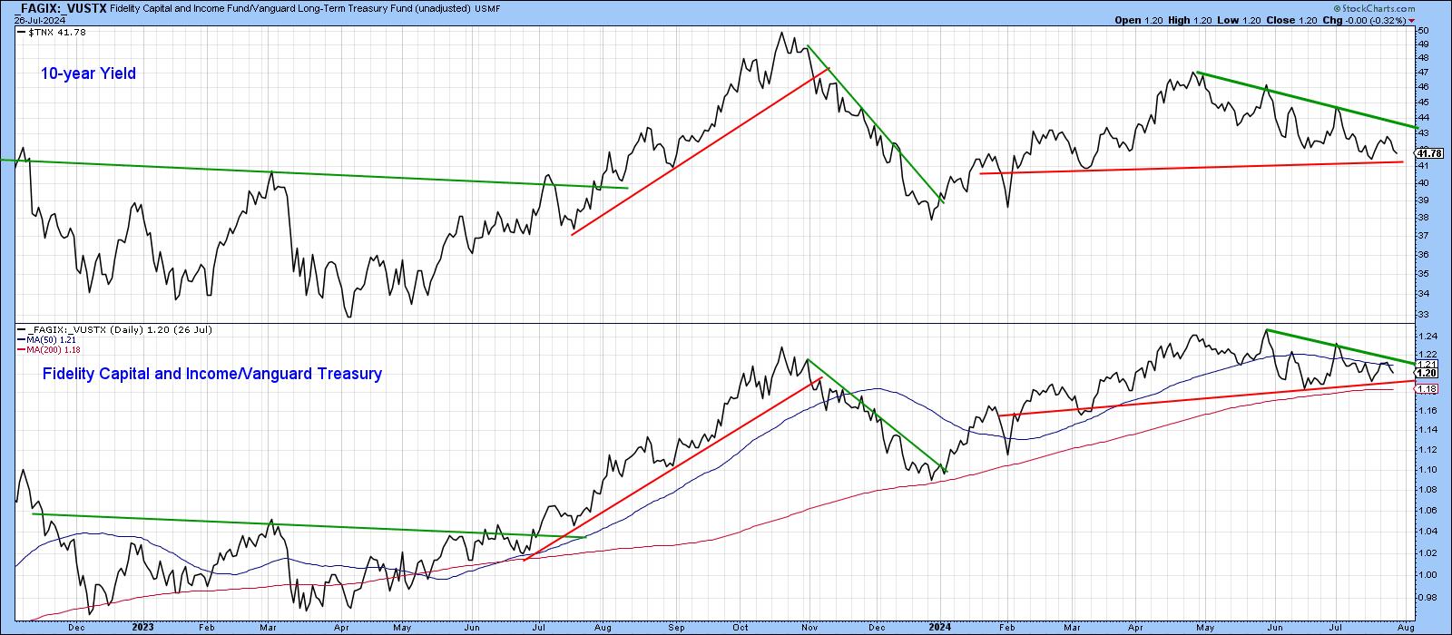
The same is true for the ratio between the Fidelity Capital and Income Fund (FAGIX) and the Vanguard Long-term Treasury Fund (VUSTX). This is a form of credit spread, where FAGIX represents more risky bond investments relative to the safety of US Treasuries. A rising ratio represents confidence, whereas a falling one represents a growing fear of defaults. It, too, has been tracing out a similar pattern to the 10-year Treasury yield. If it breaks down, it will reflect a loss of confidence of the type that bond prices love.
Yields vs Commodities
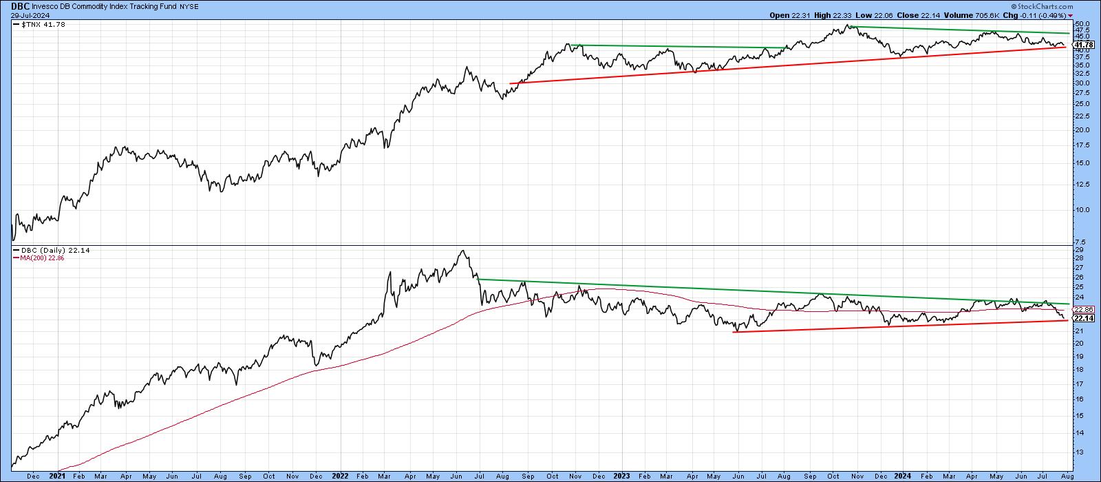
Swings in commodity prices are one of the key drivers of yields. In that respect, Chart 6 compares the 10-year Treasury yield to the Invesco DB Commodity Index Tracking Fund (DBC). Both are very close to a downside breakout. A downside break would be negative for yield and commodities, whereas an upside one would be inflationary.
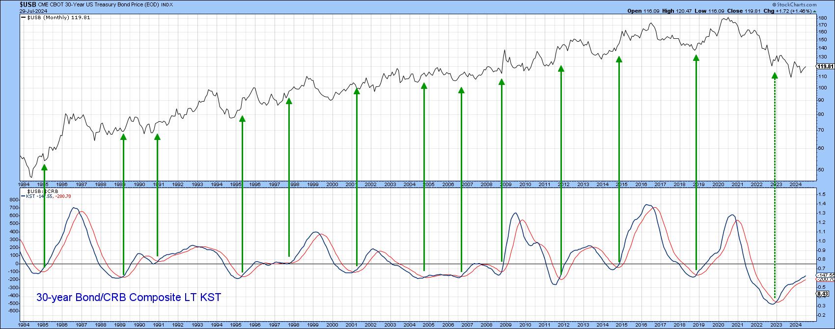
Occasionally, changes in the momentum of the ratio between bond and commodity prices signal a change in the trend of bond prices themselves. In a sense, this is the ultimate inflation/deflation ratio.
In that respect, the green arrows in Chart 7 show long-term KST upside reversals from a sub-zero position. Historically, they have been bullish for bond prices (bearish for yields). The latest signal has not so far resulted in a bull market, probably because it is counter-secular. However, as long as it continues to rise, this indicator should be interpreted in a bullish way for prices.
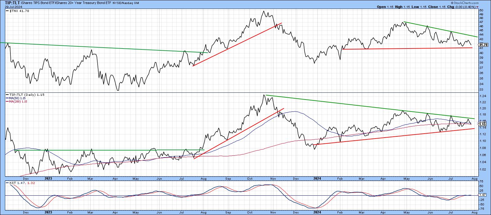
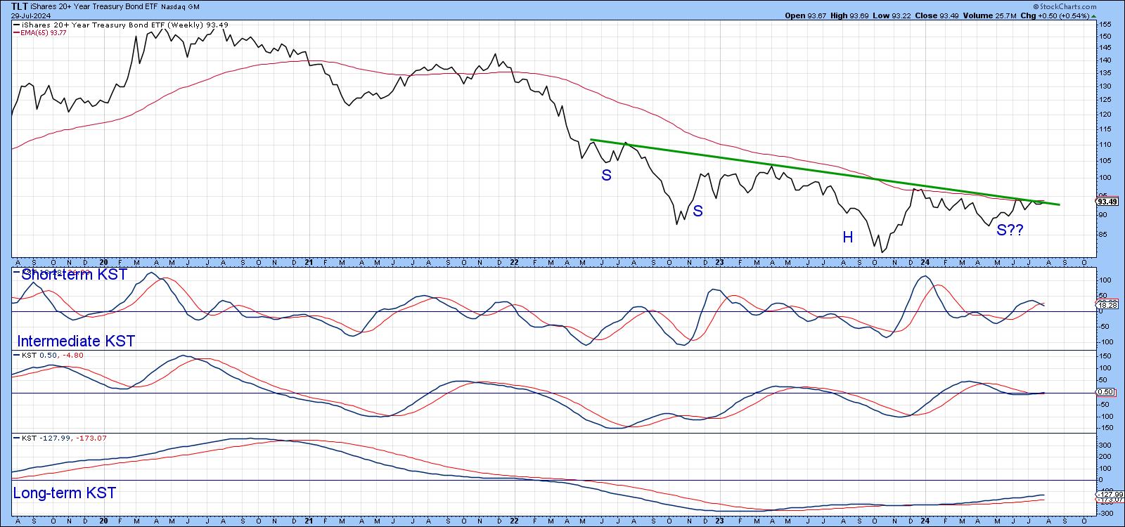
Finally, Chart 8 shows the iShares 20+ Year Treasury Bond ETF (TLT) is right at the neckline of a potential inverse head and shoulders and its 65-week exponential moving average (EMA). A rising intermediate and long-term KST argue for an immediate breakout, whereas a mildly bearish short-term KST suggests it may take longer.
Good luck and good charting,
Martin J. Pring
The views expressed in this article are those of the author and do not necessarily reflect the position or opinion of Pring Turner Capital Groupof Walnut Creek or its affiliates.


