These Two Sectors are Showing Promising Silver Cross Setups
A silver cross occurs when a 20-day MA crosses above its 50-day counterpart. While far from perfect, such signals enable you to ride a persistent trend. However, like all trend following techniques, problems can occur in a trading range environment.
Chart 1 features two recent buy signals for the S&P, which worked out well because we have been in a bull market. They have been flagged by the green arrows. The one (red arrow) sell signal when the 20-day MA crossed below its 50-day counterpart was not so fortunate, as the S&P immediately proceeded to move higher.

StockCharts has a number of sector-based breadth indicators that monitor the percentage of components where the silver cross indicator is positive. These can be quite helpful in isolating buying opportunities for individual S&P sectors. I am not saying that you should buy the sector every time one of these indicators goes positive; rather, what I'm saying is that an upside reversal in a silver cross indicator can be used as a starting point for further investigation.
The Energy Sector and Silver Crossovers
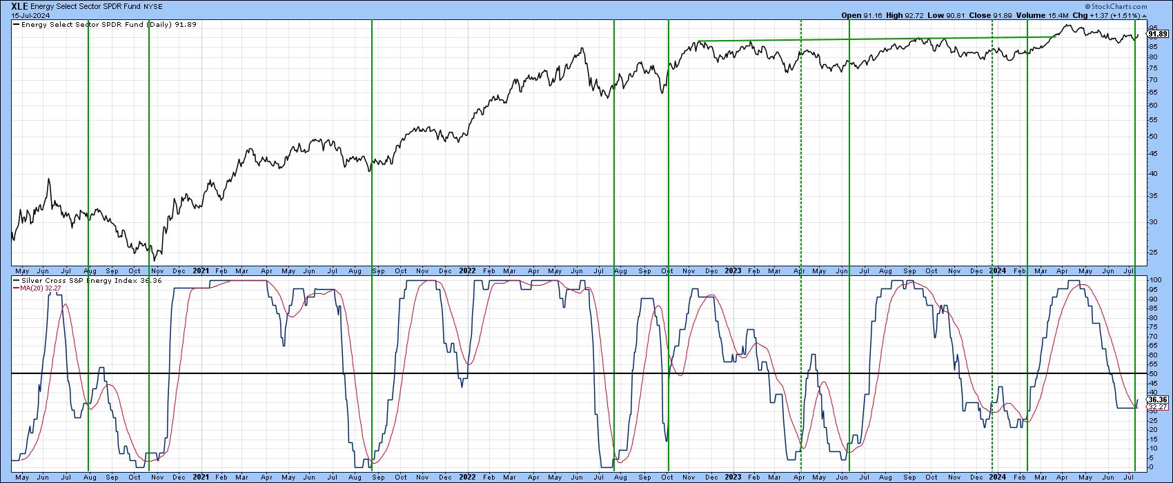
As an example, Chart 2 features the silver cross indicator for the energy ETF (XLE). Right now, it is moderately oversold. The low reading means that there aren't a lot of components of XLE that are experiencing a positive silver cross. The good news is that the number appears to be on the rise as the indicator has just crossed above its red 20-day MA. The 50 level marks the equilibrium point, where half the components are sporting a positive silver cross, and the vertical lines indicate sub-equilibrium positive MA crossovers. The dashed vertical line represents a failed signal. It is a reminder not to rely solely on one indicator, but to spread the net a little wider.
Digging down a little deeper ,Chart 3 shows that the XLE has decisively broken above its 2024 down trendline and experienced a positive, but by no means overextended, short-term KST. It is now back above its 10-week MA, which has been an important pivotal point in 2024. Also important is the completion of a reverse head-and-shoulder pattern.
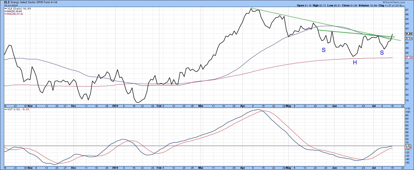
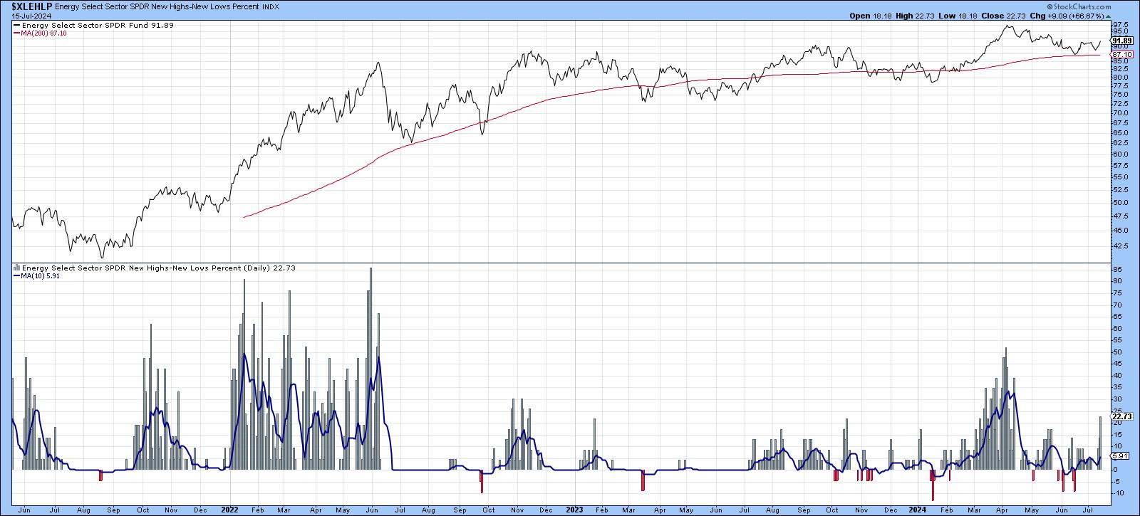
Chart 4 indicates that the number of XLE components registering 52-week highs improved to a healthy number, suggesting that the XLE is likely to experience plenty of near-term upside momentum.
The Silver Cross Indicator for Financials Goes Bullish
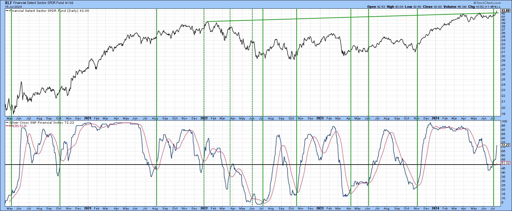
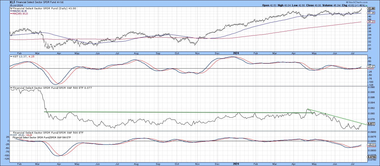
The vertical lines in Chart 5 again signal sub-equilibrium positive MA crossovers. This time however, we are looking at the financial sector. The vast majority of signals were followed by a rally of some kind. However, the three dashed lines reflect false positives, two of which developed under the context of a primary bear market. The really impressive part of the chart, though, lies with the price, which has now broken above an important resistance trendline that traces its roots back to 2022.
The area to keep an eye on is its relative performance. There are two reasons for this. First, Chart 6 shows that the daily RS line, in the third window, is right at its 2024 down trendline. The short-term KST for relative action is currently in a rising trend, so it should manage to breakout.
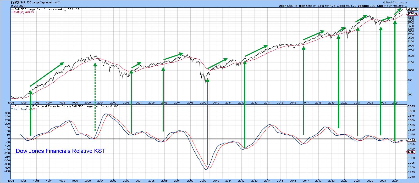
The second reason to monitor relative action lies in the fact that strong relative action by the financial sector is usually a positive factor for the market as a whole. You can appreciate this from Chart 7, where the arrows flag long-term KST buy signals. In virtually every situation, the S&P Composite celebrates by rallying. Right now, the KST is above its MA, which is positive. However, the indicator itself is rolling over and, unless the daily RS line in Chart 6 can break above its down trendline, the long-term KST will be in danger of triggering a sell signal. That wouldn't mean that financials cannot move higher on an absolute basis, but weak relative action would remove one important prop from the primary bull market case.
For a complete library of silver cross signals carried by StockCharts, please click on this link.
Good luck and good charting,
Martin J. Pring
The views expressed in this article are those of the author and do not necessarily reflect the position or opinion of Pring Turner Capital Groupof Walnut Creek or its affiliates.


