The Great Rotation: Not What You Think
KEY TAKEAWAYS
- Small-cap stocks look like they have lost momentum.
- Market breadth in small-cap stocks appears to be weakening.
- The Utilities sector seems to be gaining momentum.

Just so we are on the same page, I looked up "Great Rotation" on Microsoft's Copilot and came away with this definition: ... a rotation out of big U.S. growth stocks (think "The Magnificent Seven") and into small, cheap, and international stocks. Essentially, investors are reallocating their portfolios from large-cap tech companies to smaller, potentially undervalued stocks.
My problem with this rotation is that almost everyone and their dog agrees. When a consensus such as this forms, it usually pays to look in a different direction. With that in mind, I decided to look at the small-cap breakout a little more closely and cast a wider net to find out whether any other sector is acting better.
The Small Cap Breakout
Chart 1 features the S&P 600 Small Cap Index ($SML). On the face of it, we see what looks to be a legitimate breakout with a normal retracement move. This week's action, though, has pushed the index back below the extended trendline. That means the breakout is nullified until the index can move back above the extended green trendline.
The indicator in the lower window monitors a 10-day moving average (MA) of the percentage of the index components trading above their 20-day exponential moving average (EMA). Sell signals are triggered when the indicator re-crosses its overbought zone on its way back to equilibrium or reverses to the downside from a position close to that zone. The solid vertical red lines show signals since late 2021 have been followed by short-term declines. Another was generated a few sessions ago. Since the oscillator is still overstretched, there is a strong likelihood that the 2024 red support trendline will be violated. If that happens, it would confirm the July breakout as spurious. Since false breakouts are often followed by above-average declines, as traders scramble to get back to the right side of the market, it would not be good news for small caps.
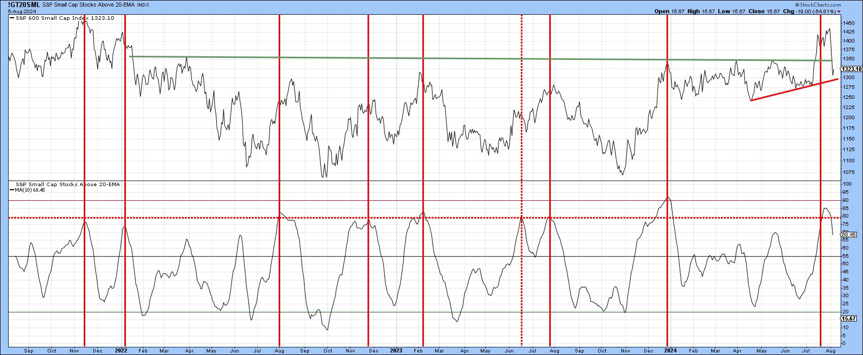
Chart 2 features the iShares Russell 2000 ETF (IWM) along with another diffusion indicator. This one substitutes a 100-day MA ($SMLA100R) for the 20-day EMA used in Chart 1. It too recently triggered a sell signal and is overstretched. In this instance a decisive break below the dashed up trendline at just over $200 would confirm the much-heralded July breakout as being false.
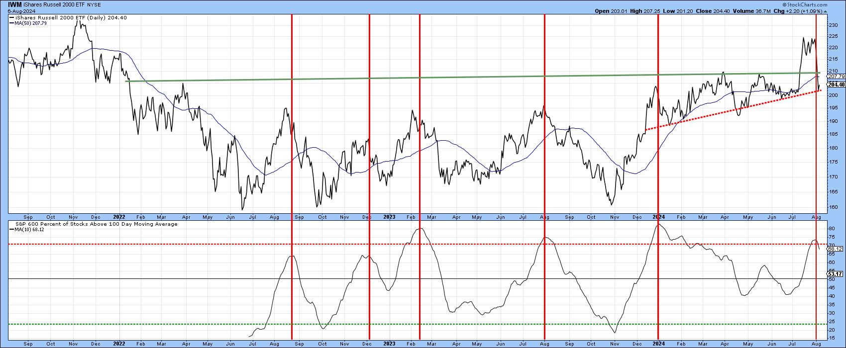
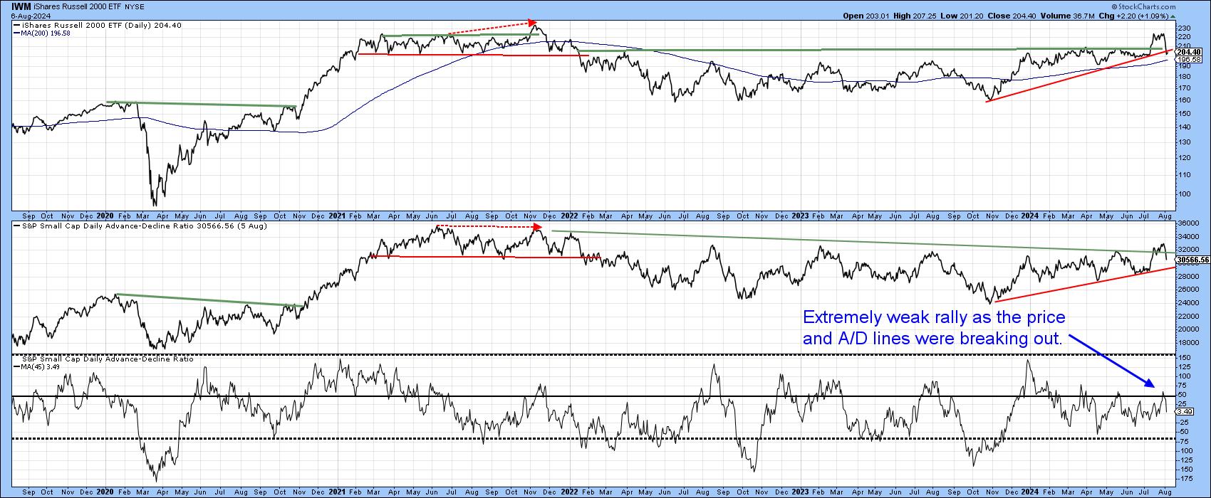
Chart 3, on the other hand, compares the price to the Small Cap Advance/Decline Ratio. You can see that this breadth indicator has also broken out but failed to hold above the extended resistance trendline. It looks like a whipsaw move but still requires additional proof, which would come with a violation of the 2023–2024 red up trendline. One reason this is likely to occur is that the 45-day ratio of daily small cap breadth was barely able to punch through zero when the "historic" breakout in the price was taking place.
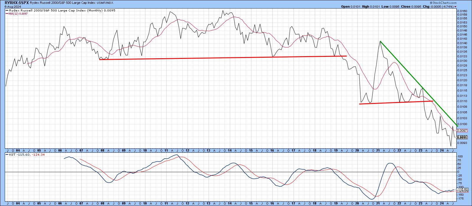
Finally, Chart 4 shows the relative action of the Rydex Russell 2000 Fund (RYRHX) against the S&P 500. Note that the "great rotation" temporarily pushed the RS line back above its 12-month MA. However, it could not remain there and failed to surpass its long-term bear trendline. So far, that move registers on the RS radar. Two caveats, though. First, this is a monthly chart, and there are 18 trading days left before an August settlement takes place. Second, the long-term Pring's Know Sure Thing (KST) is bullish. That does not guarantee a rally but does increase the odds of one.
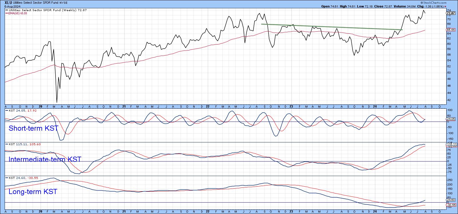
The Rotation to Utilities on a Sounder Technical Footing
It seems that a more durable rotation into Utilities has been taking place. Chart 5, for example, shows that all three momentum indicators for the Utilities Select Sector SPDR ETF (XLU) are in a positive trend, following a nice breakout by price. No prevarication here!
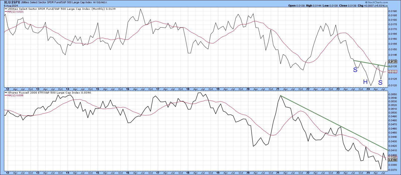
Second, Chart 6 compares the relative action we saw for the IWM in Chart 4 to that for the XLU. Note that the XLU RS line has completed a reverse head and shoulders pattern and is maintaining a position north of its 12-month MA. Even the MA has started to rally, which is usually a sign of a resilient trend.
Good luck and good charting,
Martin J. Pring
The views expressed in this article are those of the author and do not necessarily reflect the position or opinion of Pring Turner Capital Groupof Walnut Creek or its affiliates.


