What the Economic Indicators are Saying About Stocks and Commodities
You may not know it, but StockCharts' library of economic indicators has recently been enlarged. It's not as extensive as, say, the stock coverage, but it does include a lot of indicators that actually work, in the sense of helping identify major reversals in stock, bond, and commodity prices. I say "major", because economic indicators are often published well after the fact and subject to revision. Consequently, they are of little use for assessing short-term movements unless it's a kneejerk reaction to unexpected good or bad news in the trading pits on freshly published data. (FYI, the symbols for these indicators in the StockCharts database are preceded by the $$ sign.)
In this article, I will be using some of these indicators to see how they interact with stocks and commodities, along with what they are saying now.
The Stock Market and the Economy
At Pring Turner Capital, we assume the business cycle is nothing more or less than a series of chronological events that keep repeating, just like the seasons of the year. Most of the time, the sequence repeats in a consistent manner. However, there are enough exceptions and variation in the leads and lags to make the process more challenging. Fortunately for investors, primary trend turning points for stocks, bonds and commodities are part of the sequence. Since there are three markets and each has a peak and trough, the financial cycle can conveniently split into six stages or seasons, as demonstrated in Figure 1.
In my monthlyIntermarket Review, I use models, called barometers, to figure out the prevailing stage in the cycle. Knowing the existing stage or season helps greatly improve the asset allocation process. For a deep dive on this concept, pleaseread these articles.
Figure 1 tells us the models are currently signaling a Stage 3, which is bullish for all three markets.
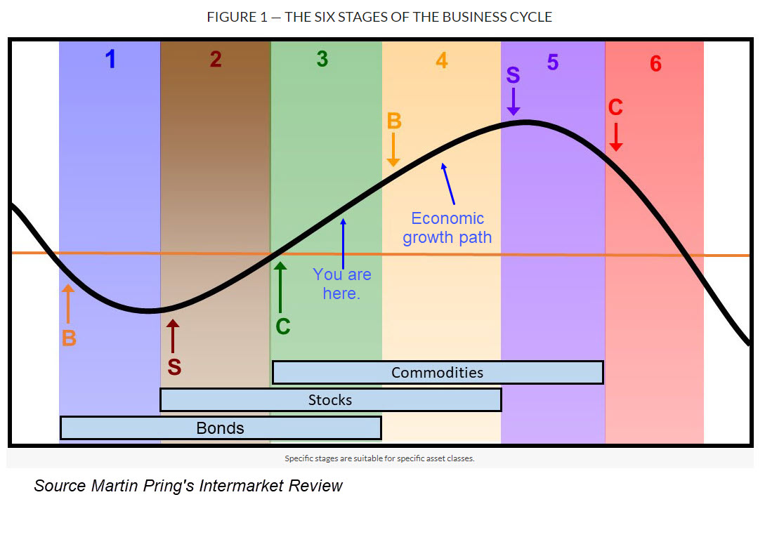
In an economic sense, the equity bull market is born during a recession, near the point where the economic growth path in Figure 1 drops to its low. At that time, the news is at its blackest, and stock investors start to anticipate the next recovery. Sometimes that economic growth curve reflects a slowdown and does not slip below zero. The usual sequence still takes place, but with less volatility. That process starts when the KST leading economic indicators bottoms out.
An example for the Conference Board's LEI ($$USLEI) is shown in Chart 1, where the vertical lines flag subzero MA crossovers. Nothing in life is perfect, as we can see from the false start in 1981. By and large, though, rising momentum from a subzero level is bullish for stocks. The current situation is slightly different because the economy is emerging from a growth slowdown rather than a recession.

Chart 2 compares the S&P to a survey of future capital spending, as published by the Philadelphia Fed ($$PHILFEDCAPEX). The raw data is of little use, as it is so jagged. However, when expressed in PPO format, it is evident that cyclic lows are typically followed by a nice rally in equities, as this is also a leading economic indicator. A major exception evolved in 2001, where it correctly predicted a recovery, but the market failed to respond because it was still busy unwinding the tech bubble.

Chart 3 tells us that improving confidence is a key to advancing the recovery. It compares the inflation-adjusted S&P Composite to University of Michigan consumer sentiment data ($$UMCSENT). The Michigan numbers are expressed in PPO format in the bottom window to obtain a clearer picture of their underlying trends. In that respect, the green-shaded areas flag periods when the oscillator has been above zero for an extended period, which is almost always positive for stocks. By the same token, virtually all major declines took place in the unshaded areas when the PPO was below its equilibrium point. The indicator is currently above zero, but not by much. However, the plot does not include preliminary data just published for December. At 74, it reflected a slight improvement over October's 71.8. More importantly, it allowed the PPO to experience a small upside reversal.

Bearing in mind that commodities generally bottom after stocks, Chart 4 compares the CRB Composite to capacity utilization ($$USCAPUTIL). It's fairly evident the two series move in a similar direction, as tightening capacity results in a squeeze on commodity prices and vice versa. The vertical lines show KST MA crossovers often turn out to be timely buy signals for commodities. The CRB has been edging its way higher, but has not taken off on the upside because of a declining trend in capacity. However, downside KST momentum has clearly stalled, suggesting it may be ripe for an upside reversal. Remember, the KST for the Conference Board's LEI and future capital spending data have already fulfilled their leading roles by turning up ahead of capacity momentum.

Chart 4 also tells us the commodity stakes are potentially high as a progression of the cycle to a late Stage 3 or a Stage 4 would involve the completion of a giant inverse head-and-shoulders.
A lot is going to depend on confidence, which will hinge on whether November's market action was a kneejerk reaction to expectations of a more friendly business environment, or represent the start of something more durable.
Good luck and good charting,
Martin J. Pring
The views expressed in this article are those of the author and do not necessarily reflect the position or opinion of Pring Turner Capital Group of Walnut Creek or its affiliates.


