Stocks Starting to Break Down Against This Key Asset
The S&P Composite ($SPX) briefly touched a new all-time high last week, which sounds encouraging. However, that kind of action was limited, as neither the Dow Industrials nor the NASDAQ Composite reached record territory. Such discrepancies can always be cleared up, of course, but more troubling is the fact that the ratio between the $SPX and gold ($GOLD) broke down in favor of the latter last week. We can see this in Chart 1, where the ratio slipped below the 2022-2025 support trendline. Since both momentum indicators are in a bearish mode, the break is likely to be genuine.
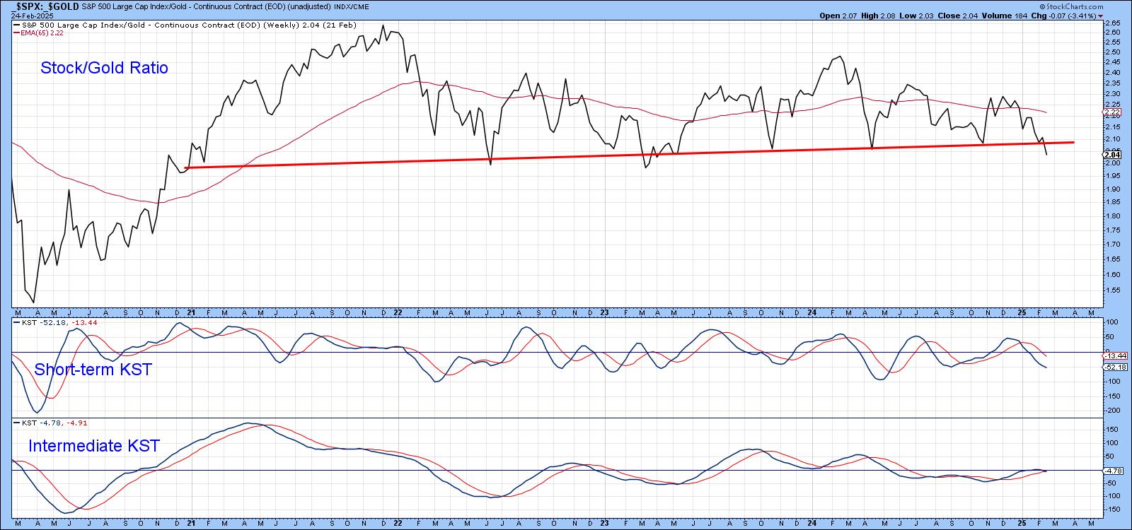
The break looks significant in its own right. However, when we expand the chart to cover a longer history, it is apparent that more is afoot than just the violation of a 3-year trendline. If the false 2020 break is ignored, the original trendline can now be traced back to late 2016. Not only is it longer but it has turned back more declines. Note the long-term KST triggered a sell signal at the end of last year, which adds further evidence favoring a valid downside break. One important caution is that this is a monthly chart and requires four more days of data before we can settle on a month end plot.

If the Break is Valid, What Does It Mean for Stocks and Gold in Their Own Right?
If this break is valid, which seems likely, all it means is that gold is likely to outperform stocks for an extended period. That said, it would be helpful to learn whether gold is likely to rally in its own right and if it the odds favor a stock market decline.
Chart 3 compares inflation-adjusted stocks in the upper window to the ratio in the lower one. Most of the time, a declining ratio means that equities weaken on an absolute basis. However, the red arrows highlight periods when stocks rallied in the face of a declining ratio. There are enough of those exceptions to caution against taking an automatic negative stance on equities simply because they are underperforming gold.

Another way of looking at this is to compare the ratio to its 48-month (4-year) moving average and observing what happens to inflation-adjusted stocks during such periods. In that respect, the green shading in Chart 4 tells us when the ratio is above its MA. The two ellipses indicate there have only been two serious whipsaws since the 1970s. What we see is that equities rally when the ratio is positive, but do not necessarily decline when it is not. It is also true to say that stocks are at their most vulnerable when the ratio is below its MA. A major exception to this occurred in 1987 when it was rising but the stock market crash happened anyway.

The ratio dropped below its MA at the end of last year, but action in 2025 has resulted in a more decisive break. Once again, it does not tell us that stocks are likely to decline but it certainly raises some cautionary flags.
Chart 5 shows things from a gold perspective. In this instance, a rising ratio means gold is outperforming stocks. The pink shading tells us when this relationship is trading below its 48-month MA. It captures most of the downside moves in the absolute price since 1972.
On the other hand, when the ratio is in a positive mode, reflected in the chart by the unshaded areas, gold is usually in a strong bull market. Since it is currently above its 48-month MA and has just broken to the upside, it seems likely that, the price of the yellow metal will continue to appreciate.

Technology Handing Over to Gold?
Finally, Chart 6 features the ratio between the recent star sector performer of the equity market, technology (XLK) and the gold price itself ($GOLD). This ratio has been in an uptrend, favoring the XLK since 2012. Recently though, it has slipped below its 600-day MA and the all important secular up trendline. The uptrend kicked off with a positive zero crossover by the Special K (SPK). If the uptrend reverses, it will be ironic, since it is likely to be accompanied by its first decisive negative crossover in 23 years. I am closely monitoring the dashed-red trendline, which could be the neckline of a 2-year head-and-shoulders top. If that gives way, it will undoubtedly result in a negative zero crossover for the SPK and perhaps, a golden age!

Good luck and good charting,
Martin J. Pring


