What RSI Is Really Saying About GOOGL, GS, and AAPL

Of all the technical indicators in my toolkit, the Relative Strength Index (RSI) remains my preferred way of measuring price momentum and defining trend phases. While novice traders tend to stick to simple measures of overbought and oversold conditions, a more advanced use of this powerful indicator designed by Welles Wilder can help us draw broader conclusions about trend strength and potential reversals.
Today, we’ll review three charts where the RSI is telling a particular story about the larger trend in price action. By recognizing these telltale signs and monitoring closely for changes in the RSI structure, we can ensure we’re on the correct side of the trend!
On top of that, we should also pay attention to which sectors are showing some of these RSI changes that could speak to larger changes in trend. Rotations from growth into value, from large-cap into small-cap names, and even between groups in the same sector, can often be detected by using the StockCharts scan engine to look for stocks demonstrating specific RSI patterns.
The Strong Uptrend Phase: GOOGL
While we’ve been documenting a steady rotation from growth into value Q4 of last year, some growth stocks remain in a clear position of strength. Alphabet (GOOGL) stands out as one of the few Magnificent 7 stocks that has made a new all-time high in January. And while the RSI was recently overbought, the long-term structure still suggests a bullish trend.
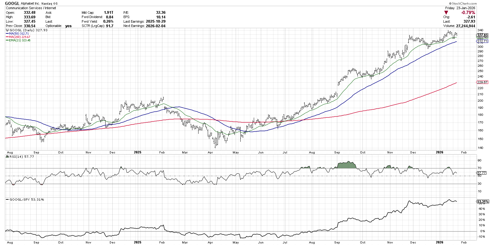
I would argue that the most important moment on this chart was around July 2025, when the price made a new three-month high. Note how the RSI finally pushed above the 60 level to reach the overbought reading of 70. This stronger price momentum during and after a major breakout speaks to the underlying strength behind the uptrend, and implies further upside to come.
Following that initial overbought condition, the RSI has often poked above 70 during upswings, serving to confirm the long-term uptrend phase. The key is to watch what happened during the subsequent pullback. As long as the RSI remains above 40, as it did during pullbacks in October, November, and December, then the current pullback would be confirmed as another short-term drop within a healthy accumulation phase.
The Bearish Momentum Divergence: GS
While the financial sector surprised with strong outperformance in Q4 2025, this earnings season has featured mixed results from key banks. Shares of Goldman Sachs (GS) remain in a primary uptrend, but the weaker momentum readings speak of a dangerous setup in January.
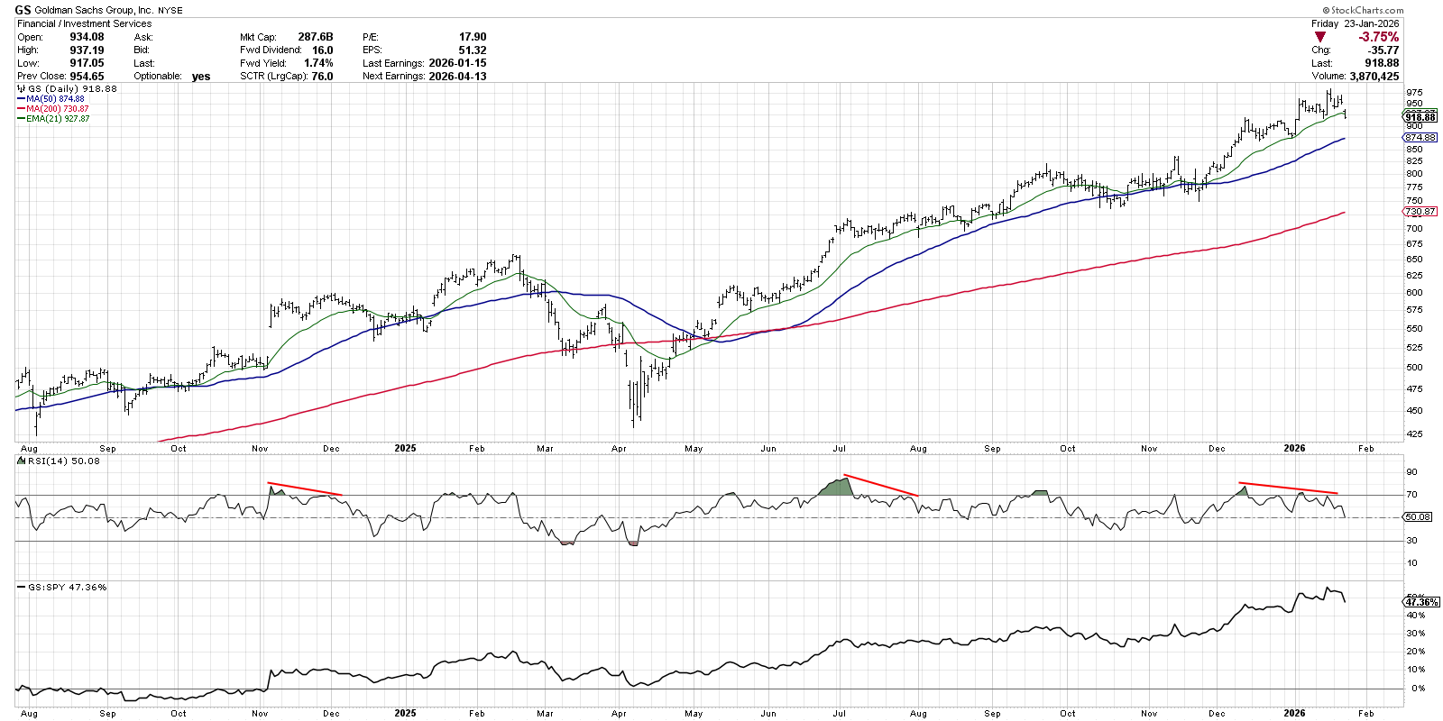
Similar to GOOGL, we can detect a clear uptrend pattern of higher highs and higher lows. But while the new high in December saw a big spike in RSI, subsequent peaks in January have shown lower RSI values. This “bearish momentum divergence” of higher prices on weaker momentum implies that there is less buying power actually pushing the price higher in the new year.
It’s not just Goldman Sachs flashing this bearish RSI pattern. Morgan Stanley (MS), Charles Schwab (SCHW), American Express (AXP), and many others have shown a similar deterioration in price momentum in January. With charts like GS, I see an RSI divergence as a leading indicator. Now it’s all about monitoring short-term support levels to see if they hold on a pullback. And if the price would break down and be accompanied by an RSI below the 40 level, then a new downtrend phase would be confirmed.
The Full-On Breakdown: AAPL
Speaking of former leadership names breaking down on weaker momentum, our final example is Apple (AAPL). While Apple did not have a bearish momentum divergence at its December peak, the price and momentum are now both confirming a new downtrend phase.
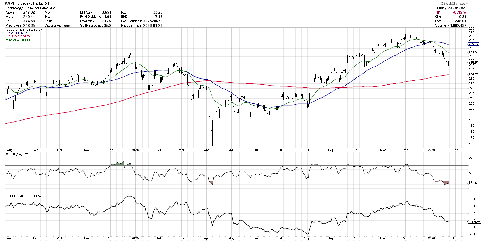
This example shows what can happen when the price trend reverses lower and the RSI pushes down to levels that serve to confirm a new primary downtrend phase. Note how pullbacks after the April 2025 low never saw the RSI drop much below the 40 level. Also note what happened at the beginning of January, when the RSI finally dropped into a bearish range as AAPL blew through its 50-day moving average.
Now that Apple is in a confirmed downtrend phase, it’s all about monitoring for a positive rotation in trend and momentum. Once the distribution phase is complete, we would see the price breaking above moving average resistance, and improved RSI readings to confirm new upside momentum. Until then, though, this chart should be considered “guilty until proven innocent.”
RR#6,
Dave
P.S. Ready to upgrade your investment process? Check out my free behavioral investing course!
David Keller, CMT
President and Chief Strategist
Sierra Alpha Research LLC
marketmisbehavior.com
https://www.youtube.com/c/MarketMisbehavior
Disclaimer: This blog is for educational purposes only and should not be construed as financial advice. The ideas and strategies should never be used without first assessing your own personal and financial situation, or without consulting a financial professional.
The author does not have a position in mentioned securities at the time of publication. Any opinions expressed herein are solely those of the author and do not in any way represent the views or opinions of any other person or entity.


