New Highs vs New Lows; XLC Goes Beast Mode; Risk is On; Dissecting Gold; A Cyber Setup
Key Takeaways
- New highs are consistently outpacing new lows
- Communication Services SPDR leads with a new high
- EW Technology consolidates above breakout
- EW Consumer Discretionary sector leads
- Dissecting the ascending triangle in the Gold SPDR
- Zscaler sets up with oversold condition
Welcome to the Friday Chart Fix!
Today's report starts with a bullish breadth indicator and the level to watch going forward. We then turn to the strongest sector: Communication Services, which has been on fire since May and continues to lead. Overall, stocks are in good shape, with the EW Technology sector trading above resistance and Consumer Discretionary outperforming Consumer Staples. Finally, we focus on Zscaler as it corrects within a long-term uptrend.
A speech from Fed Chairman Powell juiced the markets two weeks ago. Today, the employment report will provide the fireworks. This report was written well before the eternally revised employment report. Jobs and interest rates matter, but price is the ultimate arbiter, which is why charts matter the most. Whatever the reaction to the employment report, focus on the charts and maintain perspective.
New Highs Consistently Outpacing New Lows
The chart below shows the S&P 500 ($SPX), New Highs/Lows, and the High-Low Line. Even though new highs exceeded 50 only once since the current advance began (April), the High-Low Line continues to rise as new highs outnumber new lows. Notice that the High-Low Line first crossed its 10-day EMA (pink line) on May 2. The bulls have the edge as long as this EMA holds.
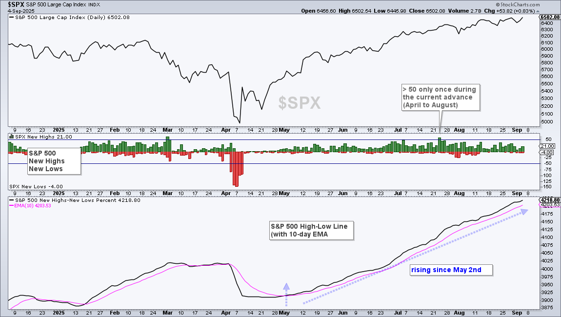
The High-Low Line is a running total of the difference between the 52-week highs and 52-week lows. This line rises when new highs outnumber new lows and falls when new lows outpace new highs. A rising High-Low Line means new highs are consistently outpacing new lows.
Communication Services SPDR Leads with New High
The Communication Services Select Sector SPDR Fund (XLC) remains in a strong uptrend. Breadth is strong within the sector, and it is outperforming the broader market. XLC is leading the sectors with a series of new highs since late June, which should not come as a surprise since XLC has been leading since May (blue dashed line). After the early April swoon, it was one of the quickest to recover, recapturing its 200-day SMA and breaking the April 9 high in late April. It has been nothing but uptrend since this breakout.
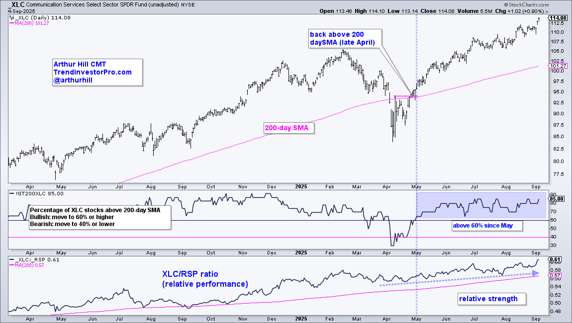
There was also a bullish breadth signal, as the Percentage of XLC stocks above their 200-day SMA exceeded 60% in early May. This indicator has been above 60% since May and 85% of component stocks are currently above their 200-day SMAs. This shows broad strength within the sector. Finally, the bottom window shows the price-relative (XLC/RSP ratio) holding above its 200-day SMA since September 2024! After a dip in February–March, it turned back up in late April and hit new highs in June, July, August, and September.
Recent reports and videos at TrendInvestorPro:
- SPY, QQQ and XLK hold the key.
- Small-caps and Banks continue to lead.
- Stocks with bullish setups (QCOM, AMZN, ELF…).
- The next levels to watch for gold and silver.
- Uranium follows through on breakout.
- Click here to learn about subscriber bonuses and a trial offer.
EW Technology Consolidates above Breakout
The Invesco S&P 500 EW Technology ETF (RSPT) surged to new highs in June, then consolidated with a trading range above these highs (blue shading). Clearly, RSPT is in a long-term uptrend. This is positive because the ETF represents the average tech stock, not just the large-caps. The consolidation looks like a flat flag, which is a bullish continuation pattern. A breakout would confirm the pattern and signal a continuation higher. A break below 40 would negate the flag pattern.
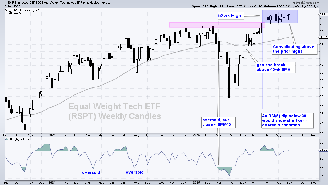
Even though a break below 40 would be short-term negative, it would not reverse the long-term uptrend because RSPT would still be well above the rising 40-week SMA. This means a pullback could set up the next mean-reversion opportunity. The bottom window shows RSI(5) with two dips below 30 in 2024; these dips signaled oversold conditions that presented opportunities to trade within the uptrend.
EW Consumer Discretionary Sector Leads
How bad can it be when the Equal-Weight Consumer Discretionary Sector is hitting a new high? Answer: Not that bad.
The chart below shows the Invesco S&P 500 EW Consumer Discretionary ETF (RSPD) gapping above its 40-week SMA in early May, breaking a pennant line in late June and hitting new highs in August–September. This is bullish because this sector represents retail, travel, autos, restaurants, and homebuilding.
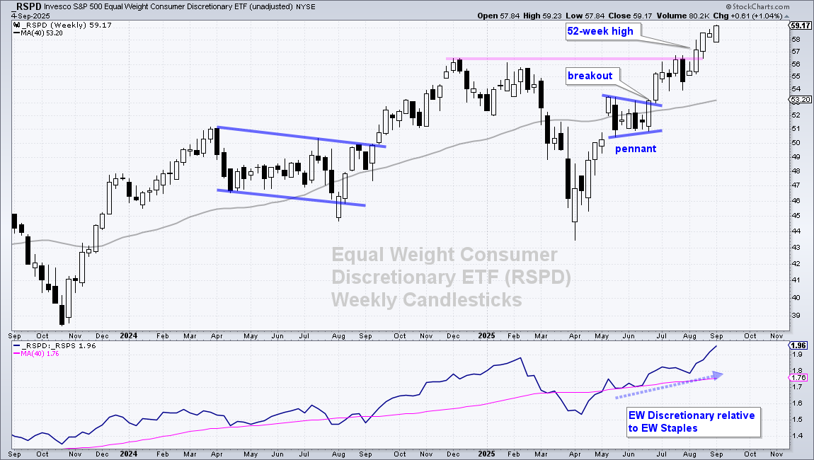
In addition to absolute strength, the EW Consumer Discretionary sector is outperforming the EW Consumer Staples Sector (RSPS). The bottom window shows the RSPD/RSPS ratio, which is the relative performance line. This ratio turned up in April, broke its 40-week SMA in early May and moved to new highs. Consumer Discretionary (risk-on) is outperforming Consumer Staples (risk-off).
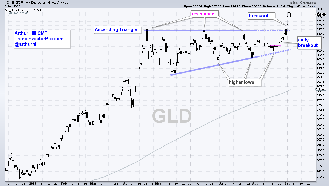
Dissecting the Ascending Triangle in the Gold SPDR
The SPDR Gold Shares (GLD) surged to another new high with a 7.5% move from August 19 to September 3. This move was building for weeks as the ETF formed a classic bullish continuation pattern ahead of the surge. The solid blue lines show a classic Ascending Triangle from late April to early August. This pattern was there well before the breakout, and featured on TrendInvestorPro.
The flat upper line marks overhead resistance (supply), while the rising lower line defines demand. "Rising" is the key word here. Higher lows formed in late June, late July, and mid-August. These higher lows mean buying pressure (demand) is coming in at higher price levels, which is bullish. A break above the resistance line signals a victory over supply and confirms the pattern. Chartists looking to get a jump on the breakout can look for oversold conditions within the pattern or short-term breakouts, such as the one on August 22. These were also noted on TrendInvestorPro.
Zscaler Sets Up with Oversold Condition
The next chart shows weekly candlesticks for Zscaler (ZS), which is part of the Cybersecurity ETF (CIBR). The stock and ETF fell in July–August, but I view these declines as corrections within bigger uptrends. Note that ZS surged 81% in 12 weeks and became overbought. The stock worked off this overbought condition with a correction the last nine weeks. I view this as a correction because price is still well above the rising 40-week SMA (uptrend).
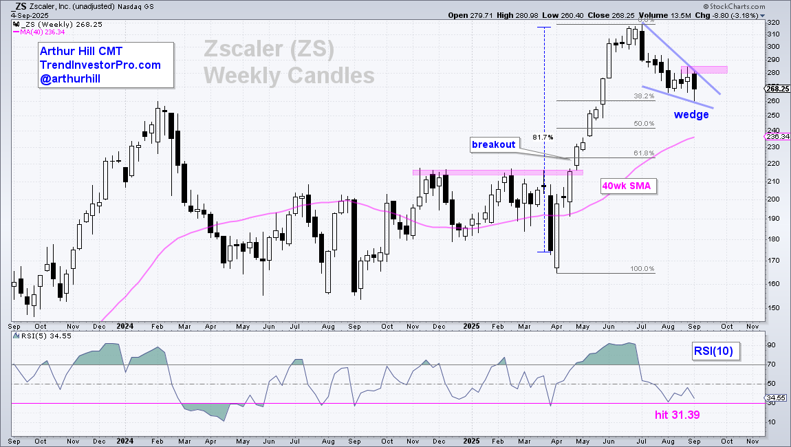
ZS piqued my interest because a classic correction is taking shape and the stock became short-term oversold (almost). First, the decline formed a falling wedge that retraced around 38% of the prior advance. The falling wedge is typical for a correction after a strong advance, as is the retracement amount. Second, RSI(5) hit 31.39 in early August, which is almost oversold. A setup is in the works and I am now looking for an upside catalyst. The August high mark resistance at 285 and a breakout here would be bullish.
See TrendInvestorPro for more chart analysis and videos.


