Ranking Long-Term Breadth; Healthcare Improves; Finance Breaks Down; Technology Holds Up; MAG7 Sets Up

Key Takeaways
- Breadth in the Health Care sector improves as Utilities lead
- Breadth in the Financials sector gets hit as XLF breaks down
- XLK rides the upper Bollinger Band higher
- Mag7 ETF becomes oversold within leading uptrend
Welcome to the Friday Chart Fix!
Price action turned volatile in October, with one key sector breaking down and another holding up. This bifurcation within the market is par for the course lately, and the key, as always, is to focus on the leaders and ignore the laggards. Finance and banks are lagging, while technology, healthcare and utilities are leading.
Today's report will rank long-term breadth and show the breakdown in finance. The Technology SPDR is still holding up and leading, and the Mag7 ETF is oversold within a leading uptrend.
Healthcare Breadth Improves as Utilities Lead
Long-term breadth indicators show weakening within the Nasdaq 100 and Financials sector, and strengthening within the Health Care sector. The table below shows the percentage of stocks above their 200-day Exponential Moving Averages (EMAs) for the major indexes and sectors, and the three month change in this indicator. For example, 53% of Nasdaq 100 stocks are above their 200-day EMAs, and this indicator fell 17 points in the last three months (pink rectangle). 70% of NDX stocks were above their 200-day EMAs three months ago. This shows weakening within the Nasdaq 100. The S&P SmallCap 600 is the laggard, with just 45.17% of components above their 200-day EMAs (pink oval).
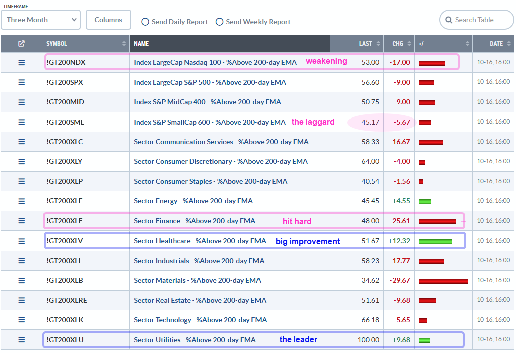
Among the sectors, the Finance SPDR (XLF) shows the second-largest decline. 48% of XLF stocks are above their 200-day EMAs, and this indicator fell 25.61 points the last three months (pink rectangle). The Materials SPDR (XLB) fared even worse. On the positive side, healthcare shows the biggest improvement; 51.67% of healthcare stocks are above their 200-day SMAs, and this indicator rose 12.32 points over the last three months (blue rectangle). 100% of utilities stocks are above their 200-day EMAs and this sector remains the leader. XLV and XLU have been, and remain, on our radar at TrendInvestorPro.
XLF Drops the First Shoe
With a 13.4% weighting, the Financials sector is the second-largest sector in the S&P 500. Finance, however, is still a distant second to technology, which accounts for 34.83% of this key benchmark for U.S. stocks. Nevertheless, the recent breakdown in the Finance SPDR (XLF) is negative. The chart below shows XLF hitting a new high in August, stalling in September, and breaking the September lows with a sharp decline last Friday. This is the first shoe to drop. The August lows and rising 200-day SMA mark long-term support at 51. This is the level to watch for the second shoe, and a long-term trend reversal.
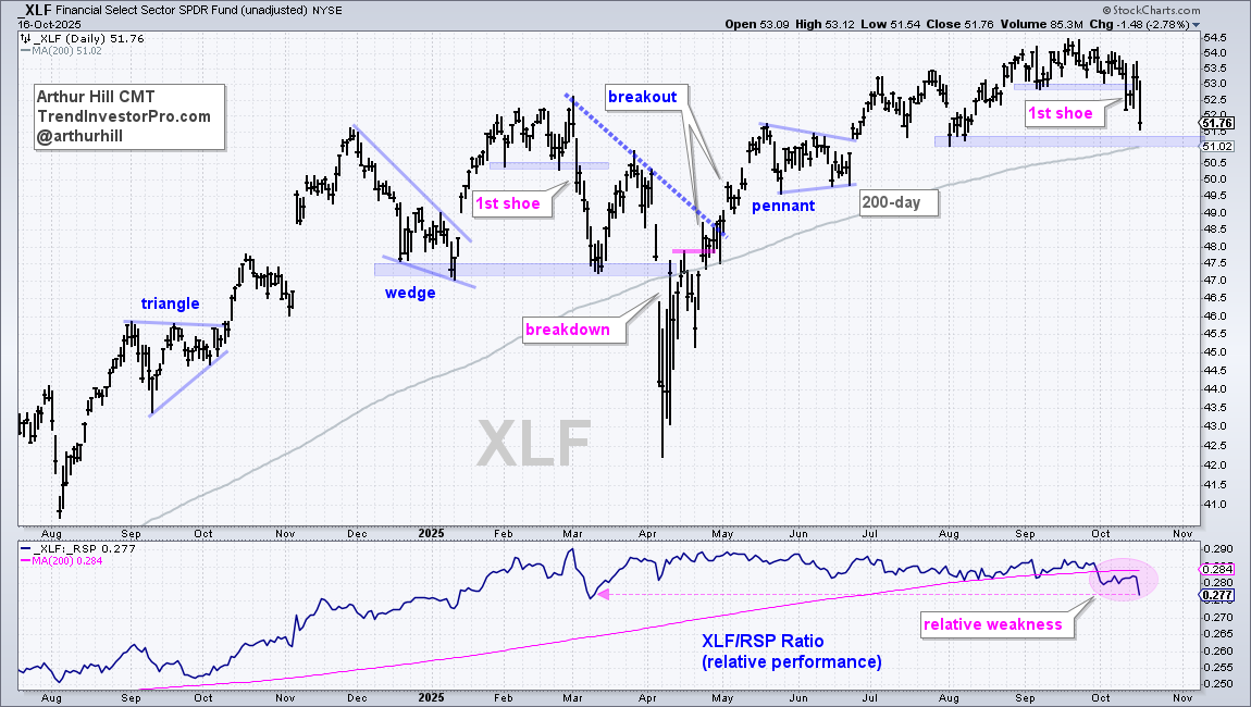
The indicator window shows the XLF/RSP ratio turning down in early October and moving lower this month (pink oval). This relative performance line hit its lowest level since March and XLF shows relative weakness. Based on relative performance and a break below the September low, chartists should avoid this sector.
Recent reports and videos at TrendInvestorPro:
- How to Trade the Parabolic Moves in the Gold/Silver Miners
- Junk Yield Spreads Widen (Market Regime Report)
- XLK and QQQ Maintain Leading Uptrends
- Utilities Lead as Healthcare Holds Breakout
- Click here to take a trial and gain full access.
XLK Rides the Upper Bollinger Band Higher
The Technology SPDR (XLK) is the key sector to watch for clues on the S&P 500 SPDR (SPY). The chart below shows XLK with the 200-day SMA (gray line), Bollinger BandsⓇ and %B. First, the long-term trend is up with a new high in October; price is well above the rising 200-day SMA. XLK was hit hard last Friday, but managed to firm this week with four inside days. A break below Friday's low would be negative, but not bearish. Instead, it would more likely lead to the next oversold setup and trading opportunity.
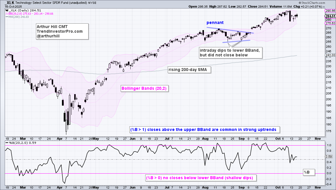
Chartists can use %B to identify oversold conditions. %B reflects the level of the close relative to the upper and lower Bollinger Bands. %B below zero means the close was below the lower band, while %B above 1 means the close was above the upper band. Notice how %B exceeded 1 several times over the last six months; riding the upper BBand is typical for strong uptrends. %B below zero signals an oversold condition that can lead to a trading setup. Thus, a close below the lower Bollinger Band (%B<0) would signal oversold conditions. Such conditions present traders with opportunities to trade in the direction of the bigger uptrend.
Mag7 ETF Oversold Within Leading Uptrend
The next chart shows the Mag7 ETF (MAGS) with an oversold setup. First, MAGS is in a long-term uptrend with new highs in September and price well above the rising 200-day SMA. The ETF was hit hard last Friday and closed below the lower Bollinger Band for the first time since early April. This signals that MAGS is short-term oversold.
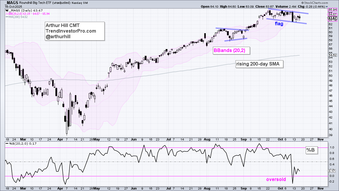
Stock and ETFs go on my watchlist when they become oversold within a leading uptrend. I then watch price action and look for a trading signal on the price chart. After advancing to new highs, MAGS formed a falling flag over the last four weeks. Such flags are short-term bullish continuation patterns. A break above last week's high would be bullish and signal a continuation higher. I would then use the flag lows as the initial stop. TrendInvestorPro specializes in finding these types of trading setups for stocks and ETFs.
See TrendInvestorPro for more chart analysis and videos.


