Full Rotations on One Side of an RRG

One of the key strengths of a Relative Rotation Graph (RRG) is that it allows us to see the rhythm of relative strength. Securities don’t just flip between outperforming and underperforming in a straight line. They move in cycles, and RRGs provide a way to track those cycles as they unfold, while keeping an eye on an entire universe.
Over the years, we have found out that rotations that are completed fully on either the right-hand side or the left-hand side of the graph provide reliable "signals" for a continuation of the existing trend. These patterns tell us something about the nature of the underlying relative trend.
The Four Quadrants in Context
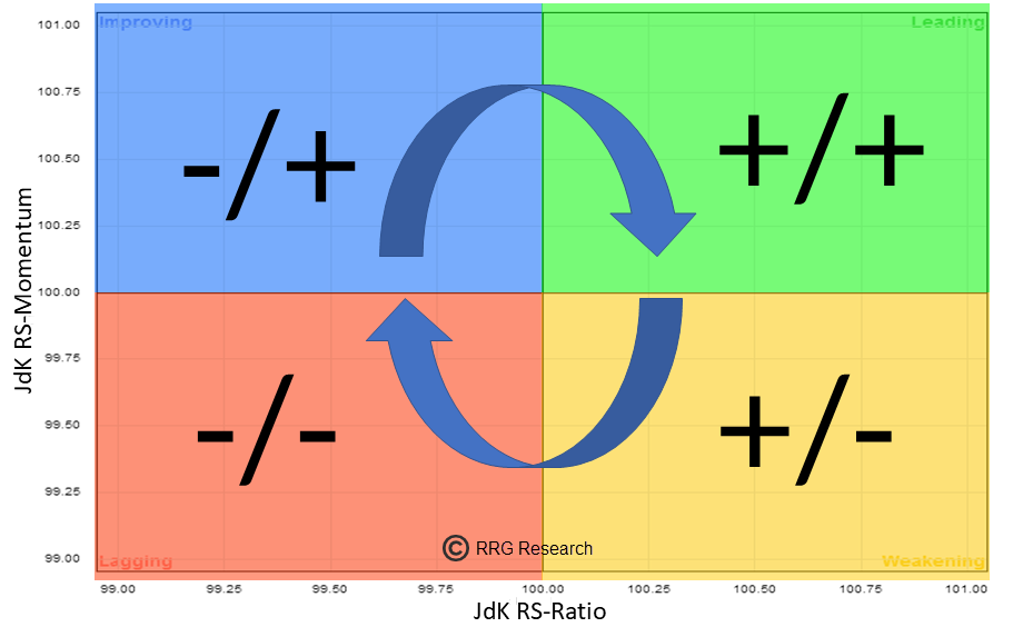
Quick refresher: Every security on an RRG rotates clockwise through the four quadrants.
- Leading (top-right): in a relative uptrend and improving.
- Weakening (bottom-right): still in a relative uptrend, but losing momentum.
- Lagging (bottom-left): in a relative downtrend and deteriorating.
- Improving (top-left): still in a relative downtrend, but picking up momentum.
That clockwise rhythm represents a complete cycle of relative performance.

A New Up-Leg In An Already Existing Relative Uptrend
When a rotation completes entirely on the right-hand side of the graph, the security never dips into the Lagging quadrant. Instead, it remains in a relative uptrend mode throughout.
Here’s how I like to explain it:
- A move from Improving into Leading is essentially a trend change — the relative line has turned from down to up.
- A move from Weakening back into Leading marks the start of a new up-leg in an existing relative uptrend.
So if the entire rotation stays on the right side, it signals persistent leadership. Even temporary momentum drops (Weakening) don’t push the relative line into negative territory. This is a very bullish setup: the market is confirming that the security is a leader and remains in demand.


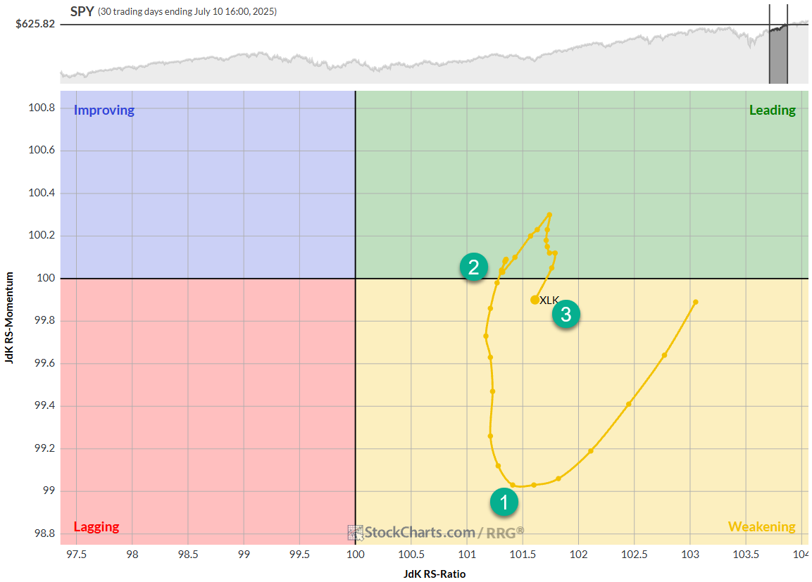
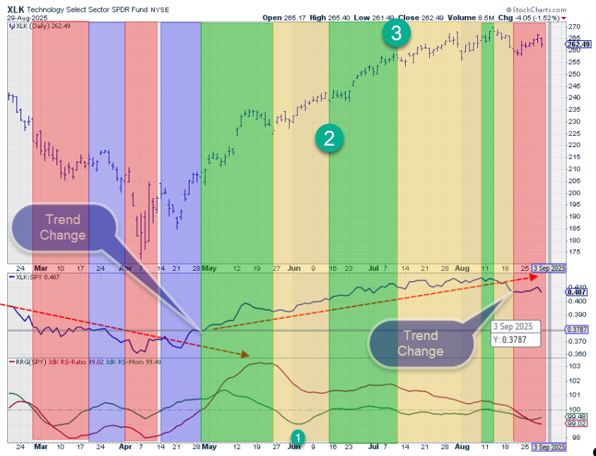
The RRG above shows the rotation for XLK from May 27, 2025 to July 10, 2025. The tail starts when it just enters the weakening quadrant. This is where the first yellow-shaded area on the price chart begins.
The most interesting point on the tail is where it starts to curl back up (1), especially when the tail begins to move at an RRG heading between 0 and 90 degrees.
At (2), the RS-Momentum line then crosses back above 100, which pushes the tail back into the leading quadrant, confirming the continuation of the existing relative up-trend.
At (3), the RS-Momentum line crosses below 100 again, pushing the tail back into weakening.
Measured from the move from weakening into leading and then back into weakening again, XLK gained 7.62% vs 5.14% for SPY. Conservatively measured from (1) to (3), XLK gained 7.99% vs 4.76% for SPY, in a period of 22 trading days.
Left-Hand Side Rotations are the Reverse
The opposite happens when a rotation completes fully on the left-hand side. Here, the security never makes it into the Leading quadrant.
- A move from Lagging into Improving signals an upturn in relative momentum. Be careful, this is NOT (yet) a reversal of the relative trend.
- A move from Weakening back into Lagging marks the start of a new down-leg in an existing relative downtrend.
So when the entire cycle stays on the left side, relative momentum may improve temporarily, but the underlying relative trend remains negative. This is the characteristic of a firm relative downtrend.
Why This Matters for Portfolio Decisions
Rotations that fully complete on one side of the graph help you stay with the relative trend for longer, and this can help prevent you from getting out of a move too early.
Obviously, we don't know whether a tail that crosses from leading into weakening will continue its move to lagging or curl back up and re-enter the leading quadrant without hitting lagging.
The metric to watch here for assessment is the reading on the RS-Ratio scale. The higher on the RS-Ratio scale the tail crosses from leading to weakening, the higher the odds for a complete rotation leading-weakening-leading.
Final Thoughts
Relative Rotation Graphs are not just about spotting which quadrants securities occupy at a single point in time. The path they follow is much more important.
Rotations that remain entirely on the right-hand side tell us we are in the middle of a relative uptrend, with each turn back into Leading marking a fresh up-leg. Rotations on the left-hand side indicate the opposite: a persistent relative downtrend, with each turn back into Lagging marking the start of another down-leg.
Recognizing these “legs” in the cycle helps you align portfolios with the true leaders and avoid the persistent laggards.
#StayAlert and have a great weekend, --Julius


