The State of the Market: Trend, Breadth & Leadership, Plus a Trend-Momentum Strategy
Key Takeaways
- SPY is in a clear uptrend with bullish breadth
- Finance, Health Care, and Industrials sectors lead
- Combine trend and momentum to select stocks, plus two healthcare stocks to consider
Despite pockets of weakness, the weight of the evidence is bullish for stocks, and has been so for several months. Until the evidence changes, we should be exposed to names in leading groups. It is often a bumpy ride full of uncertainties, but the key, as always, is to step back, turn off the news and focus on the charts.
The SPDR S&P 500 ETF (SPY) is in a long-term uptrend, breadth is clearly bullish, and non-tech sectors are leading. Today's report will cover these items and show a trend/momentum approach to find two candidate stocks in a leading sector.
SPY In a Clear Uptrend
The first chart shows SPY crossing above its 200-day Simple Moving Average (SMA) in mid-May and hitting new highs in early January. The S&P 500 is the most important benchmark for US stocks. There is a bull market somewhere when SPY is above its 200-day SMA and hitting new highs. Sure, we could see a correction, but the trend is up until proven otherwise.
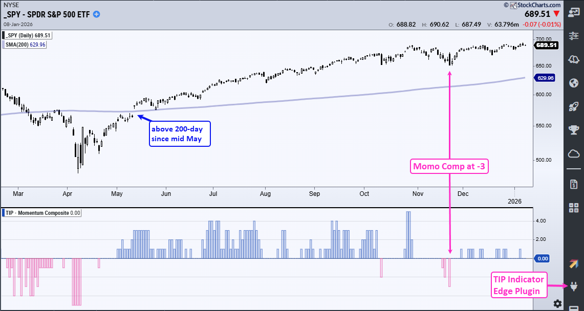
The indicator window shows the Momentum Composite, which aggregates overbought and oversold signals in five momentum indicators. Readings at -3 or lower signal conditions. It hit -3 in late November for the first oversold reading since the uptrend began. This means that three of the five indicators were oversold.
The Momentum Composite is one of 11 indicators in the TIP Indicator Edge plugin. Cick here to learn more!
New Highs Expand Within S&P 500
Breadth is strong enough to support a bull market. The next chart shows new highs and lows for the S&P 500 in the middle window. Since SPY crossed its 200-day SMA in mid May, new highs exceeded the 50 threshold three times last year and twice already this year. 50 is equivalent to 10% of the index. There were 64 new highs on January 5th and 6th. This is the highest amount in over a year.
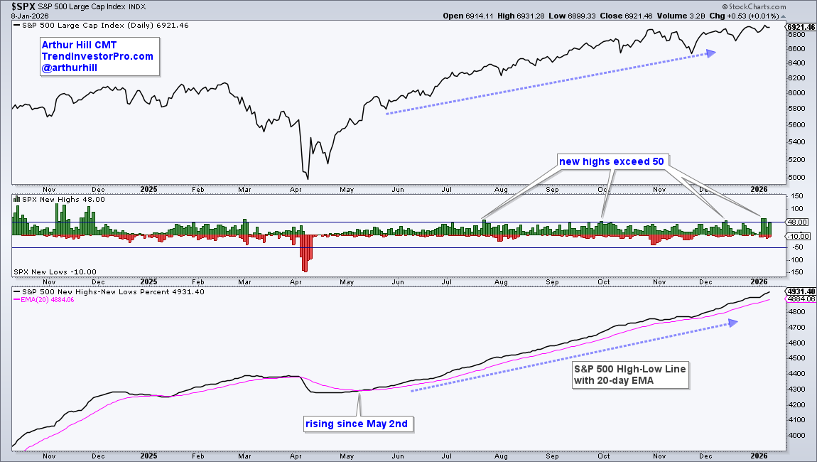
The bottom window shows the High-Low Line, which is a cumulative measure of net new highs (new highs less new lows). This line rises when new highs outnumber new lows and it has been rising since early May. The bulls have a clear edge as long as this line holds above its 20-day EMA.
Finance, Healthcare, and Industrial Stocks Lead
The table below shows the percentage of stocks above their 200-day EMAs for four major indexes and the 11 sectors. Finance, Healthcare, and Industrials are leading with the most stocks above their 200-day EMAs; these three account for 31.5% of the S&P 500. Technology is still the biggest sector with a 34.5% weighting, yet is lagging with 58% of component stocks above their 200-day EMAs. Even so, the cup is still half full because most components are in long-term uptrends.
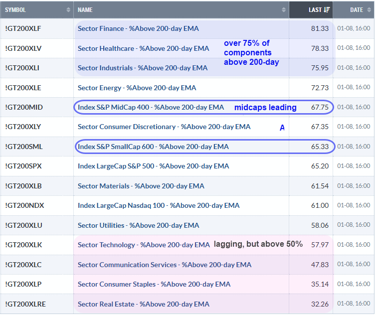
Also note that the S&P MidCap 400 has more stocks in long-term uptrends than the S&P 500. Even though the S&P 500 is lagging, 65% of its stocks are above their 200-day EMAs. This is by no means weak, because most S&P 500 stocks are in long-term uptrends.
Recent reports and videos at TrendInvestorPro:
- Bullish Continuation Pattern for SPY and Breakout for IWM
- Key Levels for MAGS, QQQ, and XLK
- Bullish Setups for Two Home Construction Stocks
- Trend Composite Signals for S&P 500 Stocks
- Core ETF Chart list (76 ETFs organized in a top-down manner)
- Click here to take a trial and gain immediate access!
Combining Trend and Momentum Composites
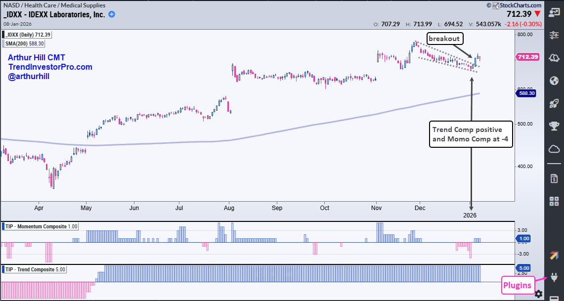
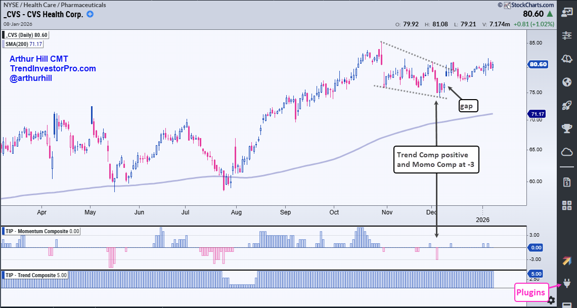
We are in a bull market with the Health Care sector leading. With this in mind, my strategy is to find healthcare stocks that are oversold within uptrends. An oversold condition means there was a pullback within the uptrend, which is an opportunity.
The next two charts show the Trend Composite in the bottom window and the Momentum Composite in the middle window. The Trend Composite is used to define the long-term trend, which is up in both cases. Once in an uptrend, the Momentum Composite is used to identify short-term overbought conditions within the uptrend. Oversold conditions provide traders with opportunities to trade in the direction of the bigger trend.
The first chart shows IDEXX Laboratories (IDXX) with a pullback into December and oversold condition on January 2nd as the Momentum Composite hit -4. A falling wedge formed on the price chart and the stock broke out with a surge the last four days.
The next chart shows CVS Health (CVS) with the Trend Composite positive (uptrend) and the Momentum Composite becoming oversold on December 2nd (-3). A falling wedge formed and the stock broke the wedge line with a gap surge on December 9th. The wedge looks like a correction within the long-term uptrend. The gap-breakout signals an end to this correction and a resumption of the uptrend.
Trend Composite Settings
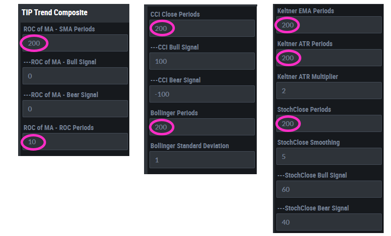
All indicators have default settings, which we can change based on our preferences. I am not using the default settings for the Trend Composite. Instead of 125 periods, I am using 200 periods for each of the five indicators. In general, I find that 200 periods works better for stocks (fewer whipsaws and longer trends). The image below shows these settings.
See TrendInvestorPro for more reports and videos.


