The Market's Tug-of-War: How to Read the S&P 500's Hammer Signals

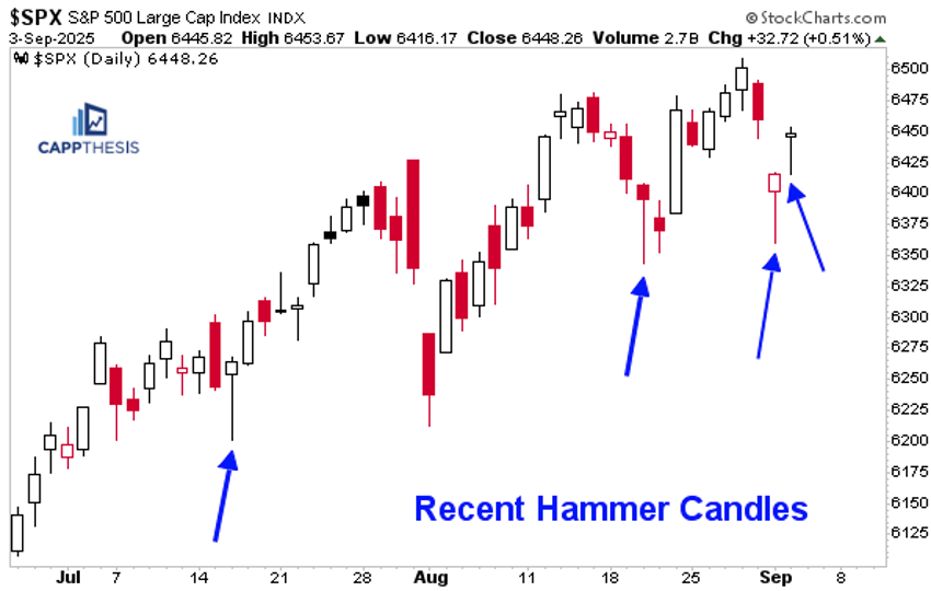
If you’ve been watching the S&P 500 ($SPX) lately, you may have noticed it rallied strongly intraday and finished near the top of its range, again. It carved out another hammer candlestick on Wednesday, which makes two in a row.
I’m not sure how rare it is to see two straight hammers, but a registering of strong closes in the S&P 500 is clearly bullish. The big question is whether buyers will grow tired of supporting early weakness if they aren’t rewarded with new highs soon.
Stuck in a Tug-of-War
For the past three weeks, the market has been in a tug-of-war, with the S&P 500 basically net flat ever since making a new high on August 12 with a strong +1% gain. The index pushed higher for two more days before a five-day losing streak set in. That run ended with a bang on Jackson Hole day (August 22) with an even bigger +1.5% spike. Yet that move, once again, produced short-lived new highs that quickly faded.
The acute turns, false breakouts, and breakdowns since August 12 have been enough to negate the very short-term bullish pattern we had been tracking.
Trading Boxes
While frustrating for bulls and bears, the market has again settled into a new trading box. That's nothing unusual, and in fact it’s the sixth such range since the April lows, with each of the prior five having ultimately resolved to the upside.
It wouldn't be surprising if this one follows the same script. It might feel boring, but “boring," in this case, could mean the S&P 500 breaks out to fresh highs after constructively digesting a short-term stretched state. That pattern of behavior is exactly what has fueled the nearly five-month-old uptrend we’re still in today.

Lessons From Recent History
We’ve been comparing this advance to two recent periods:
- The 2020 COVID pivot into 2021, which remains a relevant blueprint.
- The rally from late October 2023 to the end of March 2024.
This current advance looks comparable because, following the explosive rally off the lows, downside volatility has been virtually nonexistent. The biggest peak-to-trough pullback has been only 3.5%, echoing the calm uptrend of late 2023–early 2024. That prior move persisted for five months, and we’re now just about at the five-month mark since the April 7 low.
As the chart shows, the S&P 500 gained nearly 29% before topping on March 28, 2024. In the current run, it’s already up about 34% through the most recent high on August 28. Whether that proves to be a short-term peak or extends further, the setup suggests we may soon see a more meaningful pullback.
So it’s not a question of “if,” but “when.” More importantly, it will be critical to watch how the market responds to the first real body blow.
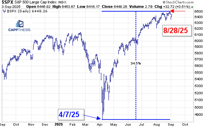

Zooming out to show all of 2024, recall that the pullback from the March high to the low totaled about 6%, with the next round of buying soon thereafter setting the stage for a strong year-end finish. Of course, that came after an even bigger summer correction, which served as the reset before the final surge.
Looking ahead, while there is no clear indication of what could unfold into 2026, we can be confident there will be plenty of opportunities along the way. Bullish patterns have already been playing out, and the mean-reverting indicators have so far failed to trigger a real downside. Even the latest Moving Average Convergence/Divergence (MACD) sell signal has yet to produce meaningful weakness.
These are the factors we’ll be watching closely for signs of a true character change in the market.

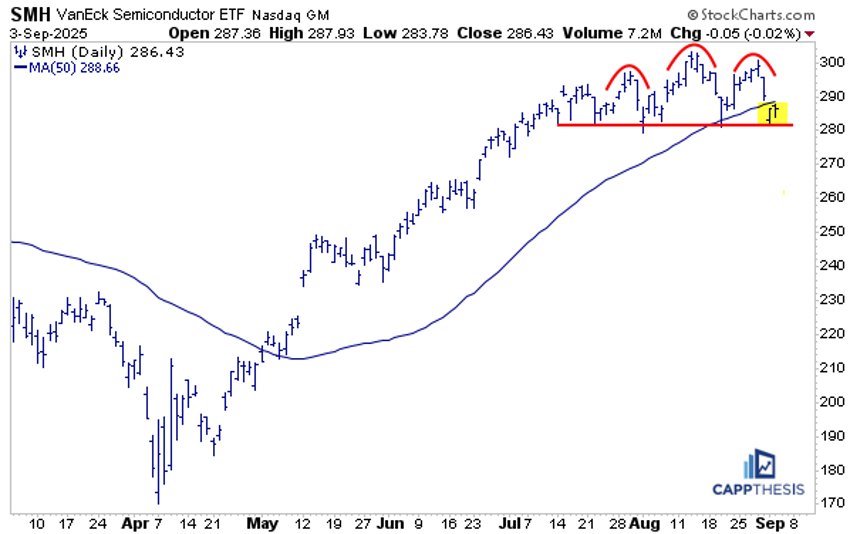
Zooming In: Semiconductors (SMH)
The VanEck Semiconductor ETF (SMH) is telling a similar story. Since mid-July, it’s been locked in a relatively tight trading range, with both false breakout attempts and breakdowns failing to generate any follow-through. Up to this point, each of the prior consolidation phases since the April lows has ultimately been resolved to the upside.

Another viewpoint highlights the risk of a potential topping pattern, with the ETF teetering on the 280 level and now trading below its 50-day moving average for two straight sessions. It’s the first time that has happened since late April.
This raises an obvious concern of a downside break, especially given that there is no meaningful near-term support underneath current levels.
From March to May 2024, SMH formed an inverse bearish cup-and-handle pattern after a blow-off top in March. It eventually broke below its support zone, a move that also pushed it under the 50-day moving average.
That breakdown saw clear downside follow-through, but it proved temporary. A bid returned within days, and SMH quickly reclaimed the 50-day MA line, which in turn set the stage for an even stronger advance into early June.
History shows that even if we get another downside break now, and even some follow-through weakness, it doesn’t necessarily imply a major material decline. More likely, it could simply be a normal retracement within an extreme and relatively consistent rally.

The Bottom Line
While waiting for the market to make a decisive move in either direction can be frustrating, it's also part of the process of a healthy uptrend. It's important to remember that as long as the pullbacks stay controlled and buyers return, the bigger picture remains bullish.


