StockCharts Insider: How To Spot a Stock That’s Wound Tight and Ready to Break (Part 1)
Before We Dive In…
Every trader knows that strong breakouts tend to make money as long as you’re on the right side of the move. The tricky part? Knowing when that breakout is likely to happen. What I’m about to give you is a framework for measuring volatility, tracking extremes, and, if all things go according to plan, jumping on the opportunity when the market tips its hand.
Always a Calm Before the Storm
It doesn’t happen all the time, but it happens often enough. Markets tend to get quiet before they jump. You can see it when a stock drifts sideways in consolidation, or gets stuck in a low-volatility trading range, where bulls and bears jostle for fair value.
In trading, boredom can sometimes be the best setup. That’s when the Bollinger Band Squeeze strategy comes in handy.
What’s the Bollinger Band Squeeze?
First, what are Bollinger Bands? Quick version: Bollinger Bands are volatility bands that wrap price around a moving average ‘envelope.’ They widen when volatility spikes and tighten when volatility fades.
The “squeeze” is what happens when the bands “pinch” together as volatility dries up. Now, think of price as a spring. The tighter the squeeze (like energy being pent up), the more explosive the release. According to John Bollinger, the indicator’s creator, low-volatility phases often lead to sharp directional moves, up or down.
Here’s what it looks like, using Bank Of America Corp. (BAC) as our example:
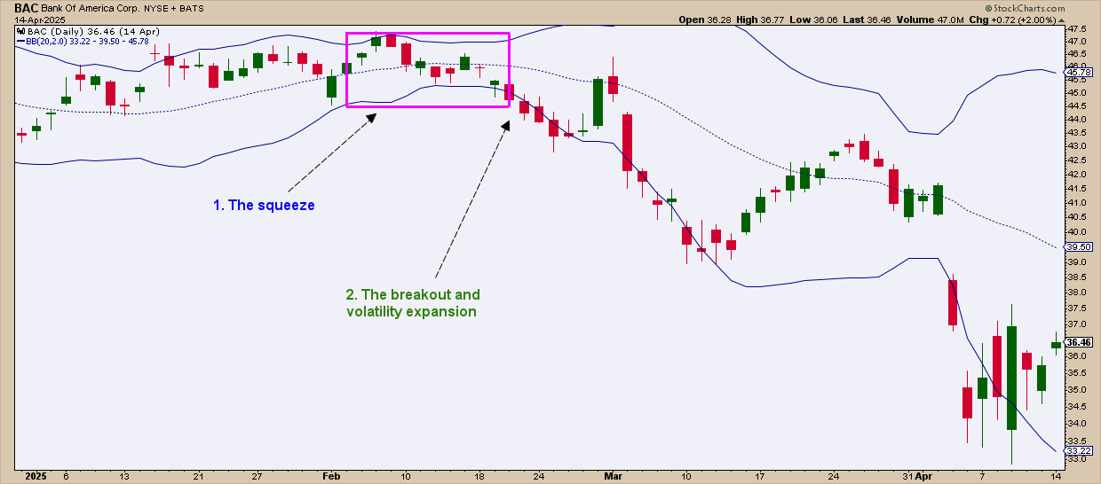
Here you can see the bands narrowing, creating the conditions of a Bollinger Band squeeze. Volatility dwindles right before the exploding move downward. Notice how the bands are expanding in response to the sudden shift in volatility. For traders who go both long and short, this could have been a strong short-side setup.
How Does This Actually Work?
Bollinger Bands use a 20-day Simple Moving Average (SMA) with upper and lower bands set to two standard deviations. In practice, about 85–90% of price action tends to stay within those bands. When volatility drops, the bands get narrower. When volatility increases, the bands expand.
Looking at a chart, it’s not always easy to distinguish narrowing bands from an actionable squeeze. Sometimes, volatility may be relatively low, yet price may not look very subdued before it jumps. In other words, a squeeze may not always look like much of a squeeze at all.
So, how can you tell when a squeeze is tight enough to be considered actionable?
Insider Tip #1: Spotting an Actionable Squeeze
This is where you need to fire up the Bollinger BandWidth indicator in your chart.
BandWidth measures how far apart the bands are as a percent of price. If it’s scraping the bottom of its six-month range, that’s your cue: the squeeze is on.
The Trigger
The real action happens when price breaks out of support and resistance:
- A break above resistance signals a bullish setup—buy at the breakout or look for buying opportunities after the breakout.
- A break below support signals a bearish setup—sell (or sell short) at the breakout or at a strategic spot after the breakout.
You’ll notice I didn’t give you any hard rules. No two breakouts look the same, so you’ll have to read the room and adapt to the situation.
The Bollinger Band Squeeze in Action
The following bearish scenario demonstrates what we just covered.
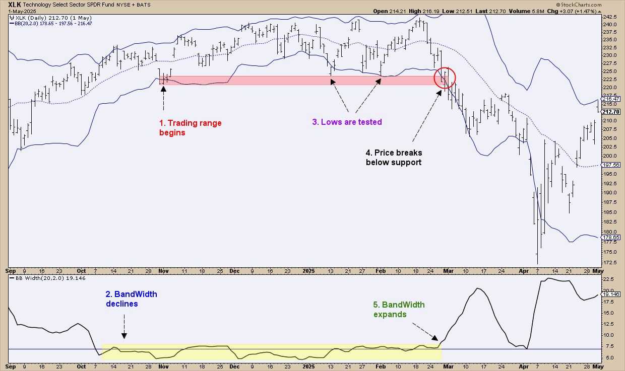
In late October to early November, the Technology Select Sector SPDR Fund (XLK) fell into a low volatility trading range. The BandWidth confirms that this is the start of XLK drifting in a limited range that goes on for around four months.
Price kept slipping under the band, but it couldn’t break support. Range-bound, tight, almost a little boring. Then March hit, support cracked, and price went down hard. BandWidth spiked, confirming the breakout was the real deal.
The main point here is that the BandWidth not only could have helped you anticipate the jump, but also spot the squeeze which, looking at the Bollinger Bands alone, might not have been as apparent.
Beware the Head Fake!
John Bollinger warns of the “head fake.” That’s when price fakes a breakout on one side, then quickly reverses and runs the other way. Without confirmation, you’re just guessing. Take a look at the circled “breakout” areas.
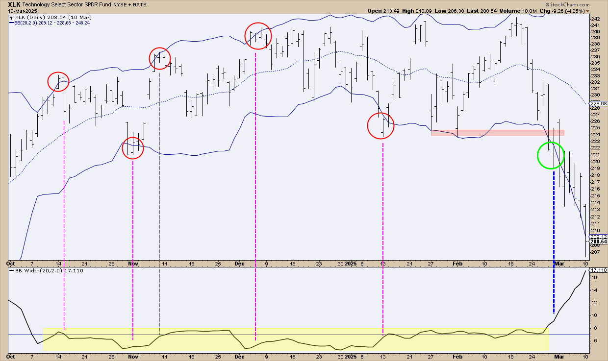
The red circles mark potential head fakes: breakouts that lured traders in, only to reverse and leave them whipsawed. The real breakout didn’t arrive until March, shown in green.
How do you tell the difference? Wait for confirmation. There are quite a few ways to do this. The BandWidth helps too: during the fakes, it was a little shaky at best (see the vertical lines). But in March, it surged alongside price, giving you a clear sign the breakout was likely the real thing.
About confirmation: Consider using volume-based indicators—like the On Balance Volume (OBV), Chaikin Money Flow (CMF), and Accumulation/Distribution Line (ADL)—or momentum indicators like the Relative Strength Index (RSI) and Moving Average Convergence/Divergence (MACD).
Remember: Strong volume often precedes strong price moves, and a strong price move needs strong momentum to sustain itself over time.
Insider Tip #2: Scanning for Squeezes Wide and Far
If you suspect this type of strategy might be your “thing,” and you want to cast a wide net to find stocks that are being squeezed, the good news is that you can easily run a scan.
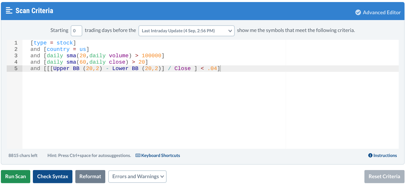
Go to the Advanced Scan Workbench (under the Scans & Alerts) menu and paste this in:
[type = stock]
and [country = us]
and [daily sma(20,daily volume) > 100000]
and [daily sma(60,daily close) > 20]
and [[[Upper BB (20,2) - Lower BB (20,2)] / Close ] < .04]
This is what it should look like:
Once you run the scan, all of the stocks and ETFs in the StockCharts universe that are currently experiencing a Bollinger Band squeeze will pop up.
All you have to do now is to filter the stocks by preference. I personally filter them by either volume, to get the most liquid assets, or StockCharts Technical Rank (SCTR) , the filter for the technically strongest stocks in the list.
Once you have your candidates, then pull up their charts and do your analysis. This scan pretty much does the legwork, saving you time while covering more ground than you ever could on your own.
And That’s a Wrap
Think of this squeeze strategy as your early-warning system: bands tighten, BandWidth drops, and the alert goes off. From there, use confirmation tools like support/resistance and volume or momentum indicators to tell you where the action zones are and to help you avoid head fakes. If you want a more extensive explanation of this strategy, check it out in our ChartSchool page.
Bottom line: When volatility tunes out, that’s a signal for you to tune in. Behind an unusually quiet period of rest may be an explosive move waiting to be triggered.


