StockCharts Insider: John Murphy’s Law #1 — Map the Trends
Before We Dive In…
While the tools and strategies we use to analyze markets have evolved, human behavior has remained consistent (more or less). That’s why John Murphy’s Ten Laws of Technical Trading is as relevant today as it was during the long course of history from which it derives its principles. In today’s Insider article, we begin with Law #1: Map the Trends.
The main lesson is that every chart analysis and every trade decision begins with knowing how the trend is positioned, if there’s a trend at all. Only then can you forecast directional possibilities.
Seeing the Forest Before the Trees
When you open up a chart, you’re likely opening a daily chart going back one year. Already, that’s plenty of information to work with, and it’s likely the timeframe you’re going to use when buying and selling a stock. But you shouldn’t – at least, not yet.
What the daily chart won’t give you is a broader context. The thing is that you might need this context to inform your trade. Bear in mind that markets always move in layers: long-term, intermediate, and short-term trends. And the big picture should always guide your trade.
So take a look at the daily chart first to get your bearings. And before you decide anything, take a look at a three- to five-year weekly chart next. If you really want a broader view, look at the monthly chart after that, going back ten to twenty years.
You’ll spot things you’d never notice on a short-term chart. For example:
- A “strong rally” that’s really just a bear-market bounce in disguise.
- A “minor correction” that’s testing a decades-old support level unseen on the daily view.
- A trading range that’s on the verge of breaking above weeks-long resistance.
Insider Tip: What pros look at that most retail traders overlook: Not only does zooming out turn noise into context, it might reveal that what you think is a valid signal may turn out to be nothing but noise.
Why This Matters
A daily chart might look bearish, but on a multi-week to multi-year view, you could be staring at a normal dip within a bullish trend. Viewing all of the timeframes not only keeps you from overreacting to market noise, but it also shows you trends and key levels that are not visible on a daily chart.
How to Apply Law #1
My personal approach has been to plot daily, weekly, and monthly charts side by side using StockCharts’ ACP Charts.
For example, take a look at these charts of Carnival Corp. (CCL).
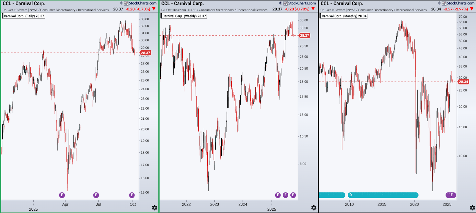
Here’s what I see:
Daily Chart (leftmost window):
The daily chart shows CCL pulling back from its highest level in a year, an uptrend that began in April after a relatively steep drop. If the pullback continues, price could retrace 50% or even 61.8% (for Fibonacci followers) and still remain within the broader uptrend. But that raises a bigger question: What’s the larger trend? To find out, let’s step back to the weekly view.
Weekly Chart (middle window):
Here, you can see a much longer trend that started back in October 2022. The daily retracement levels still make sense, but this chart reveals a deeper context—namely, that the previous major low is far below what’s visible on the daily timeframe. In other words, the short-term pullback sits comfortably inside a much larger structure.
Monthly Chart (rightmost window):
From the widest view, the significance of $32 jumps out even more, as it’s confirmed by the 2021 high. That’s the level CCL must clear to confirm a longer-term breakout. Also, on the monthly chart, the stock doesn’t look like it’s trending. Rather, it looks like it’s been stuck in an enormous trading range between the 2020 low and that $32 resistance ceiling. If price can punch through $32, the next major resistance zones sit near $52 and $64–66, key swing highs from the past 15 years.
The point here is that you would not have been able to see the wider trend or support and resistance context from the daily chart alone. But combined, the big picture looks much clearer.
Here’s another example: Nike Inc. (NKE).
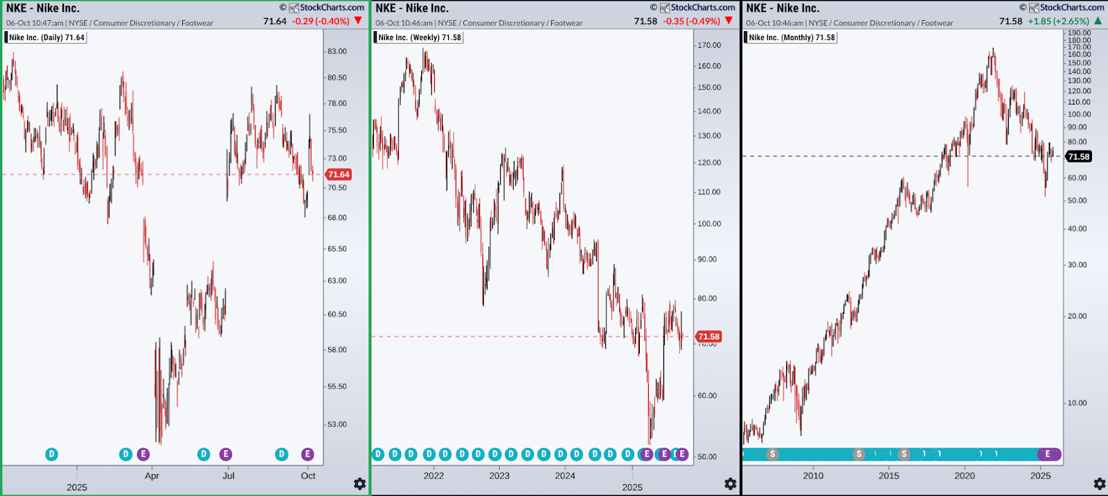
A few things worth your attention:
Daily Chart:
Nike (NKE) is pulling back from a recent uptrend that’s repeatedly failed to break above several highs over the past year. Still, the bulls aren’t giving up. Price looks ready to test those levels again as it fights to keep the uptrend alive.
Weekly Chart:
Zooming out, the weekly view shows price turning lower from the upper edge of what appears to be a downward-sloping price channel. That puts the recent rally into context, as it’s bumping against a bigger, longer-term barrier.
Monthly Chart:
From the widest view, the picture shifts again. The same downtrend becomes a deep reversal within a decades-long uptrend. Is the larger structure still bullish from a long-term perspective? That’s for investors to decide. The main point is that you can actually see it when taking a comparative perspective.
To sum it all up:
- Start your analysis by comparing daily, weekly, and monthly charts to find the dominant trend.
- Unless you’re going for a mean-reversion trade, always trade in the direction of the trend (it’s like having the wind at your back).
- Mind the timeframe: If you’re day trading, let the daily chart set the bias; if you’re swing trading, pay attention to the weekly chart; and if you’re investing for the long term, check both the weekly and monthly charts as well.
Now It’s Your Turn
Here’s a daily, weekly, and monthly chart of McDonald's Corp (MCD) side by side:
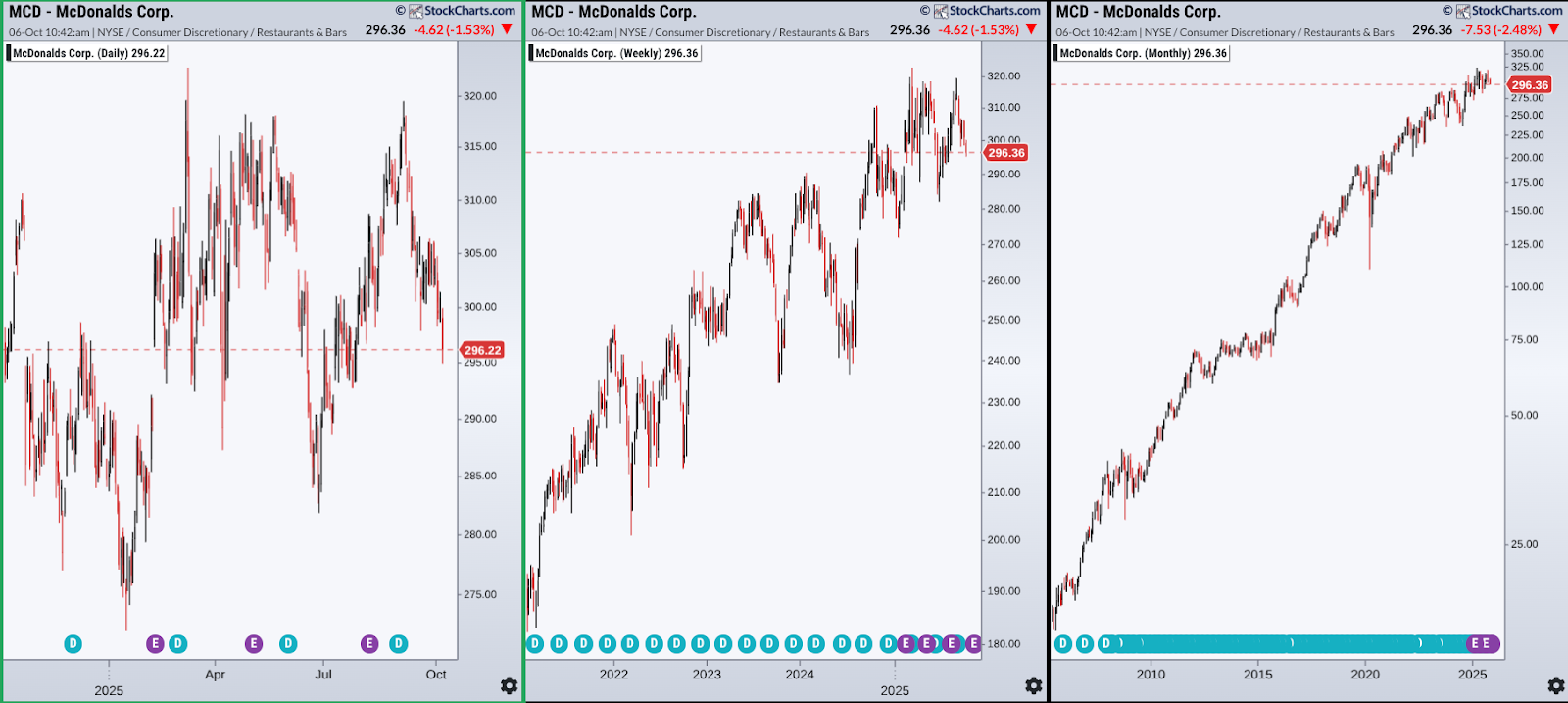
Study them as if you were planning your next trade. Then answer the following questions:
Trend Alignment: On which timeframes (daily, weekly, monthly) do you see MCD trending up, down, or sideways? Are any of them aligned—or are they diverging?
Context Shift: Does what you see on the daily chart still hold when you zoom out to the weekly and monthly charts? How does your perception of price action change as you expand the timeframe?
Support and Resistance: Try to spot key support and resistance levels on each chart. Which ones are only visible on the longer-term views? Which ones are near-term targets that could trigger a breakout or breakdown?
Trade Direction: Based on the dominant trend you identified, would you go long, short, or just stay on the sidelines? If you find a trade entry, where would it be, and based on which timeframe?
Signal vs. Noise: Is there any signal on the daily chart that turned out to be noise when viewed across all timeframes? What does that tell you about the value of zooming out?
When you’re done, try it with other stocks. The more you practice mapping trends across timeframes, the more second-nature this kind of thing becomes.
And That’s a Wrap
Before you chart your next trade, try zooming out. Remember that longer-term charts keep you grounded. They help filter the noise, making your charting decisions more solid. Law #1 stands firm: before you attempt to ride a trend, you have to see if larger trends are working with or against your position.


