StockCharts Insider: John Murphy’s Law #5 - Draw the Line (Trendlines)
Before We Dive In…
Every chart tells some kind of a story. Without structure, however, that story can feel like noise. Trendlines help you sense the rhythm underneath the often volatile surface, showing where buyers and sellers may draw their invisible battle lines and how long those lines can hold. In this post, we’ll unpack John Murphy’s fifth law—Draw the Line—and show you how trendlines turn messy price moves into clear, actionable insight.
Turning Market Noise Into a Map
If all you do is pay attention to financial news and economic reports, then the markets will probably seem chaotic more often than not. That’s what most investors discover when they shift from relying on fundamentals and start charting instead.
There’s a sense of order (and a lot of relief) once you can see whether a market is trending, in which direction, and for how long. One of the simplest ways to bring structure to a volatile, news-driven market is to draw a trendline, like the one below.
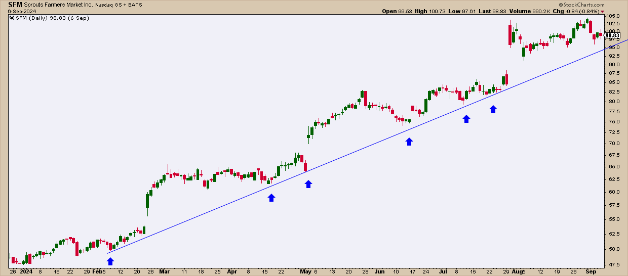
Far from a “hot stock” grabbing headlines, Sprouts Farmers Market (SFM) was a quiet mover in the Consumer Staples sector. To see how steady its uptrend really was, you had to chart it and draw a trendline. Notice how many times that line was touched? Each time, buyers stepped in. Clearly, bulls used those levels as opportunities to add to their positions.
So John Murphy was right in including this method in his 10 Laws of Technical Trading article. If you think about it, trendlines are like the skeleton of a market’s directional impulse; they’re the bones that keep the trajectory in place. When that line breaks, it’s a signal that momentum may be shifting.
How to Draw Trendlines
Drawing a trendline is pretty simple, but there are a few important rules to follow. The first is how to connect the dots the right way:
- Uptrend: Connect at least two higher lows to start the trendline. Three touches confirm that the trendline is valid.
- Downtrend: Connect at least two lower highs to start the trendline. Again, three touches make the trendline valid.
That’s the easy part. Now comes the more nuanced stuff.
How to Interpret and Use Trendlines
Trendlines act as dynamic support and resistance. They reveal where buyers or sellers are likely to step in.
- If price bounces against a trendline: This signals trend continuation; momentum is intact.
- If price breaks a trendline: This is an early warning that the trend, or the momentum driving it, may be on the verge of a stall or reversal.
When a trendline breaks, treat it as a heads-up, not a trading signal. Look for confirmation through price action, support/resistance zones, or volume before acting on it.
Watch your timeframe. Trendlines on a weekly chart will give you a bigger-picture view by plotting a longer-term trend structure. Trendlines on a daily chart will show you the immediate trend, whether you’re looking at the short-term or intermediate-term trend. Note that a trend on the daily chart can sometimes match the one seen on a weekly chart as well.
Mind the angles and spacing. If the trendline is too steep—what chartists call “parabolic”—it often won’t last; sharp moves can’t stay vertical for long. If the points of contact between price and trendlines are too close, the move might be nothing more than noise. If the points are too far apart, then the relationship between price and trendline may be questionable.
In short, look for evenly spaced, reasonable angles—that’s the sweet spot.
Now It’s Your Turn
Take a look at this chart of American Express Co. (AXP).
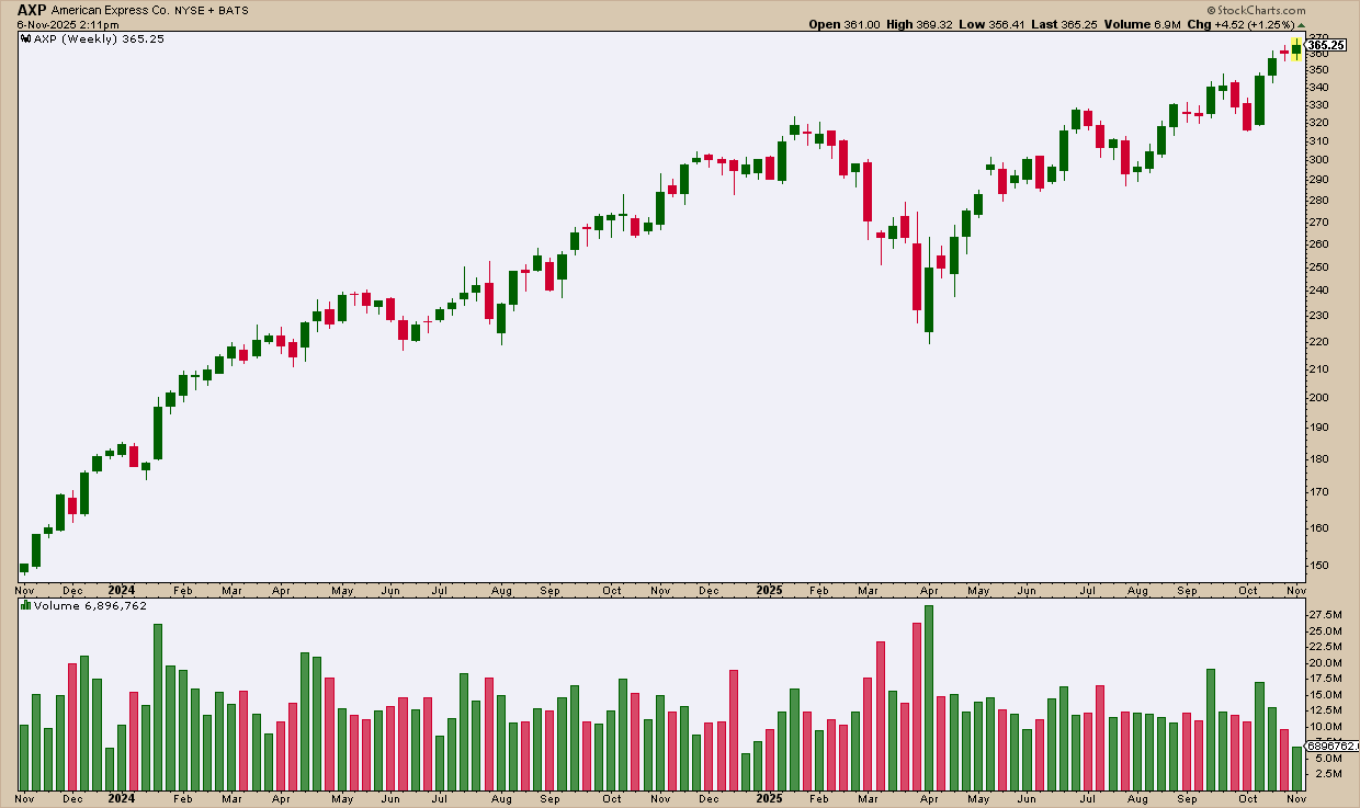
How would you connect the dots? How many trends do you see (think short-term and intermediate- or long-term)? When trends shift, does volume play a significant role in supporting the shift? Try it yourself using this link.
If you want to see my solution to this, you can check out my chart here.
A Few Insider Tips for Working with Trendlines
Trendlines are more than measures and markers – they’re decision triggers. Beyond tracing trends, you use trendlines to read what the market may do next. You then act on the developments whether price fulfills your forecast, or breaks it.
With that in mind, these Insider tips should help you when drawing and interpreting trendlines.
Insider Tip: Use the log scale when looking at a huge range in price or time. Percentage changes are more accurate and they keep trendlines more “honest” (or accurately represented) over time.
Insider Tip: Sometimes you’ll see spikes or wicks that throw off your line. That’s when you draw an internal trendline, ignoring those outliers and connecting the main price clusters instead. It smooths out the story without distorting it.
Insider Tip #3: Related to the last tip, think of trendlines as “elastic bands” rather than rigid barriers. Expect some overshoots.
Insider Tip #4: You may have to redraw your trendline if the market structure changes; trendlines evolve.
Insider Tip #5: Parallel your main trendline to create a channel; channels amplify market structure, but be sure to monitor both top and bottom lines.
Insider Tip #6: A trendline break with volume matters more than a break without.
And That’s a Wrap
A single line can tell you a lot about a market. It can show you where momentum lives, where sentiment shifts, and when it might be time to get in, get out, or just step back. Trendlines are among the simplest tools in technical analysis. But in the right hands, they’re among the most revealing and effective. Keep your lines honest, your angles realistic, and your mind flexible. The market will redraw itself; your job is to stay aligned with it.


