StockCharts Insider: Surface vs. Depth: Cracking the Code of Sector Strength
Before We Dive In…
Every index wears two faces. The first is performance—what you see on the surface. The second is breadth—what lies beneath. Price tells you where the money’s moving today. But breadth tells you if that move has legs, or if it may be running on fumes. If you want to size up a sector, you’ve got to see both the cover story and what’s happening behind the scenes. That’s where we’re headed.
The First Stop: Sector Performance
Whenever you open up the Market Summary to get a glimpse of sector action, odds are your eyes dart straight to the US Sectors panel. That’s fair, as you’re looking for a snapshot of sector performance. But it’s only part of the story.
Sector info pops up in a few other panels, too. And one worth your attention is the Sector Bullish Percent Indexes (a.k.a. Sector BPI).
Price Shows Moves, Breadth Shows What’s Driving It
Bullish Percent Index (BPI for short) pierces the surface of price, revealing how many stocks in a given sector are flashing buy signals on a Point & Figure chart.
Why’s this important? BPI is all about breadth (a.k.a. participation). And breadth gives you a sense of the conviction driving the entire sector.
Why Sector BPI Matters More Than Performance Alone
Well, a sector can climb even when breadth is missing.
How does that work? A few heavyweight stocks (think Apple + Microsoft in tech) can muscle the whole index higher while most other stocks are lagging. The sector soars as a result. Still, without broad participation, the move may be on shaky ground.
By the way, this principle can also be applied to any index or the broader market.
Sector BPI in Action
So where do you go from here? Once you’ve checked sector performance on the US Sectors panel, head over to the BPI panel. Here’s what both panels look like at the time of writing.
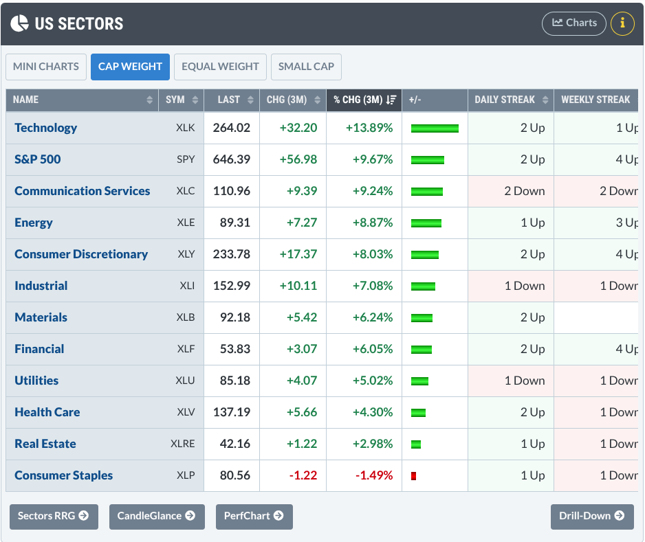
See the top 5 sectors (the S&P 500 is in there for comparison but it’s not a sector)?
You can see their performance (we’re using ETFs as the sector proxies) based on the default three-month % change:
- Technology Select Sector SPDR Fund (XLK) - up 13.89%
- Communication Services Select Sector SPDR Fund (XLC) up 9.24%
- Energy Select Sector SPDR Fund (XLE) - up 8.87%
- Consumer Discretionary Select Sector SPDR Fund (XLY) up 8.03%
- Industrial Select Sector SPDR Fund (XLI) - up 7.08%
Now, let’s compare it with their BPIs.
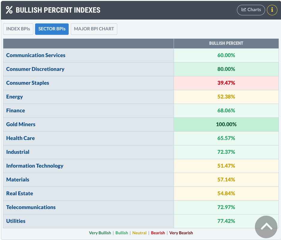
Keep in mind that any clues we get from this comparison are not definitive. They’re just there to point the direction toward closer inspection.
What the Numbers Are Really Saying
So, based solely on this data, you might ask the following questions:
- Is Tech, the top-performing sector, starting to get a little light in participation?
- Consumer Discretionary is exhibiting the strongest BPI of 80%. That’s pretty high, as a reading over 70% can signal overbought conditions. Where does it sit relative to the other sectors, and does its individual chart look a bit toppy?
- Energy has the second-weakest BPI reading. Where does it sit relative to the other sectors and what does its chart look like?
Let’s tackle the questions regarding relative performance. To get a broader visual context, let’s look at a year-to-date PerfCharts, adding in the S&P 500 (SPY) to see how all five sector ETFs are performing relative to one another and the SPY.
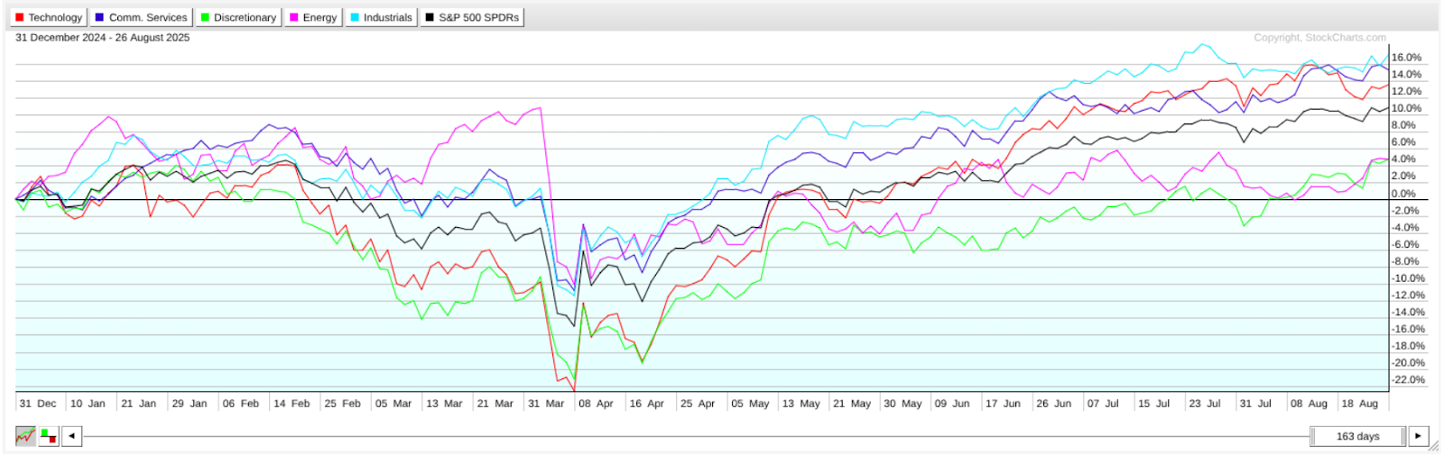
Based on this particular timeframe (YTD), I’m interested in the two underperformers—XLY and XLE. These are what caught my eye. You may spot something else, depending on your preference or strategy.
To be clear, my aim here is not to show an analysis of these sectors but to show you how to nuance your sector analysis by looking at them from a BPI angle.
So, what I’d do in this case is look at each chart to see where they stand. Below, I'll pull up a daily chart of XLY.
XLY – Stalling at Resistance
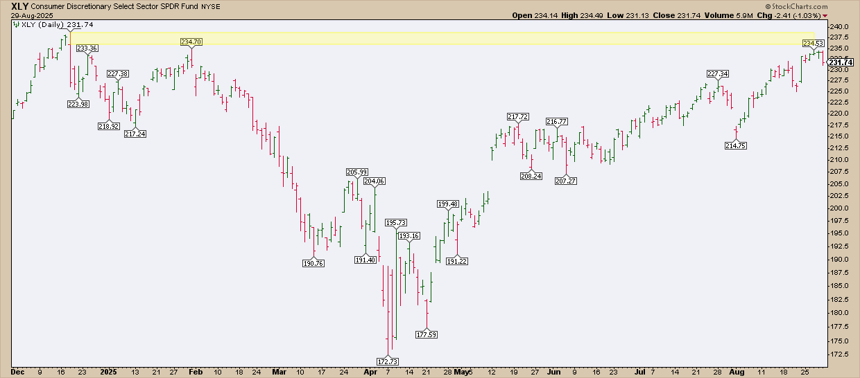
XLY looks like it’s stalling under resistance (see the yellow shaded area). Overbought? Probably. But if the pullback continues, conditions could reset. For bulls, the key is to watch whether breadth stabilizes and then increases at a favorable buy level.
The takeaway: BPI flashed the caution first. What happens next with XLY is still uncertain, but because you watched breadth, you anticipated overbought conditions before price alone tipped its hand.
XLE – Breakout Watch
Now let’s take a look at the other underperformer, XLE.
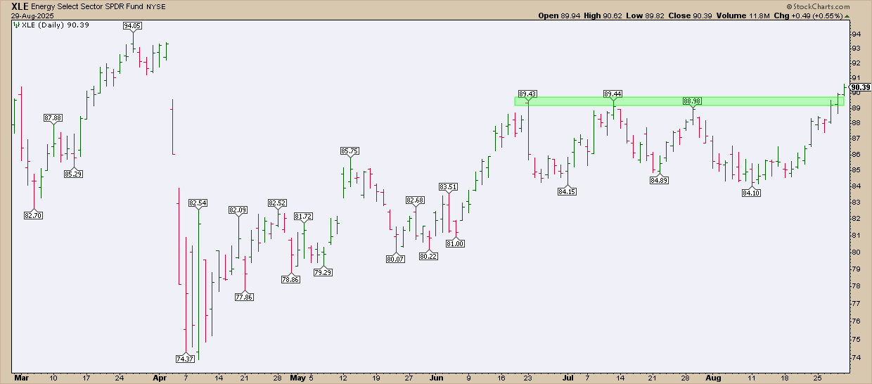
XLE broke out of a two-month resistance range. Watch the BPI level to see if it increases above its current levels. That would indicate a rise in participation which, if technical and fundamental conditions hold, might be enough to fuel a strong rally.
And That’s a Wrap
Sector performance may tell you who’s winning the sprint, but Sector BPI tells you who has enough fuel to continue powering forward.
The Insider edge? Don’t stop at price. Check breadth for conviction, and BPIs are just one way to do it (we’ll cover more in forthcoming articles). Remember: Over 50% and rising = bullish bias. Under 50% = slight bearish lean. Above 70% or below 30%? That’s when you watch for turning points.


