StockCharts Insider: The Untapped Edge Hiding in Your Moving Averages
Before We Dive In…
Markets don’t always trend. They coil, surge, and then launch in one direction or another. The trick is being able to spot each phase and to use that information to act. A lone moving average can hint at direction, but it won’t tell you the whole story. Add upper and lower bands—effectively turning it into a Moving Average Envelope (MAE)—and suddenly you can see rhythm, compression, and breakout strength in one glance.
The funny thing? Most traders skip it, even when it could give them the edge they’re looking for.
What’s Secretly ‘Enveloped’ Within the Price Action?
Take a look at this chart of Bloom Energy Corp. (BE).
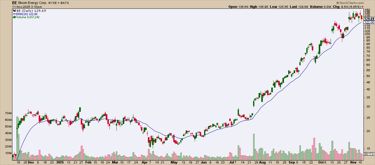
Looks easy enough, right? A breakout here, a consolidation there… but the real ‘tell’—the moment BE was coiling for liftoff—is practically invisible with a lone moving average.
While there are plenty of other ways to have spotted this, let’s check out what an envelope can do. Look at it now.
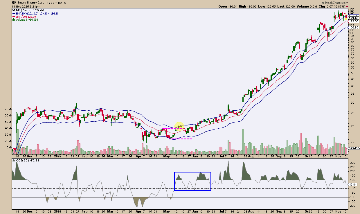
With help from the Commodity Channel Index (CCI), the story gets clearer. See that breakout in yellow? It lines up with a sharp CCI spike above +100—a zone that can mean overbought or extreme bullish momentum. If you thought it was overbought, look again: the pullback barely dipped below zero and stayed well above the last swing low (see the fuchsia line). It happened twice.
Then BE took off again, pushing past +100 as another small breakout formed. From there, momentum built, and BE hugged the top of its envelope from July through November.
The takeaway? A single moving average, or even a few of them, would’ve missed this entire picture.
So, I’d argue that moving average envelopes are worth a closer look. Let’s start with the basics.
What Moving Average Envelopes Are
A Moving Average Envelope (MAE) is a channel built around a moving average, typically a simple or exponential one. For this article, I’m going to stick with Exponential Moving Averages (EMAs).
An interesting way to view MAEs: Think of these as “training wheels” on your moving average: now you can see the wobble and the forward drive. Did you catch the metaphor?
- The middle line: Your chosen moving average.
- The upper band: A fixed percentage above that average.
- The lower band: The same percentage below.
This creates a visual “envelope” that moves with price. Unlike Bollinger Bands or Keltner Channels, these envelopes don’t automatically expand or contract with volatility—you choose the percentage, so your settings determine how responsive the channel is (more on selecting percentages later).
Why Do Envelopes Matter?
Moving Average Envelopes turn messy price action into something you can actually read.
Spot the Stall
When the channel flattens and price bounces between the bands, you’re in sideways mode. The envelopes double as dynamic support and resistance—great for spotting exhaustion or reversals.
MAEs Can Whisper Breakouts Before the Crowd Hears Them
This is like what we saw in the example above. A decisive close above the upper envelope might signal unusual momentum. It’s often the first visible hint that the market is waking up. The reverse is true of price plunges below the lower band.
A close above the upper band is your first clue of a potential pickup in strength. A plunge below the lower band can be an early warning of downside momentum. MAEs often whisper these movements, so you have to pay close attention.
Gauge Trend Strength
When a trend really gets going, price tends to ride the bands.
- In a strong uptrend, price rides the upper band, seldom dropping inside it.
- In a strong downtrend, price hugs the lower band.
- A sharply sloped channel confirms momentum and trend strength.
- MAEs also show you how far price has stretched from its mean.
In short, MAEs help reveal the market’s rhythm: range → breakout → trend—in one glance.
How Do You Choose the Parameters?
This is where traders tend to overthink things. Don’t. We're now at the part where experimentation isn’t optional; it's the whole point.
For instance, it’s easy to just say that short-term traders might consider using the 20-day EMA and longer-term traders use the 50-day EMA, but it really depends on the stock and its volatility characteristics. This is where your judgement in fine-tuning comes into play.
The SPDR S&P 500 ETF (SPY), for example, may be too low-volatile for an envelope width of 10%. Here’s what it looks like.
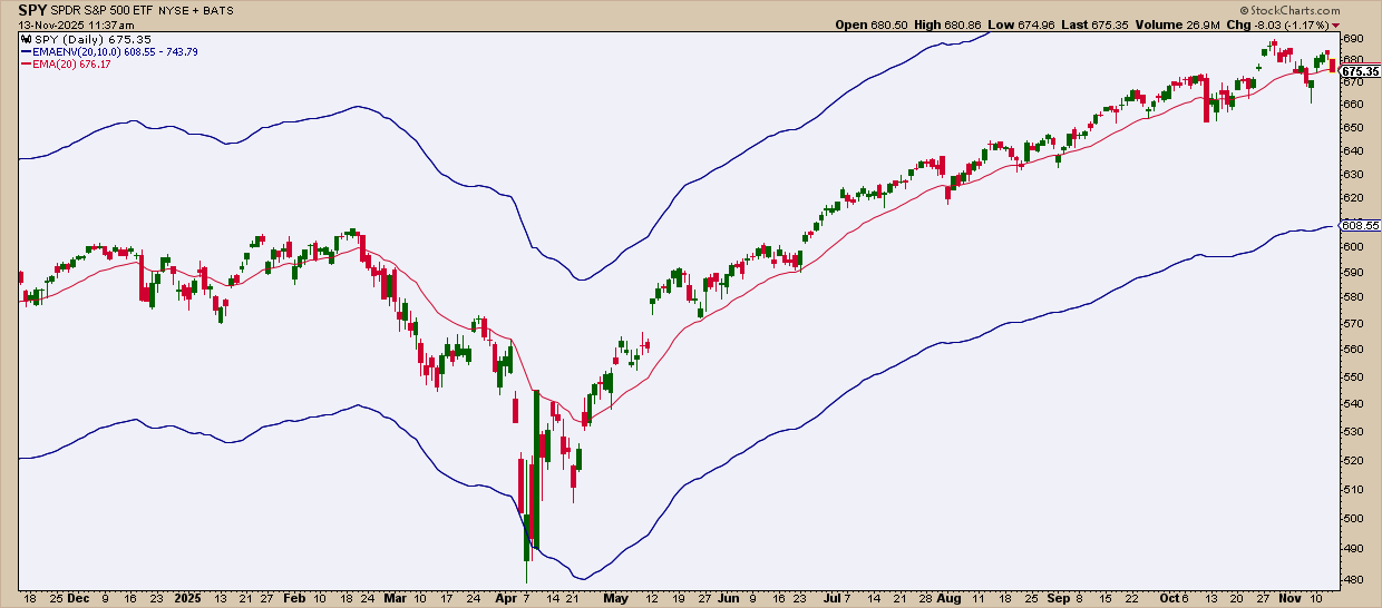
As you can see, this isn’t working. Price hardly comes near the bands enough to measure anything (with the exception of the April plunge). So let’s now try a 2.5% MAE width.
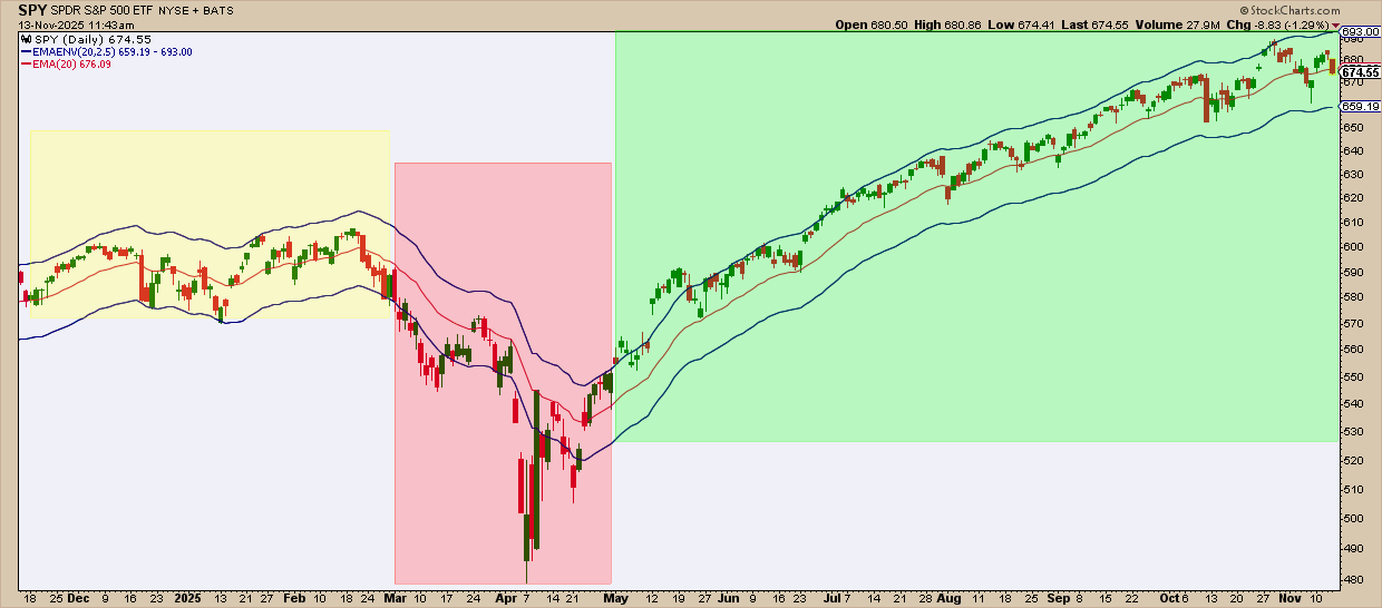
Now the MAE captures the price action in a clearer manner. The shaded areas show you the implications of the price action, based on its reaction to the MAEs with yellow indicating range-bound trading – red indicating the downtrend following the downside breakout, and green indicating the uptrend following an upside breakout.
Is there any way to fine-tune your approach when using MAEs? Yes, and that brings us to today’s Insider tips.
Insider Tip: Check Beta before you set your bands.
Ever stop by the StockCharts Symbol Summary page? There's lots of valuable technical and fundamental info to be found there.
To start, find the Beta reading. Beta tracks the S&P 500 (Beta = 1). If a stock’s beta is 1, its volatility matches the broader market. If it’s higher or lower, beta estimates volatility relative to the S&P. So if a stock’s beta is 2, then a 10% move in the S&P can mean a 20% move, up or down, in the stock. Got it?
Here’s a rule of thumb: The higher the beta, the wider the envelope.
- Low Beta (≤ 0.8): Moves less than the market; try using tight bands (2–4 %).
- Moderate Beta (~1.0–1.3): Moves roughly with the market; use mid-width (2–6 %).
- High Beta (≥ 1.5): Swings more aggressively; use wide envelopes (6–12 %).
You’re going to have to experiment with this and gauge it visually. There are no hard and fast rules here regarding width parameters.
Insider Tip: Use CCI to confirm pullbacks and reversals.
When price breaks an envelope boundary, the challenge is to figure out whether it signals exhaustion or strength.
The Commodity Channel Index (CCI) can help you analyze which is which. Look at the price action relative to the bands to determine whether the CCI’s cyclical turns indicate trend pullbacks or reversals.
This takes practice. An “overbought” reading may signal weakness or strength depending on the context of the market structure. The same can be said about an “oversold” reading. There’s no way around this—you need to practice using this combination of indicators to develop your interpretive experience and skill.
Still, this pairing keeps you from reacting too early. Envelopes define where prices are stretched; CCI helps you determine whether that stretch has real momentum behind it.
And That’s a Wrap
Moving Average Envelopes turn raw price movement into something you can actually interpret: structure, momentum, and stretch, all at once. They won’t replace your moving averages, but they’ll definitely sharpen them. Try a few settings, pair them with CCI, and see how fast you start spotting moves the naked average would’ve completely missed.


