StockCharts Insider: Turning Sector Drill-Down into an Actionable Workflow
Before We Dive In…
The Sector Drill-Down is a popular and incredibly useful tool for observing relative sector rankings at a glance. But the data itself doesn’t give you a workflow, let alone a strategy. While many traders glance at the rankings and click a few charts, hoping something jumps out, most professionals do the opposite: they follow a process that guides their use of sector rankings.
That’s what we’re going to explore in this article: turning the Sector Drill-Down (aka, Sector Summary) into a step-by-step playbook you can use as often as you need to.
What the Sector Drill-Down Is (and Isn’t)
When you click on the Sector Drill-Down tab on the top of the Market Summary page, here’s what you get.
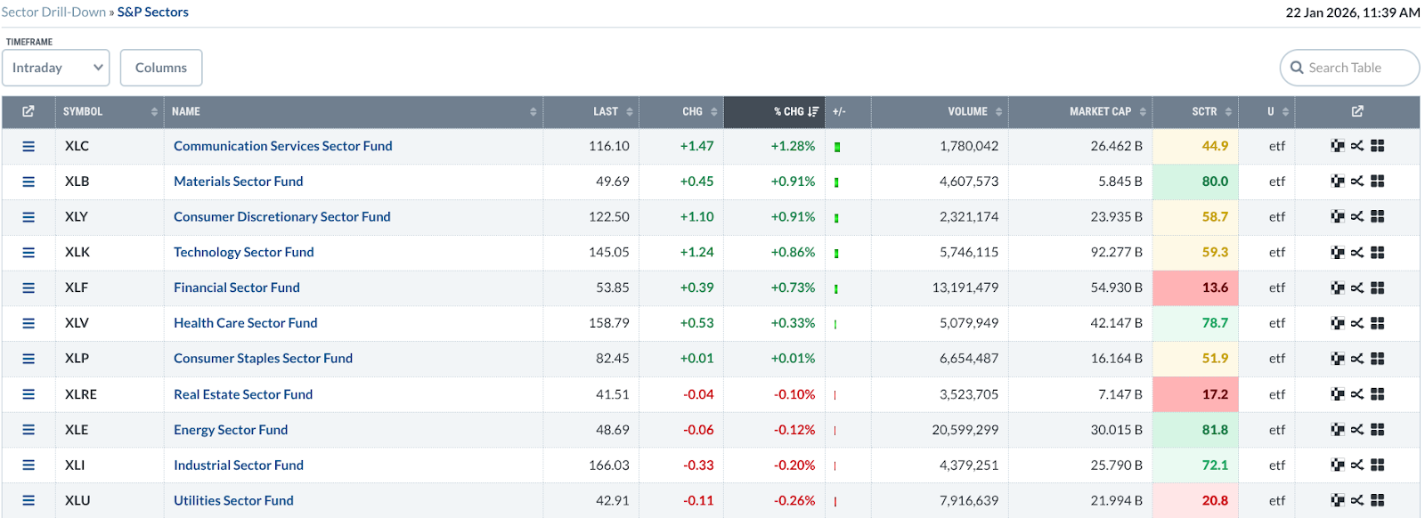
The data is quite self-explanatory, especially if you’ve been using StockCharts for some time. But let’s cover a few basic points anyway.
This table you see is a (cross-sectional) relative strength discovery engine. This is just the starting point. And to be clear, this table ranks relative performance over a given time period, not “best stocks.” A few pointers:
- It shows you where money is flowing (which is likely to change by timeframe)
- It doesn’t tell you when to buy
- It doesn’t tell you anything about trend quality
If this table is the starting point, which timeframe should you use? While there are no hard and fast rules on this, I’ll share my personal approach to this; bear in mind that your approach might differ.
Choosing the Right Timeframe (Customize to Fit Your Approach)
Here’s how I see it.
John Murphy recommends starting with a three-month lookback because it captures meaningful trends without getting lost in day-to-day noise. One-week views often exaggerate headlines and volatility, while six-month or one-year views tend to lag, showing leadership only after much of the move has already happened.
Insider Tip #1: Your sector timeframe should match your holding period.
So, if you’re a day trader, then, of course, the intraday view will be most relevant. However, you probably want context from a longer time frame, so the 1-week view will probably be informative.
Now, let’s get to the heart of it.
The 3-Step Top-Down Workflow
In this example, I’m going to follow John Murphy’s suggestion and set the table to a 3-month view.
Step 1 – Find Leading Sectors
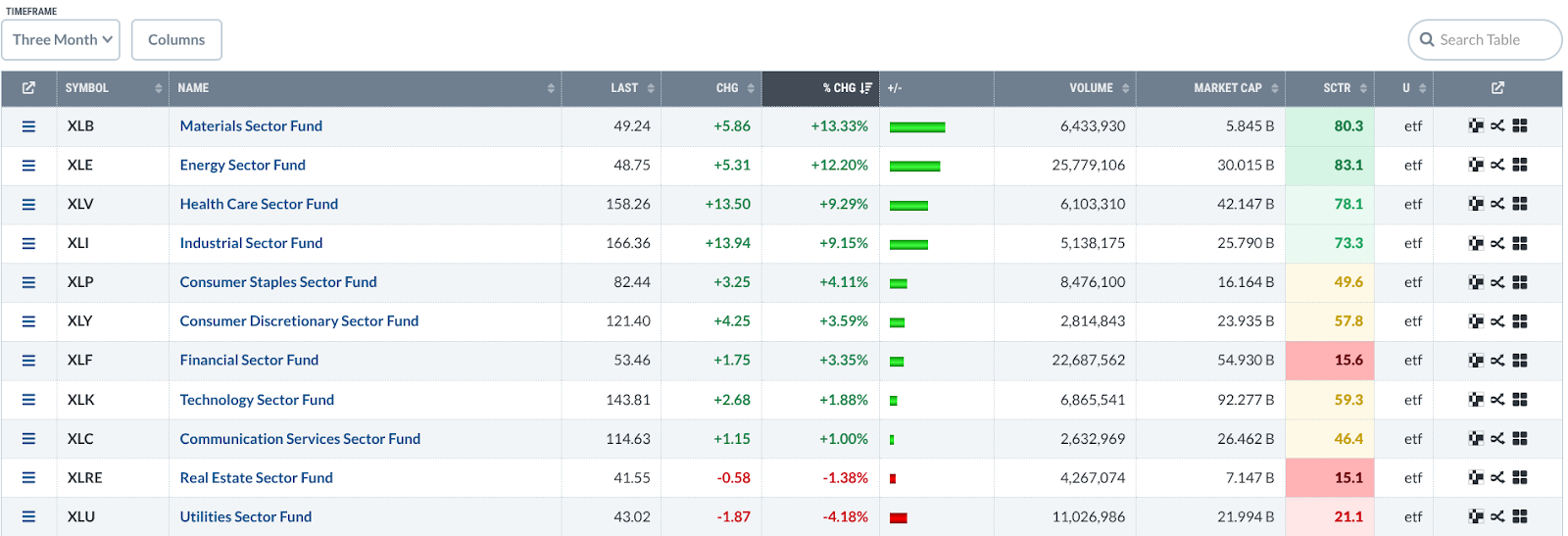
The default view sorts the performance by % Change. I’m going to focus on the four top-performing sectors, Materials (XLB), Energy (XLE), Health Care (XLV) and Industrials (XLI). If you look toward the right, you’ll see that these sector ETFs also have the strongest SCTR scores.
Insider Tip #2: Look for separation to distinguish leadership from market drift.
Look at the relative performance of the top four sectors: 13.33%, 12.20%, 9.29%. The first two (XLB and XLE) are pulling away from the last two. That “pulling away” suggests not only leadership, but also rotation. Capital is flowing (or has been flowing) into these sectors and out of others.
Now, if all four were clustered within, say, half a percent of each other, then that would be market drift. But here we see a clear hierarchy within the top four.
Insider Tip #3: Be wary of single-sector dominance.
A single sector outperforming the rest by a wide margin likely means lots of capital is pouring into it. But it also signals that overall market participation isn’t very broad. Broad participation strengthens trends, while narrow leadership often precedes volatility. So, just be careful when you encounter this scenario.
Step 2 – Drill into Industries
Let’s select the top sector, Materials, and click on it to get an industry list.
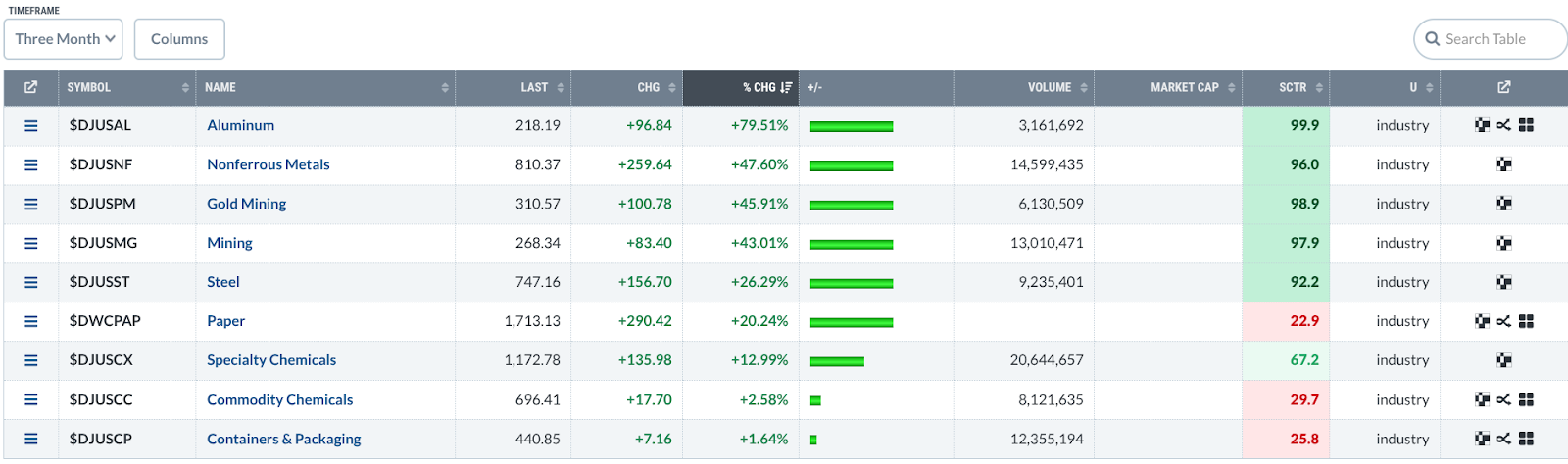
Basically, you want to avoid weak sectors within a strong industry. It sounds obvious, but it’s worth stating.
While the top five industries have strong SCTR scores—all of them are above 90—there’s clear leadership in Aluminum.
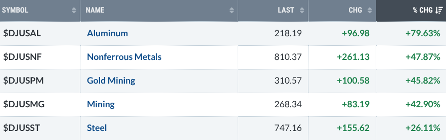
As of writing, Aluminum’s % CHG is at 79.63%, which is far from the three that follow that are all clustered at the 40% range. The Aluminum industry is exhibiting clear leadership.
Step 3 – Filter to Stocks
The last step is to click on an industry, our case, Aluminum since it’s the clear leader, and examine the stocks that come up as a result. Here’s what I got.
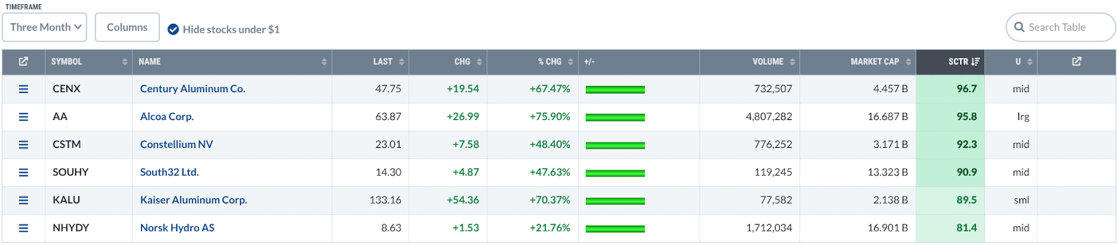
You can sort the stocks by performance or SCTR. I’m going for SCTR.
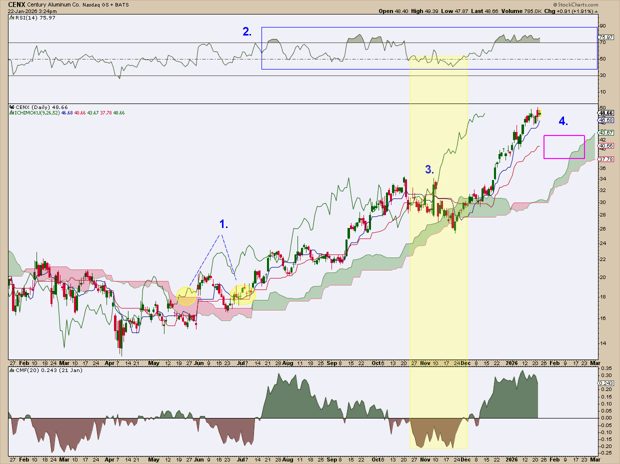
I pulled up Century Aluminum Co. (CENX), the top performer, strictly as an example. But if I were actually considering a trade, here’s how I’d read the chart.
1. Trend confirmation first.
Price breaks above the Ichimoku Cloud, then falls back to test the Kijun-sen—exactly what I’d want to see. At the same time, the Chikou Span rose above price from 26 days back and cleared the Cloud (see the two yellow-shaded circles). Shortly after, Chaikin Money Flow (CMF) surges. Had I seen it back then when it just happened, that combination would have confirmed the beginning of the uptrend.
2. RSI confirms strength.
The Relative Strength Index (RSI) consistently pushes above the 70-line, and when it cools off, it holds above 50 or bounces near 40. If you’re familiar with Connie Brown’s work (often highlighted by Dave Keller), you know this behavior is classic bull-market RSI.
3. Support does its job.
There was a deep, short-term pullback in November, and selling pressure increased noticeably in the CMF. But notice that price bounced off the Cloud (see shaded vertical area highlighting the action). For bulls, it probably got a little uncomfortable, no doubt. But support held.
4. Patience beats chasing.
This brings us to today. Would I buy here? No way. I’d rather wait for a pullback toward the Kijun-sen (a theoretical equilibrium level) or into the Cloud itself. In other words, this is a wait-and-see setup.
And that’s really the takeaway. This isn’t about CENX specifically. It’s about the process: start with sector leadership, drill down into industries, then narrow your focus to individual stocks with the wind at their backs.
Putting It All Together
To sum it all up, here’s what we did:
- Set your Sector Drill-Down to a 3-month view (you can adjust afterwards)
- Pick the top sectors
- Pick the top industries
- Filter the stocks by SCTR
- Look at each chart and analyze according to your approach and preferences
- If the stock passes your criteria, include it in your ChartList
In a nutshell, that’s your Sector Drill-Down playbook.
Common Mistakes to Avoid
Everything I’m about to say, you already know. As a reminder, I’ll go through it quickly.
Avoid "chasing" stocks in general but especially in cases where you might be using the wrong timeframe. For example, chasing intraday or 1-week leaders if your goal is to hold the stock for the intermediate term is not the wisest thing to do. Don’t ignore the primary trend—remember that a sector can outperform on a relative basis even if it's falling (this just means it's not falling as hard as other sectors). So, don’t go skipping chart confirmation.
And That’s a Wrap
If you were to gain any “edge” from this, it isn’t in the rankings but, rather, in the process you apply to them. When you move from sector to industry to stock, using the right timeframe, and doing the appropriate chart work, you turn raw data into a repeatable decision system. A playbook. As you can see, the Sector Drill-Down page is a powerful tool. But tools don’t generate winning trades. Workflows do. And now you have one.


