The Best Five Sectors This Week, #46

Key Takeaways
- Healthcare rises to the number one position, pushing technology down to second
- Energy makes a significant jump from fifth to third place
- Communication Services enters the lagging quadrant and risks dropping from the top five
- Technology shows weakness on the daily RRG despite a strong weekly RS ratio reading
Technology Loses Top Spot as Sector Rotation Accelerates
Last week brought meaningful changes to the sector landscape as the S&P 500 shed roughly 2% and rotation finally started to get underway. The ranking shows four changes in the top five, while the bottom half remains completely unchanged, a pattern that suggests the market is making real decisions about leadership.
The most important observation in the new ranking is that technology has finally left the number one position. Healthcare now takes the top spot, rising from number two and pushing technology down accordingly.
But the biggest jump comes from energy, which leapt from fifth place to third. Communication Services remains stable at four, and utilities once again enter the top five at number five. That means consumer discretionary gets pushed out of the top five altogether; it now sits at position six.
All other positions remain unchanged. Industrials, Financials, Real Estate, Materials, and Consumer Staples make up positions seven through eleven.
- (2) Healthcare - (XLV)*
- (1) Technology - (XLK)*
- (5) Energy - (XLE)*
- (4) Communication Services - (XLC)
- (6) Utilities - (XLU)*
- (3) Consumer Discretionary - (XLY)
- (7) Industrials - (XLI)
- (8) Financials - (XLF)
- (9) Real-Estate - (XLRE)
- (10) Materials - (XLB)
- (11) Consumer Staples - (XLP)
Weekly RRG
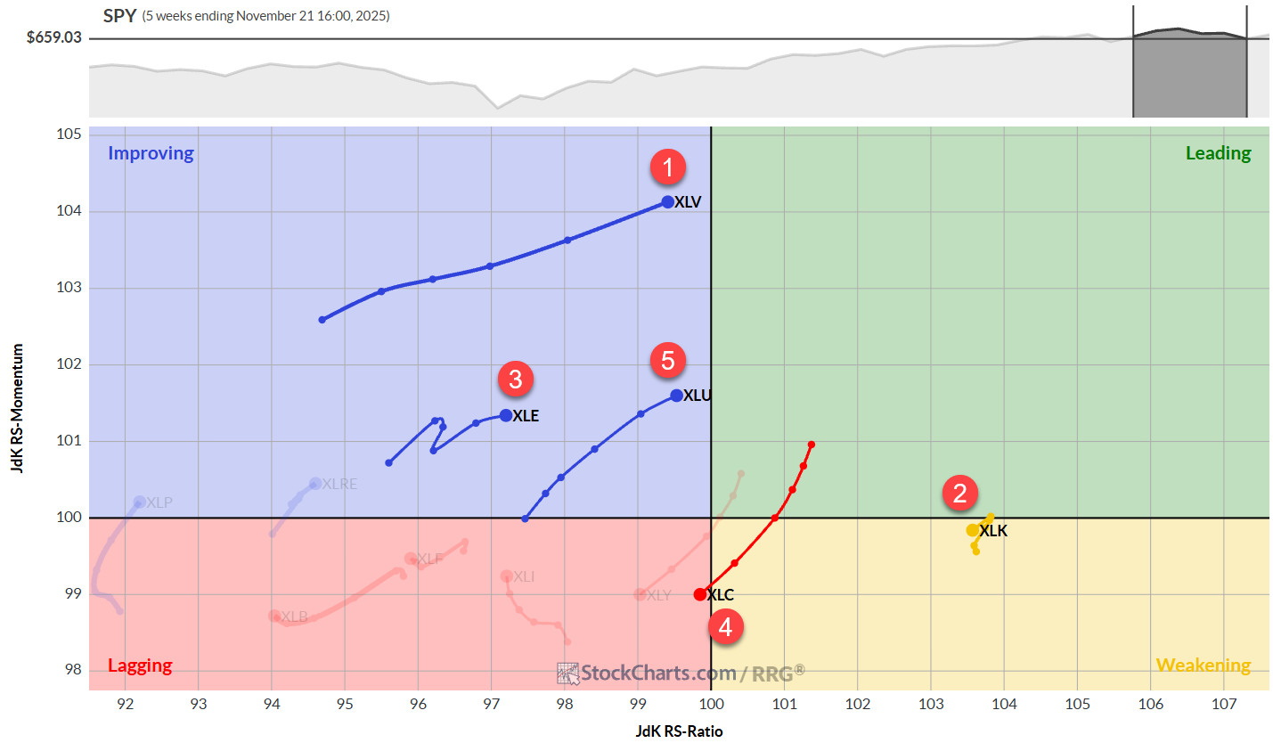
When we look at the weekly RRG, the rotation becomes crystal clear. Technology has turned around while inside the weakening quadrant, traveling at a negative heading towards the lagging quadrant.
What you can also see is that communication services has now definitely entered that lagging quadrant, explaining why it's moving towards the bottom half of the top five. Quite frankly, I think this sector is at risk of dropping out of the top five altogether.
The new number one sector, healthcare, is at the longest tail on the weekly RRG. That indicates significant power behind the move, and it's almost crossing over into the leading quadrant.
Utilities is probably the second-best sector at the moment based on the RRG — it just entered the top five again after a few flip-flops over the last few weeks, but the trajectory and heading are looking really strong.
Then there's energy, which is making a real nice push higher this week inside the improving quadrant, traveling at a positive heading.
Daily RRG
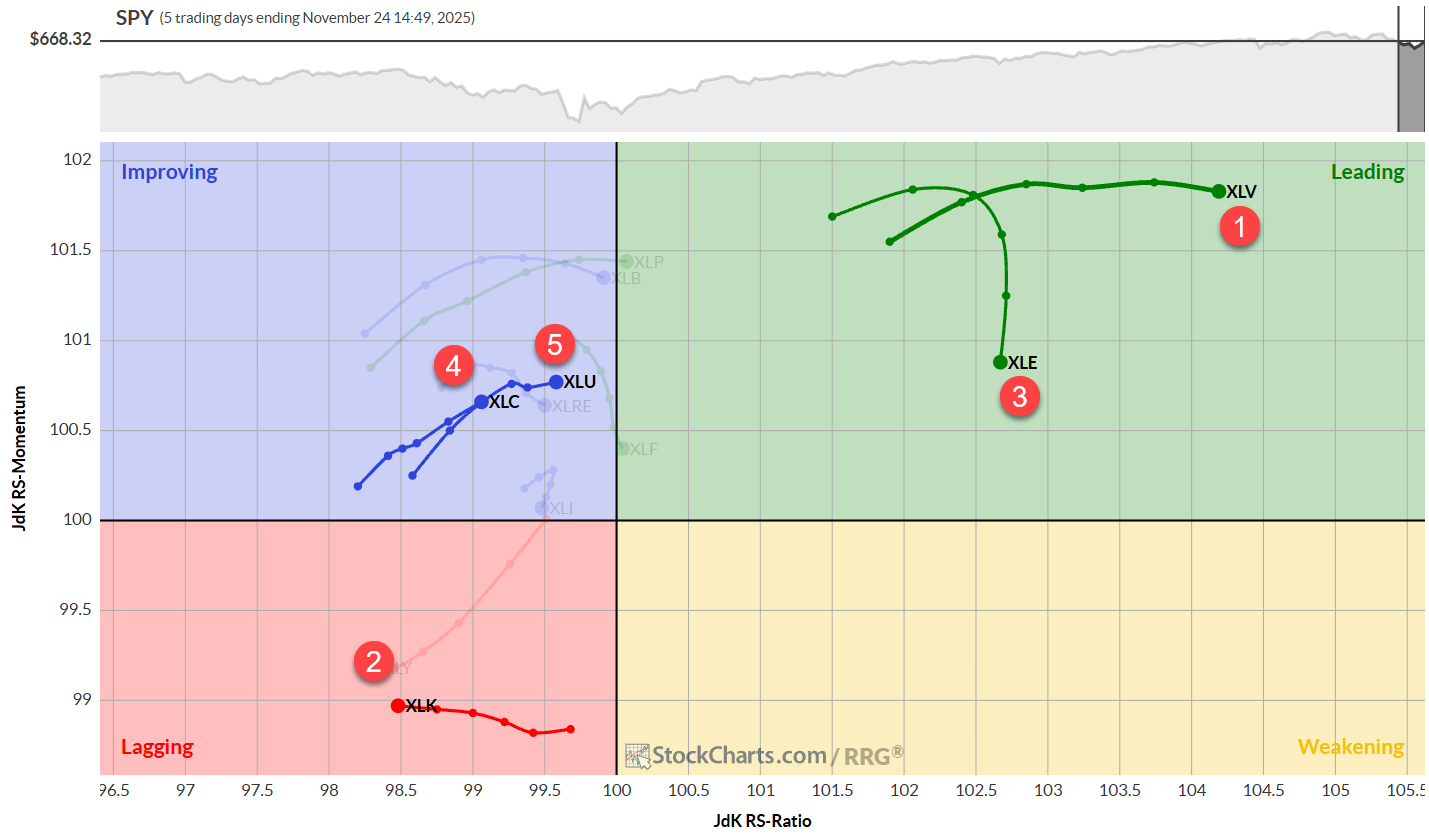
When we zoom in on the daily RRG, we can see the strength of healthcare, confirmed by the highest reading on the RS ratio scale. Energy has rolled over; it's inside the leading quadrant but losing relative momentum right now, still at the second-highest reading on the RS ratio scale.
Utilities is confirming its strength on the weekly RRG with a strong rotation on the daily as well.
We can see a pickup of strength in the communication services sector on the daily chart. It's inside the improving quadrant, trailing utilities. Still, the weak rotation on the weekly chart makes this daily rotation a little suspect, as the weekly rotation is looking really weak and moving into the lagging quadrant.
The confirmation we would get for communication services is when we see a rolling-over tail for XLC in the improving quadrant.
And then there's technology inside the lagging quadrant, moving lower on the RS ratio scale. As a matter of fact, on this daily RRG, technology is now the weakest sector. So be careful with holdings in the technology sector. Even though the weekly is still at a very high RS ratio, the daily is starting to pull it lower. We will need much more proof and much more upside on this daily RRG to pull the weekly tail back up again.
Healthcare
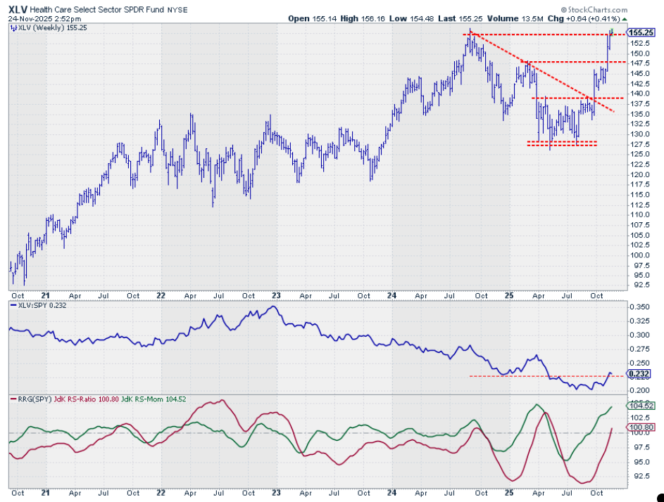
Healthcare is now the first chart on the list and the strongest sector in the universe. We see continued relative strength with an RS line that is moving above its previous low and RRG lines that are pulling above 100.
More importantly, we see a price chart breaking out to new highs. That is a strong sign. And if that can hold up, it will definitely strengthen healthcare's position in this ranking.
Technology
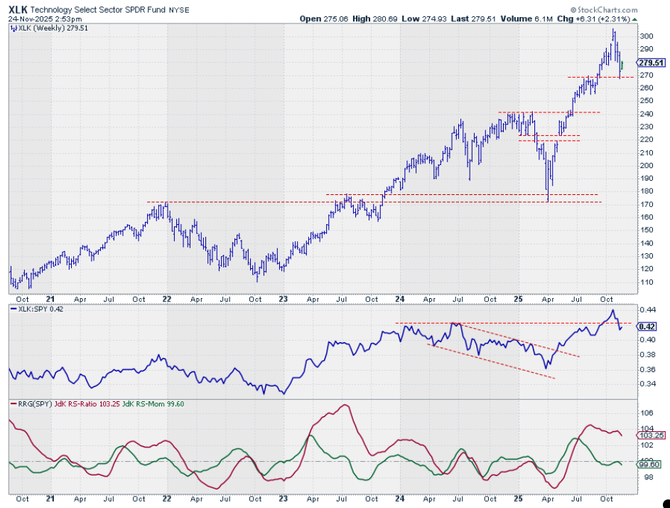
The technology sector is starting to move lower. That is visible in the raw RS line, which has dropped below support, and in both RRG lines, which are now declining. The red RS ratio line is still solidly above 100, but weakness in relative momentum will likely persist and start to drag it lower over the next few weeks.
The price chart is holding up well above support, just below 270. As long as we hold there, the longer-term uptrend for tech remains in play. But that support level (where the most recent low and the previous high are lining up) is a pretty solid line in the sand. The market should hold there to maintain the positive outlook for technology in the longer term.
Energy
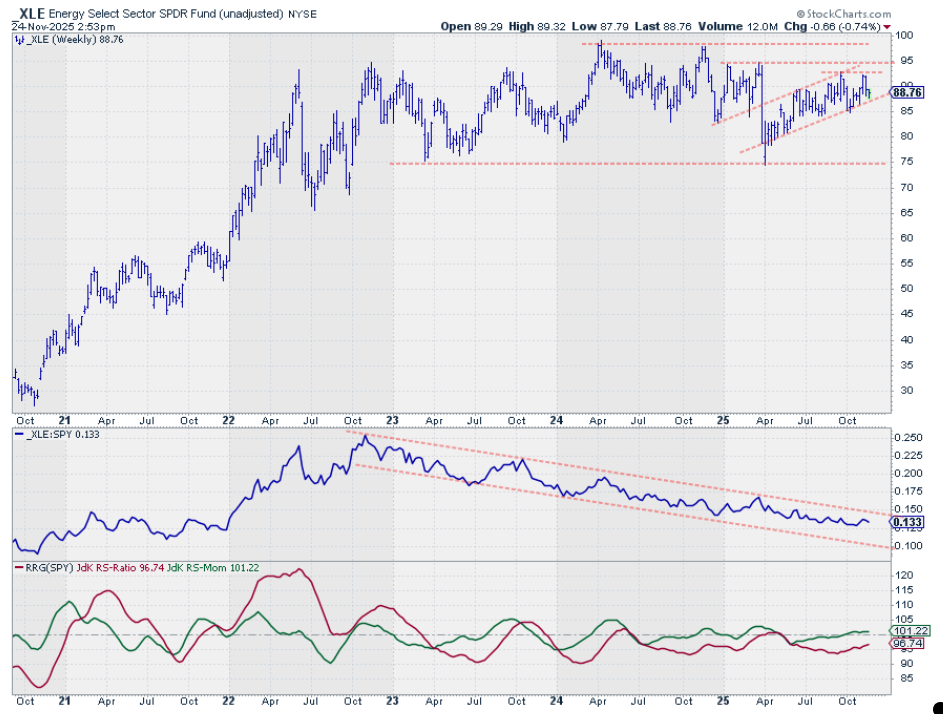
The energy sector is still moving higher in that shallow rising uptrend. Shallow is not a problem because it is still going up. There's a little bit of overhead resistance around 93-95, but, as long as that channel holds, the trend is there.
The trend is still there in relative strength as well, but that one is pointing lower, albeit at a much slower pace than we have seen over the 2-2.5 years. And that is why the green RS momentum line is moving higher, has crossed above 100, and is now starting to pull the RS ratio line higher, indicating improvement for the energy sector.
Communication Services
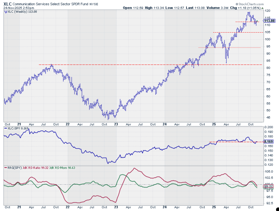
Communication Services is slowly moving down the ranks in this sector ranking. What you can see on the price chart is that a series of lower highs and lower lows is emerging; in fact, it's already in place. That means the first serious support level is only found around 105, which makes the downside the most likely direction. Upside potential is limited by overhead resistance at the previous highs.
We can also see the raw RS line dipping below its previous low and that horizontal support level, which is causing the RRG lines to now push below 100. Both of them are declining at around the same angle, causing the negative RRG-Heading around 225 degrees. This is putting the Communication Services sector inside the lagging quadrant.
Utilities
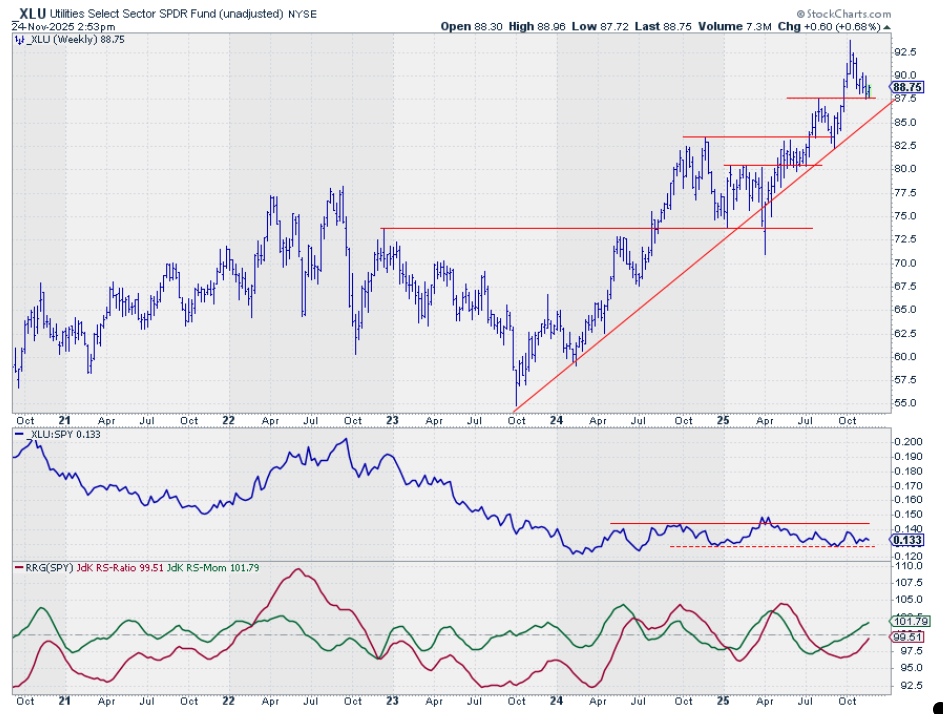
The utility sector has been flip-flopping in and out of the top five over the last few weeks, but the price chart is still holding up well. You see that price has found support once again around 87.50 and is bouncing off that level.
We now need a more solid move up in terms of price. I would say going above $90 would signal that the low is in place and that we still have the series of higher highs and higher lows intact. The price relative is still moving in a sideways trend, but the RRG lines are showing some upside potential due to a pickup in relative momentum, which is starting to drag the RS ratio line higher.
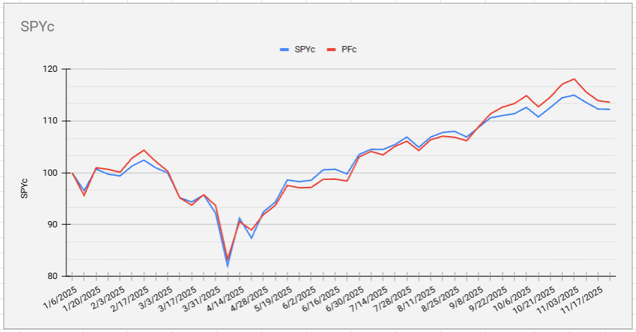
Portfolio Performance
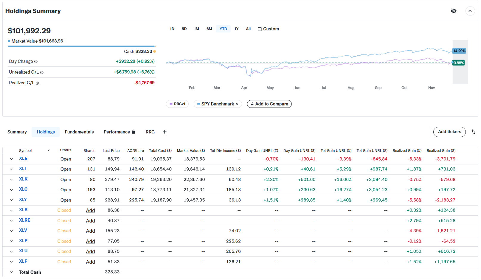
The equal-weighted portfolio is still lagging the S&P 500. The lag is around 12–13% right now, and it's static.
More importantly, the cap-weighted portfolio is now roughly 1% ahead of the S&P 500, a very clear and significant difference when you compare it to the equal-weight portfolio. Once again, this underscores how vital the weighting of the various sectors inside a portfolio and inside a trading strategy actually is.
#StayAlert and have a great week, --Julius


