These Asset Relationships Could Be About to Signal Some Important Changes Ahead
A lot of commentators, myself included, spend a lot of time analyzing the sector rotation process.
There are two reasons for this. First, it indicates which areas of the market are likely to under- or outperform going forward. Second, the nature of that rotation can provide valuable clues as to where we might be in this cycle of continuous rotation.
For example, when interest-sensitive and defensive areas underperform, it is often associated with a maturing economy, which often precedes a top. Conversely, such areas tend to be better relative performers during the late stages of a bear market, as well as the early phases of an emerging bull. Similarly, if inflation-sensitive sectors, such as resource-based industries, start to outperform the S&P, it’s a sign of an economy in its mature phase, which often coincides with the late stages of a bull market.
If all these sectors acted in accordance with the theory, it would make life very easy. However, there are enough exceptions to keep us on our toes, which is why obtaining corroborative evidence from selected inter-asset relationships is not a bad idea. By inter-asset relationships, I am referring to things such as stock/bond, commodity/bond, stock/gold, and so forth.
Let’s start off with the stock/bond ratio.
Stocks vs. Bonds
Chart 1 features the ratio in the center window. When it is rising, it means stocks are outperforming bonds and vice versa. Right now, the ratio is in a rising trend, since it is above its 12-month MA and post-2020 up trendline. That said, the vertical lines flag KST sell signals. Looking to their right in the top window indicates that slowing stock/bond momentum is usually followed by a bear market or a period of extended volatility. When the market is in a secular uptrend, as has been the case since 2009, the consequences of a KST sell signal are usually benign.
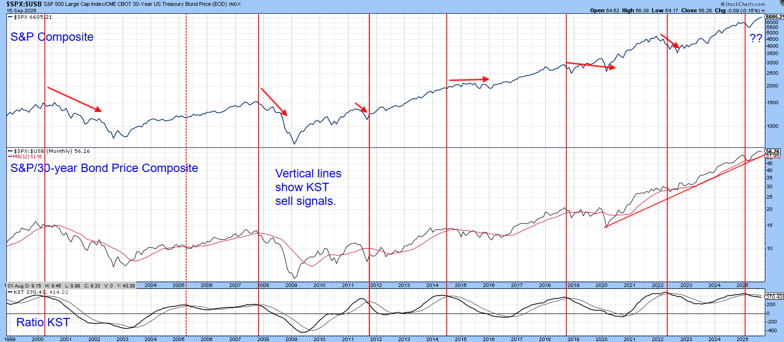
The 2000 and 2008 signals occurred during a secular bear and were immediately followed by some downside retribution. The sell signal generated earlier this year though, has been quickly followed by a new S&P high, which suggests it is more akin to the 2011 and 2019 signals. Bottom line: We should expect more rangebound volatility.
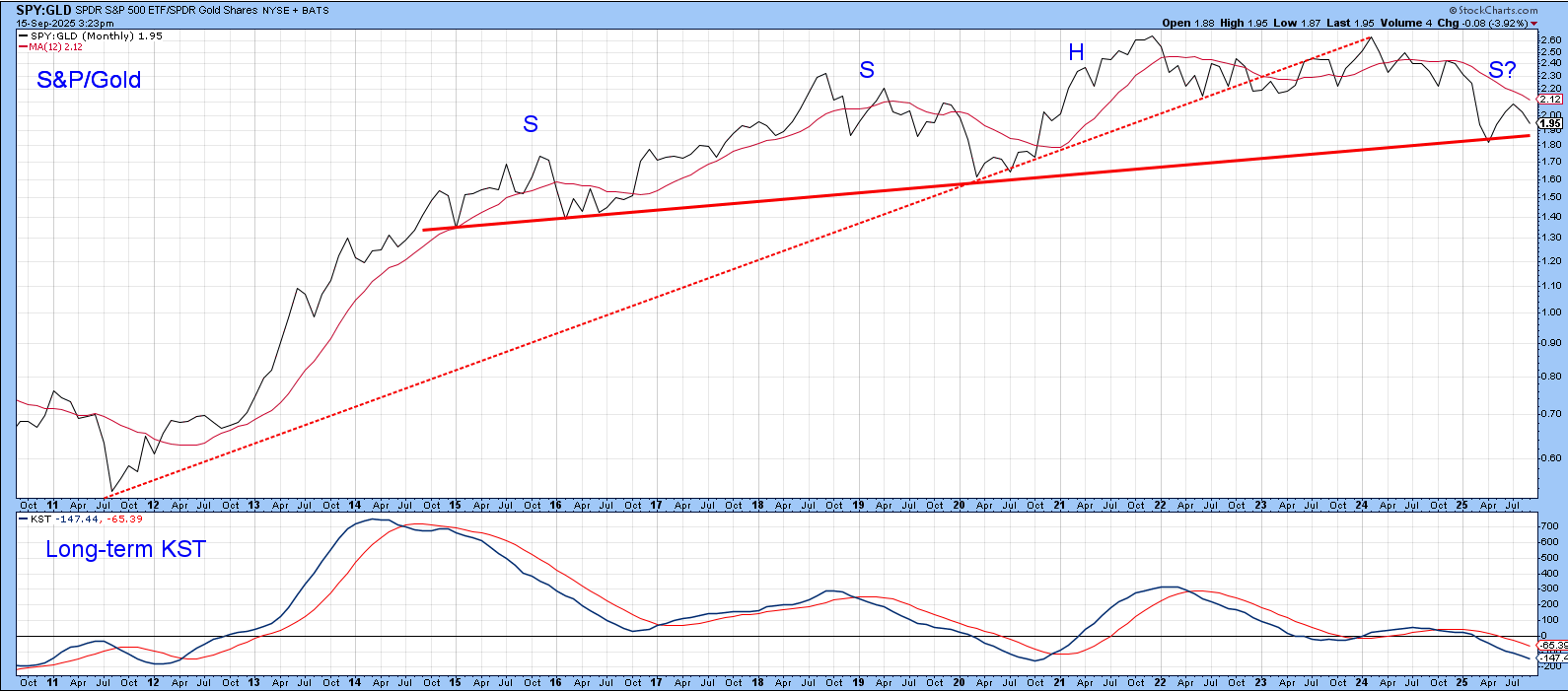
Stocks vs. Gold
Chart 2 displays the S&P/gold ratio. Most of the time, it and the Index move in the same direction. However, there have been enough exceptions, such as the period between 2002 and 2007 when the ratio declined and stocks advanced, to caution against taking a dogmatic approach to this relationship.
The first sign of equity relative weakness came in early 2022, when the ratio violated a significant up trendline. It subsequently dropped below its 12-month MA and experienced a long-term KST sell signal. It now stands a tad above the neckline of a potential 10-year head-and-shoulders top. If this pattern is completed, it would represent one piece of evidence in favor of a primary bear market.
Most of the gains in the S&P 500 have come from the technology sector. For comparison purposes, the XLK/gold ratio is featured in Chart 3. Not surprisingly, it displays a similar pattern to that for the S&P/gold relationship in Chart 2.
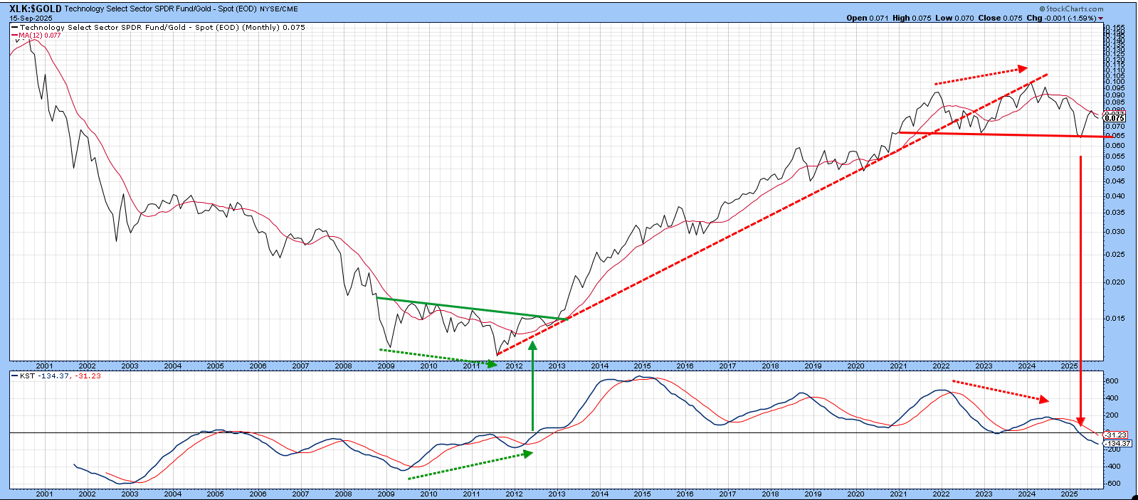
Two things stand out. First, the negative divergence between the ratio and its KST mirrors the 2009-2012 positive divergence, except for the breakout. Second, the KST has now crossed below zero for the first time since 2012. Tracing that back using the index itself, as opposed to the ETF, shows that three of the four buy signals and two of the three sell signals since the 1970s were followed by a multi-year change in trend. The recent negative zero crossover is not therefore without some significance.
Commodity/Bond Ratio
Chart 4 compares the CRB Commodity Index to the ratio between it and the 30-year bond price (arguably the ultimate inflation/deflation relationship). Both are on the cusp of a major breakout.
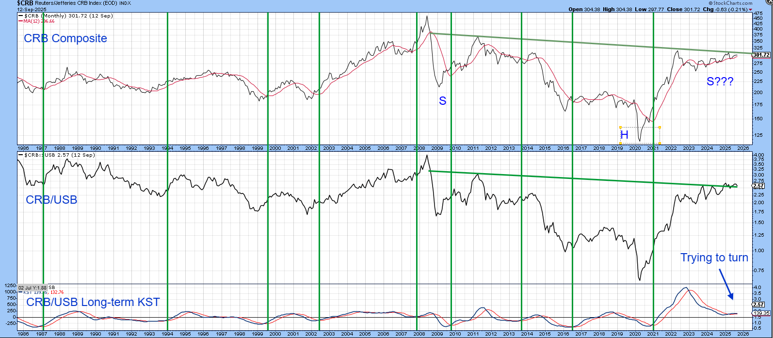
Being on the cusp and breaking out are, of course, two separate things. A breakout, though, does appear likely. That’s because the KST of the ratio has triggered a tentative buy signal. The vertical green lines show that almost all since the 1980s have been followed by a commodity bull market.
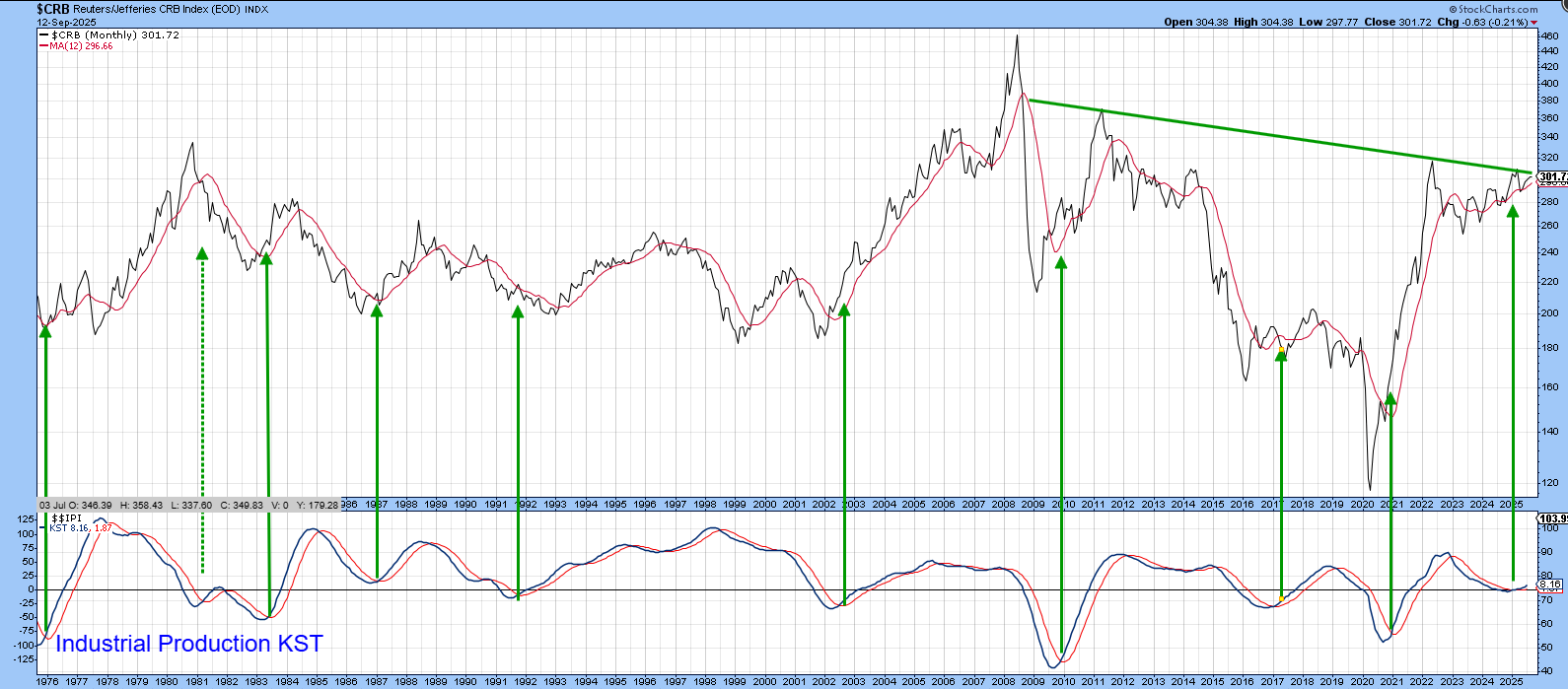
So too have KST buy signals for industrial production, featured in the bottom window of Chart 5.
Good luck and good charting,
Martin J. Pring
The views expressed in this article are those of the author and do not necessarily reflect the position or opinion of Pring Turner Capital Group of Walnut Creek or its affiliates.


