Three Breadth Signals Confirming the Market’s Bullish Trend

While market strategists harped on the dangers of the equity markets moving higher on narrow leadership in 2025, a dramatic improvement in market breadth indicators in Q4 demonstrated that this leadership trend was shifting. As the S&P 500 has pushed higher in the new year, driving the benchmark into our bullish “green light” range, breadth conditions have been quite supportive of this new uptrend phase.
In this article, we'll dig into three of those constructive breadth indicators, learn more about what the charts are telling us about leadership trends in Q1, and review what we would need to see on these charts to turn much less bullish on opportunities going forward.
Advance-Decline Lines Have Generally Broken Out
One of the simplest ways to measure breadth is to keep a running total of how many stocks are closing higher versus closing lower over a series of trading days. By charting this cumulative advance-decline line, we can track whether a move higher in the equity benchmarks is supported by a greater number of stocks closing higher over the course of weeks and months.
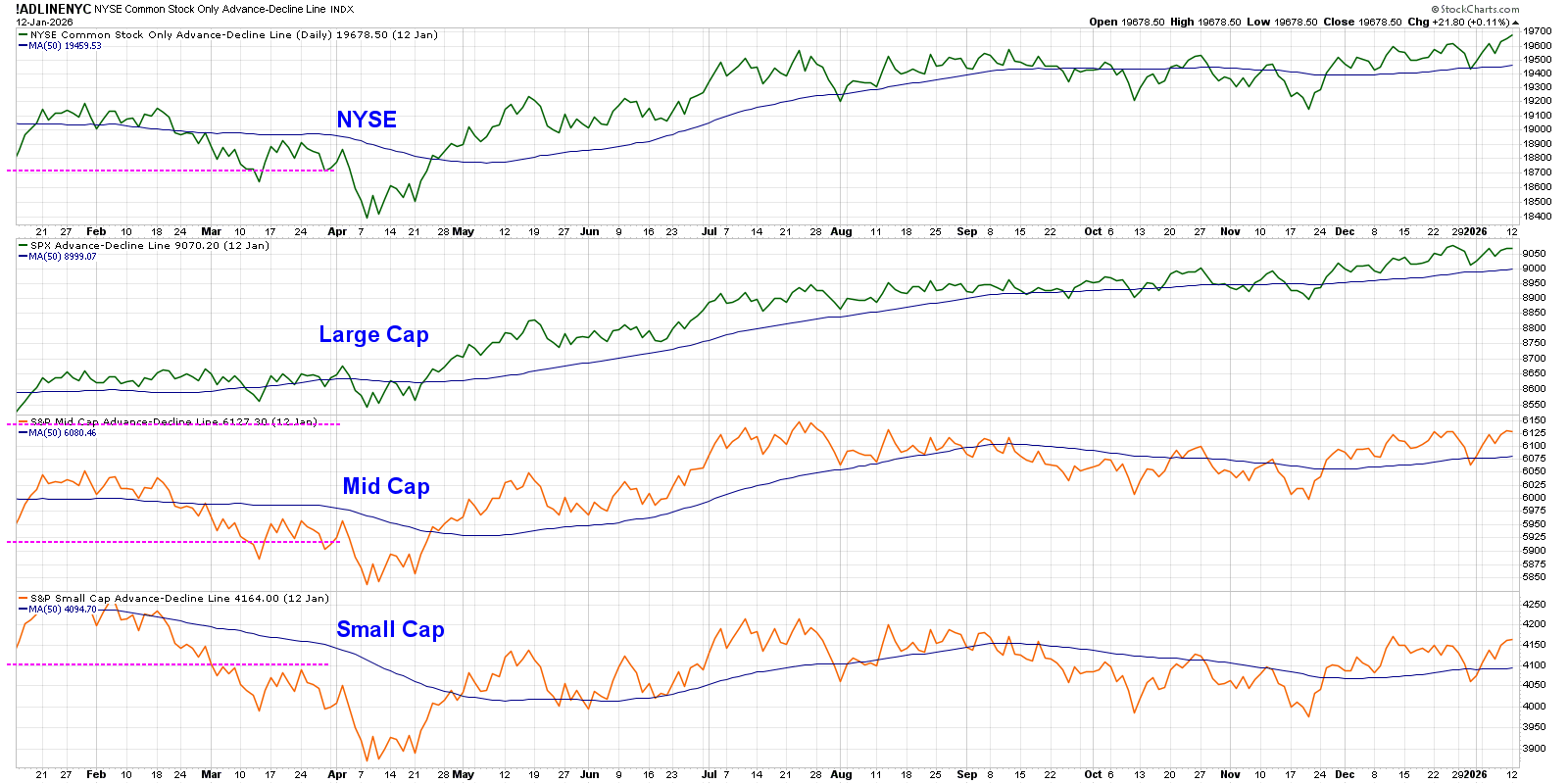
The top panel features our most important advance-decline line, which is based on the New York Stock Exchange. While some may argue that the S&P 500 breadth is more important, I have found this universe to be ideal because it includes growth and value stocks, large caps to small caps, and everything in between.
While the S&P 500 has pushed to a new high above 6900 this month, the NYSE advance-decline has confirmed that breakout by popping above its own previous highs. Note that the mid-cap and small-cap versions of this indicator have yet to achieve a new high, but the recent strength in small-cap stocks suggests that a breakout may come very soon.
Be wary when the S&P 500 and Nasdaq 100 break to a new high and the breakout is not confirmed by a new high in the advance-decline. That bearish divergence would imply that some stocks are selling off, putting the uptrend into serious question. For now, new highs in the A-D line suggest a broad market move higher.
An Expansion in New Highs Equals Broad Advance
Our second breadth chart is based on stocks making new 52-week highs versus new 52-week lows. It seems counterintuitive to expect any new 52-week highs with the major averages in a position of strength, but we don’t have to go too far back to see how this major warning sign has indeed flared up before.
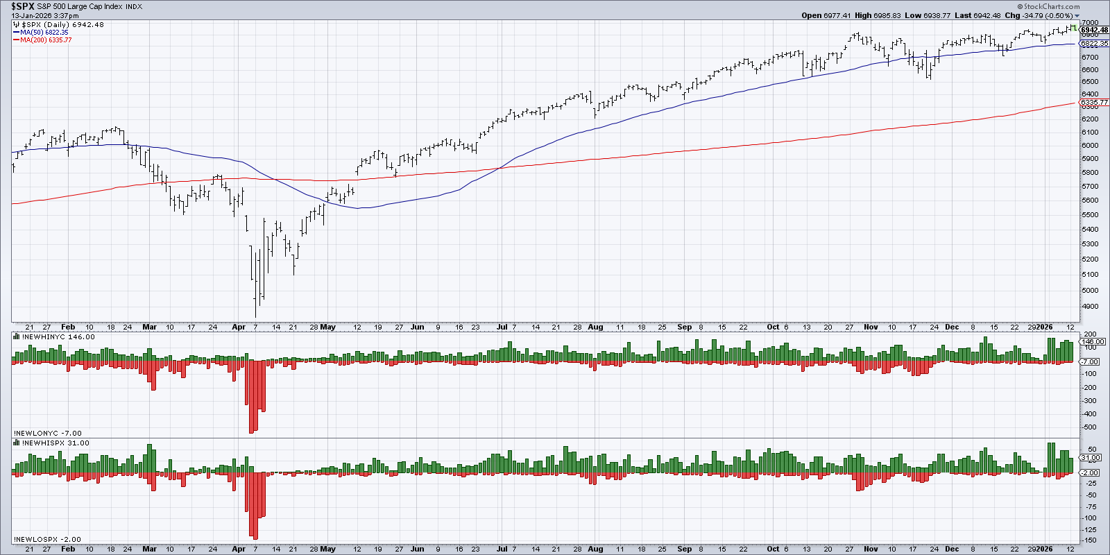
The first panel below the S&P 500 shows the daily reading of NYSE stocks making a new 52-week high in green, along with the number of stocks making a new 52-week low in red. The bottom panel follows this same methodology for the members of the S&P 500 index.
Back in September and October, we saw the SPX making consistent new price highs, and there were plenty of names making their own 52-week highs as well. Then, in late October and early November, we saw a big increase in new 52-week lows, implying that some stocks were breaking down despite the major indexes popping higher.
This represented a key distribution sign, and sure enough, the S&P 500 stalled out and neglected to make another new high until January. This month, we’ve again noted plenty of new 52-week highs with very few new lows. If we see an increase in the red histogram in the coming weeks, that would represent a similar warning sign of distribution to what we found back at the October market peak.
Most Stocks Remain Above Key Moving Averages
While the S&P 500 and Nasdaq 100 are sitting safely above their own 50-day and 200-day moving averages, our final breadth indicator gathers this data for all of the S&P 500 members. Generally speaking, we’re looking for these indicators to remain above the crucial 50% level, as anything below that would indicate a broader decline and failure to hold support.
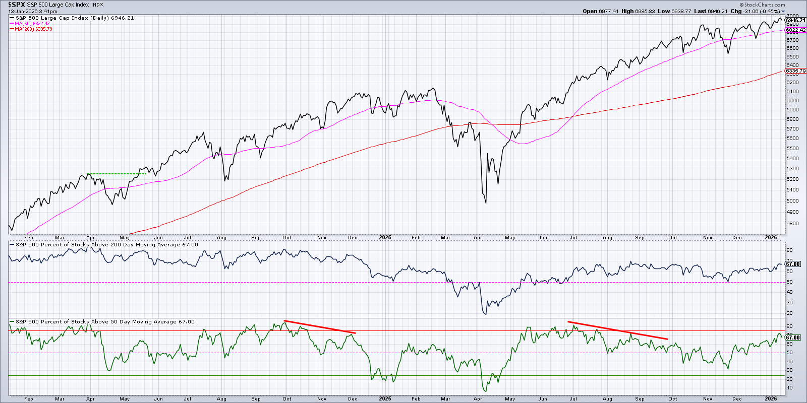
Back in mid-November, the percentage of stocks above the 200-day moving average reached right down to the 50% level. We also saw only 32% of SPX stocks remaining above their 50-day moving average. Similar to our previous observation with the new lows list, this breadth deterioration implied that a growing number of stocks were not following the primary uptrend in the major equity averages.
In December and January so far, we’ve observed a dramatic improvement with over 65% of S&P 500 members currently sitting above their 200-day and 50-day moving averages. If the S&P 500 were to make a new high with fewer stocks above the 50-day moving average, a bearish divergence would signal a similar warning to what we noted going into the Q1 2025 market peak. If and when we see less than 50% percent of stocks above the 200-day moving average, it would signal a failure in long-term breadth and raise a serious red flag for US stocks.
Our most important goal as trend followers is simply to follow the trend. Don’t discount the value of market breadth indicators to help us validate the uptrend phase, anticipate potential exhaustion points, and confirm a new corrective move for the S&P 500!
RR#6,
Dave
P.S. Ready to upgrade your investment process? Check out my free behavioral investing course!
David Keller, CMT
President and Chief Strategist
Sierra Alpha Research LLC
marketmisbehavior.com
https://www.youtube.com/c/MarketMisbehavior
Disclaimer: This blog is for educational purposes only and should not be construed as financial advice. The ideas and strategies should never be used without first assessing your own personal and financial situation, or without consulting a financial professional.
The author does not have a position in mentioned securities at the time of publication. Any opinions expressed herein are solely those of the author and do not in any way represent the views or opinions of any other person or entity.


