Two Intermarket Relationships That Could be Poised to Signal Mega Trend Changes
Most of the time we focus on the primary trend of stocks, bonds, and commodities by studying the technical position of these individual markets. However, it occasionally makes sense to dig a little deeper and examine some of their interrelationships to see if they can throw additional light on the situation.
The US vs. The Rest of the World
One of the areas of great importance to global asset managers is the relative performance between the US and the rest of the world. That’s because it’s a relationship that has historically experienced huge long-term swings, which you want to be on the right side of. Since the financial crisis in 2008, this relationship has been a one way street favoring the US. In that respect, Chart 1 compares the S&P Composite to the Vanguard FTSE Ex US ETF ($SPX/VEU).
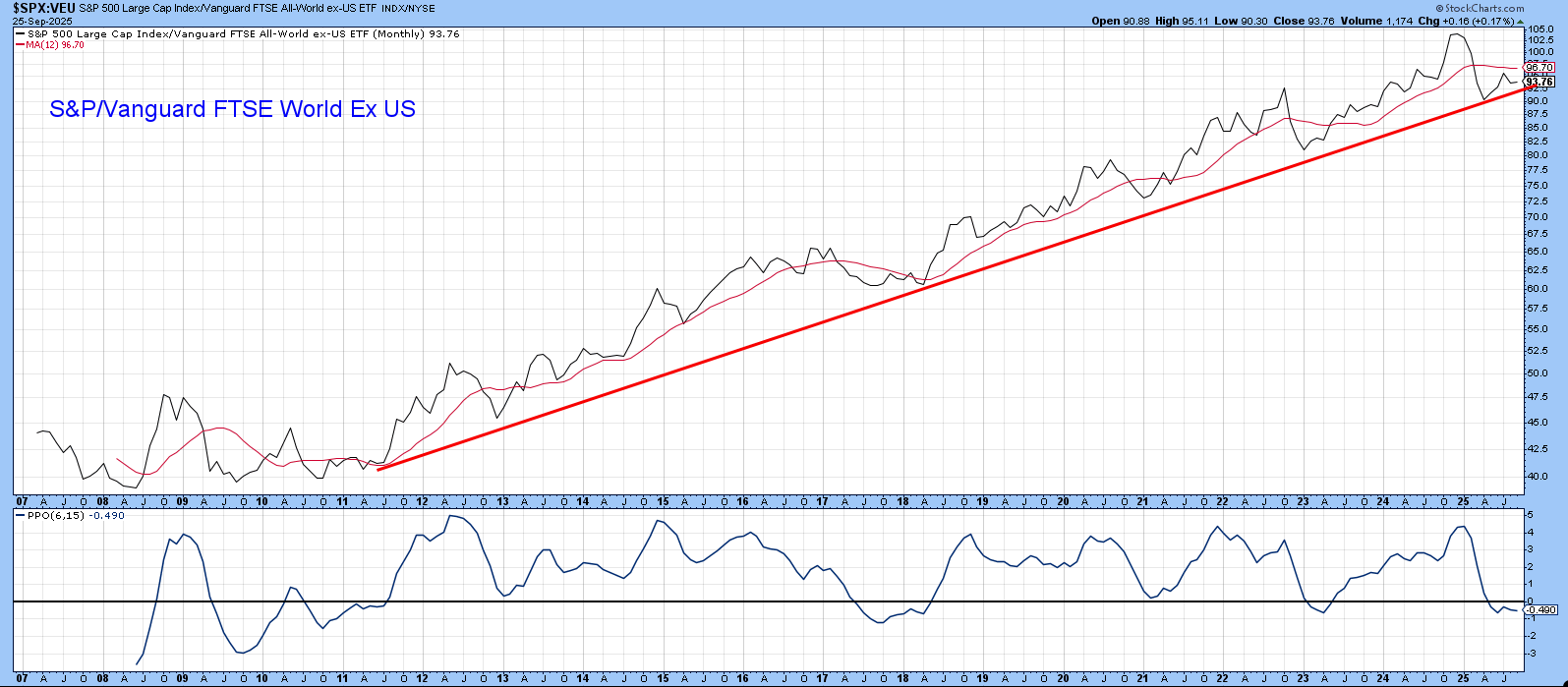
Technically, the secular bull is intact because the ratio continues to trade above its 2008-2025 up trendline. Also intact is the series of rising peaks and troughs that have been in force for the last 16 years. However, the ratio has recently experienced a decisive downside penetration of its 12-month MA and the PPO has dropped below zero. That’s certainly not encouraging, but since these two indicators have experienced several downside whipsaws between them, less weight should be placed on the latest signals than normal. Nonetheless, if the ratio drops below the trendline, which is currently around 92 (basis month-end close), it would suggest the secular uptrend had given way to a multi-year trading range or an actual bear market.
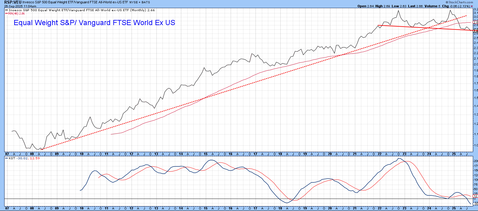
The S&P, of course, is heavily represented by technology stocks, which has contributed to most of its superior performance over the VEU. That’s why we get a slightly more bearish picture when the Invesco Equal Weight S&P ETF (RSP) is substituted for its cap-weighted counterpart. In this instance, the secular up trendline was decisively violated earlier in the year, along with the 48-month MA. We can also see that the KST is in a bearish mode and that it seriously diverged with the ratio at its 2024 secular peak. This relationship now faces an important technical test, since it has fallen back to what could potentially turn out to be a key support trendline.
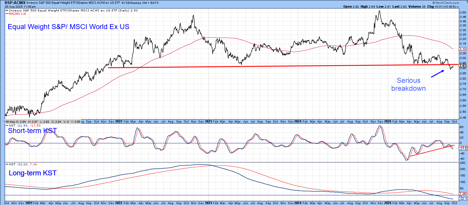
A near-term breakdown is a definite possibility, since the ratio between the RSP and the MSCI World Ex US ETF (RSP/ACWX) has already violated the red support trendline on Chart 3. This ratio is currently in retracement mode, but those negative short and long-term KSTs suggest a move to new lows is probable.
Gold vs. Stocks
Chart 4 features the ratio between gold and the S&P, which has risen to resistance in the form of a neckline of a potential multi-year inverse head-and-shoulders pattern. This relationship is currently above its 12-month MA and experiencing a bullish long-term KST. Such a combination makes an upside break favoring gold a distinct probability.
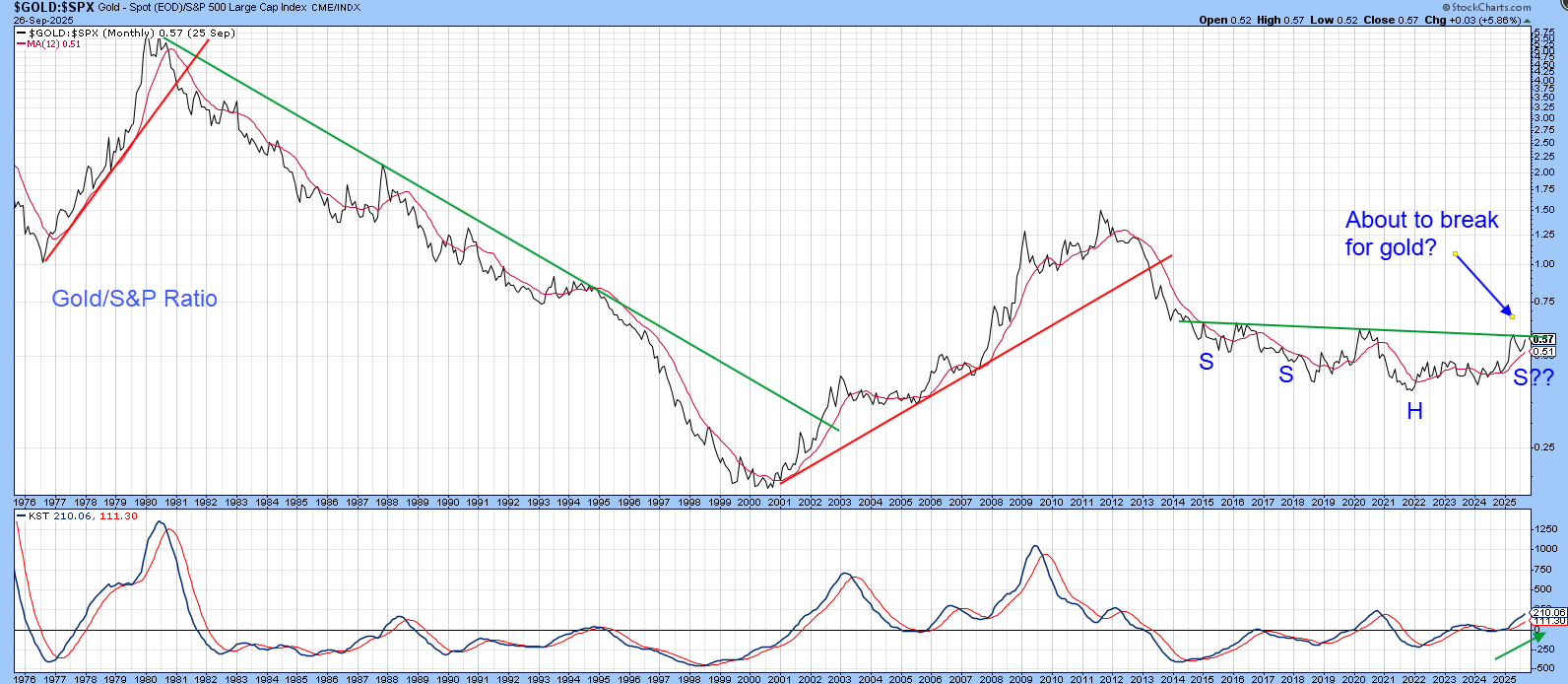
History shows that a rising ratio is not necessarily bearish for stocks in their own right. However, the turn-of-the-century 50-year trough in this relationship shows that gold has outperformed stocks over the course of the last 25 years, during which stocks themselves did spectacularly well. It’s also worth noting that there have been three secular swings in the ratio since the 1970s. Each signaled a reversal with a multi-year trendline violation, all of which suggests that if the 2014-2025 trading range is completed with an upside breakout, a major upswing in the gold/stock ratio will follow.
That could also be true for gold shares. For example, using the Philadelphia Gold and Silver Share Index ($XAU) (Chart 5), it looks as if the ratio could be about to complete a multi-year base.
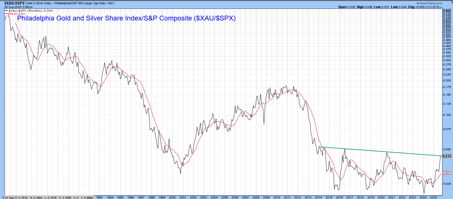
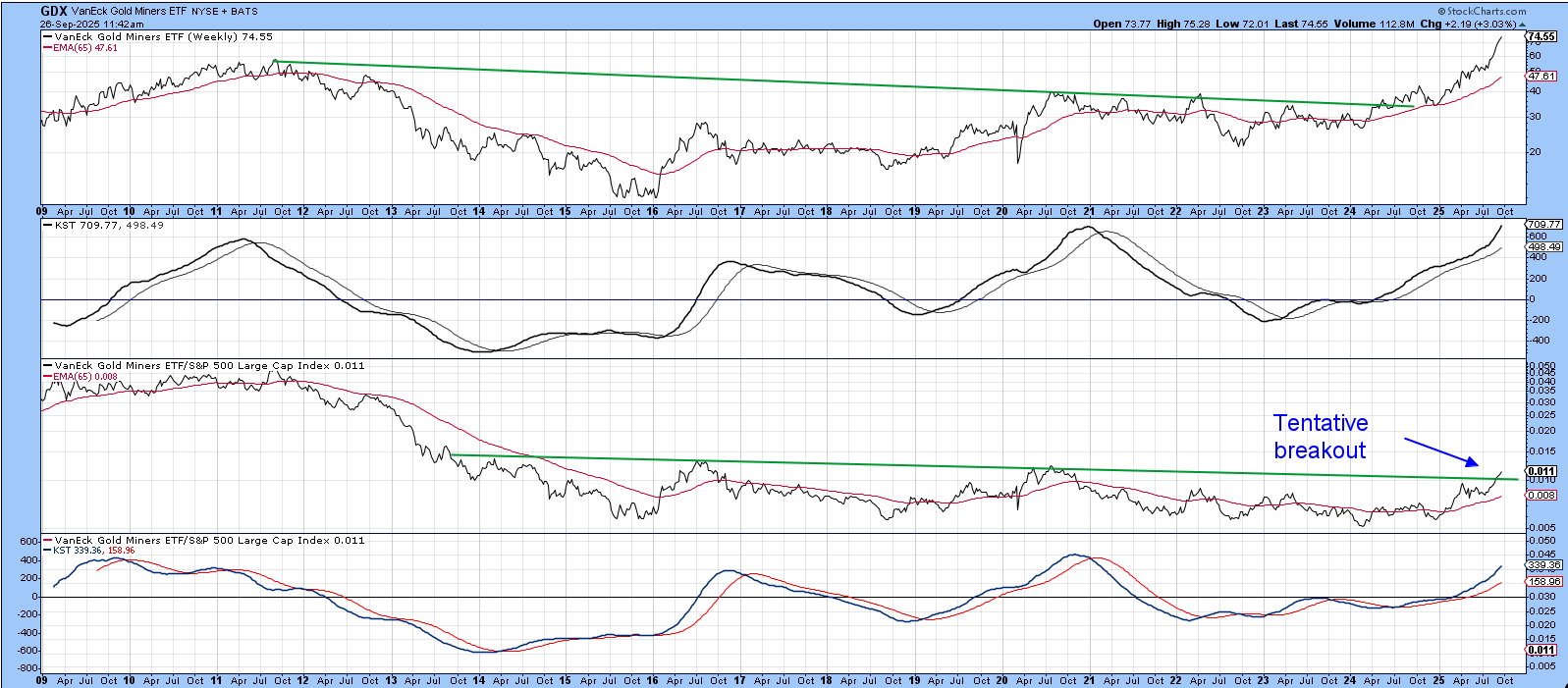
Chart 6 also indicates that things have recently perked up for gold shares, as the Van Eck Gold Miners ETF (GDX) has just surpassed its 2011 high. Relative action, measured against the S&P, has been in a trading range for the last 10 years or so but now appears to be breaking out to the upside. Gold is entering its moderately bullish year end seasonal, so we will see!
Good luck and good charting,
Martin J. Pring
The views expressed in this article are those of the author and do not necessarily reflect the position or opinion of Pring Turner Capital Group of Walnut Creek or its affiliates.


