Visualizing Breadth and Rotation Using RRG
When it comes to understanding what’s really going on beneath the surface of the market, two key concepts come to mind: breadth and rotation. Breadth helps us gauge the participation behind a trend, while rotation reveals where the strength is moving within the universe we’re analyzing. Combine both, and you get a much more complete picture than by just staring at an index chart.
Relative Rotation Graphs (RRGs) are uniquely suited to visualize both of these dynamics simultaneously on the same canvas. Let me walk you through how I think RRG can help shine some light on these two metrics.
Breadth Isn't Just About Advance/Decline
Most traders are familiar with traditional breadth indicators, such as Advance/Decline lines, new highs vs. new lows, and the McClellan Oscillator. These are all valuable tools, but they often focus on absolute price movement. What’s usually missing is the relative context.
When I look at sector rotation using RRGs, I'm not just interested in whether a sector is going up or down, but whether it is outperforming or underperforming the benchmark. Breadth, in that context, becomes more meaningful. Are multiple sectors improving relative to the S&P 500? Or is it just one sector driving the market while others lag behind?
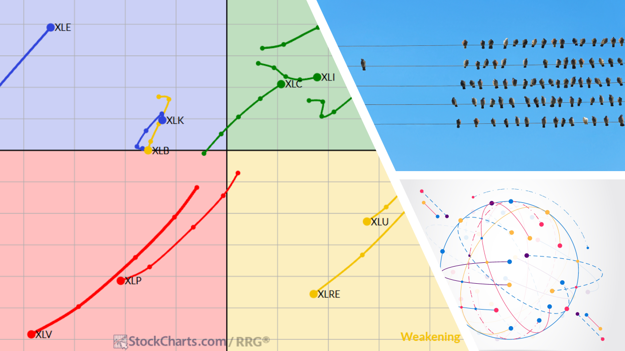
Relative Rotation Graphs allow us to assess (relative) breadth visually. If a broad swath of sectors is traveling towards and into the Leading quadrant, you have strong participation. If only one or two are doing all the heavy lifting, that’s a warning.
Rotation Comes to Life
One of the most powerful applications of RRGs is tracking the rotation of market segments over time. We can literally see how leadership changes as sectors or stocks rotate through the four quadrants: Leading, Weakening, Lagging, and Improving.
Let’s say you’re analyzing the 11 S&P sectors. If Energy is (deep) in the Leading quadrant but started to curl down toward Weakening, while Technology is pushing up to Improving, that’s a visual cue of potential rotation underway. You don’t need a complex model to spot it; the shape of the tails, the curvature, and the speed all tell a story.
Importantly, because the RRG is normalized around a benchmark (usually the S&P 500), you’re always looking at things from a relative perspective. That means you're focused on alpha—what's doing better or worse than the benchmark. Not just price action in isolation.
Spotting Breadth and Rotation Together
This is where things get really interesting. By combining breadth and rotation on an RRG, you can get a sense of how broad the rotation is.
Let me give you a few scenarios:
- If only one or two sectors have strong tails pointing northeast (into the Leading quadrant) while most others are clustered in Lagging or Weakening, you’re seeing a narrow market; breadth is thin.
- If tails are diverging in multiple directions—some heading to Improving, some to Lagging, and some circling back into Leading—you’re likely in a transitioning phase, where rotation is taking place under the hood.
- If you see a clear group of sectors moving in concert from Improving into Leading, and the length of their tails is relatively long, that’s a broad-based move with strength and participation, classic healthy rotation.
Note: When evaluating these clusters, don’t just count sectors; consider their market capitalization as well. Three or four large sectors (like Technology, Financials, or Healthcare) rotating together can have far more impact on the benchmark than a full sweep of smaller sectors. So breadth isn’t just about quantity, it’s also about weight.
And because RRGs can be animated over time, you can watch this play out like a market movie. You see where leadership was, where it’s going, and what’s coming up behind it.
Application: Sector Rotation Strategy
If you're managing a sector rotation strategy, or even just making ETF allocation decisions, this kind of visual information will be very helpful. Rather than reacting to headlines or chasing performance, you can anticipate where momentum is building. Are defensive sectors rotating out of favor? Is cyclicality coming back into play? Breadth and rotation patterns will often show up on the RRG before they’re obvious on a chart of the S&P 500.
One practical approach is to look for clusters of sectors moving together. When several sectors are starting to move into a positive RRG-Heading (between 0-90 degrees) and move toward the Leading quadrant at the same time, it may signal a positive undertone for the market. On the flip side, when sectors start rolling over into Weakening and RRG-Heading moves into 180-270 degrees and tails are getting longer, it's often a good time to scale back or rotate out.
Final Thoughts
Breadth and rotation are not new ideas—they’ve been around as long as markets have existed. What’s changed is how we can visualize and interpret them.
Relative Rotation Graphs give us a clean, intuitive way to assess both in a single glance. Whether you're an institutional portfolio manager or an individual trader, understanding the where and how of market participation can give you a serious edge.
So the next time you look at an RRG, don’t just focus on who’s in the Leading quadrant. Ask yourself: how many names are participating? How big are they? Are we seeing a broad rotation or a narrow move? And where is the next leadership likely to come from?
That’s when the real insights begin.
#StayAlert and have a great weekend, – Julius


