Watch This Chart — “Affordability” May Be About to Get Less Affordable
Key Takeaways
- Gold is signaling rising inflation pressure, but its relative leadership may be peaking.
- A reversal in the Gold/CRB ratio has historically marked the start of major commodity bull markets.
- "Affordability" risks may be rising as commodities take the baton from gold.
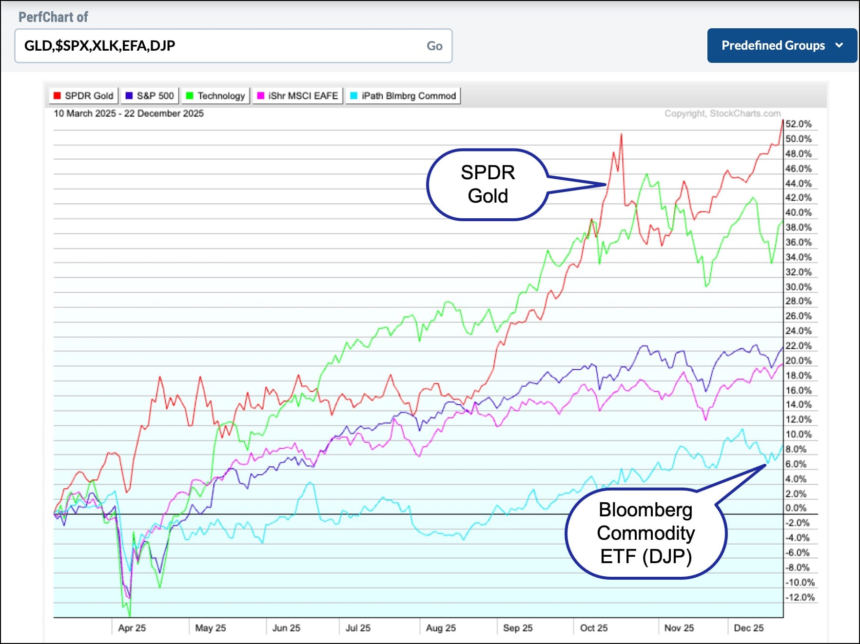
Gold has been the best-performing asset class over the past 200 days, as shown in Figure 1. Technology, represented by the lime-green plot, has been the best equity sector, but even that strong showing has paled in contrast to the price of the yellow metal. Silver and Platinum, two other precious metals, have outstripped gold, but that’s a discussion for another time.
I bring up gold because it has been trusted for thousands of years as a store of value, a refuge in troubled times, and a discounter of future price inflation. That latter point is important because we have records since the mid-1970s that gold has a strong tendency to lead commodities at important cyclical turns. In that respect, Chart 1 illustrates that gold momentum, in the form of the long-term KST indicator, has consistently turned up ahead of copper and oil. The amount of lead time is reflected by the slant of the arrows. The shallower the angle of the arrow, the longer the lead.
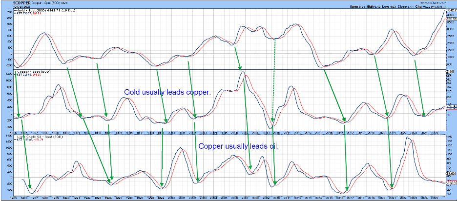
At present, gold momentum remains bullish but extremely extended, copper is moderately positive, and oil, playing its usual lag role, has yet to turn. This suggests gold is probably close to completing its upside potential and that commodities have plenty of unrealized upside potential. But what about the actual timing concerning a commodity bull market?
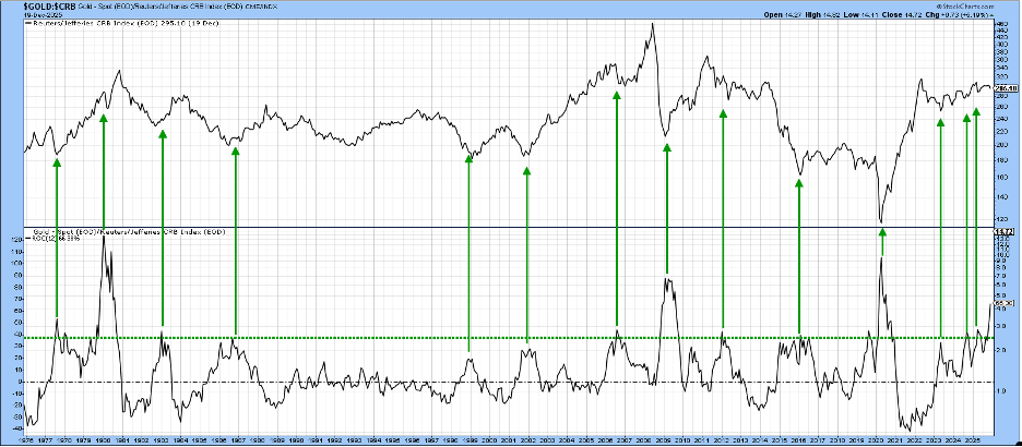
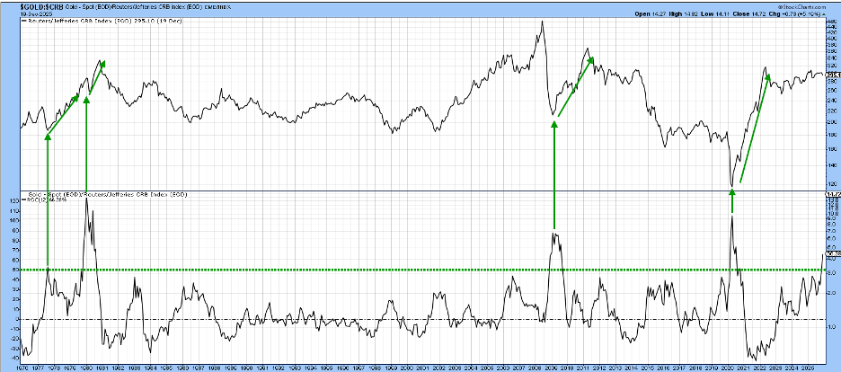
That’s where Chart 2 is the one to watch. That’s because it compares the CRB Composite with a 12-month Rate of Change (ROC) of the Gold/CRB Composite ratio. I have already established that gold has a habit of discounting future commodity inflation and that, by extension, it influences future CPI numbers. Taking all that a step further, history shows that a crucial juncture in the cycle occurs when gold no longer outperforms commodities. By that point, if commodity prices have not already bottomed, they soon will.
One method that can help identify this critical phase in the cycle is to observe when the 12-month ROC of the ratio peaks from an extreme level. Our chart uses reversals from around the 40% level. Since the mid-1970s, this has occurred fourteen times. Almost every instance was followed by a commodity bull market.
But wait, there’s more.
Bearing in mind that gold discounts commodity prices, you could say that in general, the higher the level at which the ROC peaks, the stronger the ensuing commodity rally is likely to be. In that respect, Chart 3 raises the overbought bar to +50%. This step may reduce the number of signals, but improves their average quality. Every instance was followed by a spectacular advance in the CRB Composite.
Of course, spotting previous turning points is simple in hindsight. In real time, it’s far more challenging. The ROC reached a new recovery high in December and is clearly advancing at an unsustainable pace. The magnitude of its rally is especially unpredictable, but not its duration.
Based on the ROC’s current reading and historical precedent, it is likely to be limited to 90 days or less. Since commodities have already been rising during a period when they would normally be weakening preceding a turn in the ratio, it’s possible the advance could be explosive when it begins.
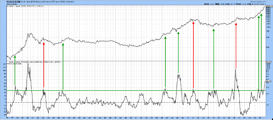
A downside reversal in the ROC does not mean that the gold bull market ends. It simply means that gold is no longer likely to outperform commodities. The red arrows in Chart 4 show that, about 30–40% of the time, it does end. More often than not, though, the price of the yellow metal continues to rally, but just not relative to the broader commodity complex.
Good luck and good charting,
Martin J. Pring
The views expressed in this article are those of the author and do not necessarily reflect the position or opinion of Pring Turner Capital Group of Walnut Creek or its affiliates.


